


最近在用uni-app,因为功能需要只能采用自定义tabbar,插件市场找了很多都不符合自己的要求,只能自己简单开发一版了
编写组件
在components文件夹下新增tabbar.vue
<template>
	<view>
		<view class="tabbar-box" style="padding-bottom: constant(safe-area-inset-bottom);padding-bottom: env(safe-area-inset-bottom);">
			<view class="tabbar-list-box" v-for="(item,index) in list" :key="index" @click="SwitchTab(item)">
				<image :src="item.id==state?item.selectedIconPath:item.iconPath" mode="heightFix" class="img-icon"></image>
				<view class="tabbar-text" :style="{color:item.id==state?'#EE9D23':'#afafaf'}">{{item.name}}</view>
			</view>

		</view>
	</view>
</template>

<script>
	export default {
		name:"tabbar",
		props:{
			state: ''
		},
		data() {
			return {
				list:[
					{id:'1',name:'矿机',iconPath:'/static/images/mill-icon.png',selectedIconPath:'/static/images/mill-check-icon.png',pagePath:'/pages/mill/mill'},
					{id:'2',name:'钱包',iconPath:'/static/images/wallet-icon.png',selectedIconPath:'/static/images/wallet-check-icon.png',pagePath:'/pages/wallet/wallet'},
					{id:'3',name:'我的',iconPath:'/static/images/my-icon.png',selectedIconPath:'/static/images/my-check-icon.png',pagePath:'/pages/my/my'},
				]
			};
		},
		onLoad() {

		},

		methods:{
			SwitchTab(item){
				console.log(item)
				uni.switchTab({
				    url: item.pagePath
				});
			}
		}
	}
</script>
list为tabbar的数组,name为tabbar标题,iconPath是未选中时的icon,selectedIconPath时选中tabbar时的icon,pagePath为跳转路径。当state对应数组id时为选中状态。
导入组件
pages目录下的页面级组件使用自定义组件
<script>
    import tabbar from '../../components/tabbar/tabbar.vue'
    export default {
        components: {
		  tabbar,
		},
        data() {
			return {
				state:'1', // tabbar标识
            }
        },
        onLoad(){
            uni.hideTabBar()
        }
    }
</script>
在页面级组件上需要规定state标识,否则tabbar组件会报错,在页面加载时需要隐藏原生tabbar,不隐藏的话会出现两个tabbar,一个为原生,一个为自定义,之所以原生还保留,主要是想要用tabbar跳转方式,用其他方式跳转不是特别好。
page.json定义tabBar设置
"tabBar": {
		// "custom": true,
	    "color": "#afafaf",
	    "selectedColor": "#EE9D23",
	    "borderStyle": "white",
	    "backgroundColor": "#F7F7F7",
		// "iconWidth": "48rpx",
		// "height":"98rpx",
		// "fontSize":"24rpx",
	    "list": [
			{
				"pagePath": "pages/mill/mill",
				"iconPath": "/static/images/mill-icon.png",
				"selectedIconPath": "/static/images/mill-check-icon.png",
				"text": "矿机"
			},
			{
				"pagePath": "pages/wallet/wallet",
				"iconPath": "/static/images/wallet-icon.png",
				"selectedIconPath": "/static/images/wallet-check-icon.png",
				"text": "钱包"
			},
			{
				"pagePath": "pages/my/my",
				"iconPath": "/static/images/my-icon.png",
				"selectedIconPath": "/static/images/my-check-icon.png",
				"text": "我的"
			}
		]
	},
使用组件
<template>
    <tabbar :state="state"></tabbar>
</template>
这只针对于app端的自定义,小程序的自定义可以在page.json的tabbar加上"custom": true, 并在页面级加载时不用隐藏tabbar即可使用。
因为项目赶着上线所以tabbar会有点粗糙,但基本够用,唯一不够好的就是在页面加载时会出现一点img图片加载事件,后期有空了会尝试复杂一点的写法,尽量完善。
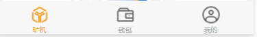
最后效果图


 4649
4649


 被折叠的 条评论
为什么被折叠?
被折叠的 条评论
为什么被折叠?
 到【灌水乐园】发言


