


一、适合tap头选项较少的 上方不带滑动


<!-- 适合少量的选项头 -->

<template>
    <view>
        <view class="topTabBar">
            <view class="grid" v-for="(item, tbIndex) in handlingType" :key="tbIndex" @tap="showType(tbIndex)">
                <view class="text" :class="[tbIndex == tabbarIndex ? 'active' : '']">{{ item.value }}</view>
            </view>
        </view>
        <view class="" style="margin-top: 100upx;padding: 0 20upx;">
            <block v-if="tabbarIndex==0">
               <view class="">
                    <text>我是内容</text>
               </view>
            </block>

            <block v-if="tabbarIndex==1">
               <view class="">
                    <text>我是内容</text>
                 <text>我是内容</text>
               </view>
            </block>
            <!-- 示例 -->
            <!-- <block v-if="eventInfoList.length > 0">
                <view class="infoList" v-for="(item, index) in eventInfoList" :key="index">
                    <view class="" style="width: 80%;">
                        <view class="">
                            <text style="color: #b7b7b7; ">问题类型:</text>
                            {{ item.typeName }}
                        </view>
                        <view class="">
                            <text style="color: #b7b7b7; ">上报时间:</text>
                            {{ item.reportTimeStr }}
                        </view>
                        <view class="">
                            <text style="color: #b7b7b7; ">问题描述:</text>
                            {{ item.letterNote }}
                        </view>
                    </view>
                    <view class="" style="width: 100%;display: flex;">
                        <button type="default" class="btn1" style="color: #288ff4;background-color: transparent;"
                            @click="getDetalis(item)">查看详情</button>
                    </view>
                </view>
            </block> -->
            <!-- <block v-if="eventInfoList.length == 0">
                <view class="netword">
                    <image src="../../static/zwsj.png" style="width: 200upx;height: 200upx;" mode=""></image>
                    <text style="color: rgb(0, 51, 204);font-weight: 700;font-size: 48upx;">暂无数据</text>
                </view>
            </block> -->
        </view>
    </view>
</template>

<script>
    var that;
    export default {
        data() {
            return {
                tabbarIndex:0,
                handlingType: [
                    {
                        value: '处置中'
                    },
                    {
                        value: '已完成'
                    }
                ],
            };
        },
        methods: {
            showType(tbIndex) {
                that =this
                //跳转订单列表类型
                this.tabbarIndex = tbIndex;
                if(this.tabbarIndex == 0){

                }
                if(this.tabbarIndex == 1){

                }
                console.info(this.tabbarIndex)
            },
        }
    };
</script>

<style>
    .topTabBar {
        width: 100%;
        height: 80upx;
        display: flex;
        justify-content: space-around;
        position: fixed;
        top: 45px;
        background-color: #f8f8f8;
    }
    .grid {
        width: 20%;
        height: 80upx;
        display: flex;
        justify-content: center;
        align-items: center;
        color: #444;
        font-size: 28upx;
    }
    .text {
        height: 76upx;
        display: flex;
        align-items: center;
    }
    .active {
        color: #0a79ff;
        border-bottom: solid 4upx #0a79ff;
    }
    /* .infoList {
        background-color: #FFFFFF;
        margin-bottom: 20upx;
        padding: 20upx;
        border-radius: 15upx;
    } */
</style>
二、适合多选项头 选项头带滑动


<!-- 适合种类多的选项头 -->
<template>
    <view>
        <scroll-view class="scroll-view_H" scroll-x="true" @scroll="scroll" scroll-with-animation>
            <view class="scroll-view-item_H" v-for="(tab,index) in tabBars" :key="tab.id" :id="tab.id"
                :class="navIndex==index ? 'activite' : ''" @click="checkIndex(index)">{{tab.name}}</view>
        </scroll-view>
        <!-- 内容切换 -->
        <view class="content" v-if="navIndex==0">
            我是选项1
        </view>
        <view class="content" v-if="navIndex==1">
            我是选项2
        </view>
        <view class="content" v-if="navIndex==2">
            我是选项3
        </view>
        <view class="content" v-if="navIndex==3">
            我是选项4
        </view>
        <view class="content" v-if="navIndex==4">
            我是选项5
        </view>
    </view>
</template>

<script>
    export default {
        data() {
            return {
                navIndex: 0,
                tabBars: [{
                    name: '关注',
                    id: 'guanzhu'
                }, {
                    name: '推荐',
                    id: 'tuijian'
                }, {
                    name: '体育',
                    id: 'tiyu'
                }, {
                    name: '热点',
                    id: 'redian'
                }, {
                    name: '财经',
                    id: 'caijing'
                }, {
                    name: '军事',
                    id: 'junshi'
                }, {
                    name: '历史',
                    id: 'lishi'
                }, {
                    name: '本地',
                    id: 'bendi'
                }],
            }
        },
        methods: {
            checkIndex(index) {
                console.log(index)
                this.navIndex = index;
            },
            scroll: function(e) {
                console.log(e)
                this.scrollTop = e.detail.scrollTop
            },
        }
    }
</script>

<style scoped>
    .activite {
        color: blue;
        font-size: 20px;
        font-weight: bold;
        border-bottom: 1px solid blue;
        /* background-color: aliceblue; */
    }
    .content {
        width: 100%;
        margin-top: 15px;
    }

    .scroll-view_H {
        white-space: nowrap;
        width: 100%;
        color: #CCCCCC;
        font-size: 15px;
    }

    .scroll-view-item_H {
        display: inline-block;
        width: 20%;
        /* height: 50rpx; */
        line-height: 50rpx;
        text-align: center;
        padding: 10px 0;
    }
    /* 隐藏滚动条,但依旧具备可以滚动的功能 */
    /deep/.uni-scroll-view::-webkit-scrollbar {
        display: none
    }
</style>
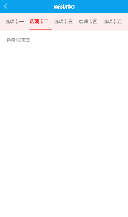
三、选项头带滑动且随着点击会自动滑动

<template>
    <view class="content">
        <view class="nav">
            <!-- 选项卡水平方向滑动,scroll-with-animation是滑动到下一个选项时,有一个延时效果 -->
            <scroll-view class="tab-scroll" scroll-x="true" scroll-with-animation :scroll-left="scrollLeft">
                <view class="tab-scroll_box">
                    <!-- 选项卡类别列表 -->
                    <view class="tab-scroll_item" v-for=" (item,index) in category" :key="index"  :class="{'active':isActive==index}" @click="chenked(index)">
                            {{item.name}}
                    </view>
                </view>
            </scroll-view>
        </view>
        <!-- 选项卡内容轮播滑动显示,current为当前第几个swiper子项 -->
        <swiper @change="change" :current="isActive" class="swiper-content" :style="fullHeight">
            <swiper-item class="swiperitem-content">
                <scroll-view scroll-y style="height: 100%;">
                    <view class="nav_item" >
                        选项卡1页面
                    </view>
                </scroll-view>
            </swiper-item>
            <swiper-item class="swiperitem-content">
                <scroll-view scroll-y style="height: 100%;">
                    <view class="nav_item" >
                        选项卡2页面
                    </view>
                </scroll-view>
            </swiper-item>
            <swiper-item class="swiperitem-content">
                <scroll-view scroll-y style="height: 100%;">
                    <view class="nav_item" >
                        选项卡3页面
                    </view>
                </scroll-view>
            </swiper-item>
            <swiper-item class="swiperitem-content">
                <scroll-view scroll-y style="height: 100%;">
                    <view class="nav_item" >
                        选项卡4页面
                    </view>
                </scroll-view>
            </swiper-item>
            <swiper-item class="swiperitem-content">
                <scroll-view scroll-y style="height: 100%;">
                    <view class="nav_item" >
                        选项卡5页面
                    </view>
                </scroll-view>
            </swiper-item>
            <swiper-item class="swiperitem-content">
                <scroll-view scroll-y style="height: 100%;">
                    <view class="nav_item" >
                        选项卡6页面
                    </view>
                </scroll-view>
            </swiper-item>
        </swiper>
    </view>
</template>
<script>
    export default {
        watch:{
            // swiper与上面选项卡联动
            currentindex(newval){
                this.isActive = newval;
                this.scrollLeft = 0;
                // 滑动swiper后,每个选项距离其父元素最左侧的距离
                for (let i = 0; i < newval - 1; i++) {
                    this.scrollLeft += this.category[i].width
                };
            },
        },
        data() {
            return {
                isActive: 0,
                index: 0,
                currentindex:0,
                category:[
                    {
                        id:1,
                        name:'选项卡一',
                    },
                    {
                        id:2,
                        name:'选项卡二',
                    },
                    {
                        id:3,
                        name:'选项卡三',
                    },
                    {
                        id:4,
                        name:'选项卡四',
                    },
                    {
                        id:5,
                        name:'选项卡五',
                    },
                    {
                        id:6,
                        name:'选项卡六',
                    },
                ],
                contentScrollW: 0, // 导航区宽度
                scrollLeft: 0, // 横向滚动条位置
                fullHeight:"",
            }
        },
        mounted() {
            var that = this;
             //获取手机屏幕的高度,让其等于swiper的高度,从而使屏幕充满
            uni.getSystemInfo({
                  success: function (res) {
                         that.fullHeight ="height:" + res.windowHeight + "px";
                  }
                });
            // 获取标题区域宽度,和每个子元素节点的宽度
            this.getScrollW()
        },
        methods: {
            // 获取标题区域宽度,和每个子元素节点的宽度以及元素距离左边栏的距离
            getScrollW() {
                const query = uni.createSelectorQuery().in(this);
                query.select('.tab-scroll').boundingClientRect(data => {
                      // 拿到 scroll-view 组件宽度
                      this.contentScrollW = data.width
                 }).exec();
                 query.selectAll('.tab-scroll_item').boundingClientRect(data => {
                     let dataLen = data.length;
                      for (let i = 0; i < dataLen; i++) {
                          //  scroll-view 子元素组件距离左边栏的距离
                          this.category[i].left = data[i].left;
                         //  scroll-view 子元素组件宽度
                         this.category[i].width = data[i].width
                    }
                 }).exec()
            },
            // 当前点击子元素靠左留一个选项展示,子元素宽度不相同也可实现
            chenked(index) {
                this.isActive = index;
                this.scrollLeft = 0;
                for (let i = 0; i < index - 1; i++) {
                    this.scrollLeft += this.category[i].width
                };
            },
            // swiper滑动时,获取其索引,也就是第几个
            change(e){
                const {current} = e.detail;
                this.currentindex = current;
            },
        }
    }
</script>
<style lang="scss">
    page{
        height: 100%;
        display: flex;
        background-color: #FFFFFF;
    }
    .content{
        display: flex;
        flex-direction: column;
        width: 100%;
        flex: 1;
        .nav{
            border-top: 1rpx solid #f2f2f2;
            background-color: #fceeee;
            position: fixed;
            z-index: 99;
            width: 100%;
            align-items: center;
            height: 100rpx;
            .tab-scroll{
                flex: 1;
                overflow: hidden;
                box-sizing: border-box;
                padding-left: 30rpx;
                padding-right: 30rpx;
                .tab-scroll_box{
                    display: flex;
                    align-items: center;
                    flex-wrap: nowrap;
                    box-sizing: border-box;
                    .tab-scroll_item{
                        line-height: 60rpx;
                        margin-right: 35rpx;
                        flex-shrink: 0;
                        padding-bottom:10px;
                        display: flex;
                        justify-content: center;
                        font-size: 16px;
                        padding-top: 10px;
                    }
                }
            }
        }
        .swiper-content{
               padding-top: 120rpx;
               flex: 1;
            .swiperitem-content{
                background-color: #ffffff;
                .nav_item{
                    background-color: #FFFFFF;
                    padding:20rpx 40rpx 0rpx 40rpx ;
                }
            }
        }
    }
    .active {
        position: relative;
        color: #ff0000;
        font-weight: 600;
    }
    .active::after {
        content: "";
        position: absolute;
        width: 130rpx;
        height: 4rpx;
        background-color: #ff0000;
        left: 0px;
        right: 0px;
        bottom: 0px;
        margin: auto;
    }
    /* 隐藏滚动条,但依旧具备可以滚动的功能 */
    /deep/.uni-scroll-view::-webkit-scrollbar {
        display: none
    }
</style>


 1844
1844


 被折叠的 条评论
为什么被折叠?
被折叠的 条评论
为什么被折叠?
 到【灌水乐园】发言


