


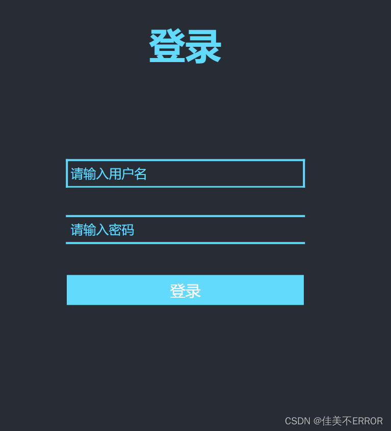
html
<body>
<div class="login">
    <div class="header">登录</div>
    <div class="container">
        <input type="text" placeholder="请输入用户名">
        <span class="left"></span>
        <span class="right"></span>
        <span class="top"></span>
        <span class="bottom"></span>
    </div>
    <div class="container1">
        <input type="password" placeholder="请输入密码">
        <span class="left"></span>
        <span class="right"></span>
        <span class="top"></span>
        <span class="bottom"></span>
    </div>
    <div class="btn">登录</div>
</div>
</body>
css
  * {
            margin: 0;
            padding: 0;
        }
        html, body {
            height: 100%;
            height: 100%;
        }
        .login {
            width: 358px;
            height: 588px;
            border-radius: 15px;
            padding: 0 50px;
            position: relative;
            left: 50%;
            top: 50%;
            transform: translate(-50%, -50%);
            background-color: #282c34;
        }
        .header{
        font-size:38px;
        font-weight:bold;
        text-align:center;
        line-height:200px;
        color:#61dafb;
        }
        .container{
        height:30px;
        width:250px;
        position:absolute;
        left:50%;
        top:40%;
        transform:translate(-50%,-50%);
        }
        input{
        width:100%;
        height:100%;
        position:relative;
        outline:none;
        border:none;
        box-sizing:border-box;
        padding-left:5px;
        background-color:#282c34;
        color:#61dafb;
        caret-color:#61dafb;
        }
        input::placeholder{
        color:#61dafb;
        }
        span{
        position:absolute;
        content:"";
        display:block;
        background-color:#61dafb;
        transition:transform .1s ease-in-out;
        }
        .top,
        .bottom{
        left:0px;
        right:0px;
        height:2px;
        }
        .left,
        .right{
        top:0px;
        bottom:0px;
        width:2px;
        transform:scaleY(0);
        }
        .top{
        top:0px;
        tranform:scaleX(0);
        transform-origin:left center;
        transition-delay:.2s;
        }
        .left{
        left:0px;
        transform-origin:bottom center;
        transition-delay:.3s;
        }
        .bottom{
        bottom:0px;
        }
        .right{
        right:0px;
        transform-origin:top center;
        transition-delay:.1s;
        }
         input:focus ~ .right {
            transform: scaleY(1);
            transform-origin: bottom center;
        }
        input:focus ~ .left {
            transform: scaleY(1);
            transform-origin: top center;
        }
        input:focus ~ .top {
            transform: scaleY(1);
            transform-origin: right center;
        }
        .container1 {
            height: 30px;
            width: 250px;
            position: absolute;
            left: 50%;
            top: 50%;
            transform: translate(-50%, -50%);
        }
        .btn {
            position: absolute;
            left: 50%;
            top: 54%;
            transform: translate(-50%, -50%);
            text-align: center;
            padding: 5px;
            width: 52%;
            margin-top: 40px;
            background-color: #61dafb;
            color: #fff;
        }
完整代码
<!DOCTYPE html>
<html lang="en">
<head>
    <meta charset="UTF-8">
    <title>练习</title>
    <style>
          * {
            margin: 0;
            padding: 0;
        }
        html, body {
            height: 100%;
            height: 100%;
        }
        .login {
            width: 358px;
            height: 588px;
            border-radius: 15px;
            padding: 0 50px;
            position: relative;
            left: 50%;
            top: 50%;
            transform: translate(-50%, -50%);
            background-color: #282c34;
        }
        .header{
        font-size:38px;
        font-weight:bold;
        text-align:center;
        line-height:200px;
        color:#61dafb;
        }
        .container{
        height:30px;
        width:250px;
        position:absolute;
        left:50%;
        top:40%;
        transform:translate(-50%,-50%);
        }
        input{
        width:100%;
        height:100%;
        position:relative;
        outline:none;
        border:none;
        box-sizing:border-box;
        padding-left:5px;
        background-color:#282c34;
        color:#61dafb;
        caret-color:#61dafb;
        }
        input::placeholder{
        color:#61dafb;
        }
        span{
        position:absolute;
        content:"";
        display:block;
        background-color:#61dafb;
        transition:transform .1s ease-in-out;
        }
        .top,
        .bottom{
        left:0px;
        right:0px;
        height:2px;
        }
        .left,
        .right{
        top:0px;
        bottom:0px;
        width:2px;
        transform:scaleY(0);
        }
        .top{
        top:0px;
        tranform:scaleX(0);
        transform-origin:left center;
        transition-delay:.2s;
        }
        .left{
        left:0px;
        transform-origin:bottom center;
        transition-delay:.3s;
        }
        .bottom{
        bottom:0px;
        }
        .right{
        right:0px;
        transform-origin:top center;
        transition-delay:.1s;
        }
         input:focus ~ .right {
            transform: scaleY(1);
            transform-origin: bottom center;
        }
        input:focus ~ .left {
            transform: scaleY(1);
            transform-origin: top center;
        }
        input:focus ~ .top {
            transform: scaleY(1);
            transform-origin: right center;
        }
        .container1 {
            height: 30px;
            width: 250px;
            position: absolute;
            left: 50%;
            top: 50%;
            transform: translate(-50%, -50%);
        }
        .btn {
            position: absolute;
            left: 50%;
            top: 54%;
            transform: translate(-50%, -50%);
            text-align: center;
            padding: 5px;
            width: 52%;
            margin-top: 40px;
            background-color: #61dafb;
            color: #fff;
        }
    </style>
</head>
<body>
<div class="login">
    <div class="header">登录</div>
    <div class="container">
        <input type="text" placeholder="请输入用户名">
        <span class="left"></span>
        <span class="right"></span>
        <span class="top"></span>
        <span class="bottom"></span>
    </div>
    <div class="container1">
        <input type="password" placeholder="请输入密码">
        <span class="left"></span>
        <span class="right"></span>
        <span class="top"></span>
        <span class="bottom"></span>
    </div>
    <div class="btn">登录</div>
</div>
</body>
</html>
效果图


 1862
1862


 被折叠的 条评论
为什么被折叠?
被折叠的 条评论
为什么被折叠?
 到【灌水乐园】发言


