


这里写目录标题
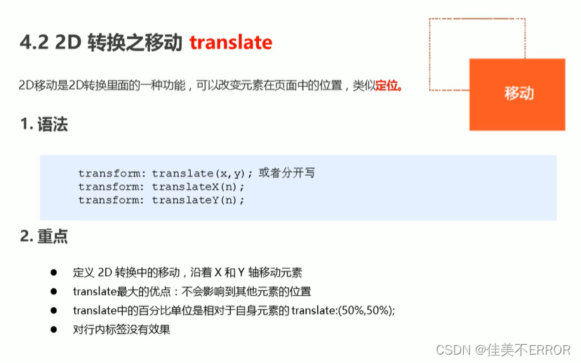
2D转换
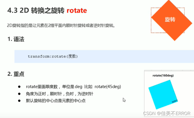
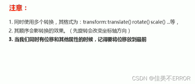
位移translate、旋转rotate、缩放scale
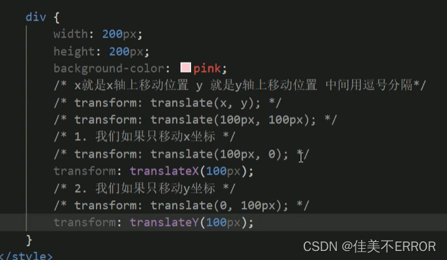
translate不影响其他的元素,对行内元素无效
<!DOCTYPE html>
<html lang="en" xmlns="http://www.w3.org/1999/html" xmlns="http://www.w3.org/1999/html">
<head>
    <meta charset="UTF-8">
    <title>练习</title>
    <link rel="stylesheet" href="src\web.css">
    <script type="text/javascript" src="Javascript src\web.js"></script>
<!--    切记单词别打错了-->
    <style>
div {
position:relative;
width:500px;
height:500px;
background-color:pink;
transform:translateX(50%);
}
p{
position:absolute;
top:50%;
left:50%;
width:200px;
height:200px;
background-color:purple;
transform:translate(-50%,-50%);
}
    </style>
</head>
<body>
<div>
    <p></p>
</div>
<!--<span></span>行内用translate无效-->
</body>
</html>
rotate旋转
  <style>
img{
width:150px;
transform:rotate(45deg);
}
    </style>
</head>
<body>
<img src="img/01.png" alt="">
</body>
案例
旋转动态效果
<!DOCTYPE html>
<html lang="en" xmlns="http://www.w3.org/1999/html" xmlns="http://www.w3.org/1999/html">
<head>
    <meta charset="UTF-8">
    <title>练习</title>
    <link rel="stylesheet" href="src\web.css">
    <script type="text/javascript" src="Javascript src\web.js"></script>
<!--    切记单词别打错了-->
    <style>
img{
width:150px;
border-radius:50%;
border:5px solid skyblue;
transition:all 0.3s;
}
img:hover {
transform:rotate(360deg);
}
    </style>
</head>
<body>
<img src="img/01.png" alt="">
</body>
</html>
三角
<!DOCTYPE html>
<html lang="en" xmlns="http://www.w3.org/1999/html" xmlns="http://www.w3.org/1999/html">
<head>
    <meta charset="UTF-8">
    <title>练习</title>
    <link rel="stylesheet" href="src\web.css">
    <script type="text/javascript" src="Javascript src\web.js"></script>
<!--    切记单词别打错了-->
    <style>
div{
position:relative;
width:249px;
height:35px;
border:1px solid #000;
}
div::after{
content:"";
position:absolute;
top:8px;
right:15px;
width:10px;
height:10px;
border-right:1px solid #000;
border-bottom:1px solid #000;
transform:rotate(45deg);
transition:all 0.2s;
}
div:hover::after {
transform:rotate(225deg);
}
    </style>
</head>
<body>
<div></div>
</body>
</html>
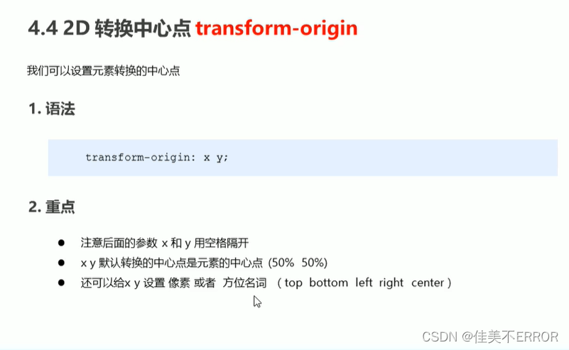
transform-origin转换中心点
x y用空格隔开
<!DOCTYPE html>
<html lang="en" xmlns="http://www.w3.org/1999/html" xmlns="http://www.w3.org/1999/html">
<head>
    <meta charset="UTF-8">
    <title>练习</title>
    <link rel="stylesheet" href="src\web.css">
    <script type="text/javascript" src="Javascript src\web.js"></script>
<!--    切记单词别打错了-->
    <style>
div{
width:200px;
height:200px;
background-color:pink;
margin:100px auto;
transition:all 1s;
transform-origin:left bottom;
<!--transform-origin:50px 50px;-->
}
div:hover{
transform:rotate(360deg);
}
    </style>
</head>
<body>
<div></div>
</body>
</html>
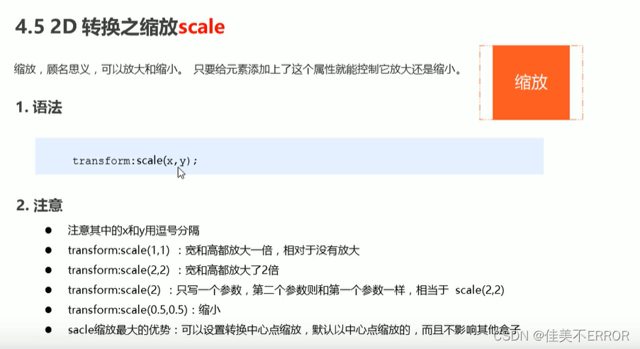
scale缩放
不会影响其他盒子,而且可以设置缩放的中心点,参数用逗号隔开
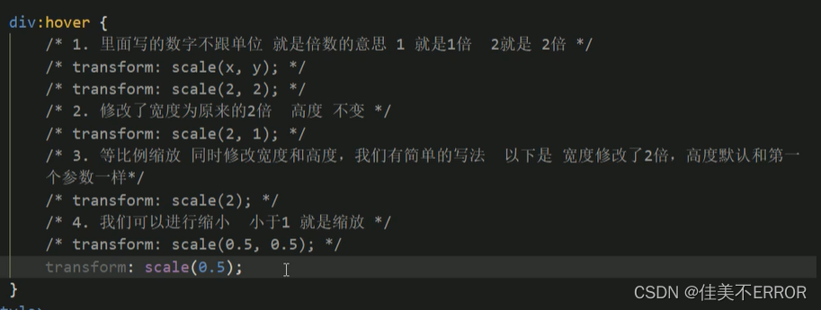
代码同上
  <style>
div{
width:200px;
height:200px;
background-color:pink;
margin:100px auto;
transition:all 1s;
transform-origin:left bottom;
<!--transform-origin:50px 50px;-->
}
div:hover{
transform:scale(2,1);
}
    </style>
案例
图片缩放
<!DOCTYPE html>
<html lang="en" xmlns="http://www.w3.org/1999/html" xmlns="http://www.w3.org/1999/html">
<head>
    <meta charset="UTF-8">
    <title>练习</title>
    <link rel="stylesheet" href="src\web.css">
    <script type="text/javascript" src="Javascript src\web.js"></script>
<!--    切记单词别打错了-->
    <style>
img{
width:100px;
height:100px;

}
div{
overflow:hidden;
float:left;
margin:10px;
}
div img{
transition:all 0.4s;
}
div img:hover{
transform:scale(1.1);
}
    </style>
</head>
<body>
<div>
    <a href="#"><img src="img/01.png" alt=""></a>
</div>
<div>
    <a href="#"><img src="img/01.png" alt=""></a>
</div>
<div>
    <a href="#"><img src="img/01.png" alt=""></a>
</div>
</body>
</html>
分页按钮
<!DOCTYPE html>
<html lang="en" xmlns="http://www.w3.org/1999/html" xmlns="http://www.w3.org/1999/html">
<head>
    <meta charset="UTF-8">
    <title>练习</title>
    <link rel="stylesheet" href="src\web.css">
    <script type="text/javascript" src="Javascript src\web.js"></script>
<!--    切记单词别打错了-->
    <style>
li{
float:left;
width:30px;
height:30px;
border:1px solid pink;
margin:10px;
text-align:center;
line-height:30px;
list-style:none;
border-radius:50%;
cursor:pointer;
transition:all .4s;
}
li:hover{
transform:scale(1.1);
}
    </style>
</head>
<body>
<ul>
    <li>1</li>
    <li>2</li>
    <li>3</li>
    <li>4</li>
    <li>5</li>
    <li>6</li>
    <li>7</li>
</ul>
</body>
</html>
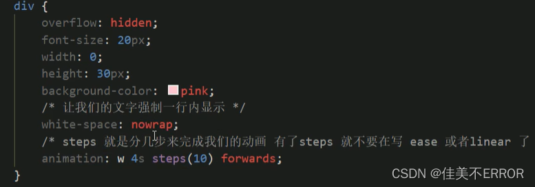
顺序:
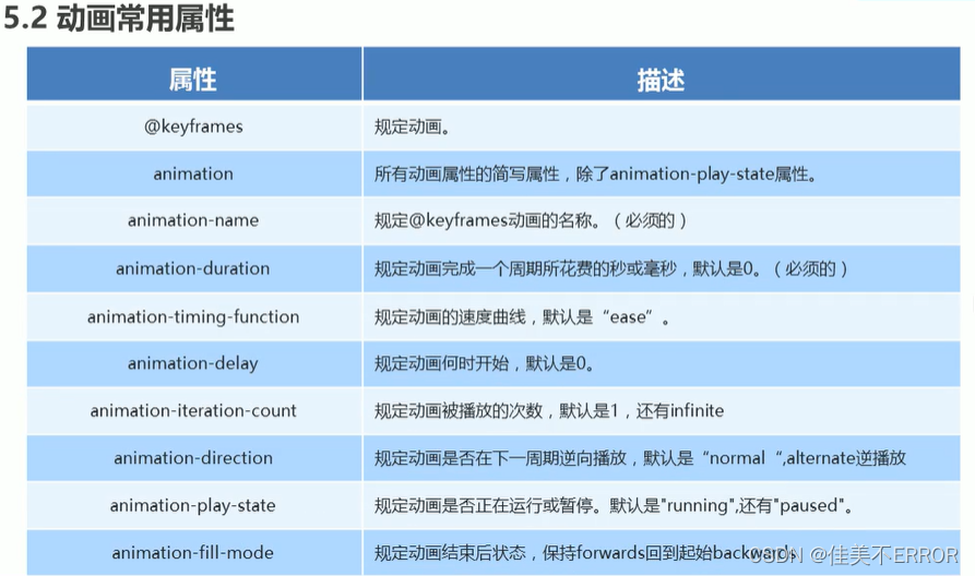
动画
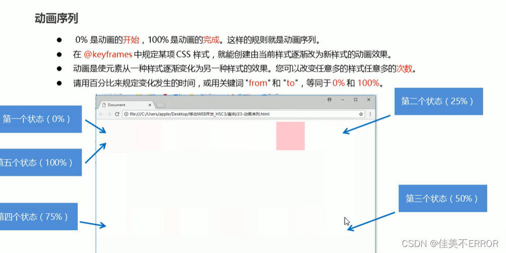
先定义动画、再调用动画
用keyframes定义
@keyframes 动画名称{
0%{
width:100px;
}
100%{
width:200px;
}
}
使用动画
div{
width:200px;
height:200px;
background-color:aqua;
margin:100px auto;
animation-name:动画名称;
animation-duration:持续时间;
}
属性
<!DOCTYPE html>
<html lang="en" xmlns="http://www.w3.org/1999/html" xmlns="http://www.w3.org/1999/html">
<head>
    <meta charset="UTF-8">
    <title>练习</title>
    <link rel="stylesheet" href="src\web.css">
    <script type="text/javascript" src="Javascript src\web.js"></script>
<!--    切记单词别打错了-->
    <style>
@keyframes move{
0%{
transform:translate(0,0);
}
100%{
transform:translate(1000px,0);
}
}
div{
width:100px;
height:100px;
background-color:pink;
animation-name:move;
animation-duration:2s;
animation-timing-function:ease;
animation-delay:1s;
animation-iteration-count:infinite;
animation-direction:alternate;
<!--animation-fill-mode:forwards;停留再结束状态-->
}
    </style>
</head>
<body>
<div></div>
</body>
</html>
简写属性:
animation:move 2s linear 0s 1 alternate forwards;
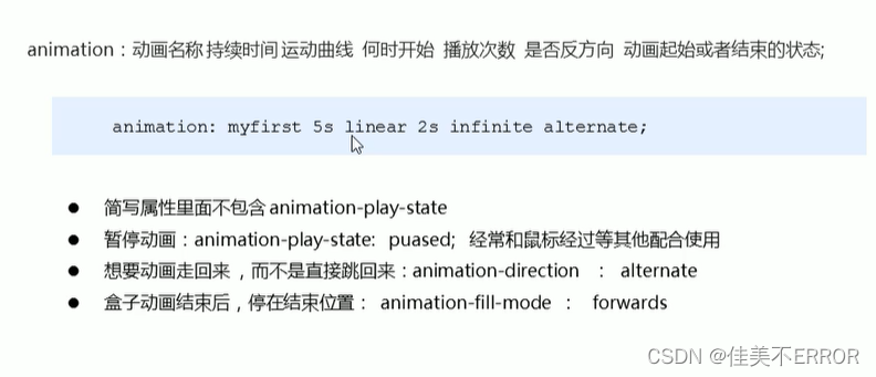
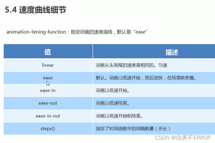
速度曲线
可做打字机效果
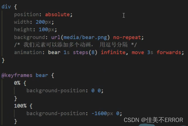
添加多个动画用逗号隔开
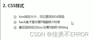
3D转换
近大远小,遮挡看不见
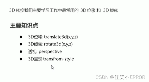
translate3D移动
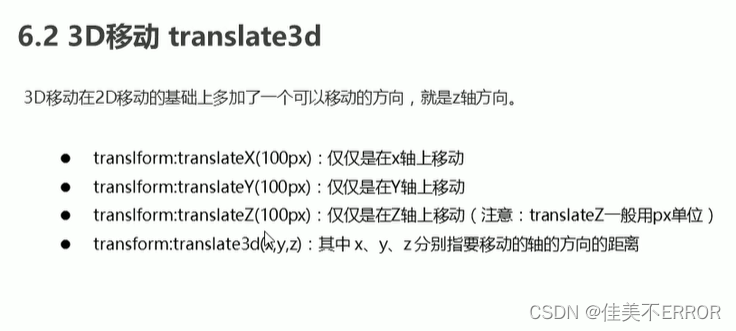
简写:
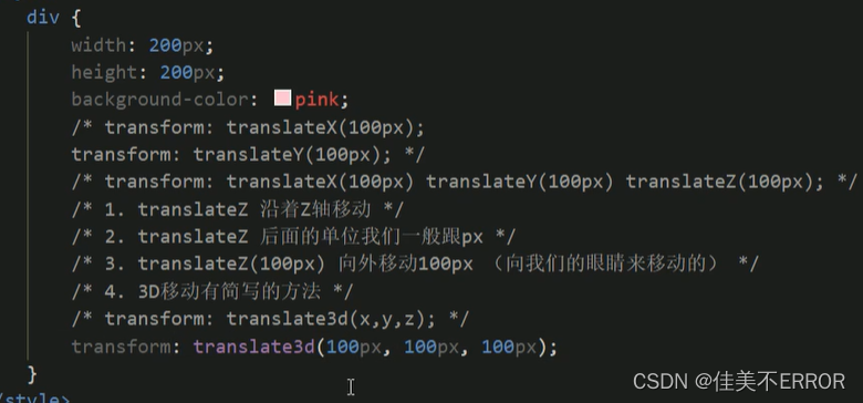
一定有3d,d小写
x y z不能省略,没有就写0
transform:translate3d(x,y,z);
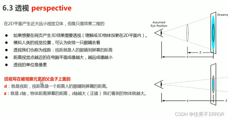
perspective透视
写再父级上
3d旋转rotate3d
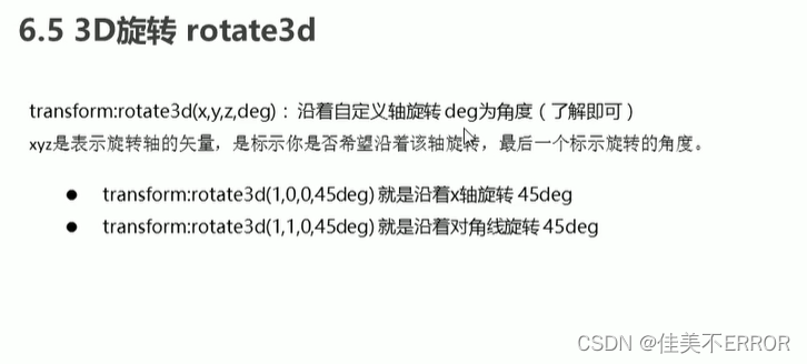
transform:rotate3d(x,y,z,45deg)
x:左手拇指向右
y:……下
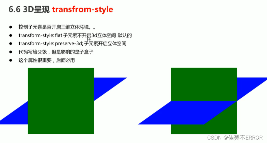
transfrom-style
保持3d状态,很重要
案例:
两面翻转的盒子
<!DOCTYPE html>
<html lang="en" xmlns="http://www.w3.org/1999/html" xmlns="http://www.w3.org/1999/html">
<head>
    <meta charset="UTF-8">
    <title>练习</title>
    <link rel="stylesheet" href="src\web.css">
    <script type="text/javascript" src="Javascript src\web.js"></script>
<!--    切记单词别打错了-->
    <style>
body{
perspective:400px;
}
.box{
position:relative;
width:300px;
height:300px;
margin:100px auto;
transition:all .4s;
transform-style:preserve-3d;
}
.box:hover{
transform:rotateY(180deg);
}
.front,
.back{
position:absolute;
top:0;
left:0;
width:100%;
height:100%;
border-radius:50%;
font-size:30px;
color:#fff;
text-align:center;
line-height:300px;
}
.front{
background-color:pink;
z-index:1;
}
.back{
background-color:purple;
transform:rotateY(180deg);
}
    </style>
</head>
<body>
<div class="box">
    <div class="front">当我男朋友吧</div>
    <div class="back">我们分了吧</div>
</div>
</body>
</html>
3D导航栏
<!DOCTYPE html>
<html lang="en" xmlns="http://www.w3.org/1999/html" xmlns="http://www.w3.org/1999/html">
<head>
    <meta charset="UTF-8">
    <title>练习</title>
    <link rel="stylesheet" href="src\web.css">
    <script type="text/javascript" src="Javascript src\web.js"></script>
<!--    切记单词别打错了-->
    <style>
*{
padding:0;
margin:0;
}

ul{
margin:100px;
}
ul li{
float:left;
margin:0 5px;
width:120px;
height:35px;
list-style:none;
perspective:500px;
}
.box{
positive:relative;
width:100%;
height:100%;
transform-style:preserve-3d;
transition:all .4s;
}
.box:hover{
transform:rotateX(90deg);
}
.front,
.bottom{
position:absolute;
left:0;
top:0;
width:100%;
height:100%;
}

.front{
background-color:pink;
z-index:1;
transform:translateZ(17.5px);
}
.bottom{
background-color:purple;
transform: translateY(17.5px) rotateX(-90deg);
}
    </style>
</head>
<body>
<ul>
    <li>
        <div class="box">
        <div class="front">心情好</div>
        <div class="bottom">心情不好</div>
        </div>
    </li>
    <li>
        <div class="box">
            <div class="front">心情好</div>
            <div class="bottom">心情不好</div>
        </div>
    </li>
    <li>
        <div class="box">
            <div class="front">心情好</div>
            <div class="bottom">心情不好</div>
        </div>
    </li>
    <li>
        <div class="box">
            <div class="front">心情好</div>
            <div class="bottom">心情不好</div>
        </div>
    </li>

</ul>
</body>
</html>
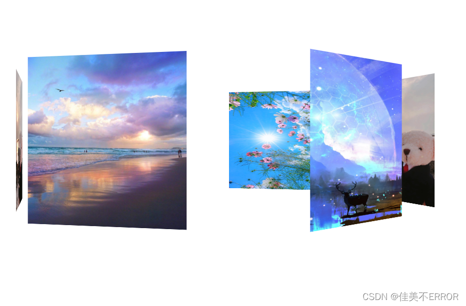
旋转木马案例
<!DOCTYPE html>
<html lang="en" xmlns="http://www.w3.org/1999/html" xmlns="http://www.w3.org/1999/html">
<head>
<meta charset="UTF-8">
<title>练习</title>
<link rel="stylesheet" href="src\web.css">
<script type="text/javascript" src="Javascript src\web.js"></script>
<!-- 切记单词别打错了-->
<style>
*{
padding:0;
margin:0;
}
body{
perspective:1000px;
}
section{
position:relative;
width:300px;
height:200px;
margin:150px auto;
transform-style:preserve-3d;
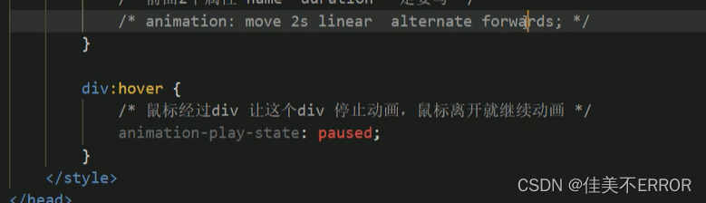
animation:rotate 5s linear infinite;
}
section:hover{
animation-play-state:paused;
}
@keyframes rotate{
0%{
transform:rotateY(0);
}
100%{
transform:rotateY(360deg);
}
}
section div{
position:absolute;
top:0;
left:0;
width:100%;
height:100%;
}
img {
width:200px;
height:200px;
}
section div:nth-child(1) {
transform:rotateY(0deg) translateZ(300px);
}
section div:nth-child(2) {
transform:rotateY(60deg) translateZ(300px);
}
section div:nth-child(3) {
transform:rotateY(120deg) translateZ(300px);
}
section div:nth-child(4) {
transform:rotateY(180deg) translateZ(300px);
}
section div:nth-child(5) {
transform:rotateY(240deg) translateZ(300px);
}
section div:nth-child(6) {
transform:rotateY(300deg) translateZ(300px);
}
</style>
</head>
<body>
<section>
<div><img src="img/222.jpg" alt="" /> </div>
<div><img src="img/333.jpg" alt="" /></div>
<div><img src="img/444.jpg" alt="" /></div>
<div><img src="img/555.jpg" alt="" /></div>
<div><img src="img/666.jpg" alt="" /></div>
<div><img src="img/444.jpg" alt="" /></div>
</section>
</body>
</html>


 2200
2200


 被折叠的 条评论
为什么被折叠?
被折叠的 条评论
为什么被折叠?
 到【灌水乐园】发言


