


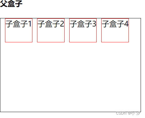
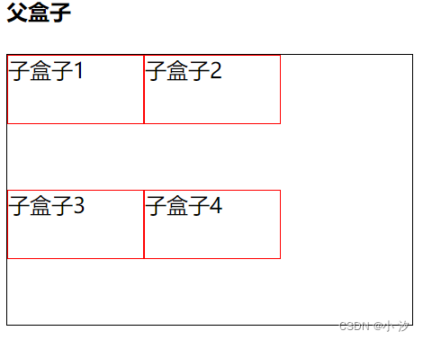
1、如何开启弹性盒子(自适应布局flex)
开启弹性盒子后子盒子会强制一盒,子盒子不设置宽会自适应设置宽会
<!DOCTYPE html>
<html lang="en">
<head>
    <meta charset="UTF-8">
    <meta http-equiv="X-UA-Compatible" content="IE=edge">
    <meta name="viewport" content="width=device-width, initial-scale=1.0">
    <title>Document</title>
</head>
<body>
    <!-- 父盒子 -->
    <h4>父盒子</h4>
    <div class="div">
        <div class="a">子盒子1</div>
        <div class="a">子盒子2</div>
        <div class="a">子盒子3</div>
        <div class="a">子盒子4</div>
    </div>
</body>
</html>
<style>
    .div{
        width: 300px;
        height: 200px;
        border: 1px solid #000;
        /* 开启弹性盒子 */
        display:flex;
    }
    .a{
        height: 50px;
        border: 1px solid red;
        margin-left: 10px;
    }
</style>
效果:
2、flex布局(父盒子)属性加效果
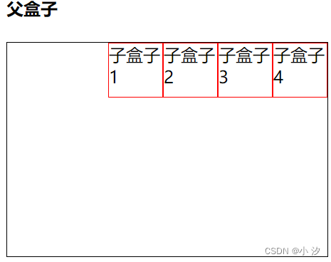
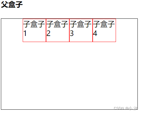
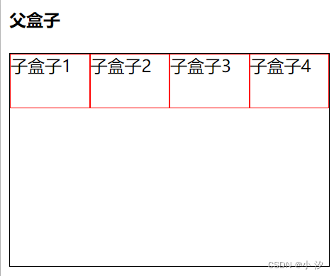
(1)flex-direction:设置主轴的方向 (写一个属性就可以了)
属性:
row 默认从左到右(常用)
row-reverse 从右到左
column 从上到下(常用)
column-reverse 从下到上
<style>
    .div{
        width: 300px;
        height: 200px;
        border: 1px solid #000;
        /* 开启弹性盒子 */
        display: flex;
        /* flex-direction:设置主轴的方向 */
        /* 默认从左到右(常用)*/
        flex-direction:row;
        /* 从右到左 */
        flex-direction:column;
        /* 从上到下(常用)*/
        flex-direction:column-reverse;
        /* 从下到上 */
        flex-direction:row-reverse;
    }
    .a{
        height: 50px;
        width: 50px;
        border: 1px solid red;
        margin-left: 10px;
    }
</style>
效果:
(1)row属性,效果

(2)row-reverse属性,效果

(3)column属性,效果

(4)column-revers属性,效果

(2)justify-content:设置主轴上的子元素排列方式(写一个属性就可以)
属性:
flex-start 默认值从头开始如果主轴X轴,则从左到右(常用)
flex-end 从尾部开始排序
center 在主轴居中对齐(如果主轴是X轴则水平居中)(常用)
space-around 平分剩余空间(常用)
space-between 现两边贴边在平分剩余空间(重要)(常用)
<style>
    .div{
        width: 300px;
        height: 200px;
        border: 1px solid #000;
        /* 开启弹性盒子 */
        /* display:flex; */
        display: flex;
        /* flex-direction:设置主轴的方向,row默认值写不写都可以不会造成影响 */
        flex-direction:row ;
        /* justify-content:设置主轴上的子元素排列方式,flex-start默认值 */
        /* 默认值从头开始如果主轴X轴,则从左到右(常用)*/
        justify-content: flex-start;
        /* 从尾部开始排序 */
        justify-content: flex-end;
        /* 在主轴居中对齐(如果主轴是X轴则水平居中)(常用) */
        justify-content: center;
        /* 平分剩余空间(常用) */
        justify-content: space-around;
        /* 现两边贴边在平分剩余空间(重要)(常用) */
        justify-content: space-between;
    }
    .a{
        height: 50px;
        width: 50px;
        border: 1px solid red;
    }
</style>
效果:
(1)flex-start 属性 效果

(2) flex-end 属性 效果
(3)center 属性 效果
(4) space-around 属性 效果

(5)space-between 属性 效果

(3)flex-wrap:设置子元素是否换行;
属性:
nowrap 不换行
wrap 换行
<style>
    .div{
        width: 300px;
        height: 200px;
        border: 1px solid #000;
        /* 开启弹性盒子 */
        /* display:flex; */
        display: flex;
        /* flex-direction:设置主轴的方向,row默认值写不写都可以不会造成影响 */
        flex-direction:row ;
        /* justify-content:设置主轴上的子元素排列方式,flex-start默认值 */
        justify-content: flex-start;
        /* flex-wrap:设置子元素是否换行;nowrap 默认值 */
        /* 不换行(默认) */
        flex-wrap:nowrap;
        /* 换行 */
        flex-wrap:wrap;
    }
    .a{
        height: 50px;
        width: 100px;
        border: 1px solid red;
    }
</style>
效果:
(1)nowrap 属性 效果
(2)wrap 属性 效果
(4)flex-flow:复合属性;属性:
flex-flow:row wrap; 相当于同时设置了 flex-direction 和 flex-wrap 这个我就不演示了可以参考flex-wrap:和这个的效果一样
3、flex布局(子盒子)属性加效果
弹性盒子子项常见属性:
(1)flex子项目占的份数
flex: 2; flex 属性定义子项目分配剩余空间,用flex来表示占多少份数
<!DOCTYPE html>
<html lang="en">
<head>
    <meta charset="UTF-8">
    <meta http-equiv="X-UA-Compatible" content="IE=edge">
    <meta name="viewport" content="width=device-width, initial-scale=1.0">
    <title>Document</title>
</head>
<body>
    <!-- 父盒子 -->
    <h4>父盒子</h4>
    <div class="div">
        <div class="a">子盒子1</div>
        <div class="a">子盒子2</div>
        <div class="a">子盒子3</div>
        <div class="a">子盒子4</div>
    </div>
</body>
</html>
<style>
    .div{
        width: 300px;
        height: 200px;
        border: 1px solid #000;
        /* 开启弹性盒子 */
        /* display:flex; */
        display: flex;
        /* flex-direction:设置主轴的方向,row默认值写不写都可以不会造成影响 */
        flex-direction:row ;
        /* justify-content:设置主轴上的子元素排列方式,flex-start默认值 */
        justify-content: flex-start;
        /* flex-wrap:设置子元素是否换行;nowrap 默认值 */
        flex-wrap:nowrap ;
    }
    .a{
        height: 50px;
        width: 50px;
        border: 1px solid red;
    }
    /*选择器*/
    .a:nth-child(2){
        /*选中子盒子2,flex给它两份大小*/
        flex: 2;
    }
</style>
效果:

(2)order属性定义子项的排列顺序(前后顺序)
order: -1; 数值越小,排列越靠前,默认为0。
<!DOCTYPE html>
<html lang="en">
<head>
    <meta charset="UTF-8">
    <meta http-equiv="X-UA-Compatible" content="IE=edge">
    <meta name="viewport" content="width=device-width, initial-scale=1.0">
    <title>Document</title>
</head>
<body>
    <!-- 父盒子 -->
    <h4>父盒子</h4>
    <div class="div">
        <div class="a">子盒子1</div>
        <div class="a">子盒子2</div>
        <div class="a">子盒子3</div>
        <div class="a">子盒子4</div>
        <div class="a">子盒子5</div>
    </div>
</body>
</html>
<style>
    .div{
        width: 300px;
        height: 200px;
        border: 1px solid #000;
        /* 开启弹性盒子 */
        /* display:flex; */
        display: flex;
        /* flex-direction:设置主轴的方向,row默认值写不写都可以不会造成影响 */
        flex-direction:row ;
        /* justify-content:设置主轴上的子元素排列方式,flex-start默认值 */
        justify-content: flex-start;
        /* flex-wrap:设置子元素是否换行;nowrap 默认值 */
        flex-wrap:nowrap ;

    }
    .a{
        height: 50px;
        width: 50px;
        border: 1px solid red;
    }
    .a:nth-child(2){
        order: 0;
        /*
        order :2;
        oreder:-2;
        */
    }
</style>
效果:
order=0时效果

order=2时效果
order=-2时效果


 3308
3308


 被折叠的 条评论
为什么被折叠?
被折叠的 条评论
为什么被折叠?
 到【灌水乐园】发言


