


概述
组件实现的步骤遵循MVP(最小可用产品)原则,确保每次提交的都是一个MVP。
最基础的Button组件应该是什么属性都不配置就能用起来:
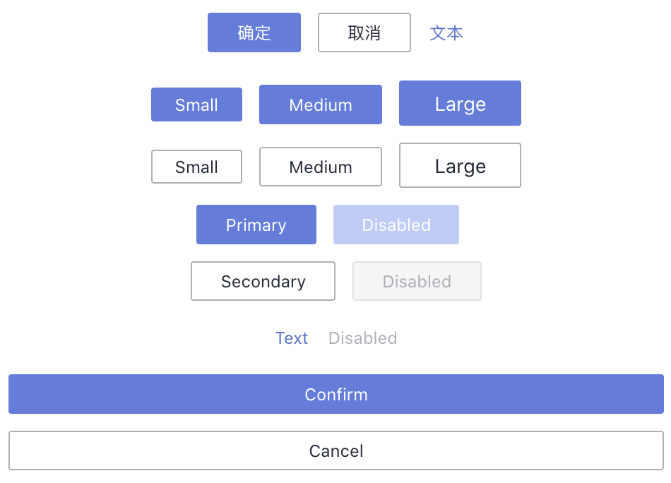
<s-button>确定</s-button>
所以我们第一步应该是实现上述基础组件。
接着就是一个一个功能的添加,不断增强Button组件的能力,我们按照以下顺序添加Button组件的功能:
- 实现主要按钮、次要按钮、文字按钮三种类型的按钮,增加
type属性 - 实现小、中、大三种尺寸的按钮,增加
size属性 - 实现禁用状态的按钮,增加
disabled属性 - 实现块级按钮,增加
block属性 - 实现图标按钮(依赖Icon组件的实现),增加
icon属性
1 基础按钮
1.1编写基础Button组件
src中存放组件相关代码:
// button/src/button.tsx
import { defineComponent } from 'vue'

export default defineComponent({
  name: 'SButton',
  setup(props, { slots }) {
    return () => {
      return <button>
        {slots.default ? slots.default() : '按钮'}
      </button>
    }
  }
})
1.2 编写入口文件
给组件编写入口文件,导出Button组件可以直接导入以组件形式使用,导出插件便于在入口文件以use方式引入。
// button/index.ts
import { App } from 'vue'
import Button from './src/button'

export { Button }

export default {
  install(app: App) {
    app.component(Button.name, Button)
  }
}
1.3 引入Button组件
// main.ts
import Button from './button'
app.use(Button)
1.4 使用Button组件
<template>
  <s-button>确定</s-button>
  <SButton>确定</SButton>
</template>
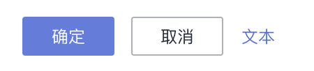
效果如下:
![[外链图片转存失败,源站可能有防盗链机制,建议将图片保存下来直接上传(img-Lz1IW3Ia-1665996037522)(https://secure2.wostatic.cn/static/pnhau1xbFnXGqeN8QZZH8W/image.png?auth_key=1665995448-u4eLhYWcZAqmTaVRxrWnBW-0-5ea3b802a1941814ecc1d2796e5df361?auth_key=1665995980-5H5rpgiM4y1WrvN8UqD2Df-0-38fda8f6efde69bbfe72794996d9eff3)]](https://img-blog.csdnimg.cn/ab6716d80db94666a2275882c7110d7b.png)
由于样式被tailwind重置,按钮看起来和div一样,但我们的基础Button已经就绪。接下来我们就来给按钮增加type属性,并添加相应的样式。
2 按钮类型
2.1 增加组件props类型
第一步是给按钮设置props类型声明,增加type这个属性。
// button/src/button-type.ts
import { PropType, ExtractPropTypes } from 'vue'

export type IButtonType = 'primary' | 'secondary' | 'text'

export const buttonProps = {
  type: {
    type: String as PropType<IButtonType>,
    default: 'secondary'
  },
} as const

export type ButtonProps = ExtractPropTypes<typeof buttonProps>
2.2 根据组件props类型实现功能
// button/src/button.tsx
import { defineComponent, toRefs } from 'vue'
import { ButtonProps, buttonProps } from './button-type'

export default defineComponent({
  name: 'SButton',
  props: buttonProps,
  setup(props: ButtonProps, { slots }) {
    const { type } = toRefs(props)

    return () => {
      return <button class={`s-btn s-btn--${type.value}`}>
        {slots.default ? slots.default() : '按钮'}
      </button>
    }
  }
})
2.3 使用type
<s-button type="primary">确定</s-button>
渲染出来的HTML
<button class="s-btn s-btn--primary">确定</button>
功能是完成了,接下来就是添加样式啦!
2.4 添加样式
由于我们的组件库需要做主题定制,所以需要将主题变量抽取出来,
第一步是定义主题变量。
// button/src/button.scss
// 定义主题变量
$s-border-radius: var(--s-border-radius, 2px); //一般圆角
$s-font-size-md: var(--s-font-size-md, 12px); //当组件size为''时使用此字号大小
$s-animation-duration-slow: var(--s-animation-duration-slow, 300ms);
$s-animation-ease-in-out-smooth: var(
  --s-animation-ease-in-out-smooth,
  cubic-bezier(0.645, 0.045, 0.355, 1)
);
$s-light-text: var(--s-light-text, #ffffff); // 有色深色背景下字体颜色(固定)
$s-primary: var(--s-primary, #5e7ce0); // 主要按钮,同品牌色
$s-primary-hover: var(--s-primary-hover, #7693f5); // 主要按钮悬停
$s-primary-active: var(--s-primary-active, #344899); // 主要按钮激活
$s-text: var(--s-text, #252b3a); // 正文文本
$s-block: var(
  --s-block,
  #ffffff
); // 大面积的不可折叠区块的背景色(例如顶部导航背景色)
$s-line: var(--s-line, #adb0b8); // 边框分割线,仅用于边框
$s-form-control-line-active: var(
  --s-form-control-line-active,
  #5e7ce0
); // 表单控件边框激活色,用于获得焦点
$s-brand-active: var(--s-brand-active, #526ecc); // 品牌色激活色(加深)
$s-brand-active-focus: var(
  --s-brand-active-focus,
  #344899
); // 品牌色焦点色(重度加深)

.s-btn {
  // 布局样式
  @apply inline-flex items-center justify-center;

  // 元素属性
  @apply
  border-[1px] border-solid border-transparent
  h-[28px] py-0 px-[20px]
  bg-transparent;
  border-radius: $s-border-radius;

  // 文本属性
  @apply outline-0 leading-normal whitespace-nowrap
     cursor-pointer;

  // 文字样式
  font-size: $s-font-size-md;

  // 其他样式
  transition: background-color $s-animation-duration-slow
      $s-animation-ease-in-out-smooth,
    border-color $s-animation-duration-slow $s-animation-ease-in-out-smooth,
    color $s-animation-duration-slow $s-animation-ease-in-out-smooth;

  // 主要按钮
  &.s-btn--primary {
    color: $s-light-text;
    background-color: $s-primary;

    &:hover,
    &:focus {
      background-color: $s-primary-hover;
    }

    &:active {
      background-color: $s-primary-active;
    }
  }

  // 次要按钮
  &.s-btn--secondary {
    color: $s-text;
    background-color: $s-block;
    border-color: $s-line;

    &:hover,
    &:focus,
    &:active {
      border-color: $s-form-control-line-active;
      color: $s-brand-active;
    }
  }

  // 文字按钮
  &.s-btn--text {
    padding: 0;
    color: $s-brand-active;

    &:hover,
    &:focus,
    &:active {
      color: $s-brand-active-focus;
    }
  }
}
在Button.tsx中引入样式
import './button.scss'
效果如下:
解决scss中的警告信息:
https://blog.csdn.net/sinat_36728518/article/details/119733197
2.5 样式重构
我们发现这个样式文件内容有点多,可读性比较差,可以用以下方式进行重构。
- 抽离主题变量
- 抽离按钮基础样式
- 将type相关样式抽成配置的方式
2.5.1 抽离主题变量
由于主题变量是整个组件库共用的,所以抽离到和button目录平级的位置。
/* src/style/variable.scss */
// 定义主题变量
$s-border-radius: var(--s-border-radius, 2px); //一般圆角
$s-font-size-md: var(--s-font-size-md, 12px); //当组件size为''时使用此字号大小
$s-animation-duration-slow: var(--s-animation-duration-slow, 300ms);
$s-animation-ease-in-out-smooth: var(
  --s-animation-ease-in-out-smooth,
  cubic-bezier(0.645, 0.045, 0.355, 1)
);
$s-light-text: var(--s-light-text, #ffffff); // 有色深色背景下字体颜色(固定)
$s-primary: var(--s-primary, #5e7ce0); // 主要按钮,同品牌色
$s-primary-hover: var(--s-primary-hover, #7693f5); // 主要按钮悬停
$s-primary-active: var(--s-primary-active, #344899); // 主要按钮激活
$s-text: var(--s-text, #252b3a); // 正文文本
$s-block: var(
  --s-block,
  #ffffff
); // 大面积的不可折叠区块的背景色(例如顶部导航背景色)
$s-line: var(--s-line, #adb0b8); // 边框分割线,仅用于边框
$s-form-control-line-active: var(
  --s-form-control-line-active,
  #5e7ce0
); // 表单控件边框激活色,用于获得焦点
$s-brand-active: var(--s-brand-active, #526ecc); // 品牌色激活色(加深)
$s-brand-active-focus: var(
  --s-brand-active-focus,
  #344899
); // 品牌色焦点色(重度加深)
2.5.2 抽离Button基础样式
将s-btn样式抽离至button-base.scss
@import '../../../style/variable';

// 按钮基础样式
@mixin button-base {
  // 布局样式
  @apply
    inline-flex items-center justify-center;

  // 元素属性
  @apply
    border-[1px] border-solid border-transparent
    h-[28px] py-0 px-[20px] bg-transparent;
  border-radius: $s-border-radius;

  // 文本属性
  @apply
    outline-0 leading-normal
    whitespace-nowrap cursor-pointer;

  // 文字样式
  font-size: $s-font-size-md;

  // 其他样式
  transition:
    background-color $s-animation-duration-slow $s-animation-ease-in-out-smooth,
    border-color $s-animation-duration-slow $s-animation-ease-in-out-smooth,
    color $s-animation-duration-slow $s-animation-ease-in-out-smooth;
}
2.5.3 将type相关样式抽成配置的方式
将样式抽成配置文件的方式可以增强组件样式的可维护性。
@import '../../../style/variable';

// 按钮类型的配置
$type: (
  primary: (
    color: $s-light-text,
    background-color: $s-primary,
  ),
  secondary: (
    color: $s-text,
    background-color: $s-block,
    border-color: $s-line,
  ),
  text: (
    padding: 0,
    color: $s-brand-active,
  ),
);

// 伪类的配置
$pseudo: (
  primary: (
    hover: (
      background-color: $s-primary-hover,
    ),
    focus: (
      background-color: $s-primary-hover,
    ),
    active: (
      background-color: $s-primary-active,
    ),
  ),
  secondary: (
    hover: (
      border-color: $s-form-control-line-active,
      color: $s-brand-active,
    ),
    focus: (
      border-color: $s-form-control-line-active,
      color: $s-brand-active,
    ),
    active: (
      border-color: $s-form-control-line-active,
      color: $s-brand-active,
    ),
  ),
  text: (
    hover: (
      color: $s-brand-active-focus,
    ),
    focus: (
      color: $s-brand-active-focus,
    ),
    active: (
      color: $s-brand-active-focus,
    ),
  )
);
接下来定义一个mixin函数,可以动态生成各种类型的按钮样式
// button/src/style/button-mixin.scss
@mixin button-variant($variant, $pseudo: false) {
  @each $key, $value in $variant { // 第一层是多态的类型
    &.s-btn--#{$key} {
      @each $item-key, $item-value in $value { // 第二层是多态类型下的样式
        @if $pseudo { // 如果是伪类就继续第三层
          &:#{$item-key} {
            @each $sub-item-key, $sub-item-value in $item-value { // 第三层是伪类的样式
              #{$sub-item-key}: $sub-item-value;
            }
          }
        } @else { // 不是伪类就直接设置样式
          #{$item-key}: $item-value;
        }
      }
    }
  }
}
最后我们在button.scss中应用这些mixin生成button的各种样式
// button/src/button.scss
@use './button-config';
@import './button-base';

.s-btn {
  // 导入button基础样式
  @include button-base;

  // 导入type相关的样式
  @include button-variant(button-config.$type);

  // 导入hover等伪类样式
  @include button-variant(button-config.$pseudo, true);
}
这样看着就清爽多了,关键是扩展性也大大增强了(这一点后续我们可以看到)。
3 按钮尺寸
3.1 定义类型和组件api
期待的用法是
<s-button size="large">button</s-button>
首先给按钮增加size属性
// button-type.ts

// 新增
export type IButtonSize = 'small' | 'medium' | 'large'

export const buttonProps = {
  // 新增
  size: {
    type: String as PropType<IButtonSize>,
    default: 'medium'
  },
} as const
根据传入的size属性生成特定的样式s-btn-xxx
// button.tsx
import { defineComponent, toRefs } from 'vue'
import { ButtonProps, buttonProps } from './button-type'

export default defineComponent({
  name: 'SButton',
  props: buttonProps,
  setup(props: ButtonProps, { slots }) {
    // size是新增的
    const { type, size } = toRefs(props)

    return () => {
      // s-btn--${size.value}是新增的
      return <button class={`s-btn s-btn--${type.value} s-btn--${size.value}`}>
        {slots.default ? slots.default() : '按钮'}
      </button>
    }
  }
})
使用
<s-button size="small">Small</s-button>
<s-button>Medium</s-button>
<s-button size="large">Large</s-button>
渲染出来的HTML
<button class="devui-btn devui-btn--secondary devui-btn--small">Small</button>
<button class="devui-btn devui-btn--secondary devui-btn--medium">Medium</button>
<button class="devui-btn devui-btn--secondary devui-btn--large">Large</button>
3.2 编写样式
在button-config.scss中增加样式配置
$size: (
  small: (
    height: 24px,
    padding: 0 16px,
    font-size: $s-font-size-sm,
  ),
  medium: (
    font-size: $s-font-size-md,
  ),
  large: (
    height: 32px,
    padding: 0 24px,
    font-size: $s-font-size-lg,
  ),
);
在variable.scss中添加对应变量
$s-font-size-sm: var(--s-font-size-md, 10px); //当组件size为''时使用此字号大小
$s-font-size-md: var(--s-font-size-md, 12px); //当组件size为''时使用此字号大小
$s-font-size-lg: var(--s-font-size-md, 14px); //当组件size为''时使用此字号大小
在button.scss中增加这个配置
// button.scss
.s-btn {
  // 导入size相关样式
  @include button-variant(button-config.$size);
}
可以看到,虽然我们有三种尺寸,却只是加了一个$size的配置,然后增加了一行代码就行了,之前做的样式重构的优势就体现出来了,而且可读性非常强。
效果如下:
4 禁用状态
4.1 定义类型和组件api
定义属性
// button-type.ts
export const buttonProps = {
  ...
  disabled: {
    type: Boolean,
    default: false,
  },
} as const
处理属性
// button.tsx
setup(props: ButtonProps, { slots }) {
  const { type, size, disabled } = toRefs(props) // 增加disabled

  return () => {
    return <button disabled={disabled.value}> // 增加disabled特性
      {slots.default()}
    </button>
  }
}
使用
<template>
  <div>
    <s-button type="primary" @click="confirm">Primary</s-button>
    <s-button type="primary" disabled @click="confirm">Disabled</s-button>
  </div>
</template>
<script setup>
  const confirm = () => console.log('confirm')
</script>
4.2 编写样式
在button-config.scss中增加disabled伪类样式的配置
$pseudo: (
  primary: (
    ...
    disabled: (
      color: $s-light-text,
      background: $s-primary-disabled,
      border: none,
    )
  ),
  secondary: (
    ...
    disabled: (
      color: $s-disabled-text,
      background: $s-disabled-bg,
      border: 1px solid $s-disabled-line,
    )
  ),
  text: (
    ...
    disabled: (
      color: $s-disabled-text,
    )
  )
);
在variable.scss中添加缺失的变量
$s-primary-disabled: var(--s-primary-disabled, #98a8df); // 主要按钮禁用状态
$s-disabled-text: var(--s-disabled-text, #757a83); // 禁用文本
$s-disabled-bg: var(--s-disabled-bg, #c6c9cf); // 禁用背景
$s-disabled-line: var(--s-disabled-line, #a5a8ad); // 禁用边框
在button.scss增加disabled状态下鼠标样式
// button.scss
.s-btn {
  ...

  &[disabled] {
    cursor: not-allowed;
  }
}
效果如下:
5 块级按钮
块级按钮的实现和disabled类似,也是先是定义组件api,实现功能,然后编写样式。
5.1 定义类型和组件api
// button-type.ts
export const buttonProps = {
  ...
  block: {
    type: Boolean,
    default: false,
  },
} as const
// button.tsx
setup(props: ButtonProps, { slots }) {
  // 新增block
  const { block } = toRefs(props)
  const blockClass = block.value ? 's-btn--block' : '' // 新增

  return () => {
    return <button class={`s-btn ${blockClass}`} disabled={disabled.value}> // 新增blockClass
      {slots.default()}
    </button>
  }
}
使用
<s-button type="primary" block>Confirm</s-button>
<s-button block>Cancel</s-button>
5.2 编写样式
//button.scss
.s-btn {
  ...

  &.s-btn--block {
    display: block;
    width: 100%;
  }
}
效果如下:
6 图标按钮
待Icon组件完成再补充
7 总结
所有效果
代码结构
├── components
|   ├── button
|   ├── index.ts # 组件入口文件
|   └── src # 组件源码
|     ├── button-type.ts # 组件props和类型
|     ├── button.tsx # 组件逻辑
|     ├── button-mixin.scss # mixin公共方法
|     ├── button-config.scss # 样式配置
|     └── button.scss # 组件样式入口文件
└── style # 主题变量
   └── variable.scss


 918
918


 被折叠的 条评论
为什么被折叠?
被折叠的 条评论
为什么被折叠?
 到【灌水乐园】发言


