tarotabs,taro菜单自动居中

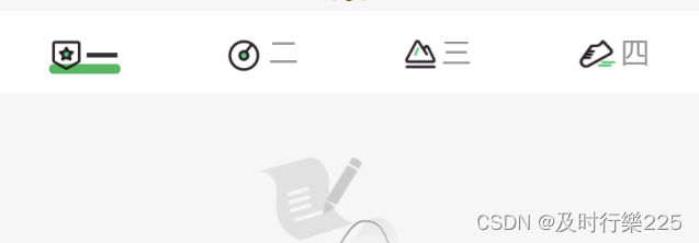
当我有多个菜单的时候我需要点击到后面菜单时自动向前移动,让用户知道后面还有菜单,taroUI的tabs可以实现但是没有办法加图片,以下是代码

   <View className='my-tab flex flex-align-item-center'
                >
                  <ScrollView
                    scrollX
                    scroll-with-animation
                    scrollLeft={scrollLeft}
                    enhanced
                    show-scrollbar={false}
                  >
                    <View className='my-tab-container flex flex-align-item-center'
                    >
                      {
                        tabs.map((tab, index) => <View key={index} className={current === index ? 'tab-item  active' : "tab-item "} onClick={() => changeTab(index)}>
                          <View className='tab-item-text'>
                            <Image
                              style={{
                                width: index === 0 ? '18px' : index == 1 ? '24px' : index == 2 ? '20px' : index == 3 ? '23px' : index == 4 ? '20px' : index == 5 ? '20px' : '24px',
                                height: index === 0 ? '19px' : index == 1 ? '24px' : index == 2 ? '18px' : index == 3 ? '18px' : index == 4 ? '16px' : index == 5 ? '17px' : '24px'
                              }}
                              className='img'
                              src={imgs[index]}
                            ></Image>
                            <Text>{tab.text}</Text>
                          </View>
                          <View className='line'></View>
                        </View>)
                      }
                    </View>
                  </ScrollView>
                </View>

需要用到的数组
const tabs = [
    {
      text: '一',
      img: 'xxx',
    
    },
    {
      text: '二',
      img: 'xxx',
     
    },
    {
      text: '三',
      img: 'xxx',
      
    },
    {
      text: '四',
      img: 'xxx',
      
    },

    {
      text: '五',
      img: 'xxx',
      
    },
    {
      text: '六',
      img: 'xxx',
     
    },
    {
      text: '七',
      img: 'xxx',
      
    },
    {
      text: '八',
      img: 'xxx',
     
    },
    {
      text: '九',
      img: 'xxx',
    },
  ]


//这里是处理tab滚动
 const [scrollLeft, setScrollLeft] = useState<number>(0)
  const handleScroll = (current: number) => {
    let moveX = 0
    const { screenWidth } = Taro.getSystemInfoSync()
    if (current > 1 && current < tabs.length - 1) {
      moveX = current * (screenWidth / 4 / 2 + current * 4)
    } else if (current >= tabs.length - 1) {
      moveX = tabs.length * (screenWidth / 4)
    }
    setScrollLeft(moveX)
  }


样式

 .my-tab {
    height: 88px;
    width: 100%;
    line-height: 88px;
    background-color: #ffffff;
    overflow: hidden;
    z-index: 999;

    .my-tab-container {
      width: 100%;
      transition: transform 0.3s ease;
    }

    ::-webkit-scrollbar {
      width: 0;
      height: 0;
      color: transparent;
      display: none;
    }

    .tab-item {
      text-align: center;
      font-size: 28px;
      color: #666667;
      white-space: nowrap;
      // padding: 0 40rpx;
      min-width: 25%;
      .img{
        vertical-align: middle;
        margin-right: 6rpx;
        z-index: 4;
        position: relative;
      }

      &.active {
        color: #333333;
        font-weight: bold;
        font-size: 36px;

        .tab-item-text {
          position: relative;
          display: inline-block;
          z-index: 3;
          vertical-align: middle;

          text {
            position: relative;
            z-index: 4;
            vertical-align: middle;
          }

          &:before {
            position: absolute;
            z-index: 2;
            content: "";
            width: 110%;
            height: 12px;
            border-radius: 12px;
            background-color: $PrimaryColor;
            bottom: 18px;
            left: 50%;
            transform: translate(-50%, -50%);
          }
        }
      }
    }
  }

  .my-tab::-webkit-scrollbar {
    display: none;
  }

  • 7
    点赞
  • 8
    收藏
    觉得还不错? 一键收藏
  • 1
    评论
要实现多层级手风琴菜单,可以使用 Taro3 框架中的 `AtAccordion` 组件。下面是一个示例代码: ``` import { AtAccordion, AtList, AtListItem } from 'taro-ui'; import { useState } from 'react'; const data = [ { title: '一级菜单1', content: [ { title: '二级菜单1-1', content: ['内容1', '内容2', '内容3'] }, { title: '二级菜单1-2', content: ['内容4', '内容5', '内容6'] }, ], }, { title: '一级菜单2', content: [ { title: '二级菜单2-1', content: ['内容7', '内容8', '内容9'] }, { title: '二级菜单2-2', content: ['内容10', '内容11', '内容12'] }, ], }, ]; function AccordionMenu() { const [openIndexes, setOpenIndexes] = useState([]); const handleClick = (index) => { let newOpenIndexes = [...openIndexes]; if (newOpenIndexes.includes(index)) { newOpenIndexes = newOpenIndexes.filter((i) => i !== index); } else { newOpenIndexes.push(index); } setOpenIndexes(newOpenIndexes); }; return ( <View> {data.map((item, index) => ( <AtAccordion key={index} title={item.title} open={openIndexes.includes(index)} onClick={() => handleClick(index)} > {item.content.map((subItem, subIndex) => ( <AtList key={subIndex}> <AtListItem title={subItem.title} hasBorder={false} /> {subItem.content.map((contentItem, contentIndex) => ( <AtListItem key={contentIndex} title={contentItem} /> ))} </AtList> ))} </AtAccordion> ))} </View> ); } export default AccordionMenu; ``` 这个示例代码中,我们首先定义了一个 `data` 数组,用来存储菜单的数据。每个菜单项包括 `title` 和 `content` 两个属性,其中 `title` 表示该菜单项的标题,`content` 表示该菜单项下的子菜单。 然后,我们使用 `useState` 定义了一个 `openIndexes` 状态,用来存储当前展开的菜单项的索引。在 `handleClick` 函数中,我们根据用户点击的菜单项的索引,来更新 `openIndexes` 状态。 最后,我们使用 `AtAccordion`、`AtList` 和 `AtListItem` 组件来实现菜单的展示。在 `AtAccordion` 组件中,我们根据 `openIndexes` 状态来判断该菜单项是否展开;在 `AtList` 组件中,我们展示了子菜单的标题和内容。

“相关推荐”对你有帮助么?

  • 非常没帮助
  • 没帮助
  • 一般
  • 有帮助
  • 非常有帮助
提交
评论 1
添加红包

请填写红包祝福语或标题

红包个数最小为10个

红包金额最低5元

当前余额3.43前往充值 >
需支付:10.00
成就一亿技术人!
领取后你会自动成为博主和红包主的粉丝 规则
hope_wisdom
发出的红包
实付
使用余额支付
点击重新获取
扫码支付
钱包余额 0

抵扣说明:

1.余额是钱包充值的虚拟货币,按照1:1的比例进行支付金额的抵扣。
2.余额无法直接购买下载,可以购买VIP、付费专栏及课程。

余额充值