


目录
I. 盒子模型 Box Model
页面布局的三大核心→盒子模型,浮动和定位
①网页布局的本质
②组成部分

❀内边距→边框与内容之间的距离
❀外边距→两个盒子之间的距离

❀图解
从外到内:外边距 margin →边距 border →内边距 padding →内容 content

❀边框 border

※ 组成

※※ 样式
✿颜色→默认是黑色✿
重点记:实线 solid 、虚线 dashed 、点线 dotted


※ 简写

※练习
※※题目→给定一个200*200的盒子,设置上边框为红色,其余边框为蓝色
※※代码:
<!DOCTYPE html>
<html lang="en">

<head>
    <meta charset="UTF-8">
    <meta http-equiv="X-UA-Compatible" content="IE=edge">
    <meta name="viewport" content="width=device-width, initial-scale=1.0">
    <title>Document</title>
    <style>
        div {
            width: 200px;
            height: 200px;
            font-size: 20px;
            line-height: 200px;
            text-align: center;
            border: 3px dashed blue;
            border-top: 1px solid red;
        }
    </style>
</head>

<body>
    <!-- ※下面是例子※ -->
    <div>
        盒子模型
    </div>
</body>

</html>
※※效果:

※细线边框
※盒子的实际大小 = 边框+宽 / 高

eg.代码←就是前面练习的代码 :(删掉注释 即/* */ ,其他的别删 qwq!是图二)
<!DOCTYPE html>
<html lang="en">

<head>
    <meta charset="UTF-8">
    <meta http-equiv="X-UA-Compatible" content="IE=edge">
    <meta name="viewport" content="width=device-width, initial-scale=1.0">
    <title>Document</title>
    <style>
        div {
            background-color: aqua;
            width: 200px;
            height: 200px;
            font-size: 20px;
            /*
            border: 3px dashed blue;
            border-top: 1px solid red;
            */
        }
    </style>
</head>

<body>
    <!-- ※下面是例子※ -->
    <div>
        盒子模型
    </div>
</body>

</html>
效果:

图一 
图二
❀内边距 padding

※会影响盒子的实际大小
※没有指定width /height 属性时不影响※

eg.代码:(删掉注释是图二)
<!DOCTYPE html>
<html lang="en">

<head>
    <meta charset="UTF-8">
    <meta http-equiv="X-UA-Compatible" content="IE=edge">
    <meta name="viewport" content="width=device-width, initial-scale=1.0">
    <title>Document</title>
    <style>
        div {
            background-color: aqua;
            width: 200px;
            height: 200px;
            font-size: 20px;
            border: 3px dashed blue;
            border-top: 1px solid red;
            /*
            padding-left: 20px;
            padding-top: 20px;
            padding-right: 20px;
            padding-bottom: 20px;
            */
        }
    </style>
</head>

<body>
    <!-- ※下面是例子※ -->
    <div>
        盒子模型
    </div>
</body>

</html>
效果:

图一 
图二
※简写
四个都要记住~!

※padding影响盒子的好处
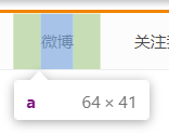
eg.新浪导航案例
要求效果:
代码:
<!DOCTYPE html>
<html lang="en">

<head>
    <meta charset="UTF-8">
    <meta http-equiv="X-UA-Compatible" content="IE=edge">
    <meta name="viewport" content="width=device-width, initial-scale=1.0">
    <title>新浪导航</title>
    <style>
        .nav {
            border-top: 3px solid #ff8500;
            border-bottom: 1px solid #edeef0;
            height: 41px;
            background-color: #fcfcfc;
        }

        .nav a {
            display: inline-block;
            padding: 0 20px;
            line-height: 41px;
/*
这个地方我和老师写的不一样。他写的height:41px,
但是我这样写是没居中的qwq,然后就按自己的来了
*/
            color: #4c4c4c;
            text-decoration: none;
            font-size: 12px;
        }

        .nav a:hover {
            color: #ff8500;
            background-color: #eee;
        }
    </style>
</head>

<body>
    <div class="nav">
        <a href="#">新浪导航</a>
        <a href="#">手机新浪网</a>
        <a href="#">移动客户端</a>
        <a href="#">微博</a>
        <a href="#">关注我</a>

    </div>
</body>

</html>
效果:


❀外边距 margin

※简写
与内边距 padding 一样 → 一个值 ➡ 上下左右;
两个值➡ 上下+左右;
三个值➡ 上+左右+下;
四个值➡ 上+右+下+左;
※应用
※※ 块级盒子水平居中对齐
 开发最常用→ margin: 0 auto
eg.代码:
<!DOCTYPE html>
<html lang="en">

<head>
    <meta charset="UTF-8">
    <meta http-equiv="X-UA-Compatible" content="IE=edge">
    <meta name="viewport" content="width=device-width, initial-scale=1.0">
    <title>新浪导航</title>
    <style>
        div {
            height: 255px;
            width: 255px;
            margin-top: 20px;
            margin-left: auto;
            margin-right: auto;
            background-color: violet;
            text-align: center;
        }
    </style>
</head>

<body>
    <div>
        <p>行内元素</p>
    </div>
    <div>
        <img src="img.png">
    </div>
</body>

</html>
效果:
(浏览器没全屏,图片是网上找的 ~!)

※※ 外边距合并

其他方法(→ 浮动、固定,绝对定位 等)现在还没讲
※※ 清除内外边距
*{}是通配符选择器,忘记的戳这

II. PS 基本操作
❀作用:完成大部分切图工作

❀图解

III. 综合案例
①产品模块
❀题目

❀分析
※※box布局→不这样写也可以的w!←反正我不是这么写的( ⓛ ω ⓛ *)

※※尺寸

❀代码及效果
①自己写的:
<!DOCTYPE html>
<html lang="en">

<head>
    <meta charset="UTF-8">
    <meta http-equiv="X-UA-Compatible" content="IE=edge">
    <meta name="viewport" content="width=device-width, initial-scale=1.0">
    <title>新浪导航</title>
    <style>
        * {
            margin: 0;
            padding: 0;
        }

        body {
            background-color: #f5f5f5;
            font-family: "微软雅黑";
        }

        .box {
            width: 298px;
            height: 415px;
            background-color: white;
            margin: 100px auto;
        }

        .box img {
            width: 100%;
        }

        .review {
            height: 70px;
            padding: 0 28px;
            margin-top: 30px;
            font-size: 14px;
        }

        .appraise {
            margin-top: 30px;
            padding: 0 28px;
            color: darkgray;
            font-size: 13px;
        }

        .info {
            margin-top: 5px;
            padding: 0 28px;
            font-size: 14px;
        }

        .info span {
            color: darkgray;
            padding-left: 20px;
        }

        .info .price {
            color: orange;
            padding-left: 2px;
        }
    </style>
</head>

<body>
    <div class="box">
        <img src="img.png">
        <p class="review">
            快递牛,整体不错蓝牙可以说秒连。红米给力
        </p>
        <div class="appraise">
            来自于117384232的评价
        </div>
        <div class="info">
            Redmi AirDots真无线蓝…
            <span>|</span> <span class="price">99.9元</span> </div>
    </div>

</body>

</html>
效果:

②pink老师写的:
<!DOCTYPE html>
<html lang="en">

<head>
    <meta charset="UTF-8">
    <meta http-equiv="X-UA-Compatible" content="IE=edge">
    <meta name="viewport" content="width=device-width, initial-scale=1.0">
    <title>新浪导航</title>
    <style>
        * {
            margin: 0;
            padding: 0;
        }

        body {
            background-color: #f5f5f5;
            font-family: "微软雅黑";
        }

        a {
            color: #333;
            text-decoration: none;
        }

        .box {
            width: 298px;
            height: 415px;
            background-color: white;
            margin: 100px auto;
        }

        .box img {
            width: 100%;
        }

        .review {
            height: 70px;
            font-size: 14px;
            padding: 0 28px;
            margin-top: 30px;
        }

        .appraise {
            font-size: 12px;
            color: #b0b0b0;
            margin-top: 20px;
            padding: 0 28px;
        }

        .info {
            font-size: 14px;
            margin-top: 15px;
            padding: 0 28px;
        }

        .info h4 {
            display: inline-block;
            font-weight: 400;
        }

        .info em {
            font-style: normal;
            color: #ebe4e0;
            margin: 0 6px 0 15px;
        }

        .info span {
            color: #ff6700;
        }
    </style>
</head>

<body>
    <div class="box">
        <img src="img.png">
        <p class="review">快递牛,整体不错蓝牙可以说秒连。红米给力</p>
        <div class="appraise">来自于117384232的评价</div>
        <div class="info">
            <h4><a href="#">Redmi AirDots真无线蓝...</a></h4>
            <em>|</em><span> 99.9元</span> </div>
    </div>

</body>

</html>
效果:

❀总结
※个人小结
不知道为什么我量的尺寸比他大好多qwq不过效果差不多hhh取色器那个我还不太会用。。所以直接用的灰色ww~!继续加油嗷嗷嗷!!!
※pink答疑

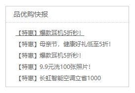
②快报模板
❀题目

❀分析
※※box布局←反正我不是这么写的( ⓛ ω ⓛ *)

※※尺寸→宽248px,高163px
※※新知识点

即
li {
    list-style: none;
}
❀代码及效果
①自己写的:
<!DOCTYPE html>
<html lang="en">

<head>
    <meta charset="UTF-8">
    <meta http-equiv="X-UA-Compatible" content="IE=edge">
    <meta name="viewport" content="width=device-width, initial-scale=1.0">
    <title>新浪导航</title>
    <style>
        * {
            margin: 0;
            padding: 0;
        }

        body {
            background-color: #f5f5f5;
            font-family: "微软雅黑";
            color: gray;
        }

        a {
            color: gray;
            text-decoration: none;
        }

        .box {
            width: 445px;
            height: 295px;
            background-color: white;
            margin: 100px auto;
            border: 2px solid #b5b5b5;
        }

        .box .title {
            height: 60px;
            margin: 0 0;
            line-height: 60px;
            border-bottom: 2px dotted #b5b5b5;
            text-indent: 30px;
            font-size: 25px;
        }

        .box .top {
            margin: 25px 40px 12px;
            font-size: 20px;
        }

        .box div {
            margin: 12px 40px;
            font-size: 20px;
        }

        .box .bottom {
            margin: 12px 40px 25px;
            font-size: 20px;
        }
    </style>
</head>

<body>
    <div class="box">
        <div class="title">品优购快报</div>
        <div class="top"><a href="#">【特惠】爆款耳机5折秒!</a></div>
        <div><a href="#">【特惠】母亲节,健康好礼低至5折!</a></div>
        <div><a href="#">【特惠】爆款耳机5折秒!</a></div>
        <div><a href="#">【特惠】9.9元洗100张照片!</a></div>
        <div class="bottom"><a href="#">【特惠】长虹智能空调立省1000</a></div>
    </div>

</body>

</html>
效果:

②pink老师写的:
<!DOCTYPE html>
<html lang="en">

<head>
    <meta charset="UTF-8">
    <meta http-equiv="X-UA-Compatible" content="IE=edge">
    <meta name="viewport" content="width=device-width, initial-scale=1.0">
    <title>新浪导航</title>
    <style>
        * {
            margin: 0;
            padding: 0;
        }

        .box {
            width: 248px;
            height: 163px;
            color: #666;
            border: 1px solid #ccc;
            margin: 100px auto;
        }

        .box h3 {
            height: 32px;
            border-bottom: 1px dotted #ccc;
            font-size: 14px;
            font-weight: 400;
            line-height: 32px;
            padding-left: 15px;
        }

        li {
            list-style: none;
        }

        .box ul li a {
            font-size: 12px;
            color: #666;
            text-decoration: none;
        }

        .box ul li a:hover {
            text-decoration: underline;
        }

        .box ul li {
            height: 23px;
            line-height: 23px;
            padding-left: 20px;
        }

        .box ul {
            margin-top: 7px;
        }
    </style>
</head>

<body>
    <div class="box">
        <h3>品优购快报</h3>
        <ul>
            <li><a href="#">【特惠】爆款耳机5折秒!</a></li>
            <li><a href="#">【特惠】母亲节,健康好礼低至5折!</a></li>
            <li><a href="#">【特惠】爆款耳机5折秒!</a></li>
            <li><a href="#">【特惠】9.9元洗100张照片!</a></li>
            <li><a href="#">【特惠】长虹智能空调立省1000</a></li>
        </ul>

    </div>

</body>

</html>
效果:加了一个点击时出现下滑线
❀总结
刚开始我跟他思路还挺像qwq也是准备用 h3和 ul 的,结果写了一会发现写不出来qwq!!!然后还是用了 div 写。。而且这次又又又量多了 !!!感觉这次学到的比第一个样例多一点hhh
恭喜看到这的小伙伴,你已经完成CSS第三天的学习了w第四天也开始了~!
其实是因为我看多了hhh
下面进入第四天剩余部分的学习吧(★ ω ★)→第四天
有用的话就点赞评论收藏嗷!!


 701
701


 被折叠的 条评论
为什么被折叠?
被折叠的 条评论
为什么被折叠?
 到【灌水乐园】发言


