


import matplotlib.pyplot as plt  #用于显示图片
import matplotlib.image as mpimg  #用于读取图片
import numpy as np
补充的关于图片的读取的知识点(学习的书本上是没有的)
需要导入的库是image库 as mping
显示的函数是
    plt.imshow('变量的名字') 变量名是一堆数组参数用这个函数将图片显示出来
读取图片的函数
    mpimg.imread('图片地址')
img1=mpimg.imread('some\gdsdxy.png')
print(type(img1))  # 可以看出图片的数据类型其实是数组
print(img1.shape)  # 查看图片的形状 三个数据分别是图片的 高,宽,第三维的数据
img2=np.hsplit(img1,4)  # 这里需要注意图片的切割,切割的份数是根据图片的形状的宽来决定的,要可以整除
img3=np.hstack((img2[0],img2[2]))
plt.imshow(img3)
plt.show()
<class 'numpy.ndarray'>
(163, 852, 4)

通用函数可以处理图像
img1=mpimg.imread('some\hcnh.jpg')
img2=img1+[55,55,55]
print('img1处理前的前三行的数据\n',img1[0:2,0:3,0:3])
print('img2处理后的前三行的数据\n',img2[0:2,0:3,0:3])
plt.imshow(img2)
plt.show()
Clipping input data to the valid range for imshow with RGB data ([0..1] for floats or [0..255] for integers).


img1处理前的前三行的数据
 [[[211 226 233]
  [211 226 233]
  [211 226 233]]

 [[211 226 233]
  [211 226 233]
  [211 226 233]]]
img2处理后的前三行的数据
 [[[266 281 288]
  [266 281 288]
  [266 281 288]]

 [[266 281 288]
  [266 281 288]
  [266 281 288]]]

随机产生色带图
arr=np.random.randint(0,255,(8,8,3))
#因为RGB的色彩图的范围是0~255,所以随机产生0-255的整数
#然后是红黄绿三个颜色叠加形成的一个颜色
#因为要的是8行8列的,所以随机产生的型状是8个数据,每个数据有8行3列,那个3代表的是红黄绿的颜色参数
#第二个8其实是图片里的每一行的每一个方块
# 第一个8是图片的8行


print(arr.shape)
plt.imshow(arr)
plt.show()
(8, 8, 3)

产生黑白色的棋盘
rgb的值为0的是黑色
      255的是白色
#先产生对应棋盘的数据
data=np.zeros((8,8,3))
for i in range(len(data)):
    for j in range(len(data[i])):
        for z in range(len(data[i,j])):
            if i % 2 == 0 and j % 2 ==1:
                data[i][j][z]=255
            if i % 2 == 1 and j % 2 ==0:
                data[i][j][z]=255
plt.imshow(data)
plt.show()


#误区,一直以为棋盘没有自带颜色的,忘记了零数组是自带颜色的
Clipping input data to the valid range for imshow with RGB data ([0..1] for floats or [0..255] for integers).

matplotlib的基本方法
title() 设置图表的名称
xlabel()  设置X轴的名称
ylabel()  设置Y轴的名称

以上三个函数内部都有loc位置参数,可以设置'left','right','center' 默认为center


xticks(ticks,label,rotation) 设置x轴的刻度,rotation旋转角度
yticks()  设置y轴的刻度
show()   显示图表
legend()  显示图例
text(x,y,text)  显示每条数据的值,x,y值的位置
savafig(路径)  保存绘制的图片,可以指定图片的分辨率,边缘颜色等参数
plt.plot()绘制线性图的方法
 plot( ) 方法的marker参数来定义 ,可以定义的符号见资料
 linewidth 线的粗细大小
 fmt函数(也是在plot中的参数)
 fmt = '[marker][linestyle][color]'
 例如
     fmt=‘ o :r’
     o表示实心圆标记
     :表示虚线
     r表示颜色红色


 注意:fmt是位置参数,在x和y之后的位置


 标记类型:'.'点  ','像素点  'o'实心圆  'v'下三角等

 线类型:'-'实线  '.'虚线   '--'破折线  '-.'点虚线


 颜色类型:颜色英文首字母
x=np.arange(-50,51)
y=x**2
plt.title('My first matplotlib')
plt.xlabel('x axis')
plt.ylabel('y axis')
plt.plot(x,y)
plt.show()

# fmt参数定义了基本格式,如标记,线条样式,颜色
# 例如 o:r , o表示实心圆标记, : 表示虚线,  r表示红色
y=np.array([5,2,13,10])
plt.plot(y,'o:c')
plt.show()

# markersize       ms 定义标记的大小
#markerfacecolor   mfc 定义标记内部的颜色
#markeredgecolor    mec 定义标记边框的颜色

y=np.array([4,25,6,4])
plt.plot(y,'o-b',ms=19)
plt.show()

默认不支持中文的标题
修改字体配置 plt.rcParams["font.sans-serif]
'SimHei'  中文黑体
‘Kaiti’ 中文楷体
 'LiSu'  中文隶书
注意:设置了中文字体之后,要设置负号,否则数值中出现负号时,负号无法显示。
plt.rcParams[‘axes.unicode_minus’]=False
plt.rcParams["font.sans-serif"]=["SimHei"]
plt.rcParams['axes.unicode_minus']=False
x=np.arange(-10,10)
y=2*x+5
plt.title("中文的标题")
plt.xlabel('x轴')
plt.ylabel('y轴')
plt.plot(x,y)
plt.show()

如果觉得字体小了,可以在(x,y)label里设置
xlabel('',fontsize=12)
设置线条的宽度 plt.plot(x,y,linewidth=5)
绘制多个线条 多条线
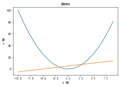
x=np.arange(-10,10)
y1=x**2
y2=x+5
plt.title('demo',fontsize=15)
plt.xlabel('x 轴')
plt.ylabel('y 轴')
plt.plot(x,y1,x,y2)#也可以分开写,写两个
plt.show()
设置x轴和y轴的刻度
plt.xticks(ticks,labels,rotation=旋转角度,color=设置颜色 )
#每个时间点的销量
times=['2015/6/26','2015/8/4','2015/10/12','2015/12/23','2016/1/2'\
      '2016/2/23','2016/5/6','2016/5/25','2016/6/26','2016/7/15']
#随机出售的销量
sales=np.random.randint(500,2000,size=len(times))
plt.plot(times,sales)
plt.show()

#观察x轴发现,数据太多,重叠到一起了,可以设置刻度
plt.xticks(range(1,len(times),2))
plt.plot(times,sales)
plt.show()
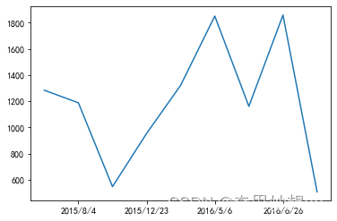
#让数据倾斜就可以放的下了
plt.xticks(range(1,len(times),2),rotation=45)
plt.plot(times,sales)
plt.show()

#如果想要按照自己的逻辑分隔,注意数值使用的是元素本身,、
#而不是元素的索引
plt.xticks([2015/6/26,2015/8/4])
plt.plot(times,sales)
[<matplotlib.lines.Line2D at 0x26f13068d90>]

#将x轴更改为字符串
#日期从1991-2020,
dates=np.arange(1991,2021).astype(np.str_)
sales=np.random.randint(500,1200,30)
#xticks第一个参数中元素不能为字符串
plt.xticks(range(0,len(dates),2),rotation=45)
# plt.xticks(dates,rotation=45)

plt.plot(dates,sales)
[<matplotlib.lines.Line2D at 0x26f168cb040>]

总结:
·x轴是数值型,会按照数值型本身作为x轴的坐标
·x轴为字符串,会按照索引作为x轴的坐标
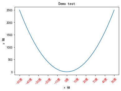
#练习
x=np.arange(-50,51)
y=x**2
plt.title('Demo test')
plt.xlabel('x 轴')
plt.ylabel('y 轴')
x_ticks=[-50,-40,-30,-20,-10,0,10,20,30,40,50]
x_labels=['%s度'%i for i in x_ticks]
plt.xticks(x_ticks,x_labels,rotation=45,color='r')
plt.plot(x,y)
plt.show()
matplotlib图形显示
# 如果在jupyter 中也想显示图形的操作菜单,可以使用以下方法
# %matplotlib notebook
#如果想回去原先的展示,使用以下方法
# %matplotlib inline
图例legend()
图例是集中于地图的一角或一侧的地图上各种符号和颜色代表内容与指标的说明,有助于更好的认识地图
#每个时间点的销量
times=['2015/6/26','2015/8/4','2015/10/12','2015/12/23','2016/1/2'\
      '2016/2/23','2016/5/6','2016/5/25','2016/6/26','2016/7/15']
#随机出收入
income= np.random.randint(500,2000,size=len(times))
#支出
expenses=np.random.randint(300,1500,size=len(times))

#绘制图形
plt.xticks(range(1,len(times),2),rotation=45)
#注意在使用图例前为每个图形设置label参数
plt.plot(times,income,label='收入')
plt.plot(times,expenses,label='支出')
#默认使用每个图形的label值作为图例中的说明
plt.legend()
<matplotlib.legend.Legend at 0x2067b272190>

图例的位置设置
loc代表了图例在整个坐标轴平面中的位置
·一般默认 “best”图例自动安家,找到最优的位置
·upper right  右上角
      left  左上角

·lower  xx    左右下角
  其他不常用
#每个时间点的销量
times=['2015/6/26','2015/8/4','2015/10/12','2015/12/23','2016/1/2'\
      '2016/2/23','2016/5/6','2016/5/25','2016/6/26','2016/7/15']
#随机出收入
income= np.random.randint(500,2000,size=len(times))
#支出
expenses=np.random.randint(300,1500,size=len(times))

#绘制图形
plt.xticks(range(1,len(times),2),rotation=45)
#注意在使用图例前为每个图形设置label参数
plt.plot(times,income,label='收入')
plt.plot(times,expenses,label='支出')
#设置固定的图例
plt.legend(loc='upper left')
<matplotlib.legend.Legend at 0x2067fbb8040>

plt.text() 给图中的点加标签,显示每条数据的值 x,y的位置
plt.text(x, y, s(就是图上的值), fontsize, verticalalignment,horizontalalignment,rotation , **kwargs)

x,y表示坐标值上的值
string :表示说明文字
fontsize:表示字体大小
verticalalignment :(va)垂直对齐方式,参数[center,top,bottom,baseline]
horizontalalignment:(ha)水平对齐方式,参数[center,right,left]
rotation:旋转的角度
#每个时间点的销量
times=['2015/6/26','2015/8/4','2015/10/12','2015/12/23','2016/1/2'\
      '2016/2/23','2016/5/6','2016/5/25','2016/6/26','2016/7/15']
#随机出收入
income= np.random.randint(500,2000,size=len(times))
#支出
expenses=np.random.randint(300,1500,size=len(times))

#绘制图形
plt.xticks(range(1,len(times),2),rotation=45)
#注意在使用图例前为每个图形设置label参数
plt.plot(times,income,label='收入')
plt.plot(times,expenses,label='支出')
plt.legend(loc='upper left')
for x,y in zip(times,income):
    plt.text(x,y,'%s万'%y)

for a,b in zip(times,expenses):
    plt.text(a,b,'%s万'%b)

#zip方法,将两个列表压缩成一个元组
x_list = [1,2,3,4,5,6,7]
y_list = [11,22,33,44,55,66,77]
xy = zip(x_list,y_list)
print(type(xy))
for x,y in xy:
    print(x," ",y)
<class 'zip'>
1   11
2   22
3   33
4   44
5   55
6   66
7   77
例子
time=np.arange(2000,2020).astype(np.str_)
sales=[109,150,172,189,260,273,333,347,393,416,458,496,514,574,598,614,657,698,714,756]
x_labels=['years%s'%time[i] for i in range(0,len(time),2)]
# x_labels=['years%s'%i for i in time]
plt.xticks(range(0,len(time),2),label=x_labels,rotation=45,color='r')
plt.yticks(color='blue')
plt.plot(time,sales)
plt.show()
['years%s'%time[i]   for i in range(0,len(time),2)]

['years2000',
 'years2002',
 'years2004',
 'years2006',
 'years2008',
 'years2010',
 'years2012',
 'years2014',
 'years2016',
 'years2018']
显示网格 : plt.grid()
plt.grid(True, linedtyle='--',color='gray',linewidth=,axis=  )
·显示网格
·linestyle  ls  线型
·color 颜色
·linewidth 宽度
·axis  x,y,both, 显示x/y两者的格网  默认为both
x=np.linspace(-np.pi,np.pi,256,endpoint=True)
c,s=np.cos(x) , np.sin(x)
plt.plot(x,c)
plt.plot(x,s)
# plt.grid(True)  # 这样就可以简单的有网格图形了
plt.grid(True,linestyle='--')

plt.gca() 对坐标轴的操作
get current axis---- gca
获取当前坐标轴位置并移动
x=np.arange(-50,50)
y=x**2
plt.plot(x,y)
[<matplotlib.lines.Line2D at 0x210056fcf10>]

x=np.arange(-50,50)
y=x**2
# 获取当前的坐标轴
ax=plt.gca()
#通过坐标轴spines,确定top,bottom, left,right(上下左右)

# 不需要右侧和上侧线条,则可以设置其他的颜色
ax.spines['right'].set_color('none')
ax.spines['top'].set_color('none')
plt.plot(x,y)
[<matplotlib.lines.Line2D at 0x210054213d0>]

x=np.arange(-50,50)
y=x**2
# 获取当前的坐标轴
ax=plt.gca()
#通过坐标轴spines,确定top,bottom, left,right(上下左右)

# 不需要右侧和上侧线条,则可以设置其他的颜色
ax.spines['right'].set_color('none')
ax.spines['top'].set_color('none')


# 移动轴下轴到指定位置
#在这里,position位置参数有三种,data,outward,axes
#参数是元组,要有一个括号需要注意
#axes:0.0-1.0之间的值,整个轴上的比例
# ax.spines['left'].set_position(('data',0))#按指定的值移动

ax.spines['left'].set_position(('axes',0.5))  #按比例移动

# ax.spines['bottom'].set_position(('data',0))
#设置坐标轴的区间,可以相当于移动下面的轴和它重合
plt.ylim(0,2500)
plt.ylim(0,y.max())

plt.plot(x,y)
[<matplotlib.lines.Line2D at 0x21004360580>]

改变分辨率
·plt.rcParams【'figure.dpi'】=设置为100或者200
·plt.rcParams['figure.figsize]=[8.0,4.0]
创建图形对象(画布)
plt.figure(
num=None  图形编号或名称,数字为编号,字符串为名称
figsize=None  指定figure的宽和高,单位为英寸
dpi= none   分辨率
facecolor=None  背景颜色
edgcolor=None   边框颜色
frameon=True    是否显示边框
)
import matplotlib.pyplot as plt
#创建图形对象
fig=plt.figure()
<Figure size 432x288 with 0 Axes>
fig=plt.figure('f1',figsize=(4,2),facecolor='gray')
plt.plot()

绘制多子图(在画布里)
·add_axes() : 添加区域
·subplot() : 均等的划分画布,只是创建一个包含子图区域的画布(返回区域对象)
·subplot() : 即创建了一个包含子图区域的画布,又创建了一个figure图形对象
1.add_axes()
在一个给定的画布中可以包含多个axes对象,但是同一个axes对象只能在一个画布中使用

add_axes(rect)
该方法用来生成一个个axes轴域对象,对象的位置有参数rect决定
rect是位置参数,接受一个由4个元素组成的浮点数列表,例如【left,bottom,width,heigh】 表示矩形区域的左下角坐标(x,y)以及宽度和高度
#创建了画布fig
fig=plt.figure(figsize=(4,2),facecolor='g')


#增加区域1 ax1
ax1=fig.add_axes([0,0,0.5,0.5])
ax1.plot([3,4,5,6],[5,6,7,8]) #给增加的画布赋值x轴,y轴

#增加区域2
ax2=fig.add_axes([0.5,0.5,0.3,0.3])
ax2.plot([1,2,3,4],[5,6,7,3])
plt.plot()

#使用区域名来作画 例如(ax2.plot())可以指定哪个区域
#如果使用plt。plot()来作画的话,会作到同一个区域里
#就是按照顺序来的
[]

注意:每个元素的值是画布宽度和高度的分数,即将画布的宽,高作为1个单位,比如【0.2,0.2,0.5,0.5】,它代表着从画布的20%的位置开始绘制,宽高是画布的50%
2.subplot()函数,它可以均等地划分画布
ax=plt.subplot(nrows,ncols,index,*args,**kwargs)
   ·nrows 行
   ·ncols 列
   ·index 位置
   ·kwargs title/xlabel/ylabel
例如 subplot(233)表示在当前画布的右上角拆功能键一个两行散列的绘画区域,并且选择在第3个位置绘制图形
plot(y) x可省略,默认(0,N-1)递增,N为Y轴元素的个数
plt.plot(range(50,70),marker='o')
plt.grid()

#默认画布分割为2行1列,当前所在第一个区域
#也可以不指定变量名,这样的话就需要在一个区域下面作图

#也可以用不指定变量名的方法来写
plt.subplot(211)
plt.plot(range(50,70))


ax1=plt.subplot(211)
ax2=plt.subplot(212)
ax1.plot(range(50,70),marker='o')
ax2.plot(np.arange(12)**2)
[<matplotlib.lines.Line2D at 0x23ad2800400>]

#新建的子图与现有的子图重叠,则会删除重叠的子图,因为不可以共享绘图区,举例说明

plt.plot([1,2,3])


ax1=plt.subplot(211)
ax2=plt.subplot(212)
ax1.plot(range(50,70),marker='o')
ax2.plot(np.arange(12)**2)


#可以发现第一次创建的没有了
[<matplotlib.lines.Line2D at 0x23ad2ba9a30>]

如果不想覆盖,需要先设置画布
plt.plot([1,2,3,4])

#设置一个新的画布
fig=plt.figure(figsize=(4,2),facecolor='r')
fig.add_subplot(211)
plt.plot(range(20))
fig.add_subplot(212)
plt.plot(range(12))
[<matplotlib.lines.Line2D at 0x23ad3d5a430>]


设置多图的基本信息
在创建的时候直接设置
plt.subplot(211,title='pic1',xlabel='x axis')
#x轴可以省略
plt.plot(range(50,70))

plt.subplot(212,title='pic2',xlabel='x axis')
plt.plot(np.arange(12**2))

#发现子图的标题重叠了
plt.tight_layout()

发现子图的标题重叠了
使用紧凑的布局 plt.tight_layout()
subplots()函数详解
使用方法与subplot()函数类似,不同之处,
subplots即创建了一个包含子图区域的画布,又创建了一个figure图形对象
函数格式
fig , ax = plt.subplots(nrows,ncols) 指的是子图所占的行和列
函数的返回值是一个元组,包括一个图形对象和所有的axes对象,axes=nrows * ncols 可以通过索引来访问
#下面创建一个2行2列的子图,并在子图中显示4个不同的图像
fig,axes = plt.subplots(2,2)

ax1=axes[0,0]
ax2=axes[0,1]
ax3=axes[1,0]
ax4=axes[1,1]

#x轴
x = np.arange(1,5)

ax1.plot(x,x*x)
ax1.set_title('squre')
ax2.plot(x,np.sqrt(x))
ax2.set_title('squre root')
ax3.plot(x,np.exp(x))
ax3.set_title('exp')
ax4.plot(x,np.log10(x))
ax4.set_title('log')

plt.tight_layout()

plt.subplot(321,facecolor='r')
plt.subplot(322,facecolor='r')
plt.subplot(323,facecolor='r')
plt.subplot(324,facecolor='r')
plt.subplot(313,facecolor='b')
<AxesSubplot:>

柱状图
- 柱状图是一钟用矩形柱来表示数据分类的图表
- 柱状图可以垂直绘制,也可以水平绘制。
- 它的高度与其所表示的数值成正比关系。
- 柱状图显示了不同类别之间的比较关系。
柱状图的绘制
plt.bar(x, height , width : float = 0.8 , bottom = None , *, align :str = ‘center’ ,data=None ,**kwargs)
- x表示x坐标,数据类型是float,一般为 np.arange()生成的固定步长列表
- height 表示柱状图的高度,也就是y坐标值,数据类型float,一般为一个列表,包含生成柱状图的所有y值
- width 表示柱状图的宽度,取值0-1之间 默认值为0.8
- bottom柱状图的起始位置,也就是y轴的起始坐标,默认为none
- align 柱状图的中心位置, ‘center’,‘lege’ 默认值为center
- color 柱状图颜色,默认为蓝色 可以为列表
- alpha 透明度 取值在0-1之间,默认值为1
- label 标签,设置后需要调用plt.legend()生成
- edgecolor 边框颜色
- linewidth 边框宽度,浮点数或类数值,默认为None
- tick label 柱子的刻度标签,字符串或字符串列表,默认值None
- linestyle 线条样式
1.基本柱状图
#x轴数据
x=range(5)

#y
data = [5,20,15,25,10]

#标题
plt.title('基本柱状图')
#绘制网格
plt.grid(ls='--',alpha=0.5)

#bar
plt.bar(x,data)
<BarContainer object of 5 artists>

bottom 参数
#x轴数据
x=range(5)
#y
data = [5,20,15,25,10]
#标题
plt.title('基本柱状图')
#绘制网格
plt.grid(ls='--',alpha=0.5)

plt.bar(x,data,bottom=[10,20,5,0,10],facecolor='g')#这两个都可以的
plt.bar(x,data,bottom=[10,20,5,0,10],color='g')
'''
--- y轴的数据要和bottom参数的数个数相同
'''
'\n--- y轴的数据要和bottom参数的数个数相同\n'

#x轴数据
x=range(5)
#y
data = [5,20,15,25,10]
#标题
plt.title('color参数设置柱状图不同的颜色')
#绘制网格
plt.grid(ls='--',alpha=0.5)

'''
facecolor和color设置单个颜色时使用方式一样
color可以设置多个颜色值,facecolor不可以
'''

#bar
plt.bar(x,data,color=['r','c','g','b'])#是循环着来的

·描边 - 相关的关键字参数缩写为:
- edgecolor ec
- linestyle ls
- linewidth lw
data = [5,20,15,25,10]
plt.title('设置边缘线条的样式')
plt.bar(range(len(data)),data,ec='r',ls='--',lw=2)

设置tick label
柱子的刻度标签,字符串或字符串列表
data = [5,20,15,25,10]
labels = ['tom','dick','harry','slim','jim']
plt.title('设置边缘线条样式')
plt.bar(range(len(data)),data,tick_label=labels)

2.同位置多柱状图
- 同一x轴位置绘制多个柱状图,通过调整柱状图的宽度和每个柱状图的x轴的起始位置
#国家
countries = ['挪威','德国','中国','美国','瑞典']

#金牌个数
gold_medal = [16,12,9,8,8]
#银牌个数
silver_medal = [8,10,4,10,5]
#铜牌个数
bronze_medal = [13,5,2,7,5]

# 1.将x轴转换为数值
x= np.arange(len(countries))

# 2.设置图形的宽度
width = 0.2

#==================确定x起始位置==================
#金牌起始位置
gold_x = x

#银牌起始位置
silver_x = x + width

#铜牌起始位置
bronze_x = x + 2*width


#=======================分别绘制图形
#金牌图形
plt.bar(gold_x,gold_medal,width=width,color='gold',label='金牌')
#银牌图形
plt.bar(silver_x,silver_medal,width=width,color='silver',label='银牌')
#铜牌图形
plt.bar(bronze_x,bronze_medal,width=width,color='saddlebrown',label='铜牌')

#================将x轴的坐标位置变回来

#注意x标签的位置未居中
plt.xticks(x+width,labels=countries)

#---------显示高度文本----------
for i in range(len(countries)):
    #金牌的文本设置
    plt.text(gold_x[i],gold_medal[i],gold_medal[i],va='bottom',ha='center')
    #银牌的文本设置
    plt.text(silver_x[i],silver_medal[i],silver_medal[i],va='bottom',ha='center')
    #铜牌的文本设置
    plt.text(bronze_x[i],bronze_medal[i],bronze_medal[i],va='bottom',ha='center')

#设置图例
plt.legend()
<matplotlib.legend.Legend at 0x173f49e6250>

3.水平柱状图
- plt.barh() 函数可以生成水平柱状图
- barh()函数的用法和bar()用法基本一样,
- 第一个数据是y轴起始的位置,然后是x的值,还有图形的宽度height
#国家
countries = ['挪威','德国','中国','美国','瑞典']


#金牌个数
gold_medal = [16,12,9,8,8]

plt.barh(countries,width = gold_medal)
<BarContainer object of 5 artists>

#由于牵扯计算,因此将数据转numpy数组
movie = ["新蝙蝠侠",'狙击手','奇迹笨小孩']

real_day1 = np.array([4053,2548,1543])
real_day2 = np.array([7840,4013,2421])
real_day3 = np.array([8080,3673,1342])

# ============确定距离左侧=========
left_day2 = real_day1 # 第二天的距离为左侧的第一天的数值

left_day3 = real_day1 + real_day2

height = 0.2

# 绘制图形
plt.barh(movie,real_day1,height=height)

plt.barh(movie,real_day2,left=left_day2,height=0.3)

plt.barh(movie,real_day3,left=left_day3,height=0.4)


sum_data = real_day1+real_day2+real_day3

for i in range(len(movie)):
    plt.text(sum_data[i],movie[i],sum_data[i],va='center',ha='left')

plt.xlim(0,sum_data.max()+2000)
(0.0, 21973.0)

3.1绘制水平的同位置的多柱状图
分析:
- 由于牵扯高度的计算,因此先将y轴转换为数值型
- 需要设置同图形的高度
- 计算每个图形高度的起始位子
- 绘制图形
- 替换y轴数据
movie = ["新蝙蝠侠",'狙击手','奇迹笨小孩']

real_day1 = np.array([4053,2548,1543])
real_day2 = np.array([7840,4013,2421])
real_day3 = np.array([8080,3673,1342])

#1.y轴转换为数值型
num_y = np.arange(len(movie))

#2.
height = 0.2

#3.计算每个图形高度的起始位置
movie1_start_y = num_y
movie2_start_y = num_y + height
movie3_start_y = num_y + 2*height

#4.
plt.barh(movie1_start_y,real_day1,height=height)
plt.barh(movie2_start_y,real_day2,height=height)
plt.barh(movie3_start_y,real_day3,height=height)

plt.yticks(num_y + height,labels=movie)

for i in range(len(movie)):
    plt.text(real_day1[i],num_y[i],real_day1[i],va='center',ha='left')
    plt.text(real_day2[i],movie2_start_y[i],real_day2[i],va='center',ha='left')
    plt.text(real_day3[i],movie3_start_y[i],real_day3[i],va='center',ha='left')

plt.xlim(0,9000)
(0.0, 9000.0)

直方图 plt.hist()
- 又称质量分布图,是条形图的一种,表示数据分布的情况
- 直方图的横轴表示数据类型,纵轴表示分布情况
- 直方图用于概率分布,显示一组数值序列在给定的数值范围内出现的概率,而柱状图则用于展示各个类别的频数
plt.hist(x,bins=None,range=None,density=None,weights=None,cumulative=False,bottom=‘bar’,…)
- x做直方图所要用的数据,必须是一维数组,多维数组可以先进行扁平化再作图,必选参数
- bins 直方图的柱数,即要分的数组,默认为10
- weights 与x形状相同的权重数组
- …
#使用numpy随机生成200个随机数据
x_value = np.random.randint(140,180,300)
plt.hist(x_value,bins=10,ec='w')

plt.title('数据统计')
plt.xlabel('身高')
plt.ylabel('比率')
Text(0, 0.5, '比率')

返回值
-
n num数组或数组列表
- 直方图的值(每个柱图形的上面的值是多少,也就是有多少个)
-
bins 数组
- 返回各个bin的区间范围,每个柱的起始位置、
- bins的返回值总会比num多一个,因为它把柱的最后一个点也返回了,所以用的时候要注意
-
patches 列表的列表或列表
- 返回每个bin里面包含的数据,是个list
num , bins, patches =plt.hist(x_value,bins=10,ec='w')
print(num)
print(bins)
print(patches)
for i in patches:
    print(i)
    #通过这样可以取值
#     print(i.get_x())
#     print(i.get_y())
#     print(i.get_width())
#     print(i.get_height())
[30. 28. 41. 25. 26. 34. 25. 25. 33. 33.]
[140.  143.9 147.8 151.7 155.6 159.5 163.4 167.3 171.2 175.1 179. ]
<BarContainer object of 10 artists>
Rectangle(xy=(140, 0), width=3.9, height=30, angle=0)
Rectangle(xy=(143.9, 0), width=3.9, height=28, angle=0)
Rectangle(xy=(147.8, 0), width=3.9, height=41, angle=0)
Rectangle(xy=(151.7, 0), width=3.9, height=25, angle=0)
Rectangle(xy=(155.6, 0), width=3.9, height=26, angle=0)
Rectangle(xy=(159.5, 0), width=3.9, height=34, angle=0)
Rectangle(xy=(163.4, 0), width=3.9, height=25, angle=0)
Rectangle(xy=(167.3, 0), width=3.9, height=25, angle=0)
Rectangle(xy=(171.2, 0), width=3.9, height=33, angle=0)
Rectangle(xy=(175.1, 0), width=3.9, height=33, angle=0)

添加折现直方图
在直方图中,我们也可以加一个折线图,辅助我们查看数据变化情况
- 首先通过plt.subplots()创建Axes对象
- 通过axes 对象吊桶hist()方法绘制直方图,返回折线图所需要的下x,y数据
- 然后axes对象调用plot()绘制折线图
    x_value = np.random.randint(140,180,300)

fig , ax = plt.subplots()

#绘制直方图
num,bins_limit,patches = ax.hist(x_value,bins=10,ec='w')

#绘制曲线图
ax.plot(bins_limit[:10],num,'--')
[<matplotlib.lines.Line2D at 0x173fcee5eb0>]

不等距分组
fig , ax = plt.subplots()
x = np.random.normal(100,200,100)
# print(x)
bins=[50,60,70,90,100,110,140,150]#区间为前一个数到后一个数的距离
ax.hist(x,bins,color='g',ec='w')
ax.set_title('不等距分组')
plt.show()

饼状图 plt.pie(x,explode=None,labels=None,colors=None,autopct=None)
- x 数组序列,数组元素对应扇形区域的数量大小
- labels 列表字符串序列,为每个扇形区域备注一个标签名字
- color 为每个扇形区域设置颜色,默认按照颜色周期自动设置
- autopct 格式化字符串’fmt%pct’ ,使用百分比的格式设置每个扇形区的标签,并将其放置在扇形区内
- pctdistance 设置百分比标签与圆心的距离
- labeldistance 设置各扇形标签与圆心的距离
- explode 指定饼图某些部分的突出显示,即呈现爆炸式()
- shadow 是否添加饼图的阴影效果
# 设置大小
# plt.rcParams['figure.figsize'] = (5,5)

labels = ['娱乐','育儿','饮食','零花','交通']

x = [500,1200,7000,200,900]

plt.pie(x,labels=labels)
([<matplotlib.patches.Wedge at 0x173ff89c100>,
  <matplotlib.patches.Wedge at 0x173ff89c610>,
  <matplotlib.patches.Wedge at 0x173ff89caf0>,
  <matplotlib.patches.Wedge at 0x173ff89cfd0>,
  <matplotlib.patches.Wedge at 0x173ff8a44f0>],
 [Text(1.0858999607914732, 0.17555989050200724, '娱乐'),
  Text(0.8375905436469615, 0.7130512472418709, '育儿'),
  Text(-1.0797150575228982, -0.21027456945224016, '饮食'),
  Text(0.8815550658463602, -0.6579214739470203, '零花'),
  Text(1.0545346777353628, -0.3129802125591561, '交通')])

百分比显示 percentage
labels = ['娱乐','育儿','饮食','零花','交通']

x = [500,1200,7000,200,900]

plt.title('8月份家庭支出')

plt.pie(x,labels=labels,autopct='%.2f%%')
([<matplotlib.patches.Wedge at 0x173ff8cefa0>,
  <matplotlib.patches.Wedge at 0x173ff8d8700>,
  <matplotlib.patches.Wedge at 0x173ff8d8d60>,
  <matplotlib.patches.Wedge at 0x173ff8e04c0>,
  <matplotlib.patches.Wedge at 0x173ff8e0be0>],
 [Text(1.0858999607914732, 0.17555989050200724, '娱乐'),
  Text(0.8375905436469615, 0.7130512472418709, '育儿'),
  Text(-1.0797150575228982, -0.21027456945224016, '饮食'),
  Text(0.8815550658463602, -0.6579214739470203, '零花'),
  Text(1.0545346777353628, -0.3129802125591561, '交通')],
 [Text(0.5923090695226217, 0.09575994027382212, '5.10%'),
  Text(0.45686756926197897, 0.3889370439501113, '12.24%'),
  Text(-0.5889354859215807, -0.11469521970122189, '71.43%'),
  Text(0.48084821773437825, -0.3588662585165565, '2.04%'),
  Text(0.5752007333101978, -0.17071647957772149, '9.18%')])

饼状图的分离
- explode: 指定饼图某些部分的突出显示
labels = ['娱乐','育儿','饮食','零花','交通']

x = [500,1200,7000,200,900]

#饼图分离
explode = (0.05,0.06,0.04,0.08,0.1)

#设置阴影效果
plt.pie(x,labels=labels,autopct='%3.2f%%',explode=explode,shadow=0.5)
([<matplotlib.patches.Wedge at 0x173ffa9a520>,
  <matplotlib.patches.Wedge at 0x173ffa9aee0>,
  <matplotlib.patches.Wedge at 0x173ffaa68b0>,
  <matplotlib.patches.Wedge at 0x173ffab0280>,
  <matplotlib.patches.Wedge at 0x173ffab0c10>],
 [Text(1.1352590499183584, 0.18353988552482575, '娱乐'),
  Text(0.8832773005731595, 0.751944951636882, '育儿'),
  Text(-1.1189774232510037, -0.21792091743232161, '饮食'),
  Text(0.9456681615442774, -0.7057703084158945, '零花'),
  Text(1.1504014666203959, -0.341432959155443, '交通')],
 [Text(0.6416681586495069, 0.10373993529664063, '5.10%'),
  Text(0.5025543261881769, 0.4278307483451224, '12.24%'),
  Text(-0.6281978516496861, -0.12234156768130335, '71.43%'),
  Text(0.5449613134322954, -0.40671509298543074, '2.04%'),
  Text(0.6710675221952308, -0.1991692261740084, '9.18%')])

设置饼状图百分比和文本距离中心位置:
- pctdistance : 设置百分比标签与圆心的距离
- labeldistance ; 设置各扇形标签(图例)与圆心的距离
labels = ['娱乐','育儿','饮食','零花','交通']

x = [500,1200,7000,200,900]
#饼图分离
explode = (0.05,0.06,0.04,0.08,0.1)

#设置阴影效果
plt.pie(x,labels=labels,autopct='%3.2f%%',explode=explode,pctdistance=1.2,labeldistance=1.3)
([<matplotlib.patches.Wedge at 0x173ffb45d90>,
  <matplotlib.patches.Wedge at 0x173ffacd8e0>,
  <matplotlib.patches.Wedge at 0x173ffb52a90>,
  <matplotlib.patches.Wedge at 0x173ffb5d1f0>,
  <matplotlib.patches.Wedge at 0x173ffb5d910>],
 [Text(1.332695406425899, 0.21545986561609978, '娱乐'),
  Text(1.0355664903271524, 0.8815906329535858, '育儿'),
  Text(-1.3152892518915305, -0.2561526573327289, '饮食'),
  Text(1.10595090078907, -0.82539239458808, '零花'),
  Text(1.3421350443904618, -0.39833845234801685, '交通')],
 [Text(1.2339772281721286, 0.19949987557046275, '5.10%'),
  Text(0.9594218954501559, 0.8167677922952338, '12.24%'),
  Text(-1.217133337571267, -0.23703678738252523, '71.43%'),
  Text(1.0258095311666735, -0.7655813515019873, '2.04%'),
  Text(1.2462682555054287, -0.3698857057517299, '9.18%')])

散点图 scatter()
plt.scatter(x,y,s,c,marker,cmap)
- x,y,s(x轴的,y轴的,大小)
- 散点图也叫x-y图,将所有的数据以点的形式展现在直角坐标系上,显示变量之间相互影响的程度,点的位置由变量的数值决定
- 数据的相关关系主要分为:正相关(两个变量同时增长)负相关(一个增加,另一个下降),不相关,线性相关,指数相关
x = np.array([1,2,3,4,5,6,7,8])
y = np.array([1,4,9,16,7,11,23,18])

s=(20 * np.random.rand(8))**2
plt.scatter(x,y,s,alpha=0.5) #alpha 透明度
# plt.plot(x,y)
plt.show()

自定义颜色和透明度
- 颜色方式
- 1.英文
- 2.缩写
- 3.十六进制的
x = np.random.rand(50)
y = np.random.rand(50)

s = (10*np.random.randn(50))**2

#颜色可以使用一组数字序列
# color = np.resize(np.array([1,2,3]),100)

#颜色随机
color = np.random.rand(50)


plt.scatter(x,y,s,c=color)
plt.show()

可以选择不同的颜色条,配合cmap参数
- 颜色条colormap
- 每种颜色都有一个范围从0-100的值
x = np.arange(1,101)
y = np.arange(1,101)
colors = np.arange(1,101)

plt.scatter(x,y,c=colors,cmap='viridis')
plt.show()

x = np.arange(1,101)
y = np.arange(1,101)
colors = np.arange(1,101)

plt.scatter(x,y,c=colors,cmap='Set1')
# plt.savefig('some\test2.jpg')
plt.show()

x = np.arange(1,101)
y = np.arange(1,101)
colors = np.arange(1,101)

plt.scatter(x,y,c=colors,cmap='Blues')
plt.show()

保存图片 plt.savefig()
savefig()
- fname : (字符串或者路径) 默认存储为‘png格式’
- dpi 分辨率
- facecolor图形表面颜色
- …
x = np.random.rand(50)
y = np.random.rand(50)

s = (10*np.random.randn(50))**2

#颜色可以使用一组数字序列
# color = np.resize(np.array([1,2,3]),100)

#颜色随机
color = np.random.rand(50)


plt.scatter(x,y,s,c=color)

plt.savefig('some\my2323.png')

plt.show()

箱线图绘制 plt.boxplot()
是一种用作显示一组数据分散情况资料的统计图表
不同于折线图,柱状图或饼图,其中包含一些统计学的均值,分位数,极值等统计量,该图信息量较大,不仅能够分析不同类别数据平均水平差异,还能揭示数据间离散程度,异常值,分布差异等。
- 在箱型图中,我们从上四分卫位数到下四分位数绘制一个盒子,然后用一条垂直触须(形象的称为‘盒须’)穿过盒子的中间,上垂线延伸至上边缘(最大值),下垂线延伸至下边缘(最小值)
箱型图应用场景
- 箱型图由于能显示一组数据分散情况,常用于品质管理
- 箱型图有利于数据的清洗,能快速知道数据分别情况
- 箱型图有助于分析一只数据的偏向如分析公司员工收入水平
函数的使用 plt.boxplot()
- x : 输入数据,类型为数组或向量序列,必备参数
- vert : 箱体的方向,当取值为True时,绘制垂直箱体,当取值为False时,绘制水平箱体,类型为布尔值,默认值为True,可选
- showmeans :是否显示算术平均数,类型为布尔值,默认值为False ,可选
- meanline :均值显示为线还是点,类型为布尔值,默认值是False,可选参数,当取值为True,且showmeans,为TRUE时,为线
- labels : 标签 比较熟悉了
x = np.array([1,20,30,60,50])
# plt.boxplot(x,showmeans=True)#平均值显示的是点
plt.boxplot(x,showmeans=True,meanline=True)#平均值显示的是线
#这样的x的值,显示的结果一个是中位数,一个是平均值


plt.grid()
plt.show()

#可以传递二维的数据
x = np.array([1,2,3,4,5,3,4,5,7,1,8,7]).reshape(3,4)
print(x)
plt.boxplot(x,showmeans=True,meanline=True,labels=list('ABCD')) # 此时箱线图取的是二维数组的每一列的元素z
plt.grid()
plt.show()
[[1 2 3 4]
 [5 3 4 5]
 [7 1 8 7]]

词云图
wordcloud 词云图,也叫文字云,是对文本中出现频率高的‘关键词’予以视觉化的展现
pip install wordcloud 安装
from wordcloud import WordCloud
with open('some/test.txt',encoding='utf-8') as file:
    #数据文件
    txt = file.read()
    #如果数据文件中包含的有中文的话,font_path必须指定字体,否则中文会乱码
    #collocations:是否包括两个词的搭配,默认为True,如果为True会有重复
    #数据,不需要重复数据,所以设置为False
    #width :幕布的宽度,height 幕布的高度
    #max_words 要显示的词的最大个数
    # generate 读取文本文件
    wordcloud = WordCloud(font_path='C:/Windows/Fonts/simfang.ttf',
                         collocations = True,
                         background_color='black',
                         width=800,
                         height=600,
                         max_words=50).generate(txt)
    #生成图片
    image = wordcloud.to_image()
    #显示
    image.show()
    #写入文件
    wordcloud.to_file('tag.jpg')


 3万+
3万+

 被折叠的 条评论
为什么被折叠?
被折叠的 条评论
为什么被折叠?
 到【灌水乐园】发言


