


二、Flex
Flex(FlexiableBox:弹性盒子,用于弹性布局,配合rem处理尺寸的适配问题)。
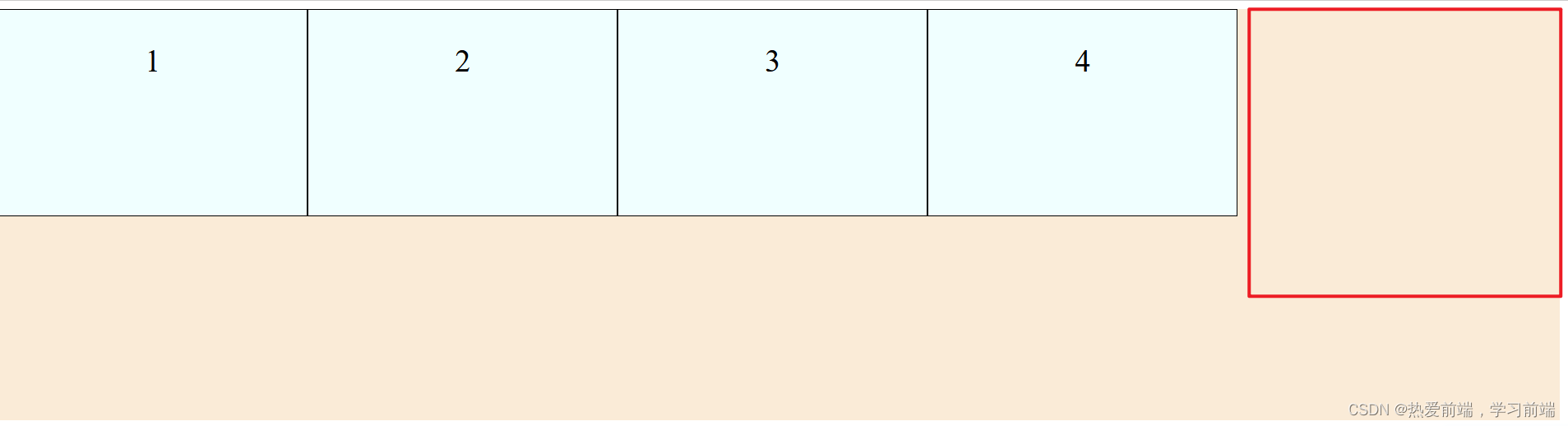
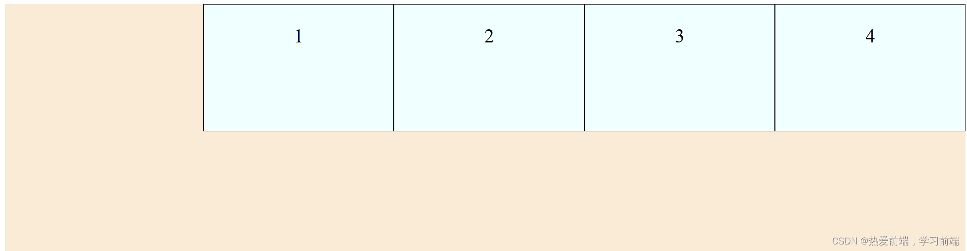
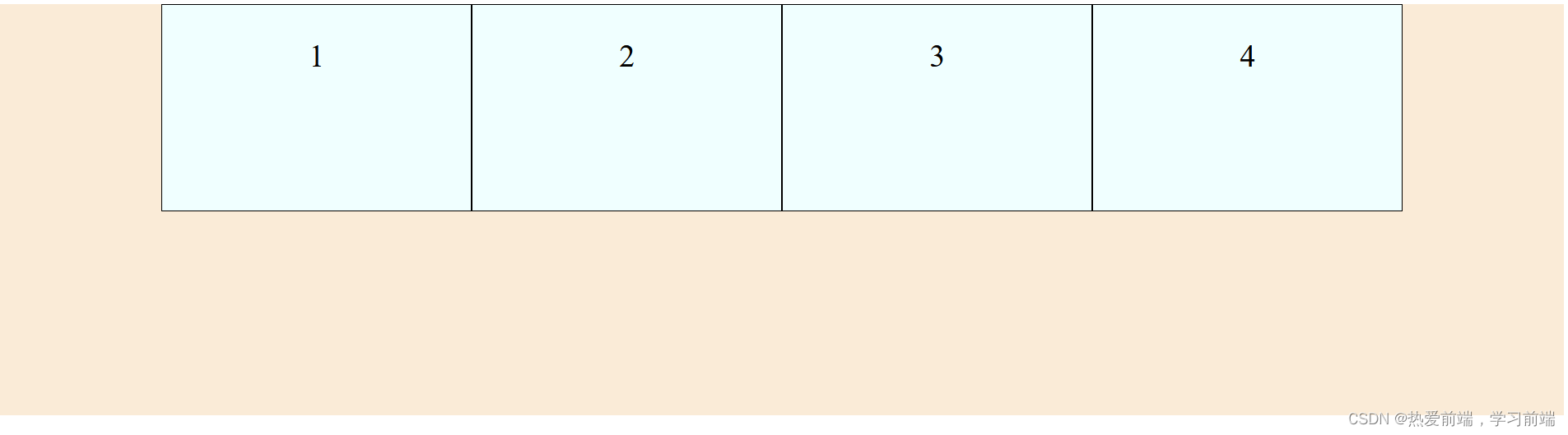
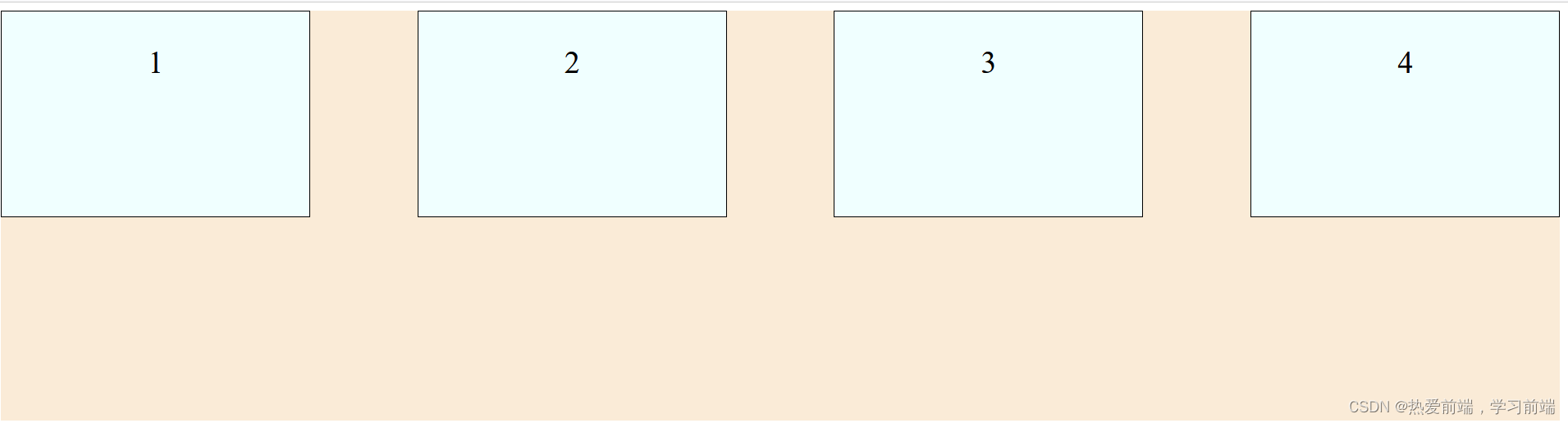
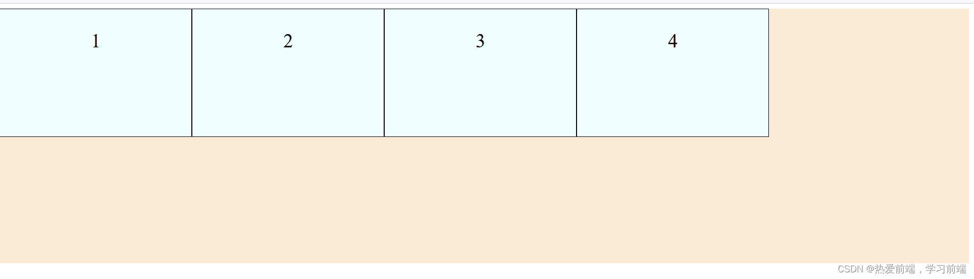
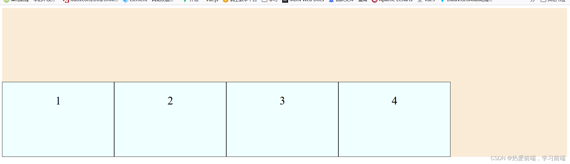
1、flex-direction:子元素在父元素盒子中的排列方式。
父级元素添加:flex-direction: row;

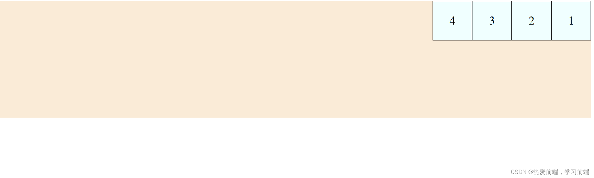
父级元素添加:flex-direction: row-reverse;
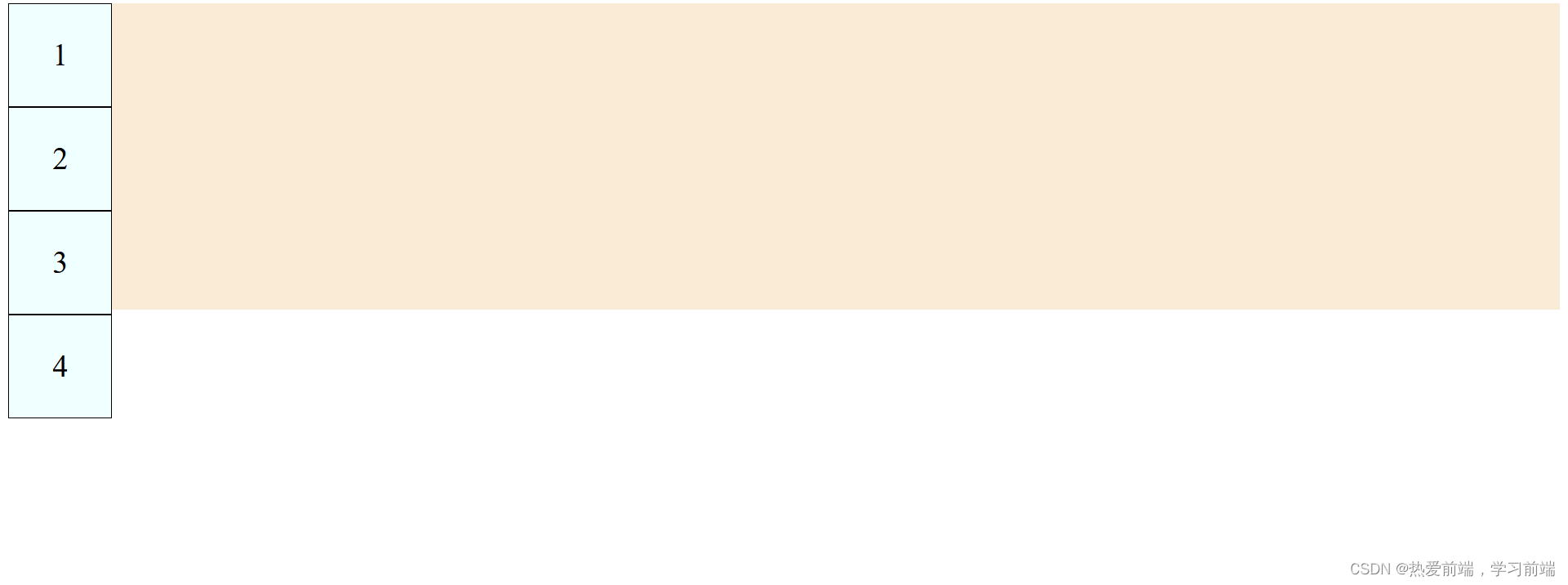
父级元素添加:flex-direction: column;
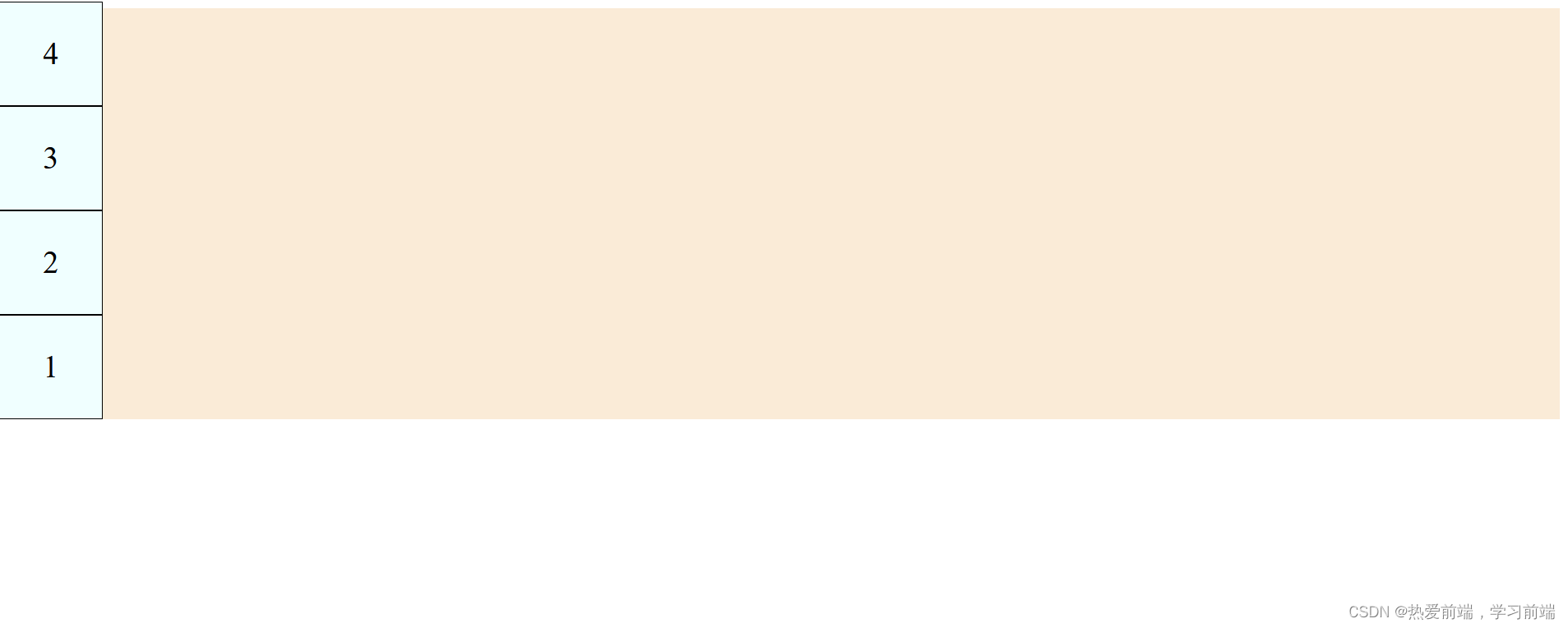
父级元素添加:flex-direction: column-reverse;
<!DOCTYPE html>
<html lang="en">
<head>
    <meta charset="UTF-8">
    <meta name="viewport" content="width=device-width, initial-scale=1.0">
    <title>Document</title>
    <style>
        .father{
            background-color: antiquewhite;
            width: 100%;
            height: 400px;
            display: flex;
            /* flex-direction: row; */
            /* flex-direction: row-reverse; */
            /* flex-direction: column; */
            flex-direction: column-reverse;
        }
        .child{
            width: 100px;
            height: 100px;
            background-color: azure;
            font-size: 30px;
            text-align: center;
            line-height: 100px;
            border: 1px solid;
        }
    </style>
</head>
<body>
    <div class="father">
        <div class="child">1</div>
        <div class="child">2</div>
        <div class="child">3</div>
        <div class="child">4</div>
    </div>
</body>
</html>
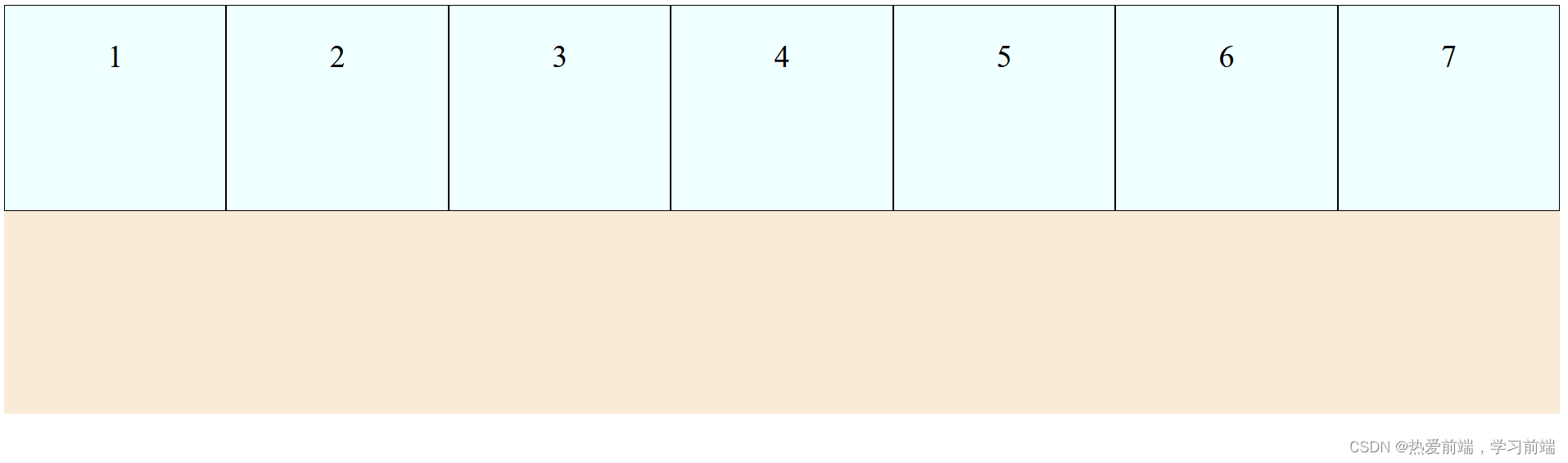
2、flex-wrap:子元素换行
已1为基础父元素设置flex-direction: row;无论我子元素设置多少个,子元素(已设置宽
、高)会被压缩。如下子元素被压缩图,添加 flex-wrap: wrap;子元素不会被压缩而且还会自动换行。

<!DOCTYPE html>
<html lang="en">
<head>
    <meta charset="UTF-8">
    <meta name="viewport" content="width=device-width, initial-scale=1.0">
    <title>Document</title>
    <style>
        .father{
            background-color: antiquewhite;
            width: 100%;
            height: 400px;
            display: flex;
            flex-direction: row;
            /* 不换行 */
            /* flex-wrap: nowrap; */
            /* 换行 */
            flex-wrap: wrap;
            /* 换行,且子元素排列顺序相反 */
            /* flex-wrap: wrap-reverse; */

        }
        .child{
            width: 300px;
            height: 200px;
            background-color: azure;
            font-size: 30px;
            text-align: center;
            line-height: 100px;
            border: 1px solid;
        }
    </style>
</head>
<body>
    <div class="father">
        <div class="child">1</div>
        <div class="child">2</div>
        <div class="child">3</div>
        <div class="child">4</div>
        <div class="child">5</div>
        <div class="child">6</div>
        <div class="child">7</div>
    </div>
</body>
</html>
3、flex-flow 等价于flex-direction+flex-wrap;
<!DOCTYPE html>
<html lang="en">
<head>
    <meta charset="UTF-8">
    <meta name="viewport" content="width=device-width, initial-scale=1.0">
    <title>Document</title>
    <style>
        .father{
            background-color: antiquewhite;
            width: 100%;
            height: 400px;
            display: flex;
            flex-flow: row wrap;
        }
        .child{
            width: 300px;
            height: 200px;
            background-color: azure;
            font-size: 30px;
            text-align: center;
            line-height: 100px;
            border: 1px solid;
        }
    </style>
</head>
<body>
    <div class="father">
        <div class="child">1</div>
        <div class="child">2</div>
        <div class="child">3</div>
        <div class="child">4</div>
        <div class="child">5</div>
        <div class="child">6</div>
        <div class="child">7</div>
    </div>
</body>
</html>
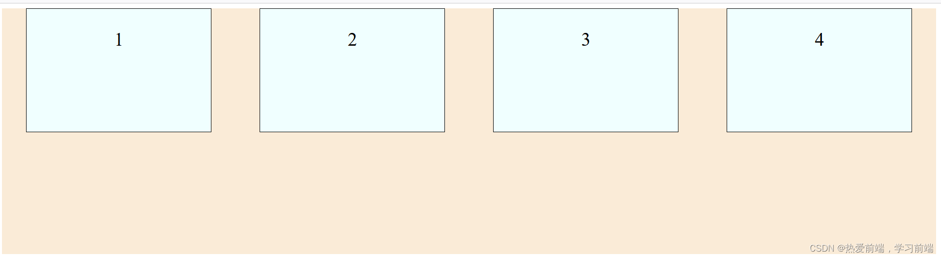
4、justify-content(常用)
justify-content: flex-start;元素从左到右排列。
justify-content: flex-end;元素从右到左。
justify-content: center;元素居中。
justify-content: space-around;平均分布,两边留有一半的间隔。
justify-content:space-between;平均分布,两边不留间隔。
5、align-items交叉轴默认对齐方式
align-items: flex-start;容器开头。
align-items: center;居中

align-items: flex-end;容器结尾。


 被折叠的 条评论
为什么被折叠?
被折叠的 条评论
为什么被折叠?
 到【灌水乐园】发言


