


更新记录
2024-06-19:
- this.$emit(‘change’, name.join(“,”)),name来源未知,其实就是上面的label,已更正。
- 点击input区域点击事件不生效。原因:input被禁用。解决办法:input样式增添
pointer-events: none,意义自查,这里不多赘述。
注意:
- 组件根据我的需求封装,我的需求是:组件绑定值为选项的name字段拼接字符串,所以组件绑定值和内部input绑定值共用。
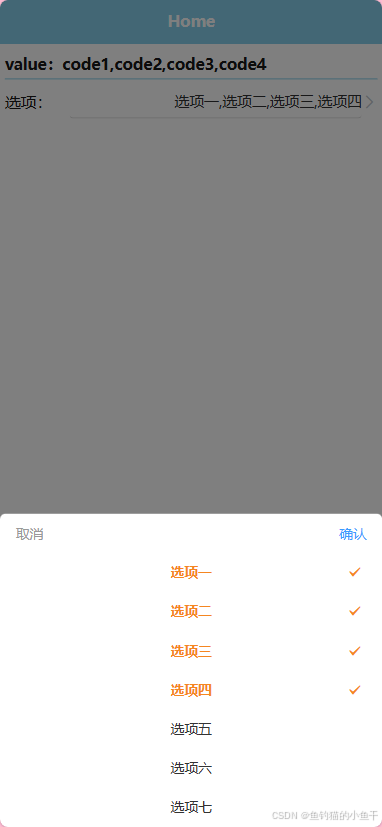
- 如果组件绑定值为选项的code字段拼接,需要把绑定值换成value,
this.$emit('change', value.join(",")),同时组件内部的input绑定值单独定义。- 如果不想改的话,confirm事件中也可以取到code集合。
2024-08-08
- 更新了绑定值为 code 拼接字符串的组件。
(推荐使用)
2025-04-26
两个月没上平台,CSDN竟然直接擅自给我改成了 VIP 收费文章,真是太6了。
声明一下,我写文章就是做个记录,分享一些日常问题,全部都是免费的!如果你有需要但是我的文章又被迫收费的话,请联系我,我会重新发布的。
以后转平台了,这个平台确实一言难尽!
最近写项目遇到一个需求,手机端(uniapp H5)下拉选需要多选,用的是uView组件库,但是原有的picker组件并没有这个功能,索性自己上手了,简单封装一下。
1. 效果图
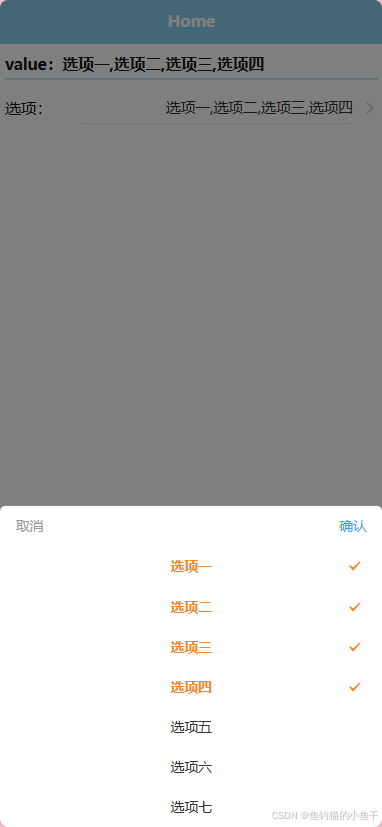 —
—
2. 使用方法
<template>
	<view class="content">
		<view class="chk_val">value:{{ value }}</view>
		<view class="option">
			<view class="label">选项:</view>
			<g-picker v-model="value" :columns="columns" @confirm="confirm"></g-picker>
		</view>
	</view>
</template>

<script>
	export default {
		data() {
			return {
				value: "",
				columns: [
					{ label: "选项一", value: "code1" },
					{ label: "选项二", value: "code2" },
					{ label: "选项三", value: "code3" },
					{ label: "选项四", value: "code4" },
					{ label: "选项五", value: "code5" },
					{ label: "选项六", value: "code6" },
					{ label: "选项七", value: "code7" },
				],
			}
		},
		methods: {
			confirm(data, value, label) {
				console.log(data, value, label)
			}
		}
	}
</script>
<style lang="scss" scoped>
	.option {
		display: flex;
		align-items: center;
		.label {
			width: 160rpx;
		}
	}
</style>
3. 使用说明
props:
- value (v-model):picker组件绑定值,所选值用逗号拼接
- columns: 数据源
- filter:数据显示格式化,label 为组件显示名称 name 字段(默认为label),value 为数据相对应的 code 字段(默认为value)
- disabled:是否禁用
- activedColor:选中后的颜色
- inputAlign:文本对齐方式,默认右对齐
- placeholder:默认提示
Events:
- confirm:点击确定按钮触发。(data, value, label) => {}
- data:选中的数据集合
- value:选中的数据 value 集合
- label:选中的数据 label 集合
4. 源码
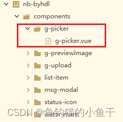
- 直接在 components 里面创建相同的文件夹和文件名,这样可以省去注册步骤直接引用。
- g-picker.vue (绑定值为 name 拼接字符串)
<template>
	<view class="g-picker">
		<view class="g-picker-value" @click.native="showPicker">
			<u-input v-model="value" disabled disabledColor="#fff" :inputAlign="inputAlign" :placeholder="placeholder" style="pointer-events: none">
			</u-input>
			<u-icon v-if="!disabled" name="arrow-right" color="#c0c4cc"></u-icon>
		</view>
		<u-popup :show="show" :round="6" mode="bottom">
			<view class="g-picker-con">
				<view class="g-picker-operate">
					<text @click="show = false">取消</text>
					<text @click="confirm">确认</text>
				</view>
				<view class="g-picker-list">
					<view class="g-picker-item" v-for="(col, inx) in columnsList" :key="inx"
						@click="checkItem(col, inx)">
						<view :class="['g-picker-item_label', col._check ? 'g-picker-item--actived' : '']"
							:style="{color: col._check ? activedColor : '#333'}">{{ col[filter.label] }}</view>
						<u-icon class="g-picker-item_icon" v-show="col._check" name="checkbox-mark"
							:color="activedColor"></u-icon>
					</view>
				</view>
			</view>
		</u-popup>
	</view>
</template>

<script>
	export default {
		model: {
			prop: 'value',
			event: 'change'
		},
		props: {
			// picker组件绑定值,默认 name 用,拼接
			value: {
				type: String,
				default: ""
			},
			// 数据源
			columns: {
				type: Array,
				default: () => {
					return []
				}
			},
			// 数据显示格式化
			filter: {
				type: Object,
				default: () => {
					return {
						label: 'label',
						value: 'value'
					}
				}
			},
			// 是否禁用
			disabled: {
				type: Boolean,
				default: false
			},
			// 选中后颜色
			activedColor: {
				type: String,
				default: "#F58621"
			},
			// 文本对齐方式
			inputAlign: {
				type: String,
				default: "right"
			},
			// 默认提示
			placeholder: {
				type: String,
				default: "请选择"
			}
		},
		data() {
			return {
				show: false,
				columnsList: [],
				value_chx: []
			}
		},
		watch: {
			value: {
				handler(n) {
					if (n) this.reShow();
				},
				immediate: true
			},
			columns: {
				handler(n) {
					if (n.length) {
						this.columnsList = n
						for (let val of this.columnsList) {
							this.$set(val, '_check', false)
						}
					}
				},
				immediate: true
			}
		},
		methods: {
			showPicker() {
				if (this.disabled) return
				this.show = true
			},
			reShow() {
				let data = this.value.split(",")
				setTimeout(() => {
					for (let val of this.columnsList) {
						if (data.includes(val[this.filter.label])) val._check = true
					}
				}, 100)
			},
			checkItem(col, inx) {
				col._check = !col._check
			},
			// close() {
			// 	this.show = false
			// 	this.$emit("close")
			// },
			confirm() {
				let value = [],
					label = []
				this.value_chx = this.columns.filter(v => v._check)
				for (let val of this.value_chx) {
					value.push(val[this.filter.value])
					label.push(val[this.filter.label])
				}
				this.show = false
				this.$emit('confirm', this.value_chx, value, label)
				this.$emit('change', label.join(","))
			}
		}
	}
</script>
<style lang="scss" scoped>
	.g-picker {
		width: 100%;
		.g-picker-value {
			display: flex;
		}

		.g-picker-con {
			color: #333;
			font-size: 28rpx;

			.g-picker-operate {
				display: flex;
				align-items: center;
				justify-content: space-between;
				height: 80rpx;
				padding: 0 32rpx;

				text {
					color: #999;

					&:last-child {
						color: #3c9cff;
					}
				}
			}

			.g-picker-list {
				min-height: 30vh;
				max-height: 60vh;
				overflow-y: scroll;

				.g-picker-item {
					position: relative;
					width: 100%;
					height: 80rpx;

					.g-picker-item_label {
						width: 66%;
						margin: 0 auto;
						text-align: center;
						line-height: 80rpx;
						white-space: nowrap;
						text-overflow: ellipsis;
						overflow: hidden;
					}

					.g-picker-item--actived {
						font-weight: 600;
					}

					.g-picker-item_icon {
						position: absolute;
						top: 50%;
						right: 40rpx;
						transform: translateY(-50%);
					}
				}
			}
		}
	}
</style>
- g-picker.vue (绑定值为 code 拼接字符串)
<template>
	<view class="g-picker">
		<view class="g-picker-value" @click="showPicker">
			<u-input v-model="val" disabled disabledColor="#fff" :inputAlign="inputAlign" border="none"
				:placeholder="placeholder" style="pointer-events:none">
			</u-input>
			<u-icon v-if="!disabled" name="arrow-right" color="#c0c4cc"></u-icon>
		</view>
		<u-popup :show="show" :round="6" mode="bottom">
			<view class="g-picker-con">
				<view class="g-picker-operate">
					<text @click="show = false">取消</text>
					<text @click="confirm">确认</text>
				</view>
				<view class="g-picker-list">
					<view class="g-picker-item" v-for="(col, inx) in columnsList" :key="inx"
						@click="checkItem(col, inx)">
						<view :class="['g-picker-item_label', col._check ? 'g-picker-item--actived' : '']"
							:style="{color: col._check ? activedColor : '#333'}">{{ col[filter.label] }}</view>
						<u-icon class="g-picker-item_icon" v-show="col._check" name="checkbox-mark"
							:color="activedColor"></u-icon>
					</view>
				</view>
			</view>
		</u-popup>
	</view>
</template>

<script>
	export default {
		// model: {
		// 	prop: 'value',
		// 	event: 'change'
		// },
		props: {
			// picker组件绑定值,默认 name 用,拼接
			value: {
				type: String,
				default: ""
			},
			// 数据源
			columns: {
				type: Array,
				default: () => {
					return []
				}
			},
			// 数据显示格式化
			filter: {
				type: Object,
				default: () => {
					return {
						label: 'label',
						value: 'value'
					}
				}
			},
			// 是否禁用
			disabled: {
				type: Boolean,
				default: false
			},
			// 选中后颜色
			activedColor: {
				type: String,
				default: "#F58621"
			},
			// 文本对齐方式
			inputAlign: {
				type: String,
				default: "right"
			},
			// 默认提示
			placeholder: {
				type: String,
				default: "请选择"
			}
		},
		data() {
			return {
				show: false,
				val: "",
				columnsList: [],
				value_chx: []
			}
		},
		watch: {
			value: {
				handler(n) {
					if (n) this.reShow();
				},
				immediate: true
			},
			columns: {
				handler(n) {
					if (n.length) {
						this.columnsList = n
						for (let val of this.columnsList) {
							this.$set(val, '_check', false)
						}
					}
				},
				immediate: true
			}
		},
		methods: {
			showPicker() {
				if (this.disabled) return
				this.show = true
			},
			reShow() {
				let data = this.value.split(",")
				setTimeout(() => {
					let ary = []
					for (let val of this.columnsList) {
						if (data.includes(val[this.filter.value])) {
							val._check = true
							ary.push(val[this.filter.label])
						}
					}
					this.val = ary.join(",")
				}, 100)
			},
			checkItem(col, inx) {
				col._check = !col._check
			},
			confirm() {
				let value = [],
					label = []
				this.value_chx = this.columns.filter(v => v._check)
				for (let val of this.value_chx) {
					value.push(val[this.filter.value])
					label.push(val[this.filter.label])
				}
				this.show = false
				this.val = label.join(",")
				this.$emit('input', value.join(","))
				this.$emit('confirm', this.value_chx, value, label)
			}
		}
	}
</script>
<style lang="scss" scoped>
	.g-picker {
		width: 100%;
		.g-picker-value {
			display: flex;
		}

		.g-picker-con {
			color: #333;
			font-size: 28rpx;

			.g-picker-operate {
				display: flex;
				align-items: center;
				justify-content: space-between;
				height: 80rpx;
				padding: 0 32rpx;

				text {
					color: #999;

					&:last-child {
						color: #3c9cff;
					}
				}
			}

			.g-picker-list {
				min-height: 30vh;
				max-height: 60vh;
				overflow-y: scroll;

				.g-picker-item {
					position: relative;
					width: 100%;
					height: 80rpx;

					.g-picker-item_label {
						width: 66%;
						margin: 0 auto;
						text-align: center;
						line-height: 80rpx;
						white-space: nowrap;
						text-overflow: ellipsis;
						overflow: hidden;
					}

					.g-picker-item--actived {
						font-weight: 600;
					}

					.g-picker-item_icon {
						position: absolute;
						top: 50%;
						right: 40rpx;
						transform: translateY(-50%);
					}
				}
			}
		}
	}
</style>
封装的比较简单,够我目前使用,大家可以根据自己的需求修改。


 扫一扫
扫一扫


 1107
1107

 被折叠的 条评论
为什么被折叠?
被折叠的 条评论
为什么被折叠?
 到【灌水乐园】发言


