<!DOCTYPE html>
<html lang="en">
<head>
    <meta charset="UTF-8">
    <meta http-equiv="X-UA-Compatible" content="IE=edge">
    <meta name="viewport" content="width=device-width, initial-scale=1.0">
    <title>利用2D旋转rotate设置</title>
    <style>
        div {
            overflow:hidden;
            width: 200px;
            height: 200px;
            border: 1px solid hotpink;
            margin: 10px;
            float: left;
        }

        div::before {
            content: "心愿";
            display: block;
            width: 100%;
            height: 100%;
            background-color: hotpink;
            transform: rotate(180deg);
            transform-origin: left bottom;
            transition:  all .25s;
        }

        div:hover::before {
            transform: rotate(0deg);
        }
    </style>
</head>
<body>
    <div></div>
    <div></div>
    <div></div>
</body>
</html>
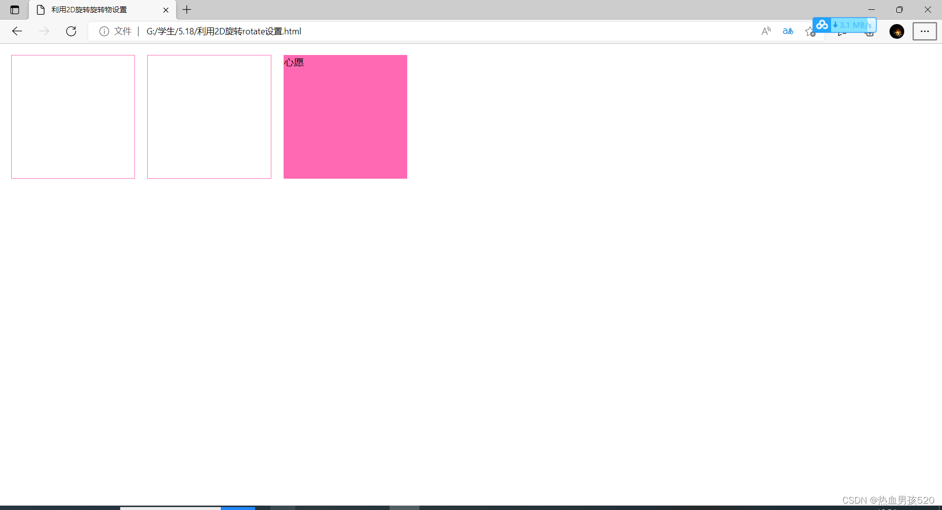
运行结果为:


 被折叠的 条评论
为什么被折叠?
被折叠的 条评论
为什么被折叠?
 到【灌水乐园】发言


