


效果图:
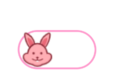
关闭:
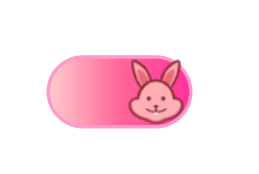
打开:
<Switch
        android:id="@+id/switch1"
        android:layout_width="wrap_content"
        android:layout_height="wrap_content"
        android:checked="true"
        android:track="@drawable/selector"
        android:thumb="@drawable/rbzhong"
        />
selector.xml
<?xml version="1.0" encoding="utf-8"?>
<selector xmlns:android="http://schemas.android.com/apk/res/android">
  <item android:drawable="@drawable/shape1" android:state_checked="true"/>
  <item android:drawable="@drawable/shape2" android:state_checked="false"/>

</selector>
shape1.xml
<?xml version="1.0" encoding="utf-8"?>
<shape xmlns:android="http://schemas.android.com/apk/res/android"
    android:shape="rectangle">
    <corners android:radius="45dp"/>
    <stroke android:width="2dp" android:color="#ff99cc"/>
    <gradient android:startColor="#ffcccc" android:centerColor="#ff6699" android:endColor="#ff3399"></gradient>
</shape>
shape2.xml
<?xml version="1.0" encoding="utf-8"?>
<shape xmlns:android="http://schemas.android.com/apk/res/android"
    android:shape="rectangle">
    <solid android:color="@color/white"/>
      <corners android:radius="45dp"/>
    <stroke android:width="2dp" android:color="#ff99cc"/>
</shape>
switch的属性
| XML 属性 | |
|---|---|
| android:switchMinWidth | 开关组件的最小宽度。 |
| android:switchPadding | 开关和标题文本之间的最小间距。 |
| android:switchTextAppearance | 文本切换拇指上显示的文本的外观样式。 |
| android:textOff | 交换机处于未选中/“关闭”状态时使用的文本。 |
| android:textOn | 交换机处于选中/“打开”状态时要使用的文本。 |
| android:thumb | 可绘制用作来回切换的“拇指”。 |
| android:thumbTextPadding | 切换拇指内文本两侧的填充量。 |
| android:track | 可绘制用作切换拇指在其中滑动的“轨道”。 |
事件监听
        val switch1:Switch=findViewById(R.id.switch1)
        switch1.setOnCheckedChangeListener { buttonView, isChecked ->
            when(isChecked){
                true->{Toast.makeText(this,"true",Toast.LENGTH_SHORT).show()}
                false->{Toast.makeText(this,"false",Toast.LENGTH_SHORT).show()}
            }
        }


 3万+
3万+


 被折叠的 条评论
为什么被折叠?
被折叠的 条评论
为什么被折叠?
 到【灌水乐园】发言


