


2栏布局 右侧自适应
基本代码
<template>
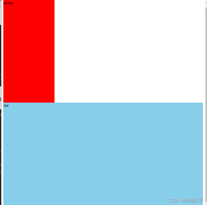
<div class="left">www</div>
<div class="right">rer</div>
</template>
<script setup></script>
<style lang="scss" scoped>
.left {
width: 200px;
height: 400px;
background-color: red;
}
.right {
height: 400px;
background-color: skyblue;
}
</style>
初始效果:
法一:flex布局
<template>
<div class="flex">
<!-- 我这里使用了unoCSS插件,所以 class="flex"等价于display:flex -->
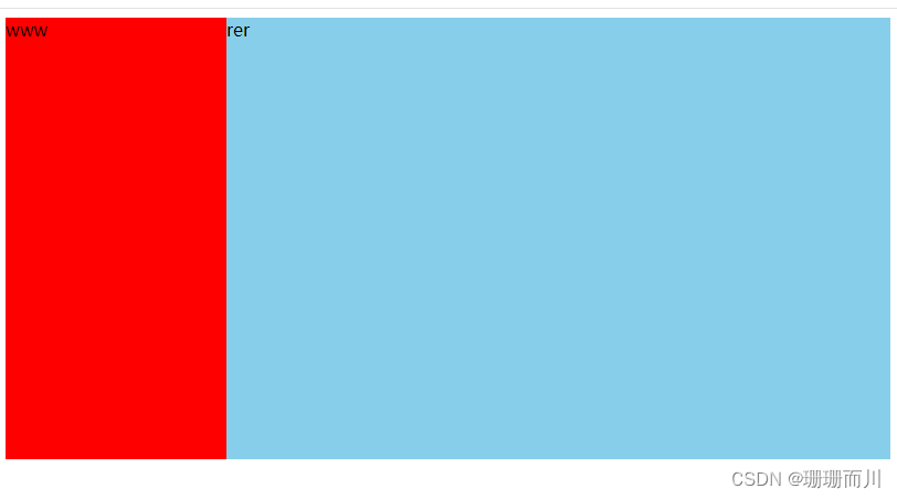
<div class="left">www</div>
<div class="right">rer</div>
</div>
</template>
<script setup></script>
<style lang="scss" scoped>
.left {
width: 200px;
height: 400px;
background-color: red;
}
.right {
flex: 1;
height: 400px;
background-color: skyblue;
}
</style>
实现效果
法2:grid布局
1. auto
<template>
  <div class="father">
    <div class="left">www</div>
    <div class="right">rer</div>
  </div>
</template>

<script setup></script>
<style lang="scss" scoped>
  .father {
    --left-width: 200px;

    display: grid;
    grid-template-columns: var(--left-width) auto;
    .left {
      height: 400px;
      background-color: red;
    }
    .right {
      height: 400px;
      background-color: skyblue;
    }
  }
</style>
2. fr
  .father {
    --left-width: 200px;

    display: grid;
    grid-template-columns: var(--left-width) 1fr;//!!!!!!!
    .left {
      height: 400px;
      background-color: red;
    }
    .right {
      height: 400px;
      background-color: skyblue;
    }
  }
法3: table
<template>
  <div class="father">
    <div class="son1">Son111</div>
    <div class="son2">Son222</div>
  </div>
</template>

<script setup></script>
<style lang="scss" scoped>
  .father {
    --son1-width: 50px;
    --son3-width: 150px;

    display: table;
    width: 100%;
    height: 200px;
    border: 1px solid red;
    .son1 {
      display: table-cell;
      width: var(--son1-width);
      background-color: purple;
    }
    .son2 {
      display: table-cell;
      background-color: orange;
    }
  }
</style>
法4:float
只有左侧float:left ,右侧ml
<template>
  <div class="left">www</div>
  <div class="right">rer</div>
</template>

<script setup></script>
<style lang="scss" scoped>
  .left {
    --left-width: 200px;

    float: left;
    width: var(--left-width);
    height: 400px;
    background-color: red;
  }
  .right {
    height: 400px;
    margin-left: var(--left-width);
    background-color: skyblue;
  }
</style>
2个都float:left 右侧需要计算宽度
<template>
  <div class="father">
    <div class="left">www</div>
    <div class="right">rer</div>
  </div>
</template>

<script setup></script>
<style lang="scss" scoped>
  .father {
    --left-width: 200px;
    .left {
      float: left;
      width: var(--left-width);
      height: 400px;
      background-color: red;
    }
    .right {
      float: left;
      width: calc(100% - var(--left-width));
      height: 400px;
      background-color: skyblue;
    }
  }
</style>
法5:position:absolute
左侧position:absolute+右侧ml
<template>
  <div class="father">
    <div class="left">www</div>
    <div class="right">rer</div>
  </div>
</template>

<script setup></script>
<style lang="scss" scoped>
  .father {
    --left-width: 200px;
    .left {
      position: absolute;
      width: var(--left-width);
      height: 400px;
      background-color: red;
    }
    .right {
      height: 400px;
      margin-left: var(--left-width);
      background-color: skyblue;
    }
  }
</style>
2个都absolute,右侧计算宽度+left:200px
<template>
  <div class="father">
    <div class="left">www</div>
    <div class="right">rer</div>
  </div>
</template>

<script setup></script>
<style lang="scss" scoped>
  .father {
    --left-width: 200px;

    position: relative;
    .left {
      position: absolute;
      width: var(--left-width);
      height: 400px;
      background-color: red;
    }
    .right {
      position: absolute;
      left: var(--left-width);
      width: calc(100% - var(--left-width));
      height: 400px;
      background-color: skyblue;
    }
  }
</style>
右侧absolute + top:0 + left:200px + 宽度计算出来
法6:position:fixed
<template>
  <div class="father">
    <div class="left">www</div>
    <div class="right">rer</div>
  </div>
</template>

<script setup></script>
<style lang="scss" scoped>
  .father {
    --left-width: 200px;
    .left {
      position: absolute;
      width: var(--left-width);
      height: 400px;
      background-color: red;
    }
    .right {
      height: 400px;
      margin-left: var(--left-width);
      background-color: skyblue;
    }
  }
</style>
3栏布局 中间自适应
法1:grid布局
<template>
<div class="father">
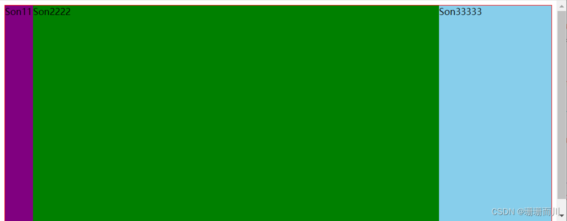
<div class="son">Son111</div>
<div class="son">Son2222</div>
<div class="son">Son33333</div>
</div>
</template>
<script setup></script>
<style lang="scss" scoped>
.father {
display: grid;
grid-template-columns: 50px auto 200px;
// grid-template-columns: 50px 1fr 200px;
height: 400px;
background-color: pink;
border: 1px solid red;
.son {
&:nth-child(1) {
background-color: purple;
}
&:nth-child(2) {
background-color: green;
}
&:nth-child(3) {
background-color: skyblue;
}
}
}
</style>
效果:
法2:flex布局
<template>
  <div class="father">
    <div class="son">Son111</div>
    <div class="son">Son2222</div>
    <div class="son">Son33333</div>
  </div>
</template>

<script setup></script>
<style lang="scss" scoped>
  .father {
    display: flex;

    --son1-width: 50px;
    --son3-width: 200px;

    height: 400px;
    background-color: pink;
    border: 1px solid red;
    .son {
      &:nth-child(1) {
        width: var(--son1-width);
        background-color: purple;
      }
      &:nth-child(2) {
        flex: 1;
        background-color: green;
      }
      &:nth-child(3) {
        width: var(--son3-width);
        background-color: skyblue;
      }
    }
  }
</style>
法3:table布局
<template>
  <div class="father">
    <div class="son">Son111</div>
    <div class="son">Son2222</div>
    <div class="son">Son33333</div>
  </div>
</template>

<script setup></script>
<style lang="scss" scoped>
  .father {
    --son1-width: 50px;
    --son3-width: 200px;

    display: table;
    width: 100%;
    height: 400px;
    border: 1px solid red;
    .son {
      &:nth-child(1) {
        display: table-cell;
        width: var(--son1-width);
        background-color: purple;
      }
      &:nth-child(2) {
        display: table-cell;
        background-color: green;
      }
      &:nth-child(3) {
        display: table-cell;
        width: var(--son3-width);
        background-color: skyblue;
      }
    }
  }
</style>
法4:float
只有2边float,调换元素顺序1float:left、3float:right、2不float+ml+mr
<template>
  <div class="father">
    <div class="son1">Son111</div>
    <div class="son3">Son33333</div>
    <div class="son2">Son2222</div>
  </div>
</template>

<script setup></script>
<style lang="scss" scoped>
  .father {
    --son1-width: 50px;
    --son3-width: 200px;


    width: 100%;
    height: 400px;
    border: 1px solid red;
    .son1 {
      float: left;
      width: var(--son1-width);
      background-color: purple;
    }
    .son2 {
      margin-right: var(--son3-width);
      margin-left: var(--son1-width);
      background-color: green;
    }
    .son3 {
      float: right;
      width: var(--son3-width);
      background-color: skyblue;
    }
  }
</style>
3个都float:left 但是中间的要计算出宽度
<template>
  <div class="father">
    <div class="son">Son111</div>
    <div class="son">Son2222</div>
    <div class="son">Son33333</div>
  </div>
</template>

<script setup></script>
<style lang="scss" scoped>
  .father {
    --son1-width: 50px;
    --son3-width: 200px;

    width: 100%;
    height: 400px;
    border: 1px solid red;
    .son {
      &:nth-child(1) {
        float: left;
        width: var(--son1-width);
        background-color: purple;
      }
      &:nth-child(2) {
        float: left;
        width: calc(100% - var(--son1-width) - var(--son3-width));
        background-color: green;
      }
      &:nth-child(3) {
        float: left; //  float: right;也可以
        width: var(--son3-width);
        background-color: skyblue;
      }
    }
  }
</style>
法5:position:absolute
只有2边absolute,1absolute+2mr+ml+3ab right:0
<template>
  <div class="father">
    <div class="son1">Son111</div>
    <div class="son2">Son2222</div>
    <div class="son3">Son33333</div>
  </div>
</template>

<script setup></script>
<style lang="scss" scoped>
  .father {
    --son1-width: 50px;
    --son3-width: 200px;

    position: relative;
    width: 100%;
    height: 400px;
    border: 1px solid red;
    .son1 {
      position: absolute;
      width: var(--son1-width);
      background-color: purple;
    }
    .son2 {
      position: absolute;
      right: 0;
      width: var(--son3-width);
      background-color: skyblue;
    }
    .son3 {
      margin-right: var(--son3-width);
      margin-left: var(--son1-width);
      background-color: green;
    }
  }
</style>
3个都absolute 但是要计算中间的宽度+left
<template>
  <div class="father">
    <div class="son">son111111</div>
    <div class="son">son22222</div>
    <div class="son">son33333</div>
  </div>
</template>

<script setup>
  import { ref, reactive } from 'vue'
</script>
<style lang="scss" scoped>
  .father {
    --son1-width: 50px;
    --son3-width: 150px;

    // position: relative;
    .son:nth-child(1) {
      position: absolute;
      left: 0;
      width: var(--son1-width);
      background-color: pink;
    }
    .son:nth-child(2) {
      position: absolute;
      left: var(--son1-width);
      width: calc(100% - var(--son1-width) - var(--son3-width));
      background-color: red;
    }
    .son:nth-child(3) {
      position: absolute;
      right: 0;
      width: var(--son3-width);
      background-color: skyblue;
    }
  }
</style>
法6:position:fixed
同上
<template>
  <div class="father">
    <div class="son1">Son111</div>
    <div class="son3">Son33333</div>
    <div class="son2">Son2222</div>
  </div>

  <p>333333333333333333</p>
  <p>asdfasdfasd</p>
</template>

<script setup></script>
<style lang="scss" scoped>
  .father {
    --son1-width: 50px;
    --son3-width: 200px;

    position: relative;
    height: 200px;
    border: 1px solid red;
    .son1 {
      position: fixed;
      width: var(--son1-width);
      background-color: purple;
    }
    .son2 {
      margin-right: var(--son3-width);
      margin-left: var(--son1-width);
      background-color: green;
    }
    .son3 {
      position: fixed;
      right: 0;
      width: var(--son3-width);
      background-color: skyblue;
    }
  }
</style>
<template>
  <div class="father">
    <div class="son1">Son111</div>
    <div class="son2">Son2222</div>
    <div class="son3">Son33333</div>
  </div>

  <p>333333333333333333</p>
  <p>asdfasdfasd</p>
</template>

<script setup></script>
<style lang="scss" scoped>
  .father {
    --son1-width: 50px;
    --son3-width: 200px;

    position: relative;
    height: 20px;
    .son1 {
      position: fixed;
      width: var(--son1-width);
      background-color: purple;
    }
    .son2 {
      position: fixed;
      width: calc(100% - var(--son1-width) - var(--son3-width));
      margin-left: var(--son1-width);
      background-color: green;
    }
    .son3 {
      position: fixed;
      right: 0;
      width: var(--son3-width);
      background-color: skyblue;
    }
  }
</style>
法7:
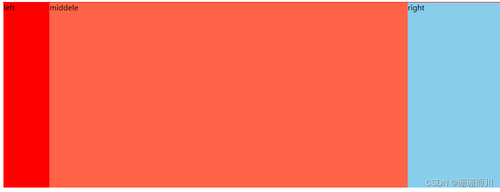
圣杯布局
    <div class="father">
      <div class="middle">middele</div>
      <div class="left">left</div>
      <div class="right">rer</div>
    </div>
  </body>

  <style lang="scss">
    .father {
      --left-width: 200px;
      --right-width: 100px;
      padding-left: var(--left-width);
      padding-right: var(--right-width);
      border: 1px solid red;
      width: 800px;

      .left {
        position: relative;
        left: calc(var(--left-width) * -1);

        float: left;
        margin-left: -100%;

        width: var(--left-width);
        height: 400px;
        background-color: red;
        overflow: hidden;
      }

      .middle {
        float: left;
        width: 100%;
        background-color: tomato;
      }
      .right {
        position: relative;
        left: var(--right-width);

        float: right;
        margin-left: calc(var(--right-width) * -1);

        width: var(--right-width);
        height: 400px;
        background-color: skyblue;
      }
    }
  </style>
法8:双飞翼布局:浮动和外边距负值
中间盒子放开头,并且要设置box-sizing:border-box;,设置宽度100%,float:left,里面的子盒子设置pl pr为对应方向的值
左右2盒子都设置float:left,和各自的宽度;左侧盒子设置 margin-left: -100%;,右侧盒子设置margin-left: 自身的宽度;
   <body>
    <div class="father">
      <div class="middle">middele</div>

      <div class="left">left</div>

      <div class="right">right</div>
    </div>
  </body>

  <style lang="scss">
    .father {
      --left-width: 100px;
      --right-width: 200px;

      border: 1px solid red;
      width: 100%;

      .left {
        float: left;
        margin-left: -100%;

        width: var(--left-width);
        height: 400px;
        background-color: red;
      }

      .middle {
        box-sizing: border-box; /* 这个不可以去掉 */
        float: left;
        width: 100%;
        background: yellow;
        padding-left: var(--left-width);
        padding-right: var(--right-width);
        background-color: tomato;
        height: 400px;
      }

      .right {
        float: left;
        margin-left: -200px;
        width: var(--right-width);
        height: 400px;
        background-color: skyblue;
      }
    }
  </style>
法9
双飞翼布局:浮动和外边距负值
中间盒子放开头,并且要用一个父盒子包裹它,这个父盒子设置宽度100%,float:left,里面的子盒子设置ml mr为对应方向的值
左右2盒子都设置float:left,和各自的宽度;左侧盒子设置 margin-left: -100%;,右侧盒子设置margin-left: 自身的宽度;
  <body>
    <div class="father">
      <div class="wrap"><div class="middle">middele</div></div>

      <div class="left">left</div>

      <div class="right">right</div>
    </div>
  </body>

  <style lang="scss">
    .father {
      --left-width: 100px;
      --right-width: 200px;

      border: 1px solid red;
      width: 100%;
      /* overflow: hidden; */
      .left {
        float: left;
        margin-left: -100%;

        width: var(--left-width);
        height: 400px;
        background-color: red;
      }

      .wrap {
        float: left;
        width: 100%;
        background: yellow;
      }
      .middle {
        margin-left: var(--left-width);
        margin-right: var(--right-width);
        background-color: tomato;
        height: 400px;
      }

      .right {
        float: left;
        margin-left: -200px;
        width: var(--right-width);
        height: 400px;
        background-color: skyblue;
      }
    }
  </style>


 750
750


 被折叠的 条评论
为什么被折叠?
被折叠的 条评论
为什么被折叠?
 到【灌水乐园】发言


