


1.1border-radius 属性
border-radius
属性,可以给任何元素制作
“
圆角
”
。
div {
width: 200px;
height: 150px;
padding: 20px;
}
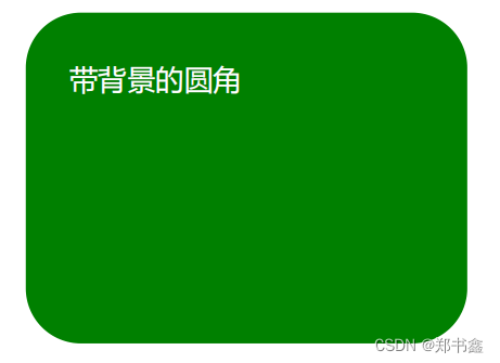
.radius1 {
color: white;
background: green;
border-radius: 25px;
}
.radius2 {
border-radius: 25px;
border: 2px solid green;
}
.radius3 {
border-radius: 25px;
background: url('img/paper.gif');
background-position: left top;
background-repeat: repeat;
}效果:

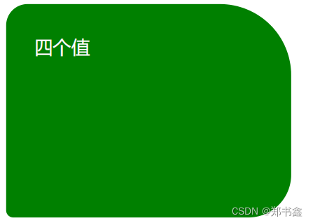
1.2指定每个圆角
CSS
拥有用于为元素的每个角指定圆角的属性:
- border-radius: 15px 50px 30px 5px; :左上角为15px,右上角为50px,右下角为30px,左下角为5px。
- border-radius: 15px 50px 30px; :左上角为15px,右上角和左下角为50px,右下角为30px。
- border-radius: 15px 50px; :左上角和右下角为15px,右上角和左下角为50px。
- border-radius: 15px; :四个角都是15px。
.radius4 {
color: white;
background: green;
border-radius: 15px 50px 30px 5px;
}
.radius5 {
color: white;
background: green;
border-radius: 15px 50px 30px;
}
.radius6 {
color: white;
background: green;
border-radius: 15px 50px;
}
.radius7 {
color: white;
background: green;
border-radius: 15px;
}
效果:

1.3椭圆边角
.radius8 {
color: white;
background: green;
border-radius: 50px/15px;
}
.radius10 {
color: white;
background: green;
border-radius: 50%;
}
效果:


1.4圆形边角
我们经常需要使用圆角来显示用户头像:

.avatar {
width: 200px;
height: 200px;
display: inline-block;
border-radius: 50%;
background: url('img/avatar.jpg');
background-size: contain;
}
效果:


 290
290


 被折叠的 条评论
为什么被折叠?
被折叠的 条评论
为什么被折叠?
 到【灌水乐园】发言


