


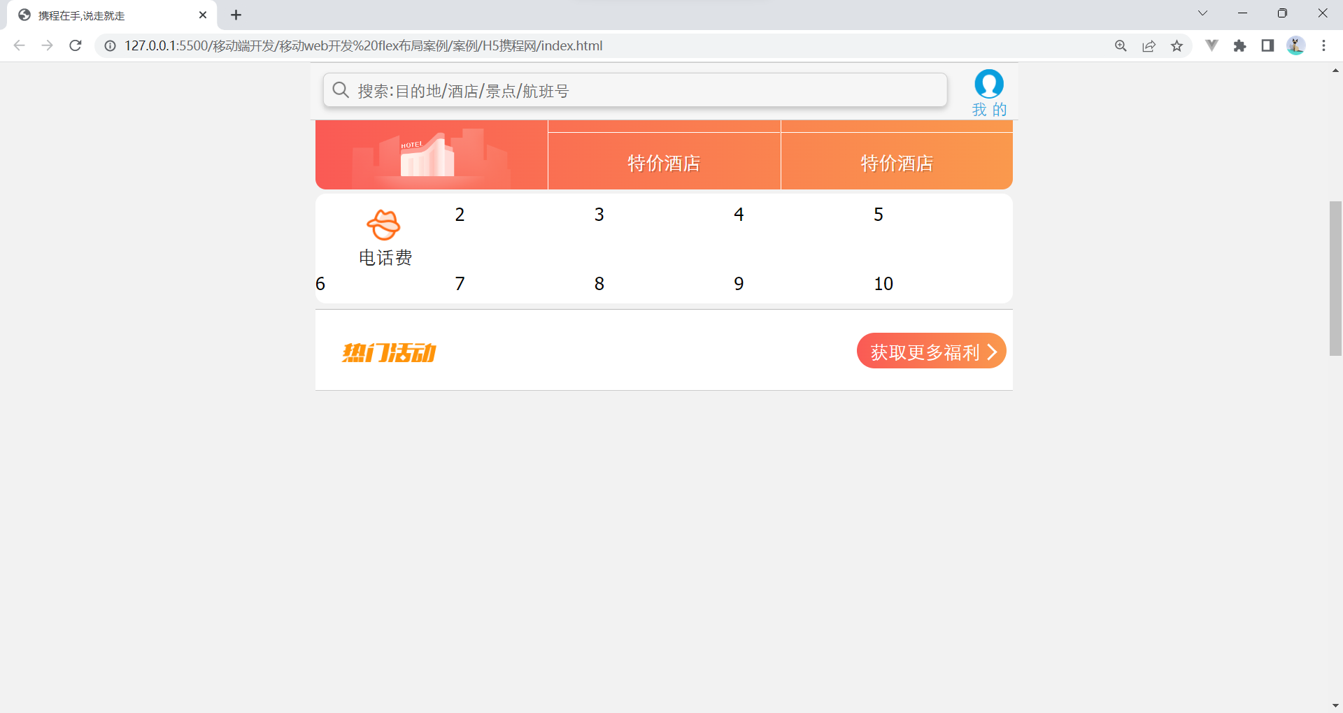
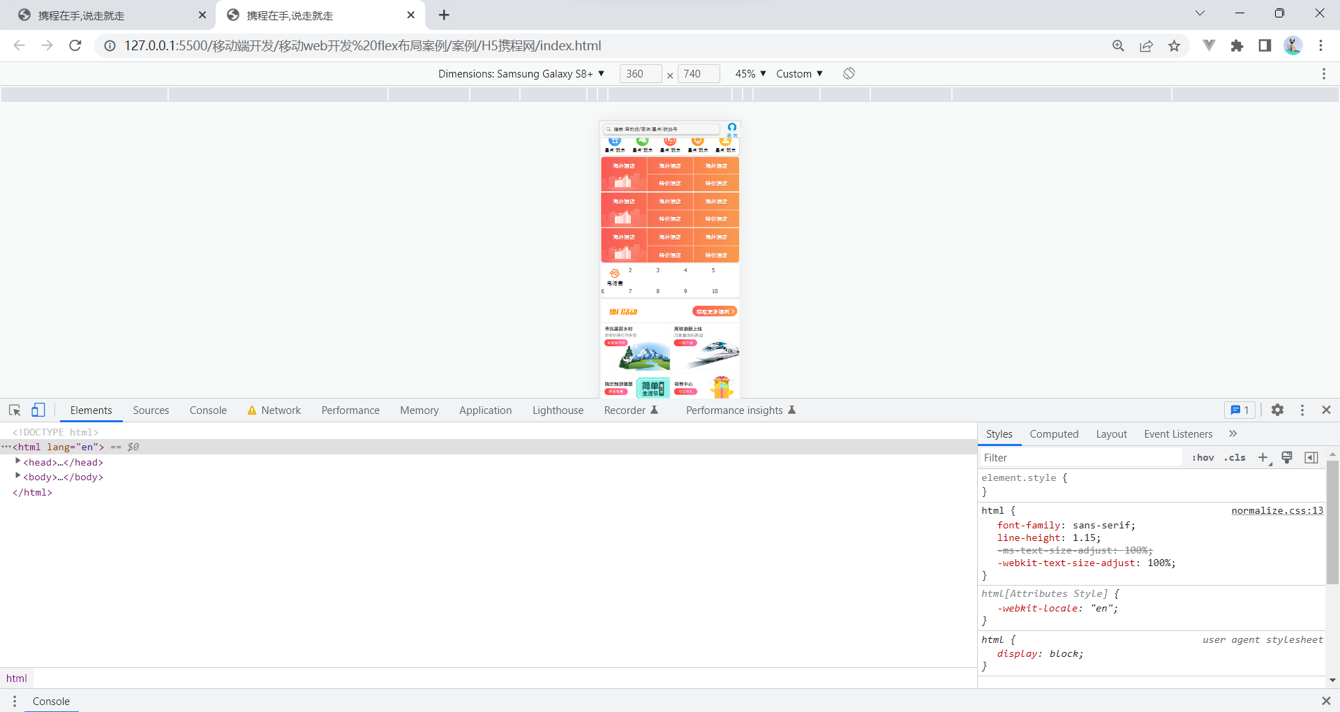
案例:携程网移动端首页
访问地址:携程旅行-酒店预订,机票预订查询,旅游度假,商旅管理-携程无线官网 (ctrip.com)

1. 技术选型
方案:我们采取单独制作移动页面方案
技术:布局采取flex布局
2. 搭建相关文件夹结构

3. 设置视口标签以及引入初始化样式
<meta name="viewport" content="width=device-width, user-scalable=no,
initial-scale=1.0, maximum-scale=1.0, minimum-scale=1.0">
 <link rel="stylesheet" href="css/normalize.css">
 <link rel="stylesheet" href="css/index.css">
4. 常用初始化样式
body {
max-width: 540px;
min-width: 320px;
margin: 0 auto;
font: normal 14px/1.5 Tahoma,"Lucida Grande",Verdana,"Microsoft
Yahei",STXihei,hei;
color: #000;
background: #f2f2f2;
overflow-x: hidden;
-webkit-tap-highlight-color: transparent;
}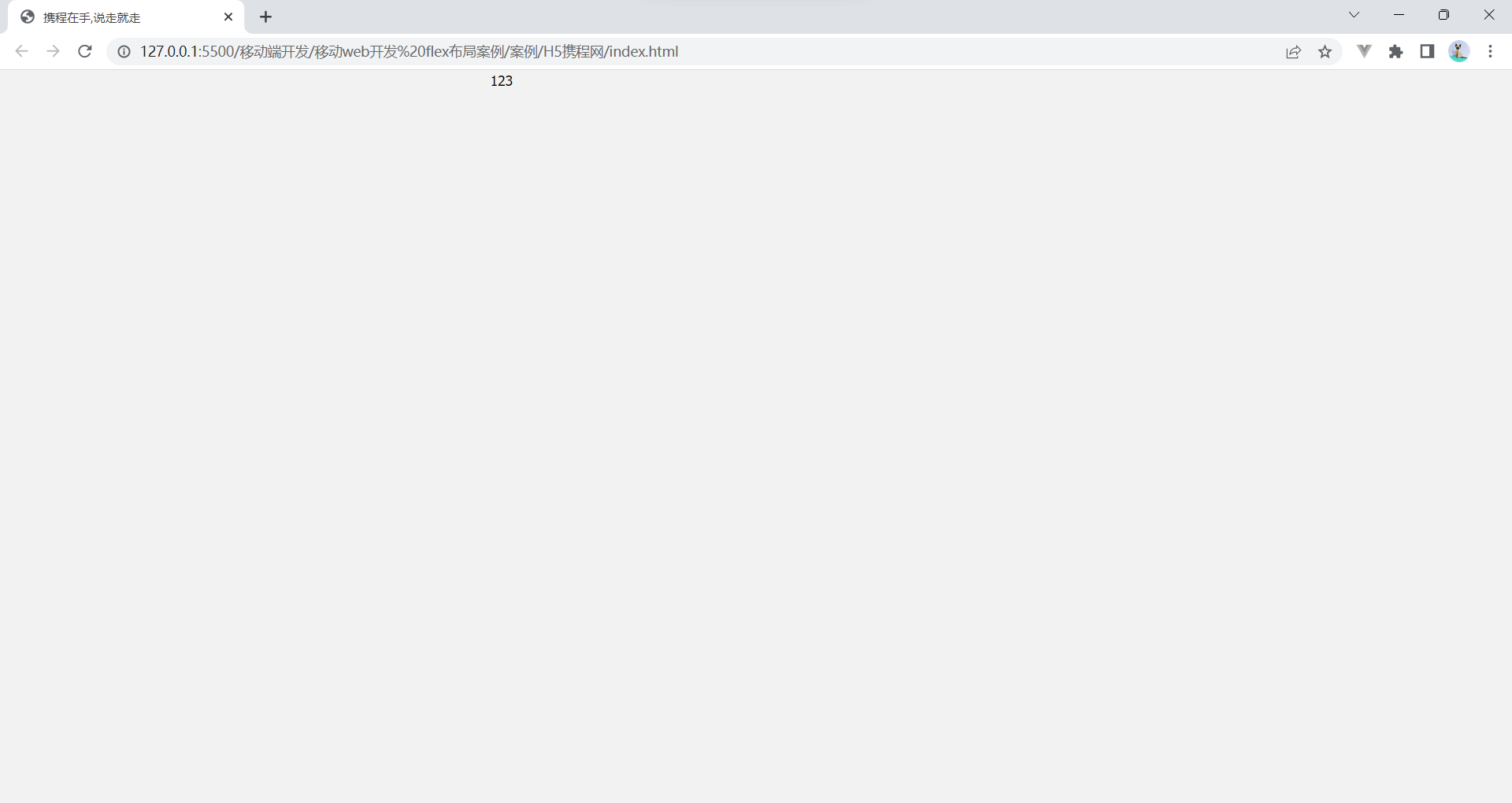
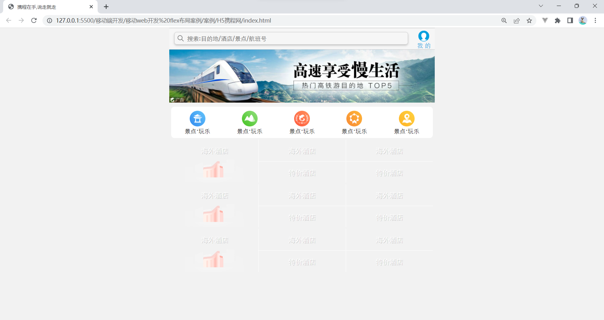
 搜索外观完成
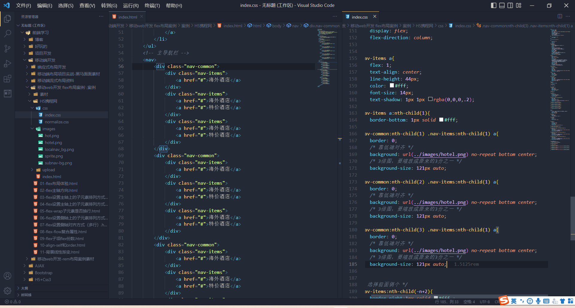
结构伪类做:二倍图
做法:1.打开PS缩放一半 2.量出需要的图标,在css中设置top和left负值 3.css中将缩放后的大小重新给就是background-size
焦点图
5. 常见模块命名


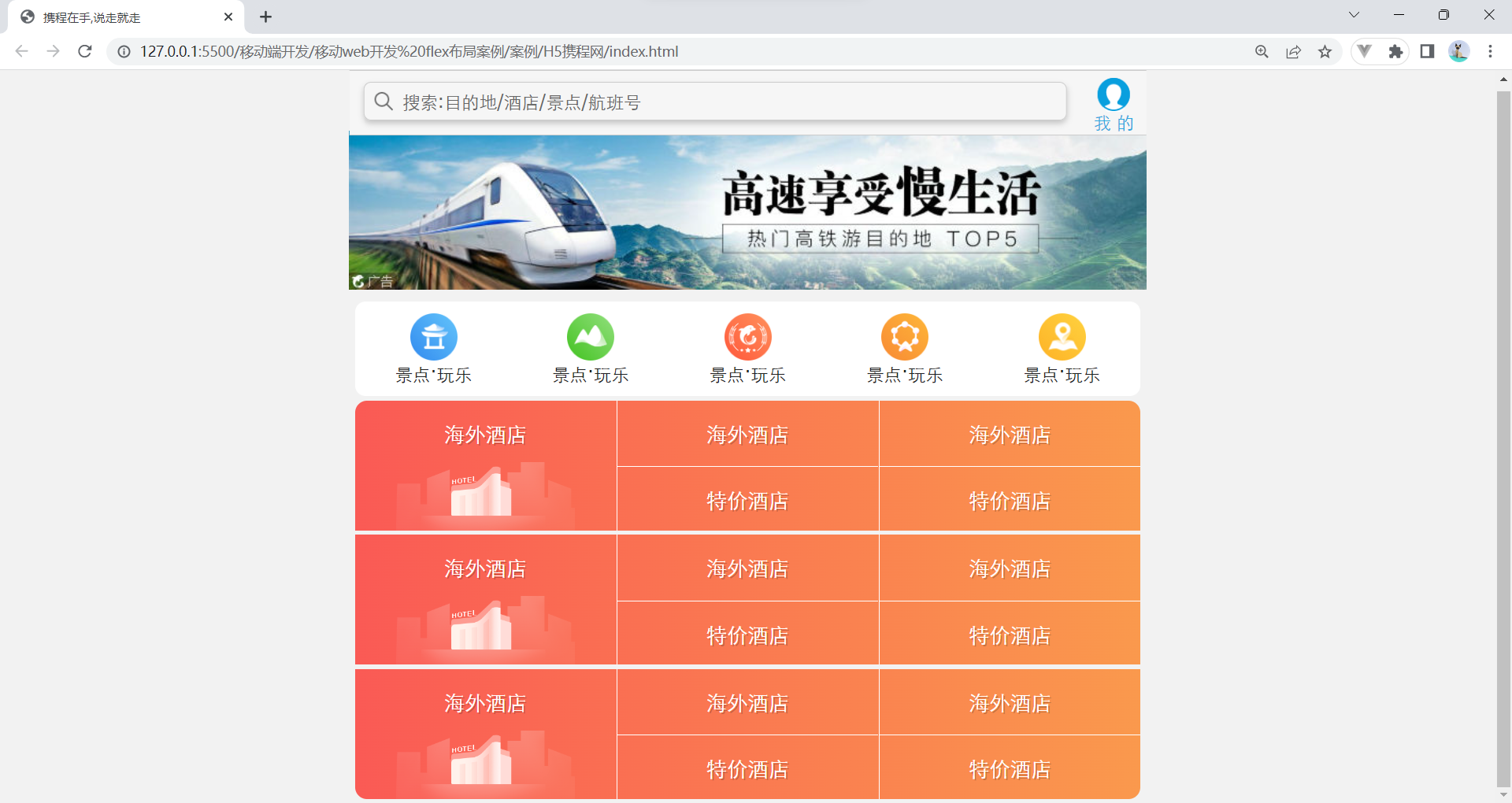
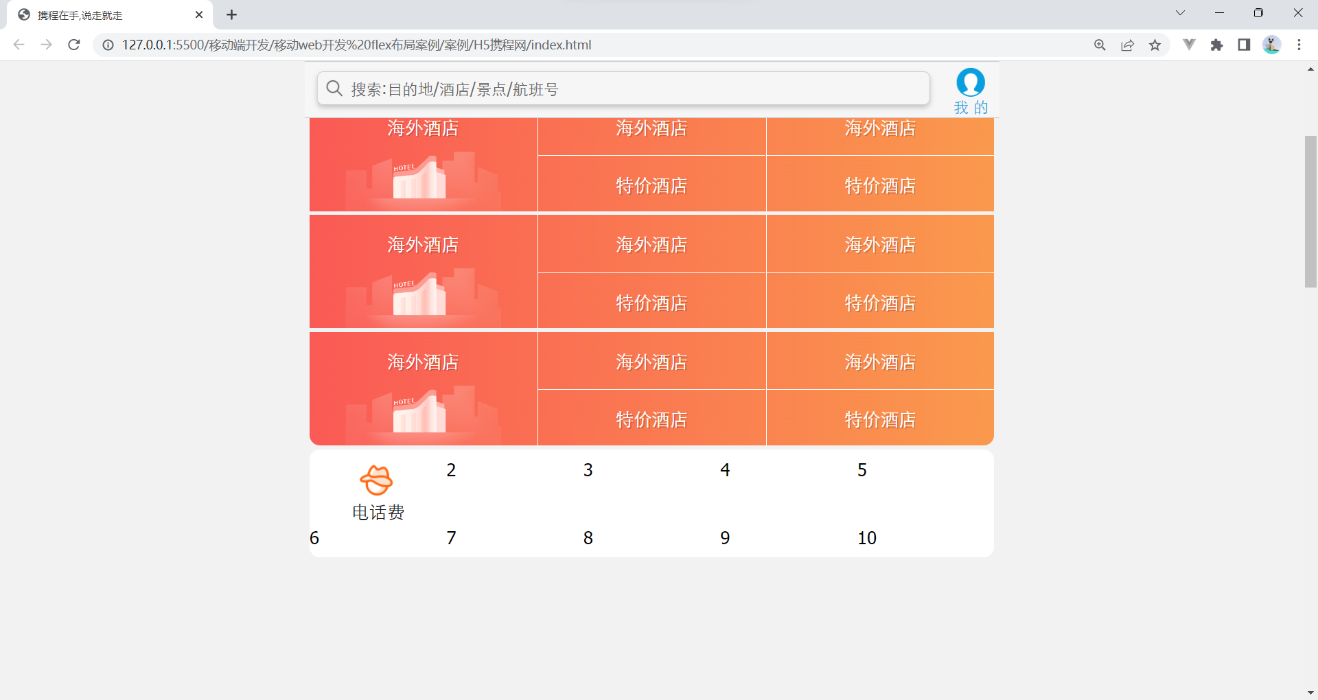
6. 常见flex布局思路

 要设置为主轴为y轴,侧轴居中

 利用属性选择器更换背景图片

 第一个a要取消下边框

7. 背景线性渐变

语法1:
background: linear-gradient(起始方向, 颜色1, 颜色2, ...);
background: -webkit-linear-gradient(left, red , blue);
background: -webkit-linear-gradient(left top, red , blue);
背景渐变必须添加浏览器私有前缀
起始方向可以是: 方位名词 或者 度数 , 如果省略默认就是top
原理跟上面是一样的

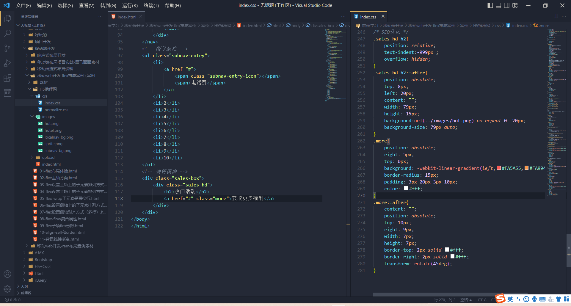
热门活动模块制作
 更多模块制作
sales-bd模块制作
完整代码
<!DOCTYPE html>
<html lang="en">
<head>
<meta charset="UTF-8">
<meta http-equiv="X-UA-Compatible" content="IE=edge">
<meta name="viewport" content="width=device-width, initial-scale=1.0">
<link rel="stylesheet" href="css/normalize.css">
<link rel="stylesheet" href="css/index.css">
<title>携程在手,说走就走</title>
</head>
<body>
<!-- 顶部搜索 -->
<div class="search-index">
<div class="search">搜索:目的地/酒店/景点/航班号</div>
</div>
<!-- 焦点图模块 -->
<div class="focus">
<img src="upload/focus.jpg" alt="">
</div>
<!-- 局部导航栏 -->
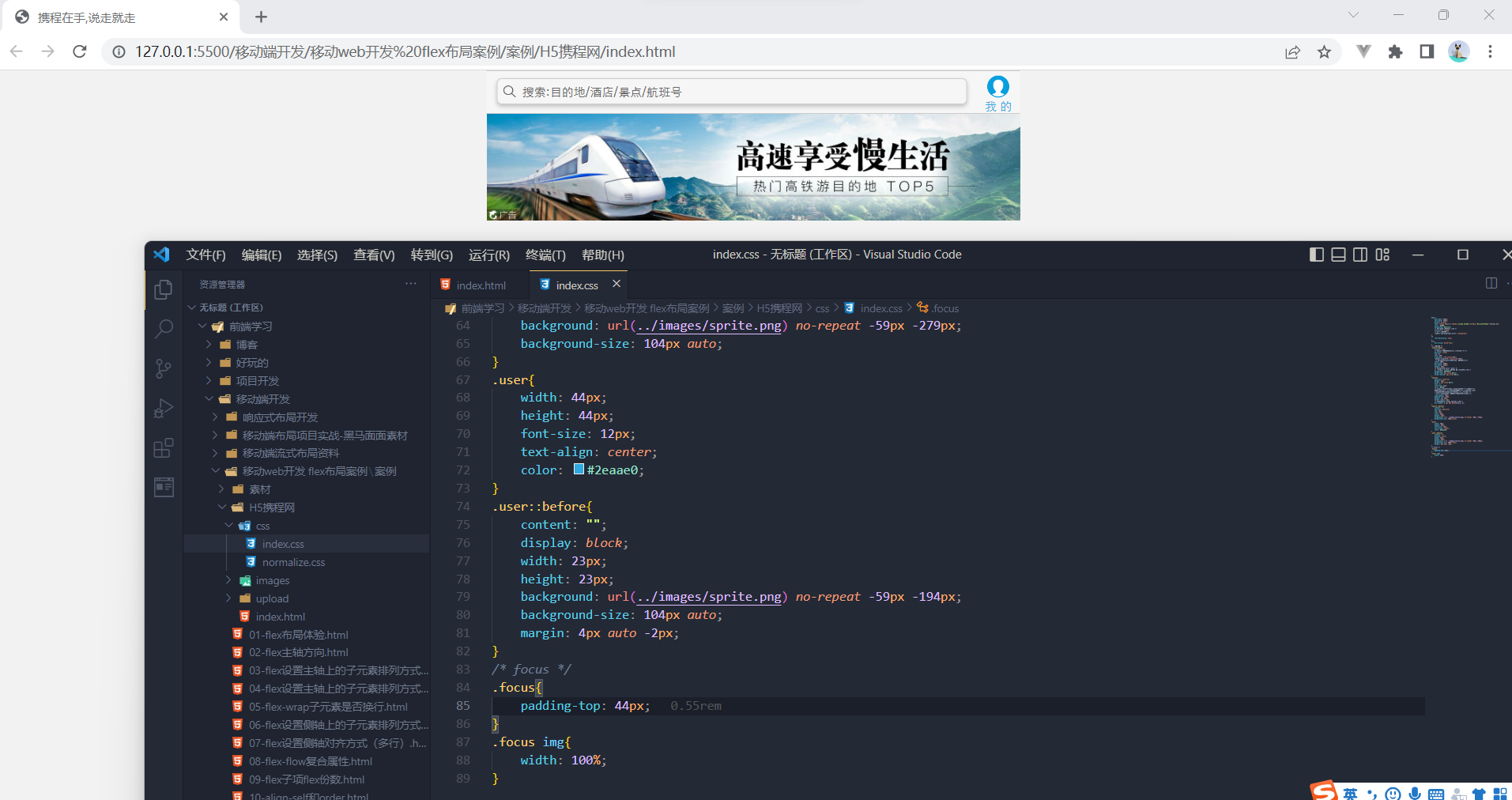
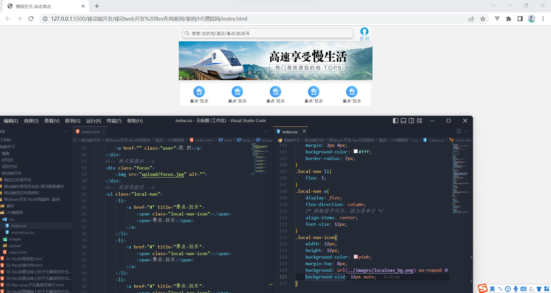
<ul class="local-nav">
<li>
<a href="#" title="景点·玩乐">
<span class="local-nav-icon-icon1"></span>
<span>景点·玩乐</span>
</a>
</li>
<li>
<a href="#" title="景点·玩乐">
<span class="local-nav-icon-icon2"></span>
<span>景点·玩乐</span>
</a>
</li>
<li>
<a href="#" title="景点·玩乐">
<span class="local-nav-icon-icon3"></span>
<span>景点·玩乐</span>
</a>
</li>
<li>
<a href="#" title="景点·玩乐">
<span class="local-nav-icon-icon4"></span>
<span>景点·玩乐</span>
</a>
</li>
<li>
<a href="#" title="景点·玩乐">
<span class="local-nav-icon-icon5"></span>
<span>景点·玩乐</span>
</a>
</li>
</ul>
<!-- 主导航栏 -->
<nav>
<div class="nav-common">
<div class="nav-items">
<a href="#">海外酒店</a>
</div>
<div class="nav-items">
<a href="#">海外酒店</a>
<a href="#">特价酒店</a>
</div>
<div class="nav-items">
<a href="#">海外酒店</a>
<a href="#">特价酒店</a>
</div>
</div>
<div class="nav-common">
<div class="nav-items">
<a href="#">海外酒店</a>
</div>
<div class="nav-items">
<a href="#">海外酒店</a>
<a href="#">特价酒店</a>
</div>
<div class="nav-items">
<a href="#">海外酒店</a>
<a href="#">特价酒店</a>
</div>
</div>
<div class="nav-common">
<div class="nav-items">
<a href="#">海外酒店</a>
</div>
<div class="nav-items">
<a href="#">海外酒店</a>
<a href="#">特价酒店</a>
</div>
<div class="nav-items">
<a href="#">海外酒店</a>
<a href="#">特价酒店</a>
</div>
</div>
</nav>
<!-- 侧导航栏 -->
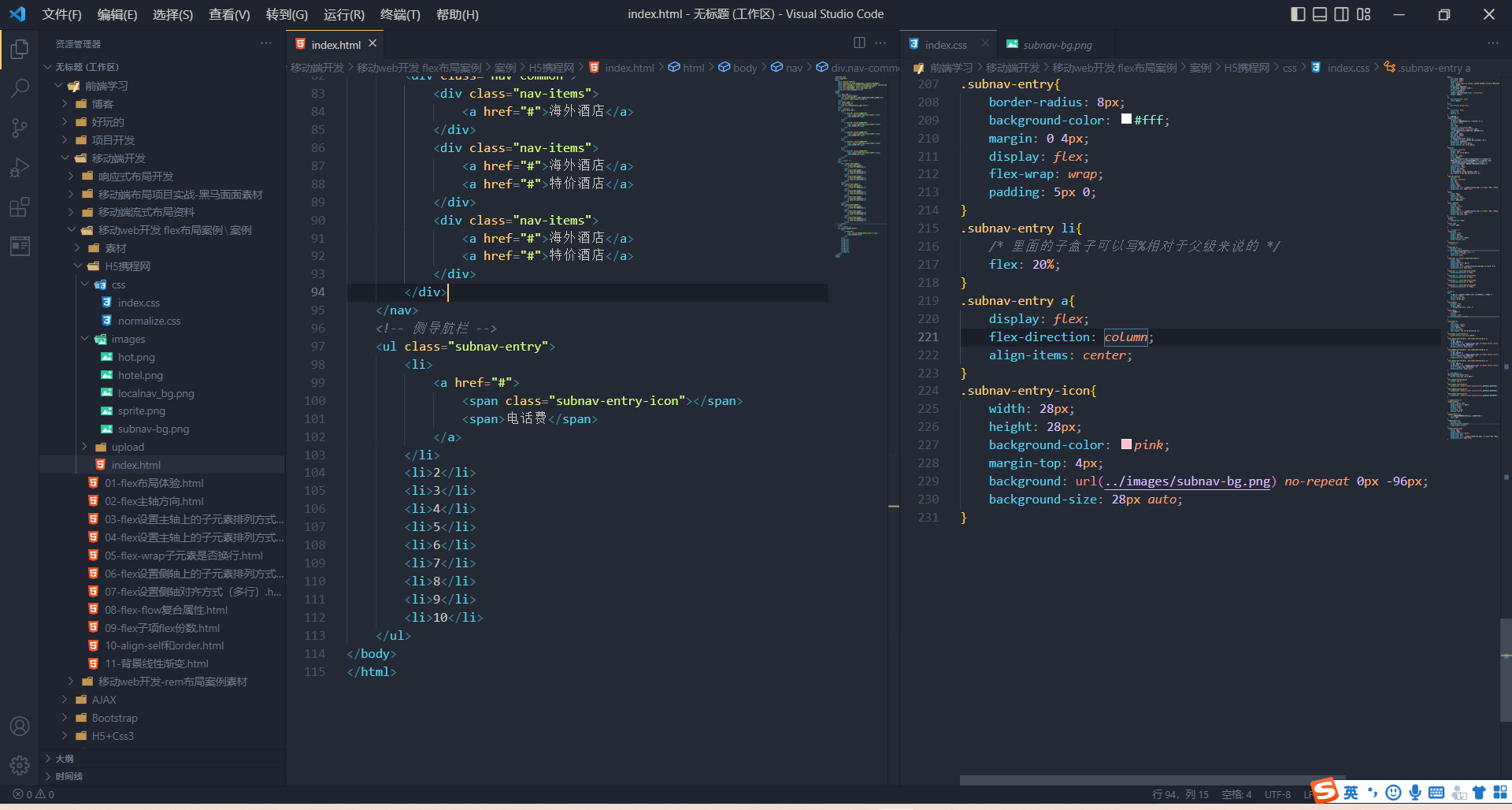
<ul class="subnav-entry">
<li>
<a href="#">
<span class="subnav-entry-icon"></span>
<span>电话费</span>
</a>
</li>
<li>2</li>
<li>3</li>
<li>4</li>
<li>5</li>
<li>6</li>
<li>7</li>
<li>8</li>
<li>9</li>
<li>10</li>
</ul>
<!-- 销售模块 -->
<div class="sales-box">
<div class="sales-hd">
<h2>热门活动</h2>
<a href="#" class="more">获取更多福利</a>
</div>
<div class="sales-bd">
<div class="row">
<a href="#">
<img src="upload/pic1.jpg" alt="" srcset="">
</a>
<a href="#">
<img src="upload/pic2.jpg" alt="">
</a>
</div>
<div class="row">
<a href="#">
<img src="upload/pic3.jpg" alt="" srcset="">
</a>
<a href="#">
<img src="upload/pic4.jpg" alt="">
</a>
</div>
<div class="row">
<a href="#">
<img src="upload/pic5.jpg" alt="" srcset="">
</a>
<a href="#">
<img src="upload/pic6.jpg" alt="">
</a>
</div>
</div>
</div>
<!-- 切换模块 -->
<ul class="cut-nav">
<li>
<a href="#" title="首页">
<span class="cut-nav-icon-icon1"></span>
<span>首页</span>
</a>
</li>
<li>
<a href="#" title="社区">
<span class="cut-nav-icon-icon2"></span>
<span>社区</span>
</a>
</li>
<li>
<a href="#" title="消息">
<span class="cut-nav-icon-icon3"></span>
<span>消息</span>
</a>
</li>
<li>
<a href="#" title="我的">
<span class="cut-nav-icon-icon4"></span>
<span>我的</span>
</a>
</li>
<li>
<a href="#" title="签到">
<span class="cut-nav-icon-icon5"></span>
<span>签到</span>
</a>
</li>
</ul>
</body>
</html>body {
max-width: 540px;
min-width: 320px;
margin: 0 auto;
font: normal 14px/1.5 Tahoma,"Lucida Grande",Verdana,"MicrosoftYahei",STXihei,hei;
color: #000;
background: #f2f2f2;
/* 永远不会出现水平滚动条 */
overflow-x: hidden;
/* 防止出现高亮 */
-webkit-tap-highlight-color: transparent;
height: 2000px;
}
a{
text-decoration: none;
color: #222;
}
div{
box-sizing: border-box;
}
ul{
list-style: none;
margin: 0;
padding: 0;
}
/* 搜索模块 */
.search-index{
display: flex;
/* 固定定位跟父级没有关系 它以屏幕为准 */
position: fixed;
top: 0;
left: 50%;
transform: translateX(-50%);
-webkit-transform: translateX(-50%);
/* 固定的比较特殊,要写宽度 跟页面同宽*/
width: 100%;
max-width: 540px;
min-width: 320px;
height: 44px;
/* background-color: pink; */
/* margin: 0 auto; 无效的 因为已经写定位了 */
background: #F6F6F6;
border-top: 1px solid #ccc;
border-bottom: 1px solid #ccc;
}
.search{
position: relative;
height: 26px;
border: 1.8px solid #0086f6;
flex: 1;
font-size: 12px;
color: #666;
/* 上下是都有边框,但是在有边框情况,又是c3盒模型,
盒子做了自减,所以实际内容区域变小,原本26px的行高,
在24px的内容里装不下,字体下边空白行间距溢出,
所以看见字体偏下。传统盒模型就没有这个影响, */
line-height: 24px;
padding-left: 25px;
margin: 7px 10px;
border-radius: 5px;
/* 水平不要,垂直2px,模糊4px,颜色 */
box-shadow: 0 2px 4px rgba(0,0,0,.2);
}
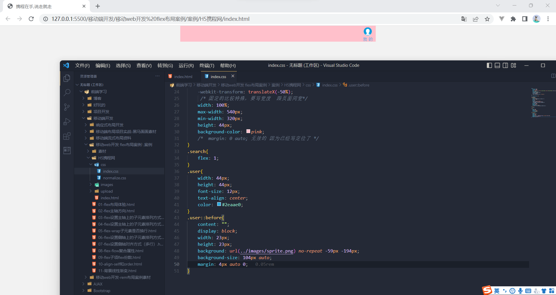
.search::before{
content: "";
position: absolute;
top: 5px;
left: 5px;
width: 15px;
height: 15px;
background: url(../images/sprite.png) no-repeat -59px -279px;
background-size: 104px auto;
}
/* 老板的 */
/* .user{
width: 44px;
height: 44px;
font-size: 12px;
text-align: center;
color: #2eaae0;
}
.user::before{
content: "";
display: block;
width: 23px;
height: 23px;
background: url(../images/sprite.png) no-repeat -59px -194px;
background-size: 104px auto;
margin: 4px auto -2px;
} */
/* focus */
.focus{
padding-top: 44px;
}
.focus img{
width: 100%;
}
/* 局部导航栏 */
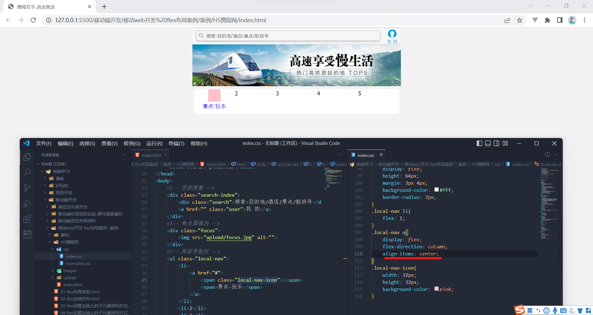
.local-nav{
display: flex;
height: 64px;
margin: 3px 4px;
background-color: #fff;
border-radius: 7px;
box-shadow: 1px 1px rgba(0,0,0,.2);
}
.local-nav li{
flex: 1;
}
.local-nav a{
display: flex;
flex-direction: column;
/* 侧轴居中对齐,因为是单行 */
align-items: center;
font-size: 12px;
}
.local-nav li [class^="local-nav-icon"]{
width: 32px;
height: 32px;
background-color: pink;
margin-top: 8px;
background: url(../images/localnav_bg.png) no-repeat 0 0;
background-size: 32px auto;
}
.local-nav li .local-nav-icon-icon2{
background-position: 0 -32px;
}
.local-nav li .local-nav-icon-icon3{
background-position: 0 -64px;
}
.local-nav li .local-nav-icon-icon4{
background-position: 0 -96px;
}
.local-nav li .local-nav-icon-icon5{
background-position: 0 -128px;
}
/* nav */
nav{
/* 因为我们给了nav设置了小圆角 nav下面的li也设置了 */
overflow: hidden;
border-radius: 8px;
margin: 0 4px 3px;
}
.nav-common{
display: flex;
height: 88px;
/* background-color: pink; */
}
.nav-items{
/* 不冲突 */
flex:1;
display: flex;
flex-direction: column;
}
.nav-items a{
flex: 1;
text-align: center;
line-height: 44px;
color: #fff;
font-size: 14px;
text-shadow: 1px 1px rgba(0,0,0,.2);
}
.nav-items a:nth-child(1){
border-bottom: 1px solid #fff;
}
.nav-common:nth-child(1) .nav-items:nth-child(1) a{
border: 0;
/* 靠低端对齐 */
background: url(../images/hotel.png) no-repeat bottom center;
/* 3倍图,要缩放成原来的3分之一 */
background-size: 121px auto;
}
.nav-common:nth-child(2) .nav-items:nth-child(1) a{
border: 0;
/* 靠低端对齐 */
background: url(../images/hotel.png) no-repeat bottom center;
/* 3倍图,要缩放成原来的3分之一 */
background-size: 121px auto;
}
.nav-common:nth-child(3) .nav-items:nth-child(1) a{
border: 0;
/* 靠低端对齐 */
background: url(../images/hotel.png) no-repeat bottom center;
/* 3倍图,要缩放成原来的3分之一 */
background-size: 121px auto;
}
/* 选择前面俩个 */
.nav-items:nth-child(-n+2){
border-right:1px solid #fff ;
}
.nav-common:nth-child(2){
margin: 3px 0 ;
}
.nav-common:nth-child(1){
background: -webkit-linear-gradient(left,#FA5A55,#FA994D);
}
.nav-common:nth-child(2){
background: -webkit-linear-gradient(left,#FA5A55,#FA994D);
}
.nav-common:nth-child(3){
background: -webkit-linear-gradient(left,#FA5A55,#FA994D);
}
/* subnav-entry */
.subnav-entry{
border-radius: 8px;
background-color: #fff;
margin: 0 4px;
display: flex;
flex-wrap: wrap;
padding: 5px 0;
}
.subnav-entry li{
/* 里面的子盒子可以写%相对于父级来说的 */
flex: 20%;
}
.subnav-entry a{
display: flex;
flex-direction: column;
align-items: center;
}
.subnav-entry-icon{
width: 28px;
height: 28px;
background-color: pink;
margin-top: 4px;
background: url(../images/subnav-bg.png) no-repeat 0px -96px;
background-size: 28px auto;
}
/* sales-box */
.sales-box{
border-top: 1px solid #bbb;
background-color: #fff;
margin: 4px;
}
.sales-hd{
position: relative;
height: 44px;
border-bottom: 1px solid #ccc;
}
/* SEO优化 */
.sales-hd h2{
position: relative;
text-indent:-999px ;
overflow: hidden;
}
.sales-hd h2::after{
position: absolute;
top: 8px;
left: 20px;
content: "";
width: 79px;
height: 15px;
background:url(../images/hot.png) no-repeat 0 -20px;
background-size: 79px auto;
}
.more{
position: absolute;
right: 5px;
top: 0px;
background: -webkit-linear-gradient(left,#FA5A55,#FA994D);
border-radius: 15px;
padding: 3px 20px 3px 10px;
color: #fff;
}
.more::after{
content: "";
position: absolute;
top: 10px;
right: 9px;
width: 7px;
height: 7px;
border-top: 2px solid #fff;
border-right: 2px solid #fff;
transform: rotate(45deg);
}
.row{
display: flex;
}
.row a{
flex: 1;
border-bottom: 1px solid #eee;
}
.row a:nth-child(1){
border-right: 1px solid #eee;
}
.row a img{
width: 100%;
}
/* 切换 */
.cut-nav{
display: flex;
/* 固定定位跟父级没有关系 它以屏幕为准 */
position: fixed;
bottom: 0;
left: 50%;
transform: translateX(-50%);
-webkit-transform: translateX(-50%);
/* 固定的比较特殊,要写宽度 跟页面同宽*/
width: 100%;
max-width: 540px;
min-width: 320px;
height: 44px;
background: #F6F6F6;
border-top: 1px solid #ccc;
border-bottom: 1px solid #ccc;
height: 64px;
}
.cut-nav li{
flex: 1;
}
.cut-nav a{
display: flex;
flex-direction: column;
/* 侧轴居中对齐,因为是单行 */
align-items: center;
font-size: 12px;
}
.cut-nav li [class^="cut-nav-icon"]{
width: 32px;
height: 32px;
margin-top: 8px;
background: url(../images/tabbar.png) no-repeat 0 0;
background-size: 32px auto;
}
.cut-nav li .cut-nav-icon-icon2{
background-position: 0 -32px;
}
.cut-nav li .cut-nav-icon-icon3{
background-position: 0 -64px;
}
.cut-nav li .cut-nav-icon-icon4{
background-position: 0 -96px;
}
.cut-nav li .cut-nav-icon-icon5{
background-position: 0 -128px;
}


 2351
2351


 被折叠的 条评论
为什么被折叠?
被折叠的 条评论
为什么被折叠?
 到【灌水乐园】发言


