


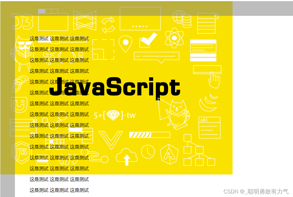
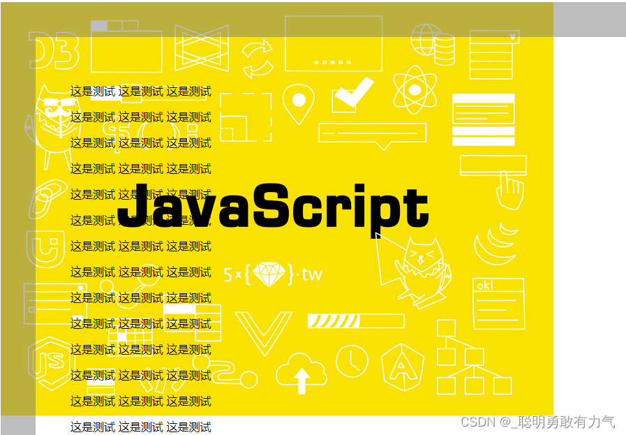
background-attachment
fixed相对于视口定位 不会随着滚动条一起滚动
<!DOCTYPE html>
<html lang="en">
  <head>
    <meta charset="UTF-8" />
    <meta http-equiv="X-UA-Compatible" content="IE=edge" />
    <meta name="viewport" content="width=device-width, initial-scale=1.0" />
    <title>Document</title>
    <style>
      .box {
        padding: 50px;
        width: 1000px;
        height: 1000px;
        border: 50px solid rgba(123, 123, 123, 0.5);
        overflow: scroll;
        background-image: url(img/1.jpg);
        background-repeat: no-repeat;
        background-position: 0 0;
        background-attachment: fixed;
      }
    </style>
  </head>
  <body>
    <div class="box">
      <p>这是测试 这是测试 这是测试</p>
      <p>这是测试 这是测试 这是测试</p>
      <p>这是测试 这是测试 这是测试</p>
      <p>这是测试 这是测试 这是测试</p>
      <p>这是测试 这是测试 这是测试</p>
      <p>这是测试 这是测试 这是测试</p>
      <p>这是测试 这是测试 这是测试</p>
      <p>这是测试 这是测试 这是测试</p>
      <p>这是测试 这是测试 这是测试</p>
      <p>这是测试 这是测试 这是测试</p>
      <p>这是测试 这是测试 这是测试</p>
      <p>这是测试 这是测试 这是测试</p>
      <p>这是测试 这是测试 这是测试</p>
      <p>这是测试 这是测试 这是测试</p>
      <p>这是测试 这是测试 这是测试</p>
      <p>这是测试 这是测试 这是测试</p>
      <p>这是测试 这是测试 这是测试</p>
      <p>这是测试 这是测试 这是测试</p>
      <p>这是测试 这是测试 这是测试</p>
      <p>这是测试 这是测试 这是测试</p>
      <p>这是测试 这是测试 这是测试</p>
      <p>这是测试 这是测试 这是测试</p>
      <p>这是测试 这是测试 这是测试</p>
      <p>这是测试 这是测试 这是测试</p>
    </div>
  </body>
</html>
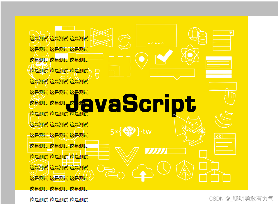
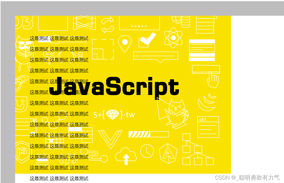
local 相对于内容区定位 会跟随滚动条一起滚动
      .box {
        padding: 50px;
        width: 1000px;
        height: 1000px;
        border: 50px solid rgba(123, 123, 123, 0.5);
        overflow: scroll;
        background-image: url(img/1.jpg);
        background-repeat: no-repeat;
        background-position: 0 0;
        background-attachment: local;
      }

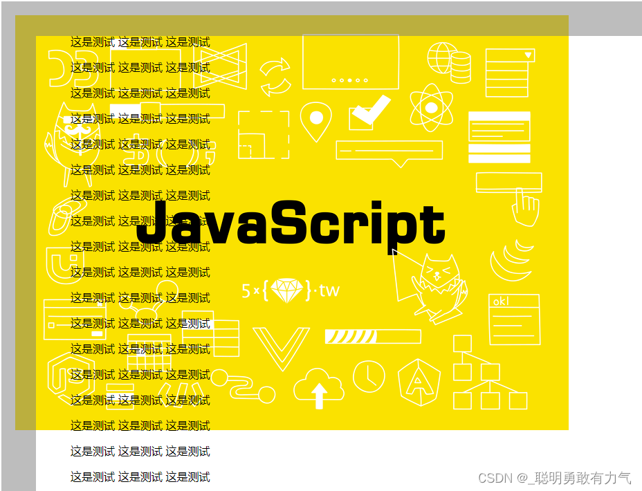
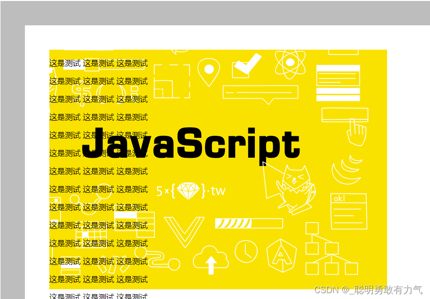
scroll 相对于文本定位 不会跟随滚动条一起滚动 与fixed差不多 只定位方式不同
      .box {
        padding: 50px;
        width: 1000px;
        height: 1000px;
        border: 50px solid rgba(123, 123, 123, 0.5);
        overflow: scroll;
        background-image: url(img/1.jpg);
        background-repeat: no-repeat;
        background-position: 0 0;
        background-attachment: scroll;
      }
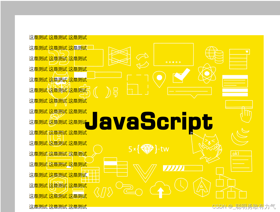
background-origin
当 background-attachment 设置为fixed 时 background-origin 与 background-position不生效
更改定位点
border-box 相对于border定位
      .box {
        padding: 50px;
        width: 1000px;
        height: 1000px;
        border: 50px solid rgba(123, 123, 123, 0.5);
        overflow: scroll;
        background-image: url(img/1.jpg);
        background-repeat: no-repeat;
        background-position: 0 0;
        background-attachment: fixed;
        background-origin: border-box;
      }
padding-box 相对于内边距定位
      .box {
        padding: 50px;
        width: 1000px;
        height: 1000px;
        border: 50px solid rgba(123, 123, 123, 0.5);
        overflow: scroll;
        background-image: url(img/1.jpg);
        background-repeat: no-repeat;
        background-position: 20px 20px;
        background-attachment: scroll;
        background-origin: padding-box;
      }

      .box {
        padding: 50px;
        width: 1000px;
        height: 1000px;
        border: 50px solid rgba(123, 123, 123, 0.5);
        overflow: scroll;
        background-image: url(img/1.jpg);
        background-repeat: no-repeat;
        background-position: 20px 20px;
        background-attachment: scroll;
        background-origin: content-box;
      }
background-clip
裁剪图片
border-box
以边框裁剪
      .box {
        padding: 50px;
        width: 1000px;
        height: 1000px;
        border: 50px solid rgba(123, 123, 123, 0.5);
        overflow: scroll;
        background-image: url(img/1.jpg);
        background-repeat: no-repeat;
        background-position: 0px 0px;
        background-attachment: fixed;
        background-origin: border-box;
        background-clip: border-box;
      }
padding-box 以内边距裁剪
 content-box 以内容裁剪
      .box {
        padding: 50px;
        width: 1000px;
        height: 1000px;
        border: 50px solid rgba(123, 123, 123, 0.5);
        overflow: scroll;
        background-image: url(img/1.jpg);
        background-repeat: no-repeat;
        background-position: 0px 0px;
        background-attachment: fixed;
        background-origin: border-box;
        background-clip: content-box;
      }
边框圆角
<!DOCTYPE html>
<html lang="en">
  <head>
    <meta charset="UTF-8" />
    <meta http-equiv="X-UA-Compatible" content="IE=edge" />
    <meta name="viewport" content="width=device-width, initial-scale=1.0" />
    <title>Document</title>
    <style>
      .box {
        width: 200px;
        height: 200px;
        border: 20px solid #000;
        box-sizing: border-box;
        border-top: 20px solid red;
        border-right: 20px solid yellow;
        border-bottom-color: blue;
        border-top-left-radius: 50%;
        border-top-right-radius: 50%;
        border-bottom-right-radius: 50%;
        border-bottom-left-radius: 50%;
      }
    </style>
  </head>
  <body>
    <div class="box"></div>
  </body>
</html>

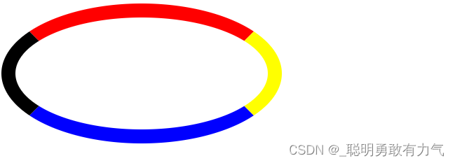
椭圆
<!DOCTYPE html>
<html lang="en">
  <head>
    <meta charset="UTF-8" />
    <meta http-equiv="X-UA-Compatible" content="IE=edge" />
    <meta name="viewport" content="width=device-width, initial-scale=1.0" />
    <title>Document</title>
    <style>
      .box {
        width: 400px;
        height: 200px;
        border: 20px solid #000;
        box-sizing: border-box;
        border-top: 20px solid red;
        border-right: 20px solid yellow;
        border-bottom-color: blue;
        border-top-left-radius: 200px 100px;
        border-top-right-radius: 200px 100px;
        border-bottom-right-radius: 50%;
        border-bottom-left-radius: 50%;
      }
    </style>
  </head>
  <body>
    <div class="box"></div>
  </body>
</html>
border-radius
一个值 对应四个角
两个值 对应 左上右下 左下右上
三个值 对应 左上 右上左下 右下
四个值 对应 左上 右上 右下 左下
100px / 50px
相当于 从左上开始顺时针到左下
100 50 border-top-left-radius
100 50 border-top-right-radius
100 50 border-bottom-left-radius
100 50 border-bottom-right-radius
100px 50px / 50px 30px
100 50 border-top-left-radius
50 30 border-top-right-radius
100 50 border-bottom-left-radius
50 30 border-bottom-right-radius
100px 50px 80px /50px 30px
100 50 border-top-left-radius
50 30 border-top-right-radius
80 50 border-bottom-left-radius
50 30 border-bottom-right-radius
当然也可以设置百分比
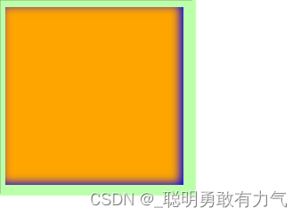
box-shadow
x-offset x方向偏移距离
y-offset y方向偏移距离
blur-radius 模糊半径 越大越模糊
spead-radius 阴影扩展半径 越大阴影越大
inset 向内投影 默认向外投影
color 阴影颜色
      .box {
        width: 200px;
        height: 200px;
        background-color: orange;
        box-shadow: 10px 10px 10px 10px inset #bfa;
      }

可以使用,设置多重阴影
      .box {
        width: 200px;
        height: 200px;
        background-color: orange;
        box-shadow: 4px 2px 1px 10px #bfa, 0px 0px 1px 10px #000, -4px -2px 10px inset blue;
      }


 559
559


 被折叠的 条评论
为什么被折叠?
被折叠的 条评论
为什么被折叠?
 到【灌水乐园】发言


