


目录
- [ ] 01-bootstrap第三方框架学习
- [ ] 1.bootstrap介绍
- [ ] 2.bootstrap初始化模板
- [ ] ==3.bootstrap全局CSS样式==
- [ ] ==4.bootstrap组件==
- [ ] ==5.bootstrap栅格系统==
响应式开发原理
就是使用媒体查询针对不同宽度的设备进行布局和样式的设置,从而适配不同设备的目的。
设备的划分情况:
小于768的为超小屏幕(手机)
768~992之间的为小屏设备(平板)
992~1200的中等屏幕(桌面显示器)
大于1200的宽屏设备(大桌面显示器)
一、Bootstrap响应式框架学习
1.1、Bootstrap简介
Bootstrap官网网址:Bootstrap中文网
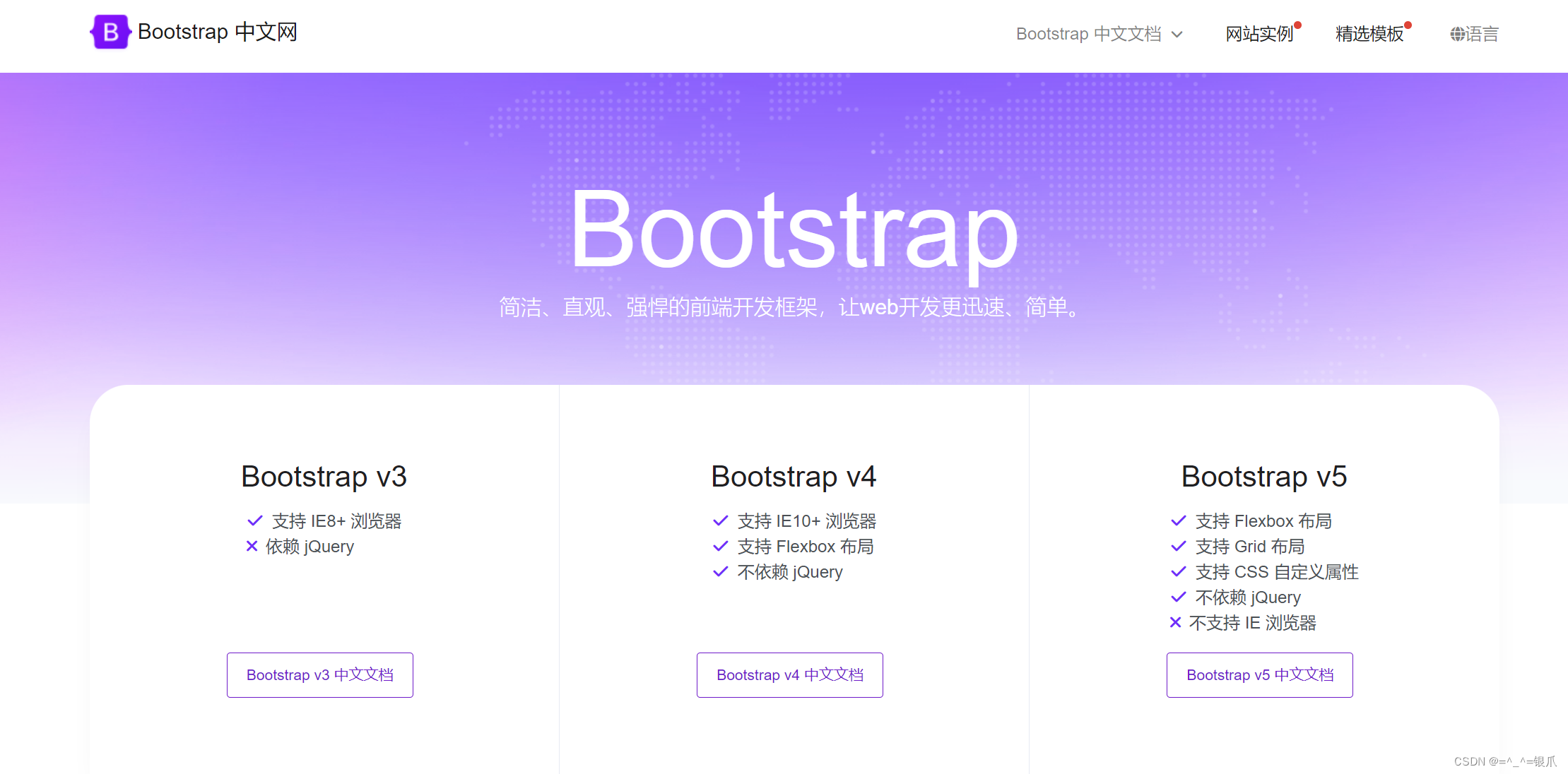
- 什么是Bootstrap
Bootstrap是一个响应式布局框架,主要用于作响应式布局页面。 框架:别人写好的通用的css样式和JS功能。 框架作用:提高开发人员工作效率(复制、粘贴即可)。
移动设备优先:移动设备指的是手机、平板;优先适配移动设备。也就是说,在使用移动设备显示使用bootstrap布局的网页,bootstrap会根据浏览的设备自适应这样的设备的宽高进行显示。
- 如何使用框架(Bootstrap)
- 下载
- 查看官方文档复制、粘贴使用
在工作中使用框架是常态,别人提供的框架就会提供使用文档。代码别人都写好了,我们仅需要复制、粘贴使用即可。
大家不用纠结别人代码是如何实现的。我们仅需要本着拿来主义,完成工作即可,但要心存感激。随着学习的深入我们会学习很多框架。而在实际开发中几乎都是使用框架来完成任务的。
- 部署Bootstrap框架(准备开始使用)
- 下载
下载Bootstrap:起步 · Bootstrap v3 中文文档 | Bootstrap 中文网

目前bootstrap有三个版本,分别是 2.x、3.x、4.x,2.x是旧的版本,3.x是新的稳定版本,4.x还在完善中,所以我们目前使用的是3.x版本。
解压:
 压缩格式的文件,会删除文件内所有的注释,换行,主要的目的是为了减少文件的体积,加快网络传输。
下载 jQuery:https://code.jquey.com/jquery-1.12.4.min.js
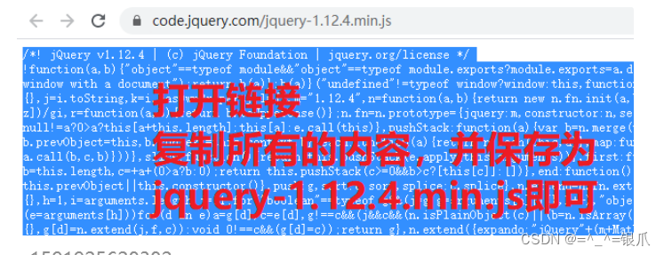
为了好管理,我们将 jquery-1.12.4.min.js 放到 bootstrap的js文件夹。

开发Bootsrap框架的人,也并不是所有的代码都是他自己写的,Bootstrap框架中也引用了其他人写的文件。我们下载Bootstrap框架并不包含这个文件,所以我们需要单独下载。这个文件注是jQuery
查看官方文档复制、粘贴使用
<!DOCTYPE html>
<html lang="zh-CN">
  <head>
    <meta charset="utf-8">
    <meta http-equiv="X-UA-Compatible" content="IE=edge">
    <meta name="viewport" content="width=device-width, initial-scale=1">
    <!-- 上述3个meta标签*必须*放在最前面,任何其他内容都*必须*跟随其后! -->
    <title>Bootstrap 101 Template</title>

    <!-- Bootstrap -->
    <link href="https://cdn.jsdelivr.net/npm/bootstrap@3.3.7/dist/css/bootstrap.min.css" rel="stylesheet">

    <!-- HTML5 shim 和 Respond.js 是为了让 IE8 支持 HTML5 元素和媒体查询(media queries)功能 -->
    <!-- 警告:通过 file:// 协议(就是直接将 html 页面拖拽到浏览器中)访问页面时 Respond.js 不起作用 -->
    <!--[if lt IE 9]>
      <script src="https://cdn.jsdelivr.net/npm/html5shiv@3.7.3/dist/html5shiv.min.js"></script>
      <script src="https://cdn.jsdelivr.net/npm/respond.js@1.4.2/dest/respond.min.js"></script>
    <![endif]-->
  </head>
  <body>
    <h1>你好,世界!</h1>

    <!-- jQuery (Bootstrap 的所有 JavaScript 插件都依赖 jQuery,所以必须放在前边) -->
    <script src="https://cdn.jsdelivr.net/npm/jquery@1.12.4/dist/jquery.min.js"></script>
    <!-- 加载 Bootstrap 的所有 JavaScript 插件。你也可以根据需要只加载单个插件。 -->
    <script src="https://cdn.jsdelivr.net/npm/bootstrap@3.3.7/dist/js/bootstrap.min.js"></script>
  </body>
</html>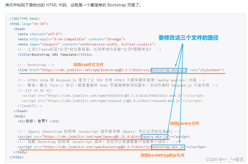
示例:

1.3、Bootstrap全局css样式
全局样式css样式:就是整个页面都可以用到的样式,这些样式主要颜色、大小。
1.3.1、情境颜色后缀样式类
xxx==-success==: 成功,代表色是淡绿色 ,颜色值:#3c763d xxx==-warning==: 提示/警告信息,代表色是橙色,颜色值:#8a6d3b xxx==-danger==: 危险/失败/错误,代表色是酒红色,颜色值:#a94442 xxx==-info==: 普通信息,代表色是天蓝色,颜色值:#31708f xxx==-muted==: 暗淡色,代表颜色深灰色,颜色值:#333333 xxx==-primary==: 首选 项信息,代表色是青色,颜色值:#337ab7 示例:
情境文字颜色

情境背景颜色

1.3.2、按钮样式类

- 大小后缀
xxx-lg: 大尺寸,对应大屏pc(>=1200px)
xxx-sm: 小尺寸,对应ipad[768,992)
xxx-xs: 超小尺寸,对应手机端 (<=768)
示例:

1.3.3、表格样式类
.table 基本样式类
.table-bordered 为表格设置边框
.table-striped 隔行换色
.table-condensed 紧凑型表格
示例:

13.4、表单
虽然使用Bootstrap框架不需要我们写结构,仅复制粘贴就可以。但了解一下对于bootstrap表单结构的定义,作为以后自己手写布局作为参照也是很有意义的。
表单的结构:
        <!-- form标签包含所有表单元素 -->
        <form action="">

            <!-- 表单元素都是 label与 input 标签配套 使用一个div包裹为一个整体 -->
            <div>
                <!-- label为表单元素设置提示信息 -->
                <label for=""></label>
                <!-- input提供用户输入 -->
                <input type="text">
            </div>

        </form>

<form>
  <div class="form-group">
    <label for="exampleInputEmail1">Email address</label>
    <input type="email" class="form-control" id="exampleInputEmail1" placeholder="Email">
  </div>
  <div class="form-group">
    <label for="exampleInputPassword1">Password</label>
    <input type="password" class="form-control" id="exampleInputPassword1" placeholder="Password">
  </div>
  <div class="form-group">
    <label for="exampleInputFile">File input</label>
    <input type="file" id="exampleInputFile">
    <p class="help-block">Example block-level help text here.</p>
  </div>
  <div class="checkbox">
    <label>
      <input type="checkbox"> Check me out
    </label>
  </div>
  <button type="submit" class="btn btn-default">Submit</button>
</form>
1.4、 Bootstrap组件
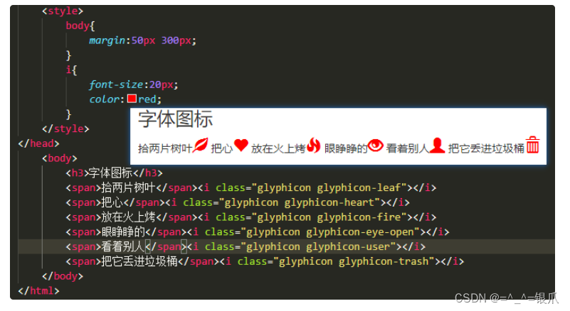
1.4.1、字体图标

1.4.2、警告框

<!DOCTYPE html>
<html lang="zh-CN">
  <head>
    <meta charset="utf-8">
    <meta http-equiv="X-UA-Compatible" content="IE=edge">
    <meta name="viewport" content="width=device-width, initial-scale=1.0, maximum-scale=1.0, user-scalable=no">
    <title>Document Title</title>
    <link href="./bootstrap-3.3.7-dist/css/bootstrap.min.css" rel="stylesheet">
    <script src="./bootstrap-3.3.7-dist/js/jquery-1.12.4.min.js"></script>
    <script src="./bootstrap-3.3.7-dist/js/bootstrap.min.js"></script>
    <style>
        body{
            margin:50px 300px;
        }
    </style>
</head>
    <body>
        <h3>警告框</h3>
        <div class="alert alert-success" role="alert">You successfully read this important alert message.</div>
        <div class="alert alert-info" role="alert">This alert needs your attention, but it's not super important.</div>
        <div class="alert alert-warning" role="alert">Better check yourself, you're not looking too good.</div>
        <div class="alert alert-danger" role="alert">Change a few things up and try submitting again.</div>
    </body>
</html>
1.4.3、按钮组

<!DOCTYPE html>
<html lang="zh-CN">
  <head>
    <meta charset="utf-8">
    <meta http-equiv="X-UA-Compatible" content="IE=edge">
    <meta name="viewport" content="width=device-width, initial-scale=1.0, maximum-scale=1.0, user-scalable=no">
    <title>Document Title</title>
    <link href="./bootstrap-3.3.7-dist/css/bootstrap.min.css" rel="stylesheet">
    <script src="./bootstrap-3.3.7-dist/js/jquery-1.12.4.min.js"></script>
    <script src="./bootstrap-3.3.7-dist/js/bootstrap.min.js"></script>
    <style>
        body{
            margin:50px 300px;
        }
    </style>
</head>
    <body>
        <h3>按钮组</h3>
        <div class="btn-group" role="group" aria-label="...">
            <button type="button" class="btn btn-default">Left</button>
            <button type="button" class="btn btn-default">Middle</button>
            <button type="button" class="btn btn-default">Right</button>
        </div>
    </body>
</html>
1.4.4、下拉菜单

<!DOCTYPE html>
<html lang="zh-CN">
<head>
<meta charset="utf-8">
<meta http-equiv="X-UA-Compatible" content="IE=edge">
<meta name="viewport" content="width=device-width, initial-scale=1.0, maximum-scale=1.0, user-scalable=no">
<title>Document Title</title>
<link href="./bootstrap-3.3.7-dist/css/bootstrap.min.css" rel="stylesheet">
<script src="./bootstrap-3.3.7-dist/js/jquery-1.12.4.min.js"></script>
<script src="./bootstrap-3.3.7-dist/js/bootstrap.min.js"></script>
<style>
body{
margin:50px 300px;
}
</style>
</head>
<body>
<h3>下拉菜单</h3>
<div class="dropdown">
<button class="btn btn-default dropdown-toggle" type="button" id="dropdownMenu1" data-toggle="dropdown" aria-haspopup="true" aria-expanded="true">
Dropdown
<span class="caret"></span>
</button>
<ul class="dropdown-menu" aria-labelledby="dropdownMenu1">
<li><a href="#">Action</a></li>
<li><a href="#">Another action</a></li>
<li><a href="#">Something else here</a></li>
<li role="separator" class="divider"></li>
<li><a href="#">Separated link</a></li>
</ul>
</div>
</body>
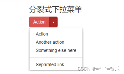
</html>1.4.5、分裂式下拉菜单
<!DOCTYPE html>
<html lang="zh-CN">
  <head>
    <meta charset="utf-8">
    <meta http-equiv="X-UA-Compatible" content="IE=edge">
    <meta name="viewport" content="width=device-width, initial-scale=1.0, maximum-scale=1.0, user-scalable=no">
    <title>Document Title</title>
    <link href="./bootstrap-3.3.7-dist/css/bootstrap.min.css" rel="stylesheet">
    <script src="./bootstrap-3.3.7-dist/js/jquery-1.12.4.min.js"></script>
    <script src="./bootstrap-3.3.7-dist/js/bootstrap.min.js"></script>
    <style>
        body{
            margin:50px 300px;
        }
    </style>
</head>
    <body>
        <h3>分裂式下拉菜单</h3>
        <div class="btn-group">
            <button type="button" class="btn btn-danger">Action</button>
            <button type="button" class="btn btn-danger dropdown-toggle" data-toggle="dropdown" aria-haspopup="true" aria-expanded="false">
            <span class="caret"></span>
            <span class="sr-only">Toggle Dropdown</span>
            </button>
            <ul class="dropdown-menu">
            <li><a href="#">Action</a></li>
            <li><a href="#">Another action</a></li>
            <li><a href="#">Something else here</a></li>
            <li role="separator" class="divider"></li>
            <li><a href="#">Separated link</a></li>
            </ul>
        </div>
    </body>
</html>
1.4.6、输入框组

<!DOCTYPE html>
<html lang="zh-CN">
  <head>
    <meta charset="utf-8">
    <meta http-equiv="X-UA-Compatible" content="IE=edge">
    <meta name="viewport" content="width=device-width, initial-scale=1.0, maximum-scale=1.0, user-scalable=no">
    <title>Document Title</title>
    <link href="./bootstrap-3.3.7-dist/css/bootstrap.min.css" rel="stylesheet">
    <script src="./bootstrap-3.3.7-dist/js/jquery-1.12.4.min.js"></script>
    <script src="./bootstrap-3.3.7-dist/js/bootstrap.min.js"></script>
    <style>
        body{
            margin:50px 300px;
        }
    </style>
</head>
    <body>
        <h3>输入框组</h3>
        <div class="input-group">
            <span class="input-group-addon" id="basic-addon1">@</span>
            <input type="text" class="form-control" placeholder="Username" aria-describedby="basic-addon1">
          </div>
          <br>
          <div class="input-group">
            <input type="text" class="form-control" placeholder="Recipient's username" aria-describedby="basic-addon2">
            <span class="input-group-addon" id="basic-addon2">@example.com</span>
          </div>
          <br>
          <div class="input-group">
            <span class="input-group-addon">$</span>
            <input type="text" class="form-control" aria-label="Amount (to the nearest dollar)">
            <span class="input-group-addon">.00</span>
          </div>
          <br>
          <label for="basic-url">Your vanity URL</label>
          <div class="input-group">
            <span class="input-group-addon" id="basic-addon3">https://example.com/users/</span>
            <input type="text" class="form-control" id="basic-url" aria-describedby="basic-addon3">
        </div>
    </body>
</html>
1.4.7、进度条

<!DOCTYPE html>
<html lang="zh-CN">
  <head>
    <meta charset="utf-8">
    <meta http-equiv="X-UA-Compatible" content="IE=edge">
    <meta name="viewport" content="width=device-width, initial-scale=1.0, maximum-scale=1.0, user-scalable=no">
    <title>Document Title</title>
    <link href="./bootstrap-3.3.7-dist/css/bootstrap.min.css" rel="stylesheet">
    <script src="./bootstrap-3.3.7-dist/js/jquery-1.12.4.min.js"></script>
    <script src="./bootstrap-3.3.7-dist/js/bootstrap.min.js"></script>
    <style>
        body{
            margin:50px 300px;
        }
    </style>
</head>
    <body>
        <h3>进度条</h3>
        <div class="progress">
            <div class="progress-bar progress-bar-success" role="progressbar" aria-valuenow="40" aria-valuemin="0" aria-valuemax="100" style="width: 40%">
              <span class="sr-only">40% Complete (success)</span>
            </div>
          </div>
          <div class="progress">
            <div class="progress-bar progress-bar-info" role="progressbar" aria-valuenow="20" aria-valuemin="0" aria-valuemax="100" style="width: 20%">
              <span class="sr-only">20% Complete</span>
            </div>
          </div>
          <div class="progress">
            <div class="progress-bar progress-bar-warning" role="progressbar" aria-valuenow="60" aria-valuemin="0" aria-valuemax="100" style="width: 60%">
              <span class="sr-only">60% Complete (warning)</span>
            </div>
          </div>
          <div class="progress">
            <div class="progress-bar progress-bar-danger" role="progressbar" aria-valuenow="80" aria-valuemin="0" aria-valuemax="100" style="width: 80%">
              <span class="sr-only">80% Complete (danger)</span>
            </div>
          </div>
    </body>
</html>
1.5、Bootstrap栅格系统(响应式布局)
1.5.1、版心容器
Bootstrap提供了两种版心容器供我们使用
- container(响应式版心)
a. 默认样式
内减盒子模型,没有高度、边框、背景颜色 padding:0 15px;
b. 宽度样式
随屏幕的变化有4个宽度尺寸: 大pc 1170px 小pc 970px; 平板 750px 手机 100%(自适应)
- container-fluid(流式版心)
a. 默认样式
内减盒子模型,没有高度、边框、背景颜色 padding:0 15px;
b. 宽度样式
100%(随屏幕的变化自适应)

在bootstrap中不需要自己写媒体查询,媒体查询的代码,已经封装到为我们提供的css类中。例如: .container
也可以根据需求修改版心宽度
<!DOCTYPE html>
<html lang="zh-CN">
  <head>
    <meta charset="utf-8">
    <meta http-equiv="X-UA-Compatible" content="IE=edge">
    <meta name="viewport" content="width=device-width, initial-scale=1.0, maximum-scale=1.0, user-scalable=no">
    <title>Document Title</title>
    <link href="./bootstrap-3.3.7-dist/css/bootstrap.min.css" rel="stylesheet">
    <script src="./bootstrap-3.3.7-dist/js/jquery-1.12.4.min.js"></script>
    <script src="./bootstrap-3.3.7-dist/js/bootstrap.min.js"></script>
    <style>
        .container{
            background:#d9d9d9;
        }

        .container-fluid{
            background:#b2b2b2;
        }

        /* 使用媒体查询修改版心默认值 */
        @media(min-width:1120px){
            .container{
                width:1100px !important;
            }
        }
    </style>
</head>
<body>
    <!-- 响应式版心 -->
    <div class="container">
        版心
    </div>
    <!-- 流式版心 -->
    <div class="container-fluid">
        流式版心
    </div>
</body>
</html>
1.5.2、栅格系统介绍
- 什么是栅格系统
在对一个页面进行布局时,无论从整体还是局部都是先划分行再划分列。这样无论是整体还是局部都形成一个类似于table一样多行多列的结构。栅格:类似于table一样,具有多行多列的结构,Bootstrap的栅格系统最多有12列。有了栅格系统的辅助我们可以很容易的分割页面空间,以及根据屏幕的尺寸作实现响应式布局。 栅格系统中的12列是虚拟的,需要等待我们划分才能真正占据页面空间。这些虚拟的列类似于excel。


- 栅格系统的相关css类
a、.container 或 .container-fluid
栅格系统必须在.container内使用,以便为其赋予合适的排列(
相当于table标签) 默认样式
都是内减盒子模型,都没有高度,没有背景,边框样式, 都有padding:0 15px; .container 宽度(1170、970、750、100%) .container-fluid 宽度为100%
b、 .row
.row必须包含在 .container或.container-fluid内(
相当于tr标签) 默认样式
没有高度,没有背景,边框 宽度为100%(父元素宽度) margin:0 -15px; 用于抵消 .container、.container-fluid的15px的padding
c、.col-
type-n
.col-
type-n用于定义1列占据多少个栅格(相当于td标签)
示例:

<!DOCTYPE html>
<html lang="zh-CN">
  <head>
    <meta charset="utf-8">
    <meta http-equiv="X-UA-Compatible" content="IE=edge">
    <meta name="viewport" content="width=device-width, initial-scale=1.0, maximum-scale=1.0, user-scalable=no">
    <title>Document Title</title>
    <link href="./bootstrap-3.3.7-dist/css/bootstrap.min.css" rel="stylesheet">
    <script src="./bootstrap-3.3.7-dist/js/jquery-1.12.4.min.js"></script>
    <script src="./bootstrap-3.3.7-dist/js/bootstrap.min.js"></script>
    <style>

    </style>
</head>
<body>
    <div class="container">
        <div class="row">
            <div class="col-lg-2" style="background:red;height:100px;"></div>
            <div class="col-lg-10" style="background:blue;height:100px;"></div>
        </div>
        <div class="row">
            <div class="col-lg-4" style="background:cyan;height:100px;"></div>
            <div class="col-lg-8" style="background:yellow;height:100px;"></div>
        </div>
        <div class="row">
            <div class="col-lg-2" style="background:orange;height:100px;"></div>
            <div class="col-lg-4" style="background:green;height:100px;"></div>
            <div class="col-lg-*" style="background:olive;height:100px;"></div>
        </div>
    </div>
</body>
</html>
一个row最多有12列,如果超过12列会自动换行。


.col-type-n 详解
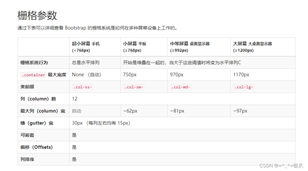
.col-
type-n是栅格系统中最主要的类,不但可以实现栅格的划分,更重要的是可以实现响应式。
n主要完成栅格的划分,设置几个栅格为1列。最大取值为12 1个row中的 所有n的和如果超过12,会自动换行。
type主要用于实现响应式划分,type用于标识屏幕的类型,取值有以下几种:lg大屏幕(大pc) 尺寸大于 >= 1200px
md中屏幕(小pc) 尺寸大于 >= 992px
sm小屏幕(平板) 尺寸大于 >= 768px
xs超小屏幕(手机) 尺寸大于 < 768px
示例:==单独使用==
col-lg-n 相当于 ==@media(min-width:1200px)==

<body>
    <div class="container">
        <div class="row">
            <!-- 大屏幕第1列占据2个栅格,相当于2/12  1/6宽度 -->
            <div class="col-lg-2" style="background:red;height:100px;"></div>

            <!-- 大屏幕第2列占据8个栅格,相当于8/12  2/3宽度 -->
            <div class="col-lg-8" style="background:blue;height:100px;"></div>

            <!-- 大屏幕第3列占据2个栅格,相当于2/12  1/6宽度 -->
            <div class="col-lg-2" style="background:cyan;height:100px;"></div>
        </div>
    </div>
</body>
col-md-n 相当于==@media(min-width:992px)==

<body>
    <div class="container">
        <div class="row">
            <!-- 只要大于中等屏幕(包含大屏幕)第1列占据5个栅格,相当于5/12宽度 -->
            <div class="col-sm-5" style="background:red;height:100px;"></div>

            <!-- 只要大于中等屏幕(包含大屏幕)第2列占据5个栅格,相当于5/12宽度 -->
            <div class="col-sm-5" style="background:blue;height:100px;"></div>

            <!-- 只要大于中等屏幕(包含大屏幕)第3列占据2个栅格,相当于1/12宽度 -->
            <div class="col-sm-2" style="background:cyan;height:100px;"></div>
        </div>
    </div>
</body>
col-sm-n 相当于==@media(min-width:768px)==

<body>
    <div class="container">
        <div class="row">
            <!-- 只要大于小屏幕(包含大屏幕、中等屏幕)第1列占据4个栅格,相当于4/12  1/3宽度 -->
            <div class="col-xs-4" style="background:red;height:100px;"></div>

            <!-- 只要大于小屏幕(包含大屏幕、中等屏幕)第2列占据4个栅格,相当于4/12  1/3宽度 -->
            <div class="col-xs-4" style="background:blue;height:100px;"></div>

            <!-- 只要大于小屏幕(包含大屏幕、中等屏幕)第3列占据4个栅格,相当于4/12  1/3宽度 -->
            <div class="col-xs-4" style="background:cyan;height:100px;"></div>
        </div>
    </div>
</body>
col-xs-n 相当于==@media(max-width:768px)==

<body>
    <div class="container">
        <div class="row">
            <!-- 只要大于超小屏幕(包含大屏幕、中等屏幕、小屏幕)第1列占据2个栅格,相当于2/12  1/6宽度 -->
            <div class="col-xs-2" style="background:red;height:100px;"></div>

            <!-- 只要大于超小屏幕(包含大屏幕、中等屏幕、小屏幕)第2列占据4个栅格,相当于4/12  1/3宽度 -->
            <div class="col-xs-4" style="background:blue;height:100px;"></div>

            <!-- 只要大于超小屏幕(包含大屏幕、中等屏幕、小屏幕)第3列占据6个栅格,相当于6/12  1/2宽度 -->
            <div class="col-xs-6" style="background:cyan;height:100px;"></div>
        </div>
    </div>
</body>
如果所设置的 多个 type 中没有一个与当前屏幕尺寸对应的,则栅格系统会失效。宽度默认为100%。
示例:==联合使用==


<body>
    <div class="container">
        <div class="row">
            <div class="col-lg-3 col-md-6 col-sm-12" style="background:red;height:100px;"></div>
            <div class="col-lg-3 col-md-6 col-sm-12" style="background:blue;height:100px;"></div>
            <div class="col-lg-3 col-md-6 col-sm-12" style="background:cyan;height:100px;"></div>
            <div class="col-lg-3 col-md-6 col-sm-12" style="background:pink;height:100px;"></div>
        </div>
    </div>
</body>
1.5.3、栅格系统练习
需求:
1.pc端,屏幕尺寸>=1200,一行显示四个盒子
2.大屏平板: 屏幕尺寸 992-1200,一行显示三个盒子
3.平板: 屏幕尺寸768-992,一行显示两个盒子
4.手机: 屏幕尺寸<768,一行显示一个盒子
<!DOCTYPE html>
<html lang="zh-CN">
  <head>
    <meta charset="utf-8">
    <meta http-equiv="X-UA-Compatible" content="IE=edge">
    <meta name="viewport" content="width=device-width, initial-scale=1.0, maximum-scale=1.0, user-scalable=no">
    <title>Document Title</title>
    <link href="./bootstrap-3.3.7-dist/css/bootstrap.min.css" rel="stylesheet">
    <script src="./bootstrap-3.3.7-dist/js/jquery-1.12.4.min.js"></script>
    <script src="./bootstrap-3.3.7-dist/js/bootstrap.min.js"></script>
    <style>
       div[class*='col-']{
           border:1px solid #b2b2b2;
       }
    </style>
</head>
<body>
    <div class="container">
        <div class="row">
            <div class="col-lg-3 col-md-4 col-sm-6 col-xs-12" style="background:red;height:100px;"></div>
            <div class="col-lg-3 col-md-4 col-sm-6 col-xs-12" style="background:blue;height:100px;"></div>
            <div class="col-lg-3 col-md-4 col-sm-6 col-xs-12" style="background:cyan;height:100px;"></div>
            <div class="col-lg-3 col-md-4 col-sm-6 col-xs-12" style="background:pink;height:100px;"></div>
        </div>
    </div>
</body>
</html>
1.5.4、栅格偏移
列默认是从左向右排列的,如果不想让列从侧开始位置排列,可以采用列偏移。
col-type-offset-n
在某一屏幕类型上当前列向右偏移n个栅格位置。 col-lg-offset-n 屏幕宽度大于等于1200px时会生效 col-md-offset-n 屏幕宽度大于等于992px时会生效 col-sm-offset-n 屏幕宽度大于等于768px时生效 col-xs-offset-n 屏幕宽度小于768px时生效

<!DOCTYPE html>
<html lang="zh-CN">
  <head>
    <meta charset="utf-8">
    <meta http-equiv="X-UA-Compatible" content="IE=edge">
    <meta name="viewport" content="width=device-width, initial-scale=1.0, maximum-scale=1.0, user-scalable=no">
    <title>Document Title</title>
    <link href="./bootstrap-3.3.7-dist/css/bootstrap.min.css" rel="stylesheet">
    <script src="./bootstrap-3.3.7-dist/js/jquery-1.12.4.min.js"></script>
    <script src="./bootstrap-3.3.7-dist/js/bootstrap.min.js"></script>
    <style>
        .row{
            margin-top:10px;
        }
    </style>
</head>

<body>
    <!-- 版心:相当于table -->
    <div class="container">
        <!-- 向右偏移实现居中 -->
        <div class="row">
            <div class="col-lg-3 col-lg-offset-2" style="height:50px;background:red"></div>
            <div class="col-lg-3" style="height:50px;background:yellow"></div>
        </div>
        <!-- 向右偏移实现两侧对齐 -->
        <div class="row">
            <div class="col-lg-3" style="height:50px;background:red"></div>
            <div class="col-lg-3 col-lg-offset-6" style="height:50px;background:yellow"></div>
        </div>

        <!-- 利用偏移实现超小屏1列中间,其他两端对齐 -->
        <div class="row">
            <div class="col-lg-3 col-md-4 col-sm-5 col-xs-8 col-sm-offset-0 col-xs-offset-2" style="height:50px;background:red"></div>
            <div class="col-lg-3 col-md-4 col-sm-5 col-xs-8 col-lg-offset-6 col-md-offset-4 col-sm-offset-2 col-xs-offset-2" style="height:50px;background:yellow"></div>
        </div>
    </div>

    <!-- 隐藏还可以设置给其他元素 -->
    <h1 class="hidden-md">hello</h1>
</body>

</html>
1.5.5、栅格隐藏
在作响应式布局时,经常会遇到在某个屏幕尺寸范围内将元素隐藏,可以使用bootstrap提供的隐藏属性。
.hidden-lg
.hidden-md
.hidden-sm
.hidden-xs
<!DOCTYPE html>
<html lang="zh-CN">
  <head>
    <meta charset="utf-8">
    <meta http-equiv="X-UA-Compatible" content="IE=edge">
    <meta name="viewport" content="width=device-width, initial-scale=1.0, maximum-scale=1.0, user-scalable=no">
    <title>Document Title</title>
    <link href="./bootstrap-3.3.7-dist/css/bootstrap.min.css" rel="stylesheet">
    <script src="./bootstrap-3.3.7-dist/js/jquery-1.12.4.min.js"></script>
    <script src="./bootstrap-3.3.7-dist/js/bootstrap.min.js"></script>
    <style>
        .row{
            margin-top:10px;
        }
        li{
            list-style: none;
            padding:0 10px;
            background:gold;
            text-align: center;
            background-clip: content-box;
        }
    </style>
</head>

<body>
    <!-- 版心:相当于table -->
    <div class="container">
        <ul class="row">
            <li class="col-lg-2 col-md-2 col-sm-2 col-xs-2">menu 1</li>
            <li class="col-lg-2 col-md-2 col-sm-2 col-xs-2 hidden-md hidden-sm hidden-xs">menu 2</li>
            <li class="col-lg-2 col-md-2 col-sm-2 col-xs-2 hidden-sm hidden-xs">menu 3</li>
            <li class="col-lg-2 col-md-2 col-sm-2 col-xs-2 hidden-xs">menu 4</li>
            <li class="col-lg-2 col-md-2 col-sm-2 col-xs-2 hidden-xs">menu 5</li>
            <li class="col-lg-2 col-md-2 col-sm-2 col-xs-2">menu 6</li>
        </ul>
    </div>

    <!-- 隐藏还可以设置给其他元素 -->
    <h1 class="hidden-md">hello</h1>
</body>

</html>
隐藏类
.visible-lg-block
.visible-lg-inline
.visible-lg-inline-block
.visible-md-block
.visible-md-inline
.visible-md-inline-block
.visible-sm-block
.visible-sm-inline
.visible-sm-inline-block
.visible-xs-block
.visible-xs-inline
.visible-xs-inline-block
显示与隐藏,可以设置给任何元素,不仅仅是栅格。


 781
781


 被折叠的 条评论
为什么被折叠?
被折叠的 条评论
为什么被折叠?
 到【灌水乐园】发言


