


一,CSS入门之基本规则
1,从基本规则开始学习CSS
<!DOCTYPE html>
<html lang="en">

<head>
    <meta charset="UTF-8">
    <meta http-equiv="X-UA-Compatible" content="IE=edge">
    <meta name="viewport" content="width=device-width, initial-scale=1.0">
    <title>Document</title>
    <style>
        div {
            width: 100px;
            height: 200px;
            background-color: red;
        }
    </style>
</head>

<body>
    <div></div>
</body>

</html>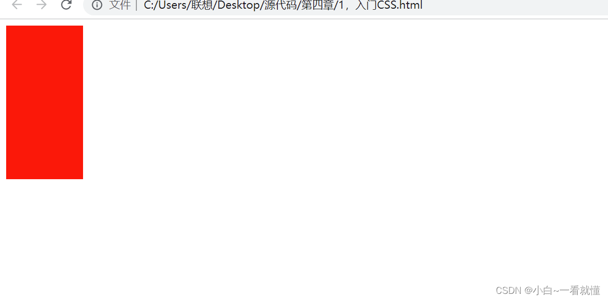
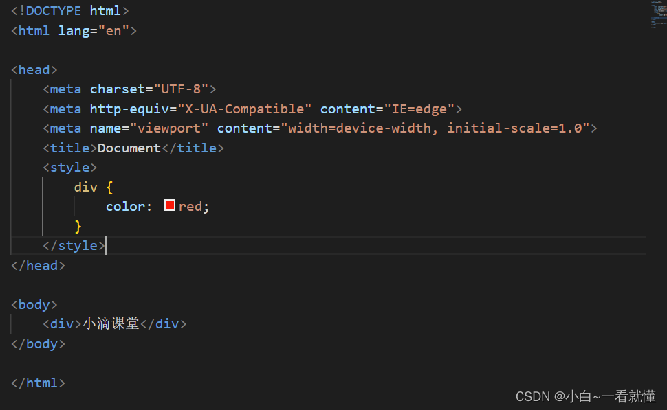
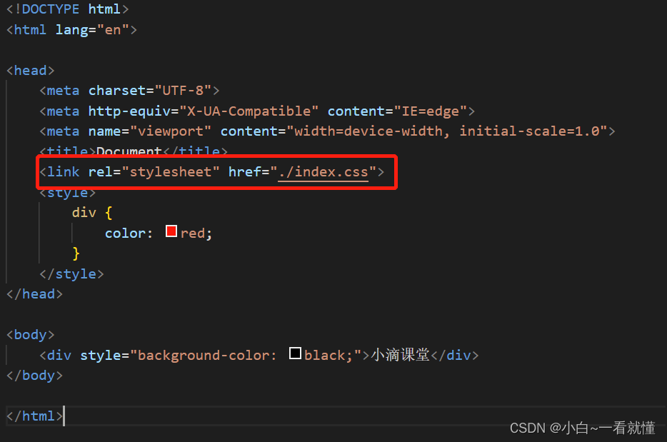
2,CSS几种写法及推荐写法
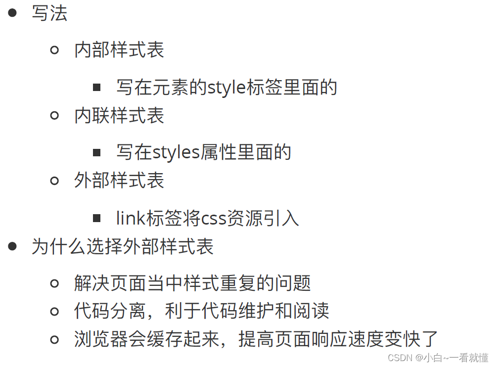
内部样式表
内连样式表
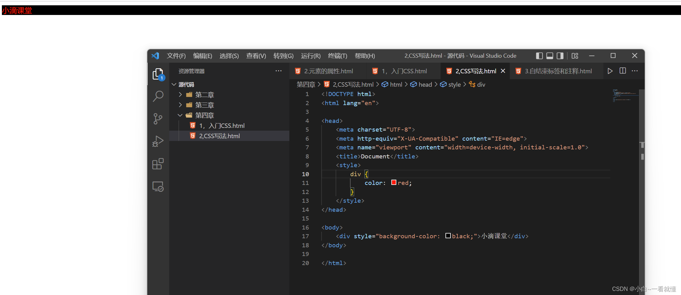
外部样式表
3,css常见选择器
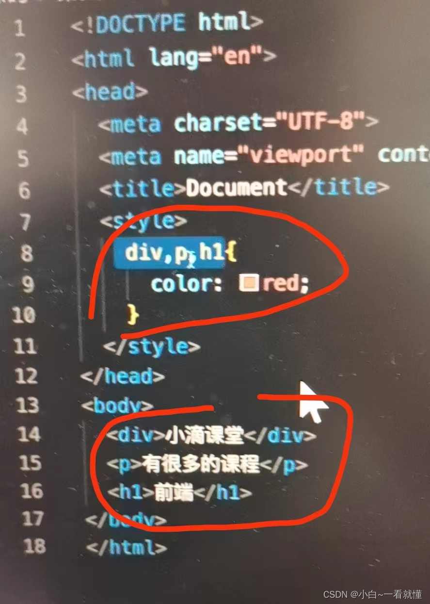
元素(标签)选择器
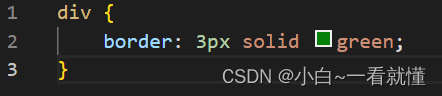
组合选择器: h1,p{color:red}
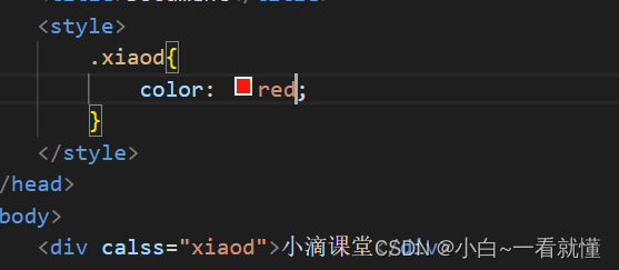
类选择器
1普通的类选择器
2结合标签选择器
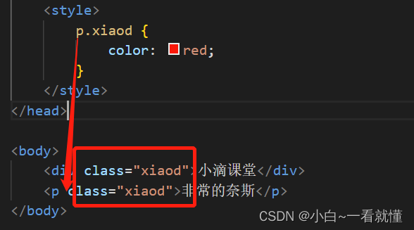
h1.xiaodi {color:red;}(多个class定义的标签时候,结合标签选择器可以实现特定的标签使用)

3,多类选择器
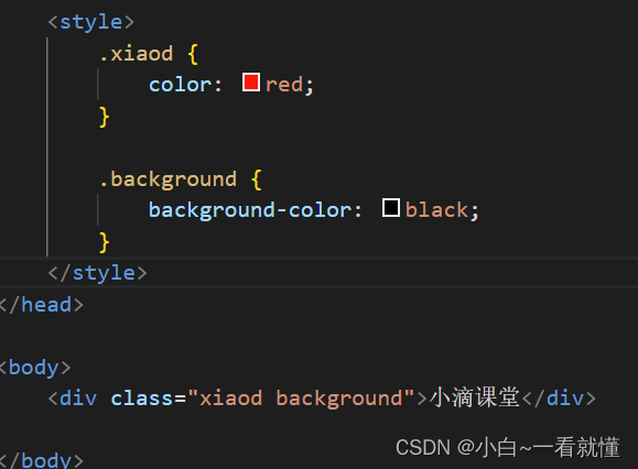
4链接多个类选择器

class属性值必须包括color和background才能生效
id选择器
声明:#important{}
属性:id="important
注意:⼀个id选择器的属性值在html⽂档中只能出现⼀次,避免写js获取id时出现混淆
通配符选择器*

注意:通配符选择器可以设置全局的属性,但是他的层级比较低
最常用的是margin和padding让他们等于0(使网页的字和外围没有空间)
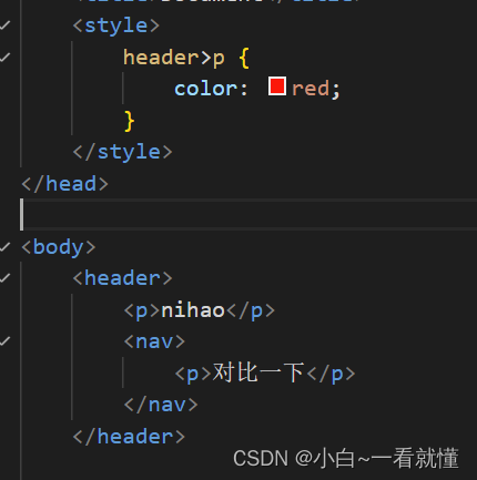
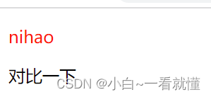
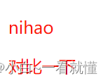
派生选择器
1,后代选择器
h1 p{color:red;}

h1 p也能实现,相当于孙子也是后代
2,⼦元素选择器

现在对比一下两者的关系

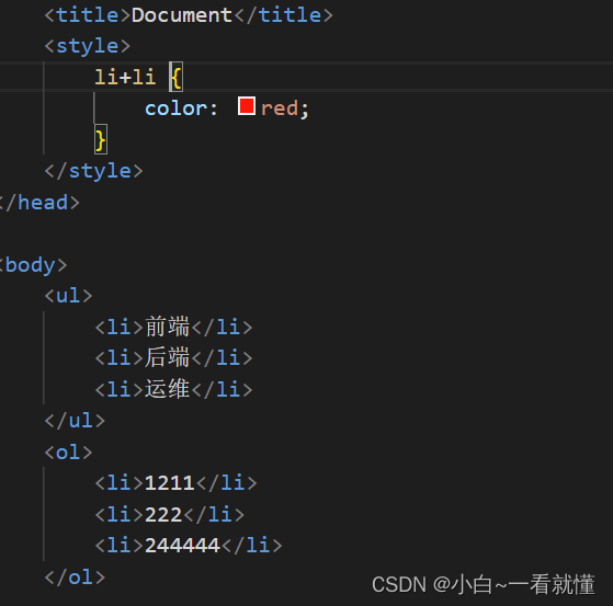
3相邻选择器(兄弟)

CSS特殊选择器
1,伪类选择器
不改变任何DOM内容。只是插⼊了⼀些修饰类的元素
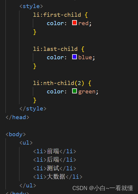
:first-child {} //第⼀项
:last-child {} //最后⼀项
:nth-child(n) {} //第n项
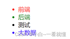
:nth-child(2n+1){} //奇数项
:nth-child(2n) {} //偶数项
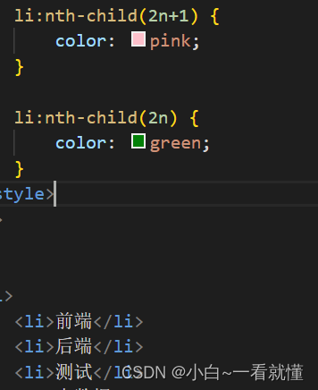

:not() //否定伪类 除了第n项
a:link {color:#FF0000;} /*未访问的链接*/
a:visited {color:#00FF00;} /*已访问的链接*/
a:hover {color:#FF00FF;} /*⿏标悬浮后的链接*/
a:active {color:#0000FF;} /*已选中的链接*/

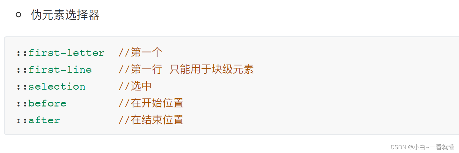
2伪元素选择器
<!DOCTYPE html>
<html lang="en">
<head>
<meta charset="UTF-8">
<meta http-equiv="X-UA-Compatible" content="IE=edge">
<meta name="viewport" content="width=device-width, initial-scale=1.0">
<title>Document</title>
<style>
.test::first-letter {
color: red;
}
.test::first-line {
color: red;
}
.test::selection {
color: green;
/* 鼠标选中哪里哪里就是绿色 */
}
.test::before {
content: '小滴课堂';
/* 加内容,但是不想再写标签的时候,方便 */
}
.test::after {
content: '小滴课堂';
/* 加内容,但是不想再写标签的时候,方便 */
}
span::first-line {
color: red;
}
/* }这里比较一下,span是行内元素,不是块级元素,所以应该是无效的,不变红色 */
</style>
</head>
<body>
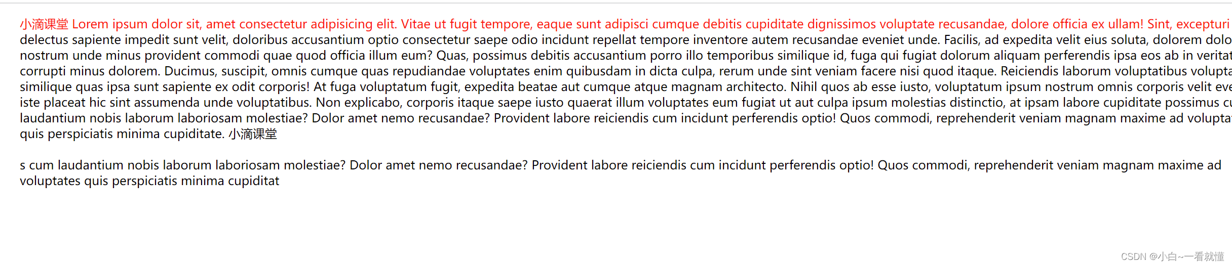
<ul>
<div class="test">
Lorem ipsum dolor sit, amet consectetur adipisicing elit. Vitae ut fugit tempore, eaque sunt adipisci cumque debitis cupiditate dignissimos voluptate recusandae, dolore officia ex ullam! Sint, excepturi delectus sapiente impedit sunt velit, doloribus
accusantium optio consectetur saepe odio incidunt repellat tempore inventore autem recusandae eveniet unde. Facilis, ad expedita velit eius soluta, dolorem dolore nostrum unde minus provident commodi quae quod officia illum eum? Quas, possimus
debitis accusantium porro illo temporibus similique id, fuga qui fugiat dolorum aliquam perferendis ipsa eos ab in veritatis corrupti minus dolorem. Ducimus, suscipit, omnis cumque quas repudiandae voluptates enim quibusdam in dicta culpa,
rerum unde sint veniam facere nisi quod itaque. Reiciendis laborum voluptatibus voluptas similique quas ipsa sunt sapiente ex odit corporis! At fuga voluptatum fugit, expedita beatae aut cumque atque magnam architecto. Nihil quos ab esse iusto,
voluptatum ipsum nostrum omnis corporis velit eveniet, iste placeat hic sint assumenda unde voluptatibus. Non explicabo, corporis itaque saepe iusto quaerat illum voluptates eum fugiat ut aut culpa ipsum molestias distinctio, at ipsam labore
cupiditate possimus cum laudantium nobis laborum laboriosam molestiae? Dolor amet nemo recusandae? Provident labore reiciendis cum incidunt perferendis optio! Quos commodi, reprehenderit veniam magnam maxime ad voluptates quis perspiciatis
minima cupiditate.
</div>
<br>
<span>
s cum laudantium nobis laborum laboriosam molestiae? Dolor amet nemo recusandae? Provident labore reiciendis cum incidunt perferendis optio! Quos commodi, reprehenderit veniam magnam maxime ad voluptates quis perspiciatis
minima cupiditat
</span>
</ul>
</body>
</html>结果
第5集 CSS基本概念之盒⼦模型
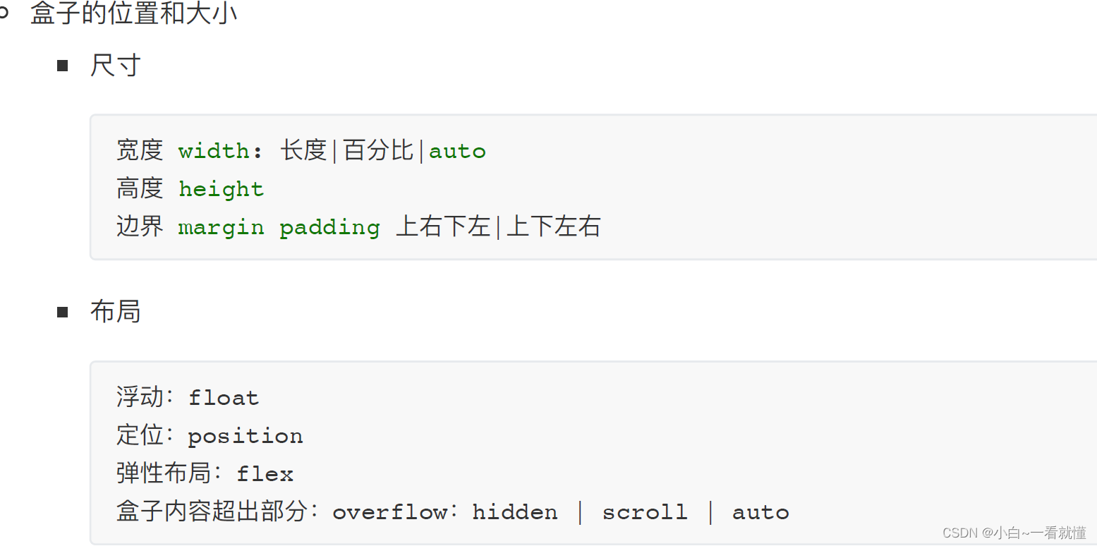
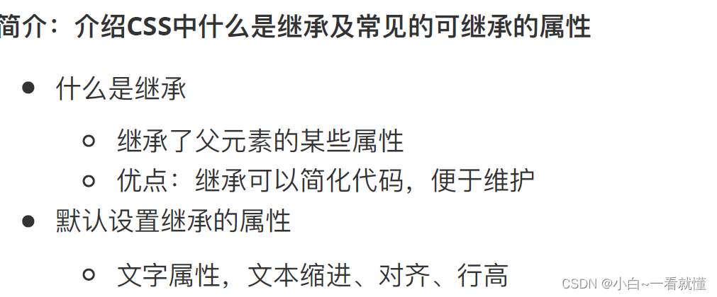
在CSS⾥⾯,所有的HTML元素你都可以看成是⼀个盒⼦
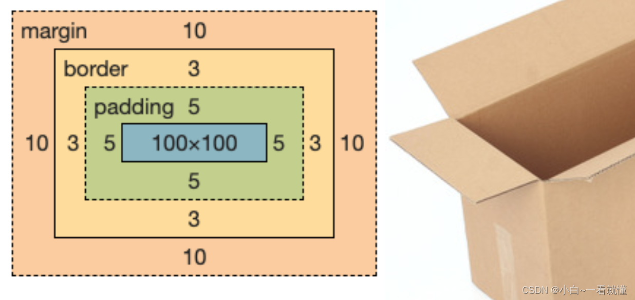
盒⼦的内边距(padding)
padding-left:10px //左边距10px
padding-top:10px //上边距10px
padding-right:10px //右边距10px
padding-bottom:10px //下边距10%,相对于⽗级元素的width
padding:10px 10px 10px 10% //等同于上⾯四⾏ 百分⽐是对应⽗标签的⼤⼩
padding:5px 10px //上下边距5px、左右边距10px
padding:5px 10px 20px //上边距 左右边距 下边距
padding:10px //上下左右边距10px (顺时针)
<!DOCTYPE html>
<html lang="en">

<head>
    <meta charset="UTF-8">
    <meta http-equiv="X-UA-Compatible" content="IE=edge">
    <meta name="viewport" content="width=device-width, initial-scale=1.0">
    <title>Document</title>
    <style>
        .big {
            width: 100px;
            height: 100px;
            background-color: red;
            padding-left: 10px;
            padding-right: 10px;
            padding-top: 10px;
            padding-bottom: 10px;
        }

        .small {
            width: 30px;
            height: 30px;
            background-color: blue;
            padding: 10%;
        }

        * {
            margin: 0;
            padding: 0;
        }
    </style>
</head>

<body>
    <div class="big">
        <div class="small">
        </div>
    </div>
</body>

</html>

盒⼦的边框(border)
margin-left:10px //左边距10px
margin-top:10px //上边距10px
margin-right:10px //右边距10px
margin-bottom:10% //下边距10%,相对于⽗级元素的width
margin:10px 10px 10px 10% //等同于上⾯四⾏
margin:5px 10px //上下边距5px、左右边距10px
margin:10px //上下左右边距10px
盒⼦的外边距(margin)
margin-left:10px //左边距10px
margin-top:10px //上边距10px
margin-right:10px //右边距10px
margin-bottom:10% //下边距10%,相对于⽗级元素的width
margin:10px 10px 10px 10% //等同于上⾯四⾏
margin:5px 10px //上下边距5px、左右边距10px
margin:10px //上下左右边距10px
<!DOCTYPE html>
<html lang="en">

<head>
    <meta charset="UTF-8">
    <meta http-equiv="X-UA-Compatible" content="IE=edge">
    <meta name="viewport" content="width=device-width, initial-scale=1.0">
    <title>Document</title>
    <style>
        .big {
            width: 500px;
            height: 500px;
            background-color: red;
        }

        .small {
            width: 200px;
            height: 200px;
            background-color: blue;
            border: 10px dashed #000;
            /* solid 实线 dotted 点  dashed虚线 */
        }

        * {
            margin: 0;
            padding: 0;
        }
    </style>
</head>

<body>
    <div class="big">
        <div class="small">
        </div>
    </div>
</body>

</html> 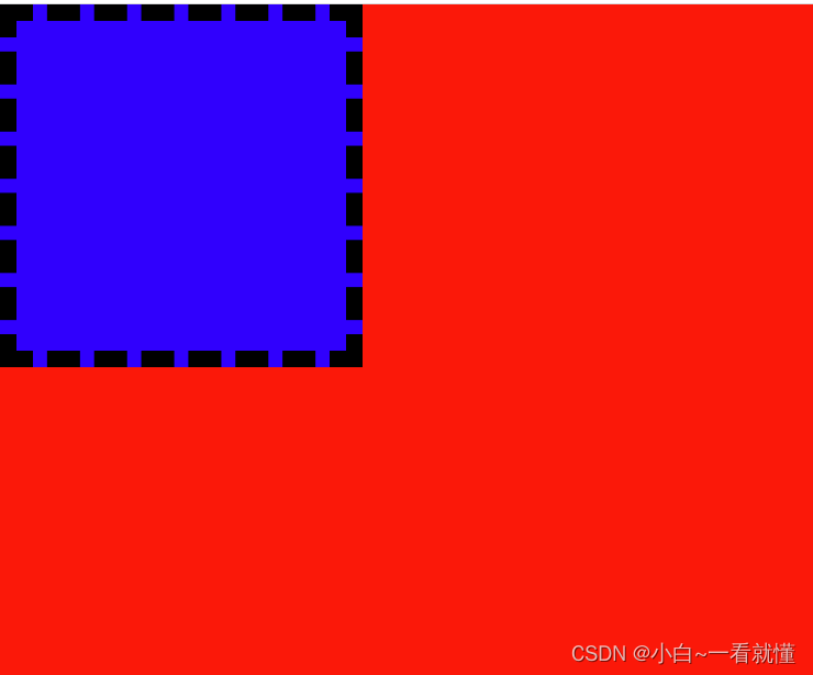
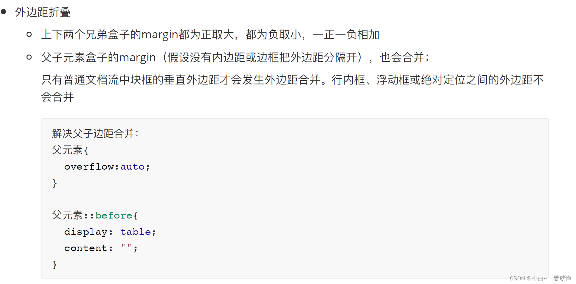
盒⼦怪异模型

这儿是标准模型

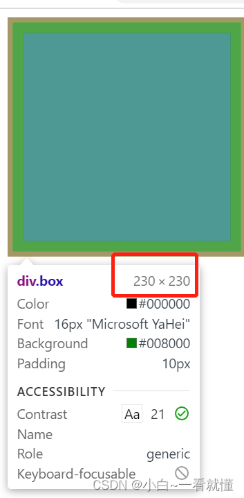 这里的盒子大小是230×230
IE标准模型
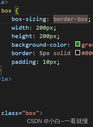
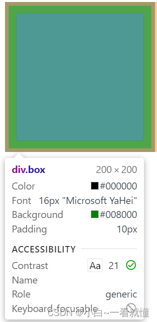
这儿虽然设置了padding 和border 但是还是200×200
<!DOCTYPE html>
<html lang="en">

<head>
    <meta charset="UTF-8">
    <meta http-equiv="X-UA-Compatible" content="IE=edge">
    <meta name="viewport" content="width=device-width, initial-scale=1.0">
    <title>Document</title>
    <style>
        .top {
            width: 100px;
            height: 100px;
            background-color: red;
            margin-bottom: 10px;
        }

        .bottom {
            width: 100px;
            height: 100px;
            background-color: blue;
            margin-top: 10px;
        }

        .father {
            width: 200px;
            height: 200px;
            background-color: red;
            /* overflow: auto;解决⽗⼦边距合并: */
        }

        /* .father::before {解决⽗⼦边距合并:
            display: table;
            content: '';
        }
         */
        .son {
            width: 50px;
            height: 50px;
            background-color: blue;
            margin-top: 20px;
        }
    </style>
</head>

<body>
    <div class="top"> </div>
    <div class="bottom"> </div>
    <br>
    <div class="father">
        <div class="son">

        </div>
    </div>

</body>

</html> 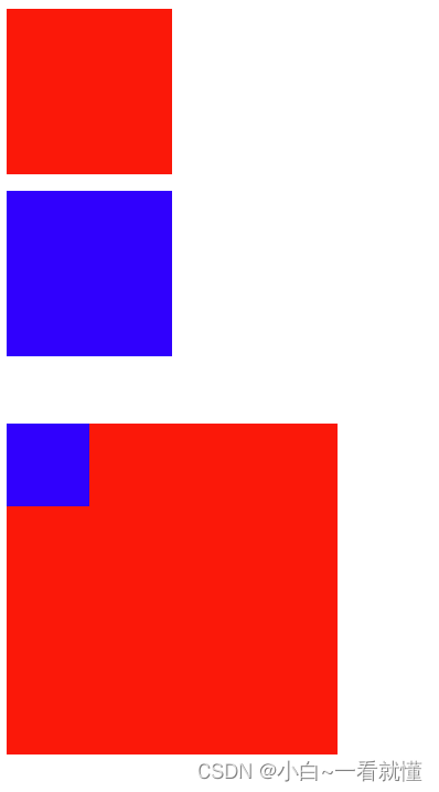
第6集 CSS中的常⽤属性
<!DOCTYPE html>
<html lang="en">

<head>
    <meta charset="UTF-8">
    <meta http-equiv="X-UA-Compatible" content="IE=edge">
    <meta name="viewport" content="width=device-width, initial-scale=1.0">
    <title>Document</title>
    <style>
        .box {
            width: 100px;
            height: 100px;
            background-color: red;
            /* float: left; */
        }

        .boxs {
            width: 100px;
            height: 100px;
            background-color: blue;
            /* float: right; */
            /* position: absolute;
            top: 0;
            left: 100px; */
            overflow: scroll;
            /* 溢出的时候用,还可以hidden隐藏 */
        }

        .father {
            /* position: relative; */
            display: flex;
            /* 弹性布局 */
        }
    </style>
</head>

<body>
    <div class="father">
        <div class="box"></div>
        <div class="boxs">
            Lorem ipsum dolor sit amet consectetur, adipisicing elit. Culpa quisquam enim asperiores rerum harum iure sed in ut rem amet.
        </div>
    </div>
</body>

</html>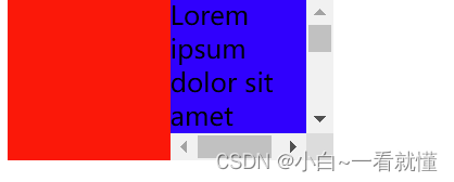
<!DOCTYPE html>
<html lang="en">
<head>
<meta charset="UTF-8">
<meta http-equiv="X-UA-Compatible" content="IE=edge">
<meta name="viewport" content="width=device-width, initial-scale=1.0">
<title>Document</title>
<style>
.image {
width: 200px;
height: 200px;
background-color: red;
/* background-color: red;
background-image: url(https://file.xdclass.net/xdclass/xdclass_logo.png);
background-repeat: no-repeat; */
/* 不加norepeat会重复指导把200px填满 */
/* background-size: 90%; */
/* 这里的size百分之多 少是针对引入的图片来的 */
/* background-position: center; */
/* 这里的center就是引入图片在200px盒子的位置 */
/* 下面介绍一种简便的写法 */
/* background: red url(https://file.xdclass.net/xdclass/xdclass_logo.png) no-repeat center;
background-size: 90%; */
/* 注意这里的size不能简略的写,而且back里必须按照 颜色 url 是否repeat position */
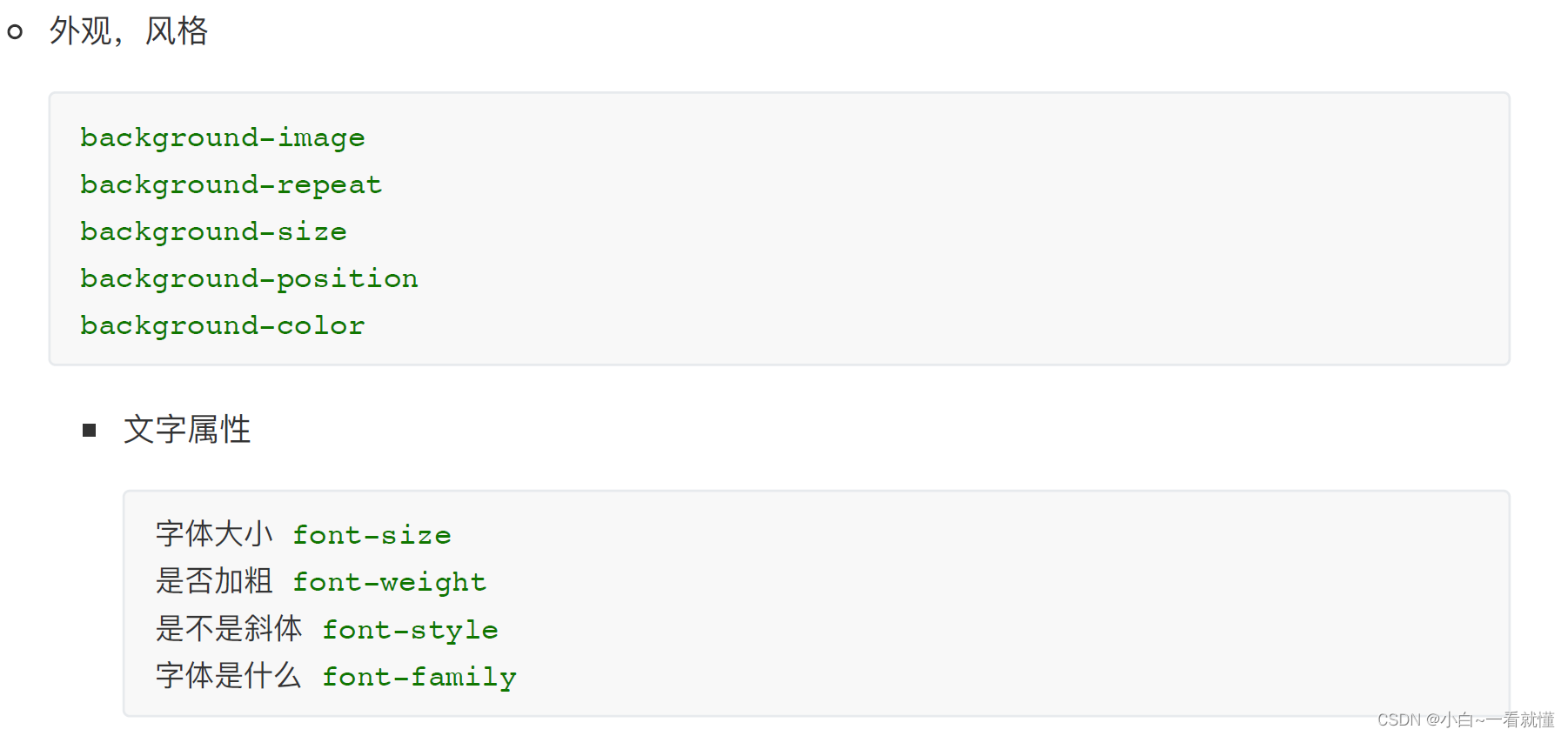
font-size: 14px;
font-weight: 600;
font-style: italic;
font-family: 'Gill Sans', 'Gill Sans MT', Calibri, 'Trebuchet MS', sans-serif;
}
</style>
</head>
<body>
<div class="image">
小滴课堂
</div>
</body>
</html>第7集 CSS的层叠与选择器优先级
<!DOCTYPE html>
<html lang="en">
<head>
<meta charset="UTF-8">
<meta http-equiv="X-UA-Compatible" content="IE=edge">
<meta name="viewport" content="width=device-width, initial-scale=1.0">
<title>Document</title>
<style>
/* .box{
color: red;
}
.box{
color: blue;
} */
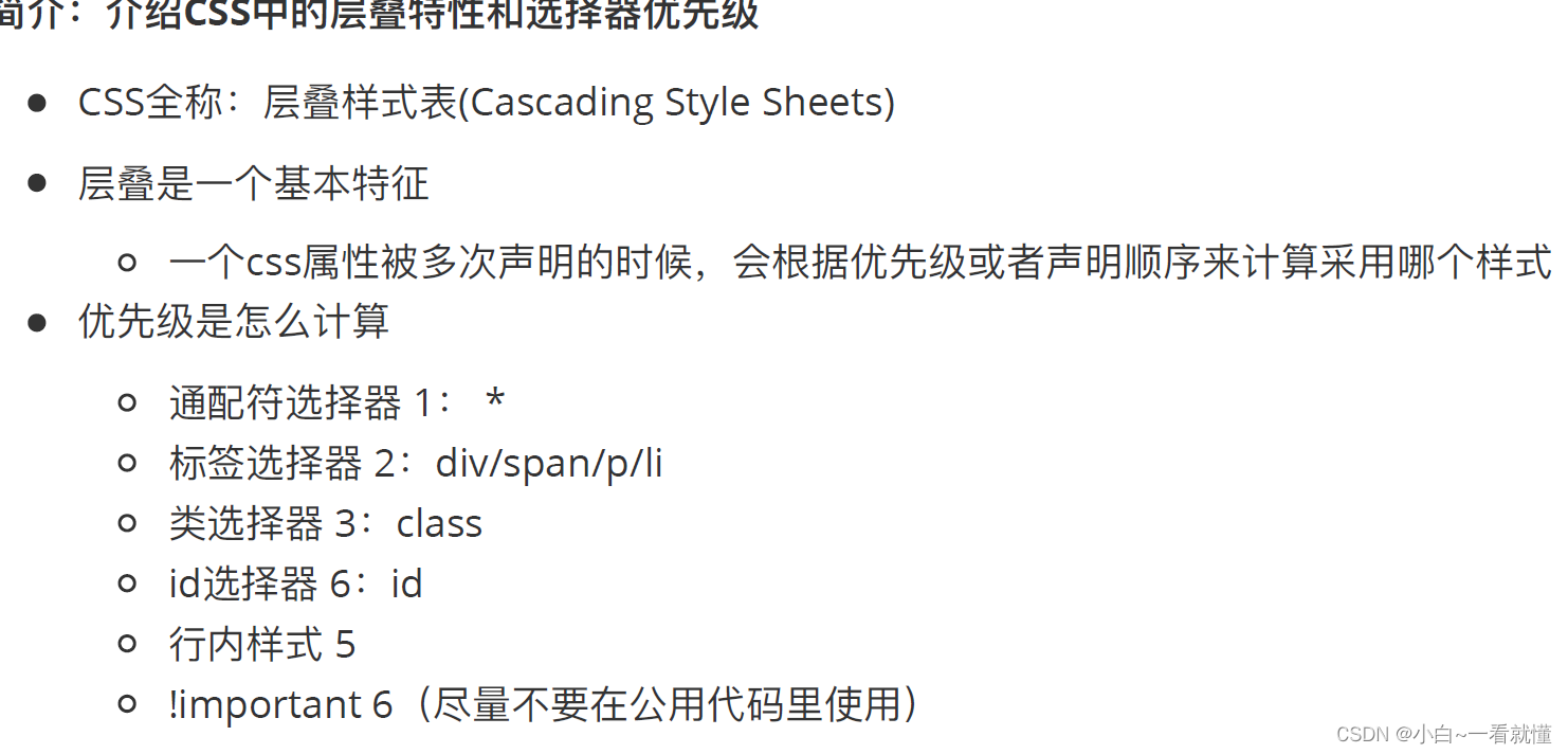
* {
color: red !important;
}
div {
color: blue;
}
.box {
color: green;
}
#idbox {
color: yellow;
}
</style>
</head>
<body>
<div class="box" id="idbox" style="color: pink;">小弟课堂很牛比</div>
</body>
</html>第8集 CSS中常⻅的可继承的属性
<!DOCTYPE html>
<html lang="en">
<head>
<meta charset="UTF-8">
<meta http-equiv="X-UA-Compatible" content="IE=edge">
<meta name="viewport" content="width=device-width, initial-scale=1.0">
<title>Document</title>
<style>
/* * {
color: red;
} */
/* 通配符可以看作顶级的父类 */
.box {
color: red;
font-size: 30px;
font-weight: 700;
font-style: italic;
/* italic是斜体 */
text-indent: 50px;
/* ident是缩进 */
text-align: right;
/* align是对齐、排整齐的意思 */
line-height: 80px;
}
</style>
</head>
<body>
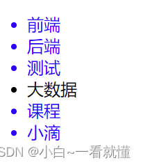
<div class="box">
<div>
前端
<div>html</div>
</div>
<div>后端</div>
<div>测试</div>
</div>
</body>
</html>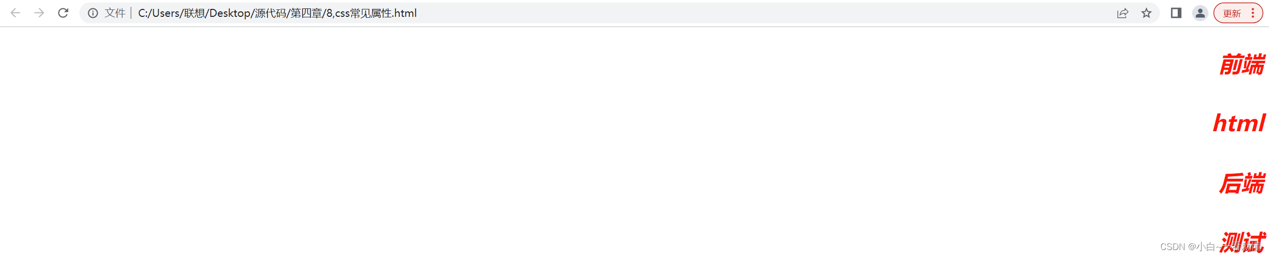


 3776
3776


 被折叠的 条评论
为什么被折叠?
被折叠的 条评论
为什么被折叠?
 到【灌水乐园】发言


