


用数据可视化的知识分析下列数据
数据集
某一年的全国疫情数据
地区 | 新增确诊 | 治愈人数 | 死亡人数 | 现存人数 | 累计确诊 |
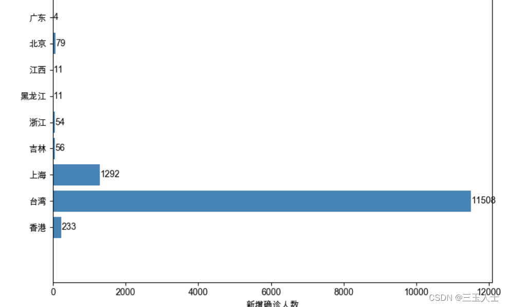
香港 | 233 | 59015 | 9282 | 261201 | 329498 |
台湾 | 11508 | 13742 | 860 | 73844 | 88446 |
上海 | 1292 | 29302 | 292 | 21217 | 50811 |
吉林 | 56 | 38373 | 5 | 1755 | 40133 |
浙江 | 54 | 2464 | 1 | 612 | 3077 |
黑龙江 | 11 | 2521 | 13 | 397 | 2931 |
江西 | 11 | 1083 | 1 | 274 | 1358 |
北京 | 79 | 1810 | 9 | 214 | 2033 |
广东 | 4 | 6814 | 8 | 175 | 6997 |
江苏 | 2 | 2122 | 0 | 70 | 2192 |
福建 | 2 | 2940 | 1 | 70 | 3011 |
山东 | 8 | 2624 | 7 | 64 | 2695 |
内蒙古 | 10 | 1690 | 1 | 49 | 1740 |
河南 | 4 | 2829 | 22 | 47 | 2898 |
山西 | 0 | 373 | 0 | 45 | 418 |
广西 | 1 | 1533 | 2 | 45 | 1580 |
湖南 | 1 | 1332 | 4 | 43 | 1379 |
青海 | 1 | 56 | 0 | 39 | 95 |
辽宁 | 1 | 1607 | 2 | 34 | 1643 |
四川 | 4 | 1974 | 3 | 34 | 2011 |
云南 | 0 | 2081 | 2 | 33 | 2116 |
海南 | 0 | 253 | 6 | 29 | 288 |
河北 | 2 | 1972 | 7 | 19 | 1998 |
安徽 | 0 | 1049 | 6 | 10 | 1065 |
陕西 | 1 | 3265 | 3 | 9 | 3277 |
湖北 | 0 | 63881 | 4512 | 5 | 68398 |
天津 | 1 | 1798 | 3 | 2 | 1803 |
重庆 | 1 | 688 | 6 | 2 | 696 |
西藏 | 0 | 1 | 0 | 0 | 1 |
新疆 | 0 | 996 | 3 | 0 | 999 |
甘肃 | 0 | 679 | 2 | 0 | 681 |
贵州 | 0 | 177 | 2 | 0 | 179 |
宁夏 | 0 | 122 | 0 | 0 | 122 |
澳门 | 0 | 82 | 0 | 0 | 82 |
要求根上列数据进行数据分析,并生成图表和综述
使用pandas和matplotlib绘制了一个水平条形图,显示了不同地区的新增确诊人数分布。
具体步骤如下:
-
导入所需的库:使用
import pandas as pd导入pandas库,import matplotlib.pyplot as plt导入matplotlib.pyplot库,import matplotlib.font_manager as fm导入matplotlib.font_manager库。 -
设置字体:使用
plt.rcParams['font.family'] = 'Arial Unicode MS'设置字体为Arial Unicode MS,这样可以支持中文显示。 -
读取数据:使用
df = pd.read_excel('疫情数据.xlsx')从Excel文件中读取疫情数据,并将其存储在名为df的DataFrame中。 -
数据处理:使用
df['地区'] = df['地区'].str.strip()对地区列进行处理,去除地区名称的空格。 -
统计地区数量:使用
category_count = df['地区'].value_counts()统计每个地区的出现次数,得到地区的数量信息。 -
创建图像对象:使用
fig, ax = plt.subplots(figsize=(8, 0.5*category_count.size))创建一个图像对象,设置图像的尺寸为(8, 0.5*category_count.size),即宽度为8英寸,高度为每个地区的数量乘以0.5英寸。同时,将图像对象的返回值分别赋给fig和ax变量。 -
设置网格规格:使用
gs = gridspec.GridSpec(nrows=category_count.size, ncols=1, height_ratios=[2]*category_count.size)设置网格规格,将网格的行数设置为地区的数量,每个网格的高度比例设置为2(可以根据需要调整高度)。 -
绘制水平条形图:使用
ax.barh(df['地区'], df['新增确诊'], color='steelblue')绘制水平条形图,横坐标为新增确诊人数(df['新增确诊']),纵坐标为地区名称(df['地区']),条形图的颜色设置为steelblue。 -
设置标签和标题:使用
plt.xlabel('新增确诊人数')设置x轴标签为"新增确诊人数",plt.ylabel('地区')设置y轴标签为"地区",plt.title('Distribution of New Confirmed Cases')设置标题为"Distribution of New Confirmed Cases"。 -
显示数据标签:使用
ax.text(v + 5, i, str(v), va='center')在每个条形图上显示其对应的新增确诊人数。其中v为新增确诊人数,i为对应的地区索引,v + 5表示数据标签的位置稍微偏移。 -
调整子图布局:使用
plt.tight_layout(rect=[0, 0, 1, 0.95])调整子图布局,确保子图之间的间距合适。 -
显示图像:使用
plt.show()将图像显示出来。
代码展示:
import pandas as pd
import matplotlib.pyplot as plt
import matplotlib.font_manager as fm
from matplotlib import gridspec
plt.rcParams['font.family'] = 'Arial Unicode MS'  # 设置字体为Arial Unicode MS


df = pd.read_excel('疫情数据.xlsx')
df['地区'] = df['地区'].str.strip()

category_count = df['地区'].value_counts()

fig, ax = plt.subplots(figsize=(8, 0.5*category_count.size))  # 调整图像的尺寸

gs = gridspec.GridSpec(nrows=category_count.size, ncols=1, height_ratios=[2]*category_count.size)  # 设置网格规格,调整纵间距

ax.barh(df['地区'], df['新增确诊'], color='steelblue')

plt.xlabel('新增确诊人数')
plt.ylabel('地区')
plt.title('Distribution of New Confirmed Cases')

for i, v in enumerate(df['新增确诊']):
    ax.text(v + 5, i, str(v), va='center')  # 显示数据标签

plt.tight_layout(rect=[0, 0, 1, 0.95])  # 调整子图布局

plt.show()
生成图表


 1848
1848


 被折叠的 条评论
为什么被折叠?
被折叠的 条评论
为什么被折叠?
 到【灌水乐园】发言


