


别具一格,独此一家,原创唯美浪漫情人节表白专辑
不一样的惊喜哦~!(html5,css3,svg)表白爱心代码(复制就可用)(4)
目录
款式四:时光的记忆款

动态图

适用:相片回忆,精简的几句表白文字。
修改使用方法:
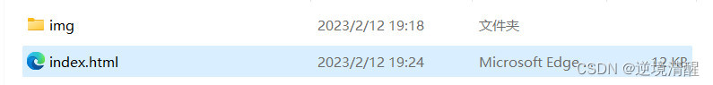
1、拷贝完整源代码
保存成index.html文件。具体方法见 原创唯美浪漫情人节表白专辑(1)的介绍。
2、更新时光盒所显示的相片
准备12张图片,大小为500px*500px
挑选6张显示在最外面的图片:
将文件名改为:w1.jpg、w2.jpg、w3.jpg、w4.jpg、w5.jpg、w6.jpg。
挑选6张显示在最里面的图片:
将文件名改为:i1.jpg、i2.jpg、i3.jpg、i4.jpg、i5.jpg、i6.jpg。
将所有图片拷贝到名字为:img的目录中。
3、写上简短的表白文字
修改:【有一种路叫做浪漫。。。美好的未来】这几个字----》为你想表白的简短文字
此部分是修改以下显示内容:

4、检验修改表白内容后的效果
双击运行index.html文件,或用浏览器打开index.html文件,即可显示表白效果。
5、打包发送
将你的文件打包成.zip\.rar等通用压缩格式(index.html和img目录一起),发给你喜欢的人,让她(他)解压压缩包后,运行index.html文件即可。
6、完整源代码
<!DOCTYPE html>

<html lang="en" xmlns="http://www.w3.org/1999/xhtml">
<head>
    <meta charset="utf-8" />
    <link rel="apple-touch-icon" type="image/png" href="https://.png" />
    <link rel="shortcut icon" type="image/x-icon" href="https://.ico" />
    <link rel="mask-icon" type="image/x-icon" href="https://.svg" color="#111" />
    <meta name="逆境清醒2023情人节专辑" content="逆境清醒2023情人节专辑">
    <title>时光的记忆款旋转相册 逆境清醒</title>
    <link rel="stylesheet" href=".css">

    <style>
        html {
            background: #000;
            height: 100%;
        }

        .body {
            position: absolute;
            background: #000;
            height: 100%;
        }

        .axdiv {
            align-items: center;
            justify-content: center;
            position: relative;
        }

        .saysomething {
            position: relative;
            height: 80px;
            padding-top: 30px;
            background-image: linear-gradient(to top, #3ab5b0 0%, #3d99be 31%, #56317a 100%);
            color: white;
            text-align: center;
            align-items: center;
            justify-content: center;
            border: 5px solid white;
        }

        canvas {
            position: absolute;
        }

        * {
            margin: 0;
            padding: 0;
            color: #FFF;
        }

        canvas#canvas {
            display: block;
            background: #000;
        }

        ul#navigation {
            position: absolute;
            height: 100%;
            top: 0;
            right: 0;
            text-align: center;
            margin-right: 1.6rem;
            font-size: 0.8rem;
            -webkit-writing-mode: vertical-rl;
            -ms-writing-mode: tb-rl;
            writing-mode: vertical-rl;
        }

            ul#navigation > li {
                display: inline-block;
            }

        .wrap {
            width: 10px;
            height: 10px;
            margin: 200px 400px;
            position: relative;
            align-items: center;
            justify-content: center;
        }

        .cube {
            width: 1000px;
            height: 400px;
            margin: 0 auto;
            transform-style: preserve-3d;
            transform: rotateX(-30deg) rotateY(-80deg);
            -webkit-animation: rotatecube 20s infinite;
            animation-timing-function: linear;
            align-items: center;
            justify-content: center;
        }

        @-webkit-keyframes rotatecube {
            from {
                transform: rotateX(0deg) rotateY(0deg)
            }

            to {
                transform: rotateX(360deg) rotateY(360deg)
            }
        }

        .cube div {
            position: absolute;
            width: 300px;
            height: 300px;
            //opacity: .8;
            opacity: 1;
            transition: all .4s;
            padding: 20px;
            border: 10px solid white;
        }

        .pic {
            width: 300px;
            height: 300px;
        }

        .img {
        }


        .cube .out_front {
            transform: rotateY(0deg) translateZ(180px)
        }

        .cube .out_back {
            transform: translateZ(-180px) rotateY(180deg)
        }

        .cube .out_left {
            transform: rotateY(90deg) translateZ(180px)
        }

        .cube .out_right {
            transform: rotateY(-90deg) translateZ(180px)
        }

        .cube .out_top {
            transform: rotateX(90deg) translateZ(180px)
        }

        .cube .out_bottom {
            transform: rotateX(-90deg) translateZ(180px)
        }

        .cube span {
            display: bloack;
            width: 200px;
            height: 200px;
            position: absolute;
            top: 50px;
            left: 50px
        }

        .cube .in_pic {
            width: 200px;
            height: 200px
        }

        .cube .in_front {
            transform: rotateY(0deg) translateZ(100px)
        }

        .cube .in_back {
            transform: translateZ(-100px) rotateY(180deg)
        }

        .cube .in_left {
            transform: rotateY(90deg) translateZ(100px)
        }

        .cube .in_right {
            transform: rotateY(-90deg) translateZ(100px)
        }

        .cube .in_top {
            transform: rotateX(90deg) translateZ(100px)
        }

        .cube .in_bottom {
            transform: rotateX(-90deg) translateZ(100px)
        }

        .cube:hover .out_front {
            transform: rotateY(0deg) translateZ(400px)
        }

        .cube:hover .out_back {
            transform: translateZ(-400px) rotateY(180deg)
        }

        .cube:hover .out_left {
            transform: rotateY(90deg) translateZ(400px)
        }

        .cube:hover .out_right {
            transform: rotateY(-90deg) translateZ(400px)
        }

        .cube:hover .out_top {
            transform: rotateX(90deg) translateZ(400px)
        }

        .cube:hover .out_bottom {
            transform: rotateX(-90deg) translateZ(400px)
        }
    </style>

    <script>
(function () {
  'use strict';
  window.addEventListener('load', function () {
    var canvas = document.getElementById('canvas');

    if (!canvas || !canvas.getContext) {
      return false;
    }

    /********************
      Random Number
    ********************/

    function rand(min, max) {
      return Math.floor(Math.random() * (max - min + 1) + min);
    }

    /********************
      Var
    ********************/

    var ctx = canvas.getContext('2d');
    var X = canvas.width = window.innerWidth;
    var Y = canvas.height = window.innerHeight;
    var mouseX = X / 2;
    var mouseY = Y / 2;
    var shapes = [];
    var shapeNum = 100;
    var angle = 360 / 2;
    var radian = angle * Math.PI / 180;
    var hsl = rand(0, 360);

    /********************
      Animation
    ********************/

    window.requestAnimationFrame =
      window.requestAnimationFrame ||
      window.mozRequestAnimationFrame ||
      window.webkitRequestAnimationFrame ||
      window.msRequestAnimationFrame ||
      function(cb) {
        setTimeout(cb, 17);
      };

    /********************
      Shape
    ********************/

    function Shape(ctx, x, y, i) {
      this.ctx = ctx;
      this.init(x, y, i);
    }

    Shape.prototype.init = function(x, y, i) {
      this.x = x;
      this.y = y;
      this.i = i;
      this.r = 15 * i;
      this.a = 1 * i;
      this.rad = this.a * Math.PI / 180;
    };

    Shape.prototype.draw = function() {
      var ctx  = this.ctx;
      ctx.save();
      ctx.strokeStyle = 'hsl(' + hsl + ', ' + (100 - this.i) + '%, ' + (100 - this.i) + '%';;
      ctx.lineWidth = 0.4;
      ctx.translate(this.x, this.y);
      ctx.rotate(Math.sin(this.rad * 3));
      ctx.translate(-this.x, -this.y);
      ctx.beginPath();
      ctx.moveTo(Math.sin(this.rad) * 100 + Math.sin(radian * 1) * this.r + this.x, Math.cos(this.rad) * 100 + Math.cos(radian * 1) * this.r + this.y);
      ctx.lineTo(Math.sin(this.rad) * 100 + Math.sin(radian * 2) * this.r + this.x, Math.cos(this.rad) * 100 + Math.cos(radian * 2) * this.r + this.y);
      ctx.lineTo(Math.sin(this.rad) * 100 + Math.sin(radian * 3) * this.r + this.x, Math.cos(this.rad) * 100 + Math.cos(radian * 3) * this.r + this.y);
      ctx.closePath();
      ctx.stroke();
      ctx.restore();
    };

    Shape.prototype.updateParams = function() {
      this.a += 1;
      this.rad = this.a * Math.PI / 180;
    };

    Shape.prototype.resize = function() {
      this.x = X / 2;
      this.y = Y / 2;
    };

    Shape.prototype.render = function(i) {
      this.updateParams();
      this.draw();
    };

    for (var i = 0; i < shapeNum; i++) {
      var s = new Shape(ctx, X / 2, Y / 2, i);
      shapes.push(s);
    }

    /********************
      Render
    ********************/

    function render() {
      //ctx.clearRect(0, 0, X, Y);
      ctx.globalCompositeOperation = "darken";
      ctx.globalAlpha = 0.05;
      ctx.fillStyle = "rgb(0,0,0)";
      ctx.fillRect(0, 0, X, Y);
      ctx.globalCompositeOperation = "source-over";
      ctx.globalAlpha = 1;
      for (var i = 0; i < shapes.length; i++) {
        shapes[i].render(i);
      }
      requestAnimationFrame(render);
    }

    render();

    /********************
      Color
    ********************/

    function changeColor() {
      var time = rand(1000, 5000);
      hsl = rand(0, 360);
      setTimeout(changeColor, time);
    }

    changeColor();

    /********************
      Event
    ********************/

    function onResize() {
      X = canvas.width = window.innerWidth;
      Y = canvas.height = window.innerHeight;
      for (var i = 0; i < shapes.length; i++) {
        shapes[i].resize();
      }
    }

    window.addEventListener('resize', function(){
      onResize();
    });

    canvas.addEventListener('wheel', function(e){
      for (var i = 0; i < shapes.length; i++) {
        shapes[i].r += e.deltaY / 10;
      }
    }, false);

    var touchStartY;
    var touchMoveY;
    var touchEndY;

    canvas.addEventListener('touchstart', function(e) {
      var touch = e.targetTouches[0];
      touchStartY = touch.pageY;
    }, false);

    canvas.addEventListener('touchmove', function(e) {
      var touch = e.targetTouches[0];
      touchMoveY = touch.pageY;
      touchEndY = touchStartY - touchMoveY;
      for (var i = 0; i < shapes.length; i++) {
        shapes[i].r -= touchEndY / 10;
      }
    }, false);

    canvas.addEventListener('touchend', function(e) {
      touchStartY = null;
      touchMoveY = null;
      touchEndY = null;
    }, false);

  });
  // Author
  console.log('File Name / eyesight.js\nCreated Date / Jun 28, 2020\nAuthor / Toshiya Marukubo\nTwitter / https://twitter.com/toshiyamarukubo');
})();
</script>
</head>
<body>
    <canvas id="canvas" width="1519" height="746"></canvas>
    <div class="axdiv">
        <div class="saysomething"><h1>有一种路叫做浪漫,那里有你给我美好的未来。</h1></div>
    </div>
    <div class="wrap">
        <div class="cube">
            <div class="out_front"><img src="img/w1.jpg" class="pic" /></div>
            <div class="out_back"><img src="img/w2.jpg" class="pic"></div>
            <div class="out_left"><img src="img/w3.jpg" class="pic"></div>
            <div class="out_right"><img src="img/w4.jpg" class="pic"></div>
            <div class="out_top"><img src="img/w5.jpg" class="pic"></div>
            <div class="out_bottom"><img src="img/w6.jpg" class="pic"></div>

            <span class="in_front"><img src="img/i1.jpg" class="in_pic"></span>
            <span class="in_back"><img src="img/i2.jpg" class="in_pic"></span>
            <span class="in_left"><img src="img/i3.jpg" class="in_pic"></span>
            <span class="in_right"><img src="img/i4.jpg" class="in_pic"></span>
            <span class="in_top"><img src="img/i5.jpg" class="in_pic"></span>
            <span class="in_bottom"><img src="img/i6.jpg" class="in_pic"></span>
        </div>
    </div>

</body>
</html>

| 原创唯美浪漫情人节表白专辑(1) |
| 原创唯美浪漫情人节表白专辑(2) |
| 原创唯美浪漫情人节表白专辑(3) |
| 原创唯美浪漫情人节表白专辑(4) |
推荐阅读:
 | ||
|
| 2023年春节祝福第二弹——送你一只守护兔,让它温暖每一个你【html5 css3】画会动的小兔子 | |
| 25 |
| 2023春节祝福系列第一弹(放飞祈福孔明灯,祝福大家身体健康)(附完整源代码及资源免费下载) |
| 24 |
| |
| 23 |
| |
| 22 |
| |
| 21 |
| python爱心源代码集锦 |
| 20 |
| 巴斯光年python turtle绘图__附源代码 |
| 19 |
| Three.js实例详解___旋转的精灵女孩(附完整代码和资源) |
| 18 |
| |
| 17 |
| |
| 16 |
| |
| 15 |
| |
| 14 |
| |
| 13 |
| |
| 12 |
| |
| 11 |
| 用代码写出浪漫__合集(python、matplotlib、Matlab、java绘制爱心、玫瑰花、前端特效玫瑰、爱心) |
| 10 |
| |
| 9 |
| |
| 8 |
| |
| 7 |
| |
| 6 |
| |
| 5 |
| |
| 4 |
| |
| 3 |
| |
| 2 |
| |
| 1 |
|


 被折叠的 条评论
为什么被折叠?
被折叠的 条评论
为什么被折叠?
 到【灌水乐园】发言


