


 本文介绍了SVG中三种常用的动画标记:<animate>、<animateTransform>和<animateMotion>,并详细讲解了如何创建和应用这些动画。通过实例展示了如何制作来回往返且初次逐渐变大的圆形、矩形旋转以及弧线路径运动的动画效果,涵盖了SVG动画的基本属性如attributeType、attributeName、from/to、dur等,并解释了repeatCount、repeatDur、begin、restart等关键属性的用法。
SVG中提供三种常用动画标记
<animate> 基础动画
<animateTransform> 形变动画
<animateMotion> 路径动画
SVG动画使用方式
创建动画,告诉动画标记哪个元素需要执行动画
创建元素,在元素中说明需要执行什么动画
SVG动画属性
attributeType: CSS/XML规定的属性值的名称空间
attributeName: 规定元素的哪个属性会产生动画效果
from/to: 从哪到哪
dur: 动画时长
fill: 动画结束之后的状态,保持freeze结束状态/remove回复初始状态
基本图形
x:水平坐标轴
y:垂直坐标轴
rx:矩形圆角是r为半径画的圆
cx:圆形的中心点x轴坐标
cy:圆形的中心点y轴坐标
r:圆形的半径
fill:填充颜色
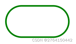
1.矩形
<svg width="500" height="500">
        <rect x="30" y="30" width="200" height="100" fill="none" stroke="green" stroke-width="5" rx="50" ry="100"></rect>
</svg>
效果:
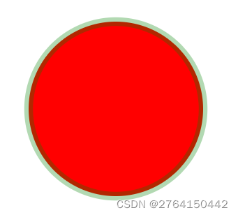
2.圆形
<circle cx="300" cy="300" r="100" fill="red" stroke="green" stroke-width="10" stroke-opacity="0.3"></circle>效果:
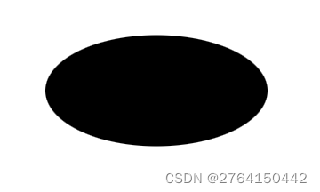
3.椭圆
<ellipse cx="200" cy="200" rx="100" ry="50"></ellipse>效果图:
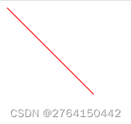
4.直线
<line x1="0" y1="0" x2="100" y2="100" stroke="red"></line>效果:
5.折线
<polyline points="0,0,0,100,50,100" stroke="green" fill="none"></polyline>效果:
svg动画
常用属性
repeatCount = "次数/indefinite" 规定动画重复的次数
repeatDur = “持续时间/indefinite” 规定动画重复总时长
begin: 规定动画开始的时间
begin="1s"
begin="click"
begin="click + 1s"
restart: 规定元素开始动画后,是否可以被重新开始执行
always: 动画可以在任何时候被重置。默认值
whnNoActive: 只有在动画没有被激活的时候才能被重置,例如在动画结束之后
never: 在整个SVG自行过程中,元素动画不能被重置
calcMode: 非连续动画,没有动画效果瞬间完成
linear: 默认属性,匀速动画
discrete: 非连续动画,没有动画效果瞬间完成
paced: 规定整个动画效果始终以相同的速度进行,设置keyTimes属性无效
spline: 配合ksyplines属性来定义各个动画过渡,自定义动画
keyTimes: 划分动画时间片段,取值0-1
values: 划分对应取值片段的值
1.来回往返并且第一次逐渐变大的圆形
重点:利用id来实现动画一直移动
代码:
<body>
    <svg width="800" height="800">
        <circle id="circle1" cx="100" cy="100" r="5">
             <!-- 点击后动画开始执行 -->
             <animate attributeName="r"   attributeType="XML" from="0" to="100" begin="click" dur="5"  fill="freeze"></animate>

             <animate attributeName="fill" attributeType="XML" from="yellow" to="orange" begin="3" dur="5" fill="freeze"></animate>

             <animate id="toRight" attributeName="cx" attributeType="XML" from="100" to="500" begin="click;toLeft.end" dur="5" fill="freeze"></animate>
             <animate id="toLeft" attributeName="cx" attributeType="XML" from="500" to="100" begin="toRight.end" dur="5" fill="freeze"></animate>
        </circle>
    </svg>
</body>
效果:
最开始:
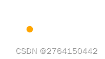
一半时:
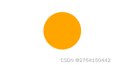
最大时:
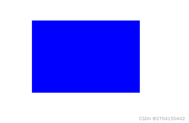
2.矩形动画
代码:
利用 <animateTransform> 形变动画
rect:
x:x轴坐标
y: y轴坐标
fill:填充颜色
animateTransform:
form: 角度 坐标 坐标
to:角度 坐标 坐标
<body>
    <svg width="800" height="800">
        <rect x="100" y="100" width="300" height="200" fill="blue">
            <animateTransform attributeName="transform" type="rotate" from="0 100 100" to="360 100 100" dur="3" begin=" click" fill="freeze"></animateTransform>
        </rect>
    </svg>
</body>
效果(点击过后旋转):
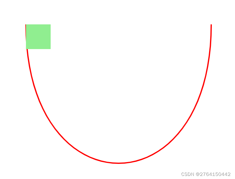
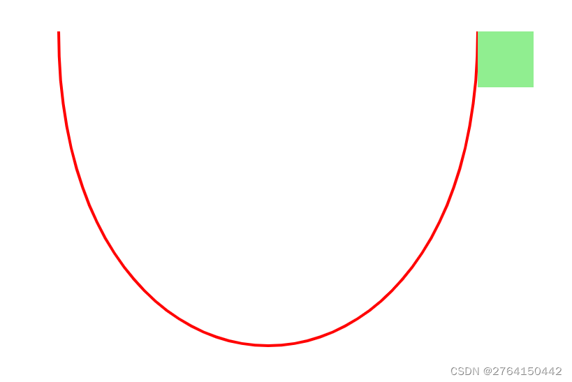
3.弧线运动
代码:
<body>
    <svg width="800" height="800" viewBox="-100 -100 500 500">
        <path d="M0 0 c0 300 300 300 300 0" stroke="red" stroke-width="2" fill="none"></path>
        <rect x="0" y="0" width="40" height="40" fill="lightgreen">
            <animateMotion path="M0 0 c0 300 300 300 300 0" dur="3" begin=" click" fill="freeze" retate="auto"><animateMotion/>
        </rect>
    </svg>
</body>
效果(点击后沿着弧线运动):


 扫一扫
扫一扫


 2591
2591

 被折叠的 条评论
为什么被折叠?
被折叠的 条评论
为什么被折叠?
 到【灌水乐园】发言


