


作者:老余捞鱼
原创不易,转载请标明出处及原作者。

写在前面的话:
本文比较了六种技术分析方法,用于识别股市趋势。并通过Python代码分析了这些方法在SPY交易 traded fund(ETF)上的应用和效果,最终得出了各种方法的回报率和统计数据,以及对比了它们在其他几只股票上的表现。
在我前面发布的不少文章中都有读者留言询问,到底用哪种技术方法识别股票的发展趋势最好?识别趋势在交易中至关重要,因为它可以帮助交易者顺应市场趋势,最大限度地提高利润,降低风险。通过识别市场方向,交易者可以对进入和退出点做出明智的决定,从而改进整体策略,避免在波动条件下犯下代价高昂的错误。希望看完本文您能找到自己想要的答案。
在本文中,您可以看到以下内容:
- 描述使用指标识别趋势的最常用的6种技术分析方法:快慢移动平均线、移动平均线+MACD、RSI+快慢移动平均线、布林线和RSI、ADX与快慢移动平均线以及一目均衡云图和MACD。
- 每种方法都通过Python代码实现,以趋势为信号,找出每种方法的总回报。(我将使用每个指标的市场实践参数)。
- 以此来计算总回报和其他统计数据,如最大回撤、夏普比率等,并比较各种方法的统计数据。
- 运用上述知识计算股票数量并给出图表展示以及相应的分析结果。
- 最后回答问题,哪种方法是赢家?
请注意,在本文中我不会就 “买入并持有” 展开任何比较。因我的分析范畴是去了解并对比各类方法,而不是制定“致胜策略”的工作。
在我们深入研究每种方法之前,如果你想看看用 Python 是如何完成该项工作的,可以继续往下读。或则您可以直接跳过代码实现的环节,直接去看分析结果,但您仍然会发现一些分析会很有趣!
一、前期准备工作
我们将导入整个代码所需的库,并下载包含 SPY 价格的主数据帧。我使用 SPY,因为对我来说,在分析个股之前,最重要的趋势识别就是了解市场。
# Import necessary libraries
import yfinance as yf
import pandas as pd
import pandas_ta as ta
import matplotlib.pyplot as plt
import numpy as np

# Download the stock data
ticker = 'SPY'
df = yf.download(ticker, start='2023-01-01', end='2024-06-01')
然后,我们来创建一个函数,该函数将在代码的其余部分中用于获取趋势和一些统计数据
def calculate_returns(df_for_returns, col_for_returns = 'Close', col_for_signal = 'Trend'):

    stats = {}

    # Calculate daily returns
    df_for_returns['Daily_Returns'] = df[col_for_returns].pct_change()
    df_for_returns['Returns'] = df_for_returns['Daily_Returns'] * df_for_returns[col_for_signal].shift(1)
    df_for_returns['Returns'] = df_for_returns['Returns'].fillna(0)
    df_for_returns['Equity Curve'] = 100 * (1 + df_for_returns['Returns']).cumprod()

    equity_curve = df_for_returns['Equity Curve']
    # Calculate the running maximum of the equity curve
    cumulative_max = equity_curve.cummax()
    drawdown = (equity_curve - cumulative_max) / cumulative_max
    stats['max_drawdown'] = drawdown.min()

    # calculate the sharpe ratio
    stats['sharpe_ratio'] = (df_for_returns['Returns'].mean() / df_for_returns['Returns'].std()) * np.sqrt(252)

    # calculate the total return
    stats['total_return'] = (equity_curve.iloc[-1] / equity_curve.iloc[0]) - 1

    # calculate the number of long signals
    stats['number_of_long_signals'] = len(df_for_returns[df_for_returns[col_for_signal] == 1])

    # calculate the number of short signals
    stats['number_of_short_signals'] = len(df_for_returns[df_for_returns[col_for_signal] == -1])

    return df_for_returns['Equity Curve'], stats
现在我们准备好了!开始吧。
二、快慢移动平均线
Fast and Slow Moving Averages
这种方法是最基本的趋势分析方法,也是最简单的方法。你有两条移动平均线。当快速移动平均线高于慢速移动平均线时,表明趋势向上。
def calculate_trend_2_ma(df_ohlc, period_slow=21, period_fast=9):
    # Calculate Moving Averages (fast and slow) using pandas_ta
    df_ohlc['MA_Fast'] = df_ohlc.ta.sma(close='Close', length=period_fast)
    df_ohlc['MA_Slow'] = df_ohlc.ta.sma(close='Close', length=period_slow)

    # Determine the trend based on Moving Averages
    def identify_trend(row):
        if row['MA_Fast'] > row['MA_Slow']:
            return 1
        elif row['MA_Fast'] < row['MA_Slow']:
            return -1
        else:
            return 0

    df_ohlc = df_ohlc.assign(Trend=df_ohlc.apply(identify_trend, axis=1))
    df_ohlc['Trend'] =  df_ohlc['Trend'].fillna('0')

    return df_ohlc['Trend']

df['Trend'] = calculate_trend_2_ma(df, period_slow=21, period_fast=9)
df['Equity Curve'], stats = calculate_returns(df, col_for_returns = 'Close', col_for_signal = 'Trend')

# Plotting with adjusted subplot heights
fig, ax1 = plt.subplots(1, 1, figsize=(14, 7), sharex=True)

# Plotting the close price with the color corresponding to the trend
for i in range(1, len(df)):
    ax1.plot(df.index[i-1:i+1], df['Close'].iloc[i-1:i+1],
             color='green' if df['Trend'].iloc[i] == 1 else
                   ('red' if df['Trend'].iloc[i] == -1 else 'darkgrey'), linewidth=2)

# Plot the Moving Averages
ax1.plot(df['MA_Fast'], label='9-day MA (Fast)', color='blue')
ax1.plot(df['MA_Slow'], label='21-day MA (Slow)', color='orange')
ax1.set_title(f'{ticker} - Price and Moving Averages')
ax1.text(0.5, 0.9, f'Total Return: {stats['total_return']:.2%}', transform=ax1.transAxes, ha='center', va='top', fontsize=14)
ax1.legend(loc='best')

plt.show()
运行代码后,您将得到以下图表。看看我是如何绘制收盘价的。当信号为上升趋势时,线的颜色为绿色。当信号为下降趋势时,线的颜色为红色。当没有信号时,则为灰色。
如果你对如何画出可视化交易信号还不熟悉,可以看的这篇文章《手把手带你用 Python 画出可视化交易信号》
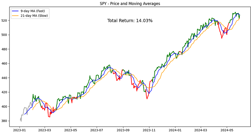
总回报率为 14.03%。剧透一下!到目前为止,SPY 的这种方法是最好的。但请继续往下阅读,它后面会走偏的!
三、移动平均线 + MACD
Moving Average + MACD
这个的核心是两个指标需要保持一致。这意味着,要识别上升趋势,收盘价应高于移动平均线,而 MACD 线应高于 MACD 信号。
def calculate_trend_macd_ma(df_ohlc, ma_period=50, macd_fast=12, macd_slow=26, macd_signal=9):
    # Calculate MACD using pandas_ta
    df_ohlc.ta.macd(close='Close', fast=macd_fast, slow=macd_slow, signal=macd_signal, append=True)

    # Calculate Moving Average
    df_ohlc['MA'] = df_ohlc.ta.sma(close='Close', length=ma_period)

    # Determine the trend based on MA and MACD
    def identify_trend(row):
        macd_name = f'{macd_fast}_{macd_slow}_{macd_signal}'
        if row['Close'] > row['MA'] and row[f'MACD_{macd_name}'] > row[f'MACDs_{macd_name}']:
            return 1
        elif row['Close'] < row['MA'] and row[f'MACD_{macd_name}'] < row[f'MACDs_{macd_name}']:
            return -1
        else:
            return 0

    df_ohlc['Trend'] = df_ohlc.apply(identify_trend, axis=1)
    return df_ohlc['Trend']

df['Trend'] = calculate_trend_macd_ma(df, ma_period=50, macd_fast=12, macd_slow=26, macd_signal=9)
df['Equity Curve'], stats = calculate_returns(df, col_for_returns = 'Close', col_for_signal = 'Trend')

# Plotting with adjusted subplot heights
fig, (ax1, ax2) = plt.subplots(2, 1, figsize=(14, 10), sharex=True,
                               gridspec_kw={'height_ratios': [3, 1]})

# Plotting the close price with the color corresponding to the trend
for i in range(1, len(df)):
    ax1.plot(df.index[i-1:i+1], df['Close'].iloc[i-1:i+1],
             color='green' if df['Trend'].iloc[i] == 1 else
                   ('red' if df['Trend'].iloc[i] == -1 else 'darkgrey'), linewidth=2)

# Plot the Moving Average
ax1.plot(df['MA'], label=f'50-day MA', color='orange')
ax1.set_title(f'{ticker} - Price and Moving Average')
ax1.text(0.5, 0.9, f'Total Return: {stats['total_return']:.2%}', transform=ax1.transAxes, ha='center', va='top', fontsize=14)
ax1.legend(loc='best')

# Plot MACD and Signal Line on the second subplot (smaller height)
ax2.plot(df.index, df['MACD_12_26_9'], label='MACD', color='blue')
ax2.plot(df.index, df['MACDs_12_26_9'], label='Signal Line', color='red')
ax2.set_title(f'{ticker} - MACD')
ax2.legend(loc='best')

plt.show()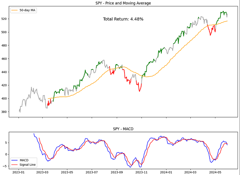
总回报率是 4.48%,比 2-MA 低不少呢,但你看,有好多灰色(中性)的时候,这样至少我们没一直担着风险呀。
四、RSI + 快慢移动平均线
RSI + Fast and Slow Moving Averages
与上述类似,我们将使用快速和慢速移动平均线,但要与 RSI 一起使用。我们的假设是,这两个信号应该一致。快速移动平均线应高于慢速移动平均线,而 RSI > 50 则表示上升趋势,相反则表示下降趋势。
def calculate_trend_rsi_ma(df_ohlc, rsi_period=14, ma_fast=9, ma_slow=21):

    # Calculate RSI using pandas_ta
    df_ohlc['RSI'] = df.ta.rsi(close='Close', length=rsi_period)

    # Calculate Moving Averages (14-day and 50-day) using pandas_ta
    df_ohlc[f'MA_{ma_fast}'] = df_ohlc.ta.sma(close='Close', length=14)
    df_ohlc[f'MA_{ma_slow}'] = df_ohlc.ta.sma(close='Close', length=50)

    # Determine the trend based on RSI and Moving Averages
    def identify_trend(row):
        if row['RSI'] > 50 and row[f'MA_{ma_fast}'] > row[f'MA_{ma_slow}']:
            return 1
        elif row['RSI'] < 50 and row[f'MA_{ma_fast}'] < row[f'MA_{ma_slow}']:
            return -1
        else:
            return 0

    df_ohlc['Trend'] = df_ohlc.apply(identify_trend, axis=1)
    return df_ohlc['Trend']

df['Trend'] = calculate_trend_rsi_ma(df, rsi_period=14, ma_fast=14, ma_slow=50)
df['Equity Curve'], stats = calculate_returns(df, col_for_returns = 'Close', col_for_signal = 'Trend')

# Plotting with adjusted subplot heights
fig, (ax1, ax2) = plt.subplots(2, 1, figsize=(14, 10), sharex=True,
                               gridspec_kw={'height_ratios': [3, 1]})

# Plotting the close price with the color corresponding to the trend
for i in range(1, len(df)):
    ax1.plot(df.index[i-1:i+1], df['Close'].iloc[i-1:i+1],
             color='green' if df['Trend'].iloc[i] == 1 else
                   ('red' if df['Trend'].iloc[i] == -1 else 'darkgrey'), linewidth=2)

# Plot the Moving Averages
ax1.plot(df['MA_14'], label='14-day MA', color='blue')
ax1.plot(df['MA_50'], label='50-day MA', color='orange')
ax1.text(0.5, 0.9, f'Total Return: {stats['total_return']:.2%}', transform=ax1.transAxes, ha='center', va='top', fontsize=14)
ax1.set_title(f'{ticker} - Price, RSI and Fast and Slow Moving Average')
ax1.legend(loc='best')

# Plot RSI on the second subplot (smaller height)
ax2.plot(df.index, df['RSI'], label='RSI', color='purple')
ax2.axhline(50, color='black', linestyle='--', linewidth=1)  # Add a horizontal line at RSI=50
ax2.set_title(f'{ticker} - RSI')
ax2.legend(loc='best')

plt.show()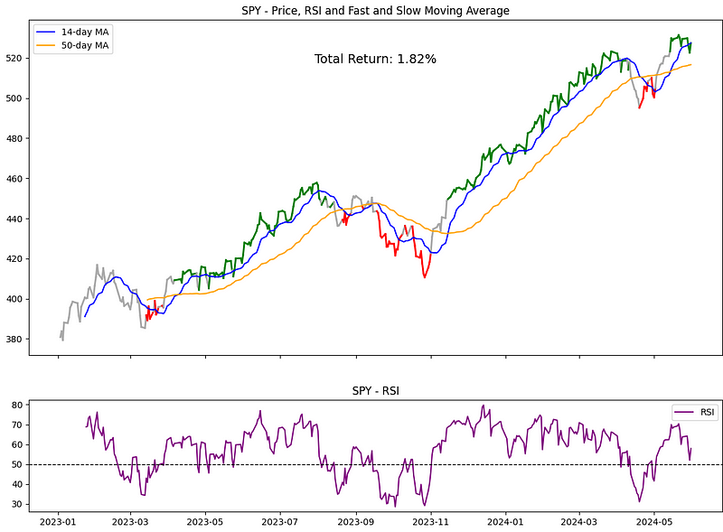
结果明显回报率降低至 1.82%。看来,加入 RSI 后,快速和慢速 MAs 的收益并不高......
五、布林线和 RSI
Bollinger Bands and RSI
现在,让我们尝试将布林线与 RSI 结合起来。同样,两个信号需要一致。当价格高于布林带中轨,且 RSI 在 50 以上时,我们就有了上升趋势。
def calculate_trend_bbands_rsi(df_ohlc, bbands_period=5, bbands_std=2, rsi_period=14):

    # Calculate RSI using pandas_ta
    df_ohlc['RSI'] = df_ohlc.ta.rsi(close='Close', length=rsi_period)

    # Calculate Bollinger Bands using pandas_ta
    bbands = df.ta.bbands(close='Close', length=bbands_period, std=bbands_std)
    df_ohlc['BB_upper'] = bbands[f'BBU_{bbands_period}_{bbands_std}.0']
    df_ohlc['BB_middle'] = bbands[f'BBM_{bbands_period}_{bbands_std}.0']
    df_ohlc['BB_lower'] = bbands[f'BBL_{bbands_period}_{bbands_std}.0']

    # Determine the trend based on Bollinger Bands and RSI
    def identify_trend(row):
        if row['Close'] > row['BB_middle'] and row['RSI'] > 50:
            return 1
        elif row['Close'] < row['BB_middle'] and row['RSI'] < 50:
            return -1
        else:
            return 0

    df_ohlc['Trend'] = df_ohlc.apply(identify_trend, axis=1)
    return df_ohlc['Trend']

df['Trend'] = calculate_trend_bbands_rsi(df, bbands_period=20, bbands_std=2, rsi_period=14)
df['Equity Curve'], stats = calculate_returns(df, col_for_returns = 'Close', col_for_signal = 'Trend')

# Plotting with adjusted subplot heights
fig, (ax1, ax2) = plt.subplots(2, 1, figsize=(14, 10), sharex=True,
                               gridspec_kw={'height_ratios': [3, 1]})

# Plotting the close price with the color corresponding to the trend
for i in range(1, len(df)):
    ax1.plot(df.index[i-1:i+1], df['Close'].iloc[i-1:i+1],
             color='green' if df['Trend'].iloc[i] == 1 else
                   ('red' if df['Trend'].iloc[i] == -1 else 'darkgrey'), linewidth=2)

# Plot Bollinger Bands
ax1.plot(df['BB_upper'], label='Upper Band', color='blue', linestyle='--')
ax1.plot(df['BB_middle'], label='Middle Band', color='orange')
ax1.plot(df['BB_lower'], label='Lower Band', color='blue', linestyle='--')
ax1.text(0.5, 0.9, f'Total Return: {stats['total_return']:.2%}', transform=ax1.transAxes, ha='center', va='top', fontsize=14)
ax1.set_title(f'{ticker} - Price, RSI and Bollinger Bands')
ax1.legend(loc='best')

# Plot RSI on the second subplot (smaller height)
ax2.plot(df.index, df['RSI'], label='RSI', color='purple')
ax2.axhline(50, color='black', linestyle='--', linewidth=1)  # Add a horizontal line at RSI=50
ax2.set_title(f'{ticker} - RSI')
ax2.legend(loc='best')

plt.show()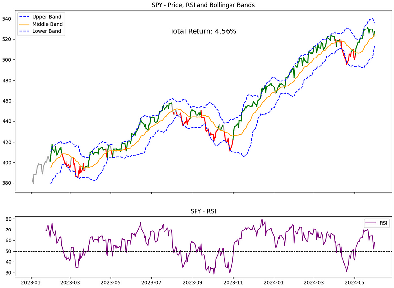
这一组合的总回报率为 4.56%。RSI 看起来又一次破坏了搞钱的气氛...
六、ADX 与慢速和快速移动平均线
ADX with slow and fast Moving Average
结合 ADX 和移动平均线,当 ADX 超过 25(表明趋势强劲)且快速 MA 超过慢速 MA 时,我们就能识别出上升趋势。
def calculate_trend_adx_ma(df_ohlc, adx_period=14, fast_ma_period=14, slow_ma_period=50):
    # Calculate ADX using pandas_ta
    df_ohlc['ADX'] = df_ohlc.ta.adx(length=adx_period)[f'ADX_{adx_period}']

    # Calculate Moving Averages (14-day and 50-day) using pandas_ta
    df_ohlc['MA_fast'] = df_ohlc.ta.sma(close='Close', length=fast_ma_period)
    df_ohlc['MA_slow'] = df_ohlc.ta.sma(close='Close', length=slow_ma_period)

    # Determine the trend based on ADX and Moving Averages
    def identify_trend(row):
        if row['ADX'] > 25 and row['MA_fast'] > row['MA_slow']:
            return 1
        elif row['ADX'] > 25 and row['MA_fast'] < row['MA_slow']:
            return -1
        else:
            return 0

    df_ohlc['Trend'] = df_ohlc.apply(identify_trend, axis=1)
    return df_ohlc['Trend']

df['Trend'] = calculate_trend_adx_ma(df, adx_period=14, fast_ma_period=14, slow_ma_period=50)
df['Equity Curve'], stats = calculate_returns(df, col_for_returns = 'Close', col_for_signal = 'Trend')

# Plotting with adjusted subplot heights
fig, (ax1, ax2) = plt.subplots(2, 1, figsize=(14, 10), sharex=True,
                               gridspec_kw={'height_ratios': [3, 1]})

# Plotting the close price with the color corresponding to the trend
for i in range(1, len(df)):
    ax1.plot(df.index[i-1:i+1], df['Close'].iloc[i-1:i+1],
             color='green' if df['Trend'].iloc[i] == 1 else
                   ('red' if df['Trend'].iloc[i] == -1 else 'darkgrey'), linewidth=2)

# Plot the Moving Averages
ax1.plot(df['MA_fast'], label='Fast MA', color='blue')
ax1.plot(df['MA_slow'], label='Slow MA', color='orange')
ax1.text(0.5, 0.9, f'Total Return: {stats['total_return']:.2%}', transform=ax1.transAxes, ha='center', va='top', fontsize=14)
ax1.set_title(f'{ticker} - Price, ADX and Moving Averages')
ax1.legend(loc='best')

# Plot ADX on the second subplot (smaller height)
ax2.plot(df.index, df['ADX'], label='ADX', color='purple')
ax2.axhline(25, color='black', linestyle='--', linewidth=1)  # Add a horizontal line at ADX=25
ax2.set_title(f'{ticker} - ADX')
ax2.legend(loc='best')

plt.show()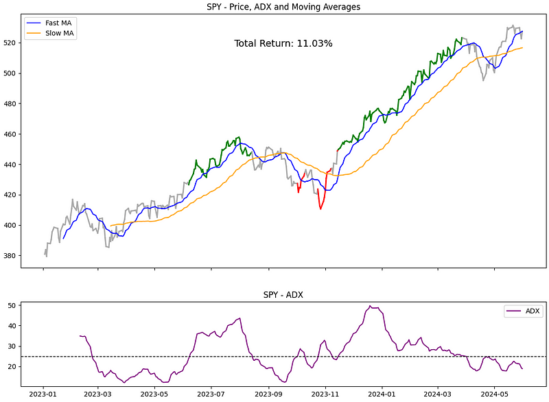
看起来很有趣!这个技术指标驱动的入市时间这么短,回报率却高达 11.03%。看来我们应该记住它。
七、一目均衡云图和 MACD
Ichimoku Cloud and MACD
让我们用一些不认识的日语单词来做一些花哨的事情!我们将使用一目均衡云图和 MACD。当价格位于一目均衡云图上方,且 MACD 位于信号线上方时,我们就能确定上升趋势。
def calculate_trend_ichimoku_macd(df_ohlc, macd_fast=12, macd_slow=26, macd_signal=9, tenkan=9, kijun=26, senkou=52):

    # Calculate Ichimoku Cloud components using pandas_ta
    df_ichimoku = df_ohlc.ta.ichimoku(tenkan, kijun, senkou)[0]

    # Extract Ichimoku Cloud components
    df_ohlc['Ichimoku_Conversion'] = df_ichimoku[f'ITS_{tenkan}']  # Tenkan-sen (Conversion Line)
    df_ohlc['Ichimoku_Base'] = df_ichimoku[f'IKS_{kijun}']       # Kijun-sen (Base Line)
    df_ohlc['Ichimoku_Span_A'] = df_ichimoku[f'ITS_{tenkan}']         # Senkou Span A
    df_ohlc['Ichimoku_Span_B'] = df_ichimoku[f'ISB_{kijun}']        # Senkou Span B

    # Calculate MACD using pandas_ta
    df_ohlc.ta.macd(close='Close', fast=macd_fast, slow=macd_slow, signal=macd_signal, append=True)

    # Determine the trend based on Ichimoku Cloud and MACD
    def identify_trend(row):
        if row['Close'] > max(row['Ichimoku_Span_A'], row['Ichimoku_Span_B']) and row['MACD_12_26_9'] > row['MACDs_12_26_9']:
            return 1
        elif row['Close'] < min(row['Ichimoku_Span_A'], row['Ichimoku_Span_B']) and row['MACD_12_26_9'] < row['MACDs_12_26_9']:
            return -1
        else:
            return 0

    df_ohlc['Trend'] = df_ohlc.apply(identify_trend, axis=1)
    return df_ohlc['Trend']

df['Trend'] = calculate_trend_ichimoku_macd(df, macd_fast=12, macd_slow=26, macd_signal=9)
df['Equity Curve'], stats = calculate_returns(df, col_for_returns = 'Close', col_for_signal = 'Trend')

# Plotting with adjusted subplot heights
fig, (ax1, ax2) = plt.subplots(2, 1, figsize=(14, 10), sharex=True,
                               gridspec_kw={'height_ratios': [3, 1]})

# Plotting the close price with the color corresponding to the trend
for i in range(1, len(df)):
    ax1.plot(df.index[i-1:i+1], df['Close'].iloc[i-1:i+1],
             color='green' if df['Trend'].iloc[i] == 1 else
                   ('red' if df['Trend'].iloc[i] == -1 else 'darkgrey'), linewidth=2)

# Plot Ichimoku Cloud
ax1.fill_between(df.index, df['Ichimoku_Span_A'], df['Ichimoku_Span_B'],
                 where=(df['Ichimoku_Span_A'] >= df['Ichimoku_Span_B']), color='lightgreen', alpha=0.5)
ax1.fill_between(df.index, df['Ichimoku_Span_A'], df['Ichimoku_Span_B'],
                 where=(df['Ichimoku_Span_A'] < df['Ichimoku_Span_B']), color='lightcoral', alpha=0.5)

ax1.plot(df['Ichimoku_Conversion'], label='Conversion Line (Tenkan-sen)', color='blue')
ax1.plot(df['Ichimoku_Base'], label='Base Line (Kijun-sen)', color='orange')
ax1.text(0.5, 0.9, f'Total Return: {stats['total_return']:.2%}', transform=ax1.transAxes, ha='center', va='top', fontsize=14)
ax1.set_title(f'{ticker} - Price and Ichimoku Cloud')
ax1.legend(loc='best')

# Plot MACD and Signal Line on the second subplot (smaller height)
ax2.plot(df.index, df['MACD_12_26_9'], label='MACD', color='blue')
ax2.plot(df.index, df['MACDs_12_26_9'], label='Signal Line', color='red')
ax2.set_title(f'{ticker} - MACD')
ax2.legend(loc='best')

plt.show()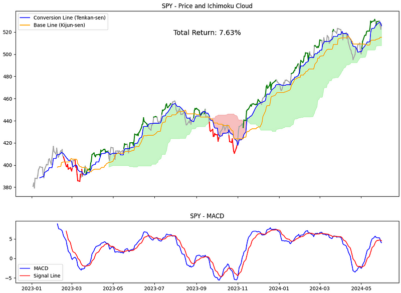
7.63% 的回报率还算不错,但对我来说,进进出出的次数太多了。
八、总结 SPY 的结果
为了总结结果,我们可以运行下面的代码:
# Download the stock data
ticker = 'SPY'  # You can replace 'AAPL' with any other stock ticker or currency pair
df = yf.download(ticker, start='2023-01-01', end='2024-06-01')

trend_identification_methods = ['2_ma', 'macd_ma', 'rsi_ma', 'bbands_rsi', 'adx_ma',  'ichimoku_macd']
trend_identification_results = []

def calculate_trend(df, method):
    if method == '2_ma':
        return calculate_trend_2_ma(df, period_slow=21, period_fast=9)
    elif method == 'macd_ma':
        return calculate_trend_macd_ma(df, ma_period=50, macd_fast=12, macd_slow=26, macd_signal=9)
    elif method == 'rsi_ma':
        return calculate_trend_rsi_ma(df, rsi_period=14, ma_fast=9, ma_slow=21)
    elif method == 'bbands_rsi':
        return calculate_trend_bbands_rsi(df, bbands_period=5, bbands_std=2, rsi_period=14)
    elif method == 'adx_ma':
        return calculate_trend_adx_ma(df, adx_period=14, fast_ma_period=14, slow_ma_period=50)
    elif method == 'ichimoku_macd':
        return calculate_trend_ichimoku_macd(df, macd_fast=12, macd_slow=26, macd_signal=9, tenkan=9, kijun=26, senkou=52)

for method in trend_identification_methods:

    # Calculate results of returns for each method and append to the list
    df_copy = df.copy()
    d = {}
    d['Method'] = method
    df_copy['Trend'] = calculate_trend(df_copy, method)
    df_copy['Equity Curve'], stats = calculate_returns(df_copy, col_for_returns = 'Close', col_for_signal = 'Trend')
    d.update(stats)
    trend_identification_results.append(d)

    # Add trend line and equity curve to the df
    df[f'Trend_{method}'] = df_copy['Trend']
    df[f'Equity Curve_{method}'] = df_copy['Equity Curve']


trend_identification_results_df = pd.DataFrame(trend_identification_results)

trend_identification_results_df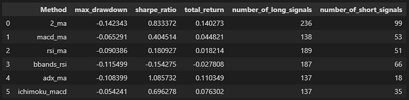
总结下 SPY 的结果,发现快速和慢速 MAs 的收益率最高,夏普比率也还行,但缩水率是最差的。这可以理解为(不管是好收益还是坏缩水),这是个信号多的策略,所以它在市场上 “花费” 的时间(风险敞口)最多。另外,用快速和慢速 MA 的 ADX 也是第二好的策略,在市场里暴露的时间少,这点挺有意思的。
让我们再加入一些股票来测试
现在,我们将运行 SPY,并增加 4 只股票(苹果、亚马逊、谷歌、特斯拉):
tickers = ['AAPL', 'AMZN', 'GOOG', 'TSLA', 'SPY']
results = []

for ticker in tickers:
    df = yf.download(ticker, start='2023-01-01', end='2024-06-01')

    trend_identification_methods = ['2_ma', 'macd_ma', 'rsi_ma', 'bbands_rsi', 'adx_ma',  'ichimoku_macd']
    trend_identification_results = []

    def calculate_trend(df, method):
        if method == '2_ma':
            return calculate_trend_2_ma(df, period_slow=21, period_fast=9)
        elif method == 'macd_ma':
            return calculate_trend_macd_ma(df, ma_period=50, macd_fast=12, macd_slow=26, macd_signal=9)
        elif method == 'rsi_ma':
            return calculate_trend_rsi_ma(df, rsi_period=14, ma_fast=9, ma_slow=21)
        elif method == 'bbands_rsi':
            return calculate_trend_bbands_rsi(df, bbands_period=5, bbands_std=2, rsi_period=14)
        elif method == 'adx_ma':
            return calculate_trend_adx_ma(df, adx_period=14, fast_ma_period=14, slow_ma_period=50)
        elif method == 'ichimoku_macd':
            return calculate_trend_ichimoku_macd(df, macd_fast=12, macd_slow=26, macd_signal=9, tenkan=9, kijun=26, senkou=52)


    for method in trend_identification_methods:

        # Calculate results of returns for each method and append to the list
        df_copy = df.copy()
        d = {}
        d['Method'] = method
        df_copy['Trend'] = calculate_trend(df_copy, method)
        df_copy['Equity Curve'], stats = calculate_returns(df_copy, col_for_returns = 'Close', col_for_signal = 'Trend')
        results.append({'ticker':ticker, 'method':method, 'total_return':stats['total_return']})

test_df = pd.DataFrame(results)

# Pivot the DataFrame to prepare for plotting
pivot_df = test_df.pivot(index='ticker', columns='method', values='total_return')

# Plotting
pivot_df.plot(kind='bar', figsize=(12, 8))

plt.title('Comparison of total returns per trend method')
plt.ylabel('Value')
plt.xlabel('Stock')
plt.legend(title='Indicators', bbox_to_anchor=(1.05, 1), loc='upper left')
plt.xticks(rotation=45)

plt.tight_layout()
plt.show()现在的情况愈发混乱了……没有哪种模式明显是赢家。不过,我个人比较喜欢带有快速和慢速 MA 的 ADX。它通常要么是最好的,要么能进入前三,就算不是最好的,表现也不会差。而且,就像我们之前说的,它的风险也比其他的要小。我挺喜欢它的。
您可以在 我的 GitHub 上找到 Python 代码,点击此处。
九、观点回顾
我首先介绍了识别股市趋势的重要性,并提出了六种不同的技术分析方法:快慢移动平均线、移动平均线+MACD、RSI+快慢移动平均线、布林线和RSI、ADX与快慢移动平均线以及一目均衡云图和MACD。
每种方法都通过Python代码实现,并在SPY ETF上进行了测试,以此来计算总回报和其他统计数据,如最大回撤、夏普比率等。文章中详细展示了每种方法的代码实现、图表展示以及相应的分析结果。
在对比了这些方法在SPY上的表现后,文章进一步将这些方法应用于其他四只股票(AAPL、AMZN、GOOG、TSLA),以检验不同股票对这些趋势识别方法的反应。最终得出了每种方法在不同股票上的总回报率,并对这些方法进行了比较,指出没有一种绝对的赢家方法,但我个人偏好ADX结合快慢移动平均线的方法,因为它在多数情况下表现稳定,且风险敞口较小。最后,文章提供了Python代码的链接。
- 快慢移动平均线方法在SPY上的总回报率最高,为14.03%,但同时具有最差的最大回撤率。
- 移动平均线+MACD方法的总回报率较低,为4.48%,但有较多的中性时期,减少了市场暴露时间。
- RSI+快慢移动平均线方法的总回报率较低,为1.82%,表明RSI的加入并未提高回报。
- 布林线和RSI结合的方法总回报率为4.56%,再次表明RSI可能不是提高回报的有效手段。
- ADX与快慢移动平均线结合的方法在SPY上的总回报率为11.03%,且市场暴露时间较短,被认为是一种稳定的方法。
- 一目均衡云图和MACD结合的方法总回报率为7.63%,但进出市场的次数较多。
- 在对比了不同股票的表现后,文章指出没有一种统一的最佳趋势识别方法,不同的股票可能对不同的技术分析方法有不同的反应。
- 我建议大家可以将这些方法当成过滤器,而不仅仅是作为交易信号,以便更全面地分析市场。
感谢您阅读到最后。如果对文中的内容有任何疑问,请给我留言,必复。
本文内容仅仅是技术探讨和学习,并不构成任何投资建议。转发请注明原作者和出处。


 被折叠的 条评论
为什么被折叠?
被折叠的 条评论
为什么被折叠?
 到【灌水乐园】发言


