


 本文介绍了如何使用CSS的flex布局改变主轴方向,将弹性盒子从默认的水平排列改为垂直排列,并提供了小案例进行演示。同时,讲解了如何使弹性盒子在一行内自动换行,以及设置了侧轴对齐方式,包括多行垂直对齐的实现方法。
1.设置主轴方向
主轴默认是水平方向, 侧轴默认是垂直方向
修改主轴方向属性: flex-direction
| 属性值 | 作用 |
|---|---|
| row | 行,水平(默认值) |
| column | *列,垂直 |
| row-reverse | 行,从右向左 |
| column-reverse | 列,从上向下 |
语法:
flex-direction:column;修改完毕,主轴是Y轴, 侧轴是X轴。
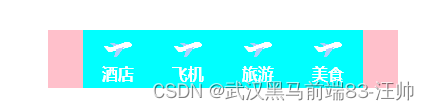
弹性盒子垂直排列小案例
<!DOCTYPE html>
<html lang="en">

<head>
    <meta charset="UTF-8">
    <meta http-equiv="X-UA-Compatible" content="IE=edge">
    <meta name="viewport" content="width=device-width, initial-scale=1.0">
    <title>Document</title>
    <style>
        .box {
            width: 350px;
            height: 58px;
            margin: 100px auto;
            background-color: pink;
            display: flex;
            justify-content: center;
        }

        .box a {
            width: 70px;
            height: 58px;
            background-color: aqua;
            display: flex;
            flex-direction: column;
            align-items: center;
            justify-content: center;
            text-decoration: none;
            color: #fff;
            font-weight: 700;
        }

        .box .one span:first-child {
            width: 28px;
            height: 28px;
            background: url(../images/mainnav.png) no-repeat 0px -170px;
            background-size: 28px auto;
        }

        .box .two span:first-child {
            width: 28px;
            height: 28px;
            background: url(../images/mainnav.png) no-repeat 0px -170px;
            background-size: 28px auto;
        }

        .box .three span:first-child {
            width: 28px;
            height: 28px;
            background: url(../images/mainnav.png) no-repeat 0px -170px;
            background-size: 28px auto;
        }

        .box .four span:first-child {
            width: 28px;
            height: 28px;
            background: url(../images/mainnav.png) no-repeat 0px -170px;
            background-size: 28px auto;
        }
    </style>
</head>

<body>
    <div class="box">
        <a href="#" class="one">
            <span></span>
            <span>酒店</span>
        </a>
        <a href="#" class="two">
            <span></span>
            <span>飞机</span>
        </a>
        <a href="#" class="three">
            <span></span>
            <span>旅游</span>
        </a>
        <a href="#" class="four">
            <span></span>
            <span>美食</span>
        </a>
    </div>
</body>

</html>
2.弹性盒子换行
特性: 给父亲添加了
display: flex;所有的子盒子(弹性盒子)都会在一行显示,不会自动换行。
弹性盒子换行显示 : flex-wrap:
语法:
flex-wrap: wrap; 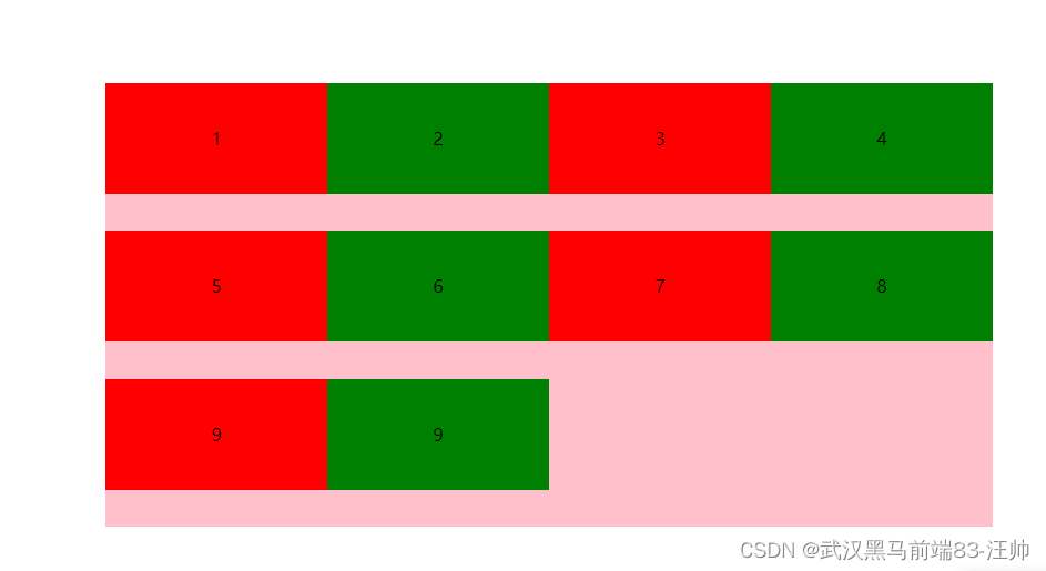
.box {
            width: 800px;
            height: 400px;
            margin: 100px auto;
            background-color: pink;
            /* 弹性容器 */
            display: flex;
            /* flex换行 加给父元素 */
            flex-wrap: wrap;
        }
1. flex换行 加给父元素
2.flex布局默认是不换行的
3.设置侧轴对齐方式
-
此处设置侧轴多行的垂直对齐方式。
align-content(少) -
和前面学过的
align-items(侧轴单行垂直对齐) (多) -
align 垂直 比如 align-items 垂直对齐 align-content 多行垂直对齐
-
content 主轴 justify-content align-content 侧轴多行对齐
align-content:center;| 属性值 | 作用 |
|---|---|
| flex-start | 默认值, 起点开始依次排列 |
| flex-end | 终点开始依次排列 |
| center | 沿主轴居中排列 |
| space-around | 弹性盒子沿主轴均匀排列, 空白间距均分在弹性盒子两侧 |
| space-between | 弹性盒子沿主轴均匀排列, 空白间距均分在相邻盒子之间 |
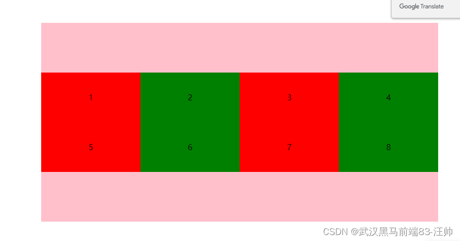
多行侧轴排列方式,一般配合换行使用
<!DOCTYPE html>
<html lang="en">

<head>
    <meta charset="UTF-8">
    <meta http-equiv="X-UA-Compatible" content="IE=edge">
    <meta name="viewport" content="width=device-width, initial-scale=1.0">
    <title>Document</title>
    <style>
        .box {
            width: 800px;
            height: 400px;
            margin: 100px auto;
            background-color: pink;
            /* 弹性容器 */
            display: flex;
            /* 主轴居中 */
            justify-content: center;
            /* 换行 */
            flex-wrap: wrap;
            /* 单行盒子的侧轴排列方式 */
            /* align-items: center; */

            /* 多行侧轴排列方式,一般配合换行使用 */
            align-content: center;
            /* align-content: flex-start;
            align-content: flex-end;
            align-content: space-around;
            align-content: space-between;
            align-content: space-evenly; */
        }

        /* flex布局默认是不换行的 */
        .box>div {
            text-align: center;
            line-height: 100px;
            width: 200px;
            height: 100px;
            background-color: red;
        }

        .box>div:nth-child(2n) {
            background-color: green;
        }
    </style>
</head>

<body>
    <div class="box">
        <div>1</div>
        <div>2</div>
        <div>3</div>
        <div>4</div>
        <div>5</div>
        <div>6</div>
        <div>7</div>
        <div>8</div>
    </div>
</body>

</html>


 扫一扫
扫一扫


 2538
2538

 被折叠的 条评论
为什么被折叠?
被折叠的 条评论
为什么被折叠?
 到【灌水乐园】发言


