


* {
margin: 0;
padding: 0;
box-sizing: border-box;
/* 不会挤大盒子 */
}
body {
width: 100%;
height: 100vh;
/* Vh:1vh 等于视口高度的1% */
background-color: #2b2b2b;
display: flex;
}
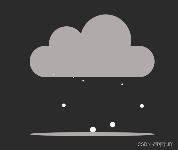
.cloud {
width: 320px;
height: 80px;
background-color: #b0aaaa;
border-radius: 50px;
margin: auto;
position: relative;
}
/* 模拟地面 */
.cloud::after {
content: '';
width: 100%;
height: 10px;
background-color: #b0aaaa;
position: absolute;
bottom: -150px;
border-radius: 50%;
}
.clouds {
width: 90px;
height: 90px;
border-radius: 50%;
background-color: #b0aaaa;
position: absolute;
top: -50px;
left: 50px;
}
/* 右上角云朵 */
.clouds::after {
content: '';
width: 130px;
height: 130px;
position: absolute;
background-color: #b0aaaa;
left: 80px;
top: -30px;
border-radius: 50%;
}
.rain {
width: 100%;
display: flex;
position: absolute;
/* 定义雨滴样子 */
top: 50%;
left: 50px;
/* 调整雨滴开始的位置 */
transform: translate();
}
.rain span {
width: 15px;
height: 15px;
background: #fff;
margin: 0 5px;
border-radius: 50%;
/* 雨滴是一直线 使其分开 */
animation: animate linear 2s infinite;
animation-duration: calc(var(--i) * 2s);
/* animation-duration属性指定一个动画周期的时长 */
}
@keyframes animate {
0% {
transform: translateY(0)scale(0);
/* scale(x,y)用于修改元素的大小 */
}
100% {
transform: translateY(170px)scale(1);
}
}<!DOCTYPE html>
<html lang="en">
<head>
<meta charset="UTF-8">
<meta http-equiv="X-UA-Compatible" content="IE=edge">
<meta name="viewport" content="width=device-width, initial-scale=1.0">
<title>Document</title>
<link rel="stylesheet" href="index.css">
</head>
<body>
<div class="cloud">
<div class="clouds"></div>
<div class="rain" id="rain">
</div>
</div>
<script src="index.js"></script>
</body>
</html>JS
// 创建雨滴
for (let i = 0; i < 10; i++) {
    let rains = document.createElement("span")
    rains.style = `--i:${Math.random()}`;
    rain.append(rains)
}


 600
600


 被折叠的 条评论
为什么被折叠?
被折叠的 条评论
为什么被折叠?
 到【灌水乐园】发言


