


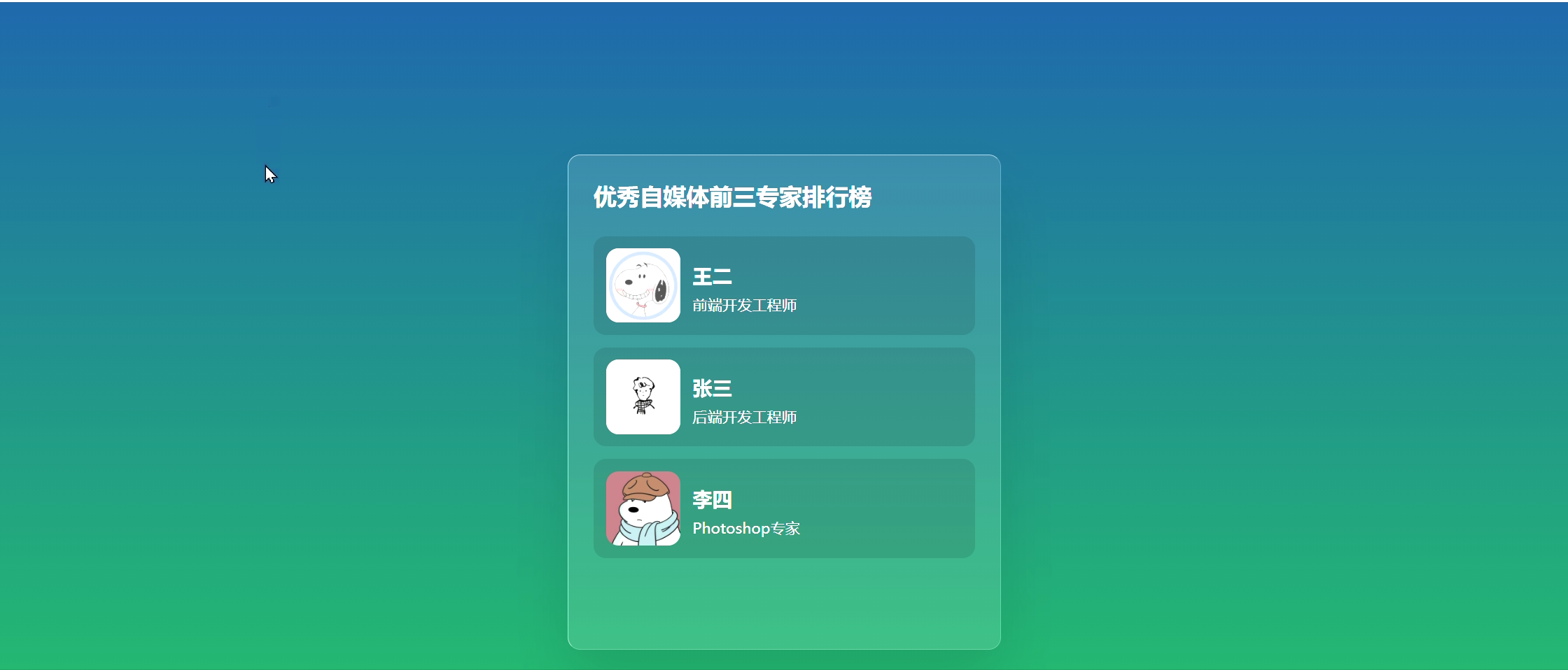
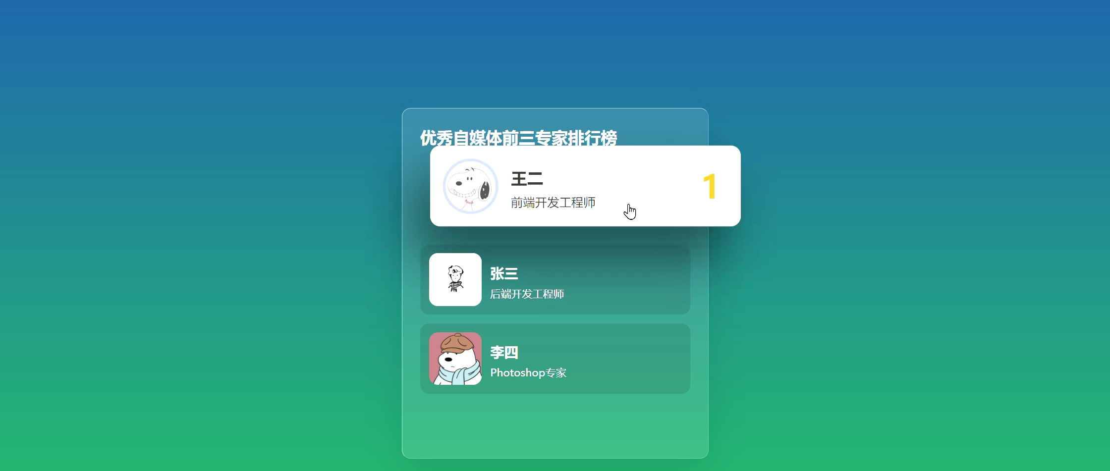
 该文章展示了如何使用HTML和CSS创建一个具有透明背景的列表,并在鼠标悬停时实现特定的效果。通过CSS样式,包括盒模型、渐变背景、过渡动画以及定位和显示属性,实现了列表项的悬停时背景变白、阴影增强以及内容元素动态变换位置的视觉效果。
效果:
HTML部分:
<!DOCTYPE html>
<html lang="en">
<head>
    <meta charset="UTF-8">
    <meta http-equiv="X-UA-Compatible" content="IE=edge">
    <meta name="viewport" content="width=device-width, initial-scale=1.0">
    <title>透明列表hover效果的实现</title>
    <link rel="stylesheet" href="透明.css">
</head>
<body>
    <section>
        <div class="box">

          <h3>优秀自媒体前三专家排行榜</h3>

          <div class="list">
            <div class="imgBx">
              <img src="./images/img1.jpg">
            </div>
            <div class="content">
              <h2 class="rank">1</h2>
              <h4>王二</h4>
              <p>前端开发工程师</p >
            </div>
          </div>

          <div class="list">
            <div class="imgBx">
              <img src="./images/img2.jpg">
            </div>
            <div class="content">
              <h2 class="rank">2</h2>
              <h4>张三</h4>
              <p>后端开发工程师</p >
            </div>
          </div>

          <div class="list">
            <div class="imgBx">
              <img src="./images/img3.jpg">
            </div>
            <div class="content">
              <h2 class="rank">3</h2>
              <h4>李四</h4>
              <p>Photoshop专家</p >
            </div>
          </div>

        </div>
    </section>
</body>
</html>
透明列表hover效果的实现大致结构如上
复习:相对路径 “./”:代表目前所在的目录(或者不写"./",直接写文件)
“../”:代表上一层目录
CSS部分:
CSS样式一般先要定义全局的内容
*{
  margin: 0;
  padding: 0;
  box-sizing: border-box;
  font-family: 'Poppins', sans-serif;
}box-sizing:
content-box:默认值,标准盒子模型。width 与 height 只包括内容的宽和高,不包括边框(border),内边距(padding),外边距(margin)。
border-box:width 和 height 属性包括内容,内边距和边框,但不包括外边距。
详见 box-sizing - CSS(层叠样式表) | MDN (mozilla.org)
section{
  position: relative;
  /* 相对定位,相对原来位置移动 */
  background: #159957;  /* fallback for old browsers */
  background: -webkit-linear-gradient(to bottom, #155799, #159957);  /* Chrome 10-25, Safari 5.1-6 */
  background: linear-gradient(to bottom, #155799, #159957); /* W3C, IE 10+/ Edge, Firefox 16+, Chrome 26+, Opera 12+, Safari 7+ */
  min-height: 100vh;
  overflow: hidden;
  display: flex;
  /* 实现 flex 布局需要先指定一个容器 */
  justify-content: center;
  /* 父级属性,设置子元素在主轴上的排列方式 */
  align-items: center;
  /* 父级属性,设置子元素在侧轴排列方式 */
}
.box{
  position: relative;
  min-width: 350px;
  min-height: 400px;
  background: rgba(255,255,255,0.1);
  box-shadow: 0 25px 45px rgba(0,0,0,0.1);
  /* x 偏移量 | y 偏移量 | 阴影模糊半径 | 阴影颜色 */
  border: 1px solid rgba(255,255,255,0.5);
  border-right: 1px solid rgba(255,255,255,0.2);
  border-bottom: 1px solid rgba(255,255,255,0.2);
  /*border-width || border-style || border-color */
  border-radius: 10px;
  padding: 20px;
}
接着设置大盒子的属性,加适当的阴影和边框增强立体效果,做出来更美观;
其中min-height:元素最小高度
.box h3{
  color: #fff;
  margin-bottom: 20px;
}
.box .list{
  position: relative;
  display: flex;
  padding: 10px;
  background: rgba(0,0,0,0.1);
  border-radius: 10px;
  margin: 10px 0;
  cursor: pointer;
  /* 设置鼠标悬停于元素上的样式,譬如pointer:悬浮于上时,通常为手 */
  transition: 0.5s;
  /* 过渡可以为一个元素在不同状态之间切换的时候定义不同的过渡效果 */
  overflow: hidden;
  /* 将溢出来的隐藏,此处是隐藏悬停时出现的名次 */
}
.box .list:hover {
  /*注意hover后的空格*/
  background: #fff;
  box-shadow: -15px 30px 50px rgba(0,0,0,0.5);
  transform: scale(1.15) translateX(30px) translateY(-15px);
  /* rotate(x,y deg)旋转,scale(x,y增加或减少元素的大小)缩放,translate(x,y px)移动(平移),skew(x-angle,y-angle deg)倾斜 */
  /* z-index: 1000; */
}
.box .list .imgBx{
  position: relative;
  width: 60px;
  height: 60px;
  border-radius: 10px;
  overflow: hidden;
  /*隐藏尖角形成圆角*/
  margin-right: 10px;
}
.box .list .imgBx img{
  width: 100%;
  height: 100%;
}
.box .list .content{
  display: flex;
  flex-direction: column;
  /*设置主轴方向,flex 容器的主轴和块轴相同。主轴起点与主轴终点和书写模式的前后点相同*/
  justify-content: center;
  /*设置子元素在主轴上的排列方式,在主轴居中对齐*/
  color: #fff;
}
.box .list .content .rank{
  position: absolute;
  /*元素会被移出正常文档流,并不为元素预留空间,通过指定元素相对于最近的非 static 定位祖先元素的偏移,来确定元素位置。绝对定位的元素可以设置外边距(margins),且不会与其他边距合并*/
  right: -50px;
  color: #dfb520;
  transition: 0.5s;
  font-size: 2em;
}
.box .list:hover .content .rank{
  right: 20px;
}
.box .list .content h4{
  line-height: 2em;
  /* 行高 */
  transition: 0.5s;
}
.box .list .content p{
  font-size: 0.75em;
  transition: 0.5s;
}
.box .list:hover .content h4,
.box .list:hover .content p
{
  color: #333;
}
然后添加悬停和过渡效果
其中 cursor: zoom-in:指示可被放大;grab:可抓取;move:被悬浮的物体可被移动;text:指示文字可被选中;wait:程序繁忙,用户不可交互 (与progress 相反).图标一般为沙漏或者表;pointer:悬浮于上时,通常为手等。
详见 cursor - CSS(层叠样式表) | MDN


 扫一扫
扫一扫


 1639
1639

 被折叠的 条评论
为什么被折叠?
被折叠的 条评论
为什么被折叠?
 到【灌水乐园】发言


