


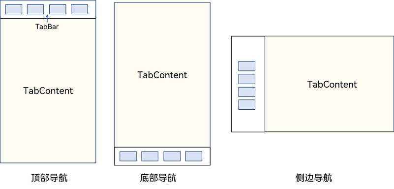
Tabs的基本概念及其功能
Tabs组件是一种常见的用户界面(UI)组件,它是一个可以容纳多个选项卡的容器组件。每个选项卡通常包含一个面板和一个标签,用户可以通过点击标签来切换面板。Tabs组件通常用于展示多个相关但又不需要同时展示的数据集合或功能集合,以提高页面的可维护性和可用性。
当页面信息较多时,为了让用户能够聚焦于当前显示的内容,需要对页面内容进行分类,提高页面空间利用率。Tabs组件可以在一个页面内快速实现视图内容的切换,一方面提升查找信息的效率,另一方面精简用户单次获取到的信息量。
1.基本布局
Tabs使用花括号包裹TabContent,每一个TabContent对应一个tabBar
Tabs() {
TabContent() {
Text('首页的内容').fontSize(30)
}
.tabBar('首页')
TabContent() {
Text('推荐的内容').fontSize(30)
}
.tabBar('推荐')
TabContent() {
Text('发现的内容').fontSize(30)
}
.tabBar('发现')
TabContent() {
Text('我的内容').fontSize(30)
}
.tabBar("我的")
}
2.导航位置
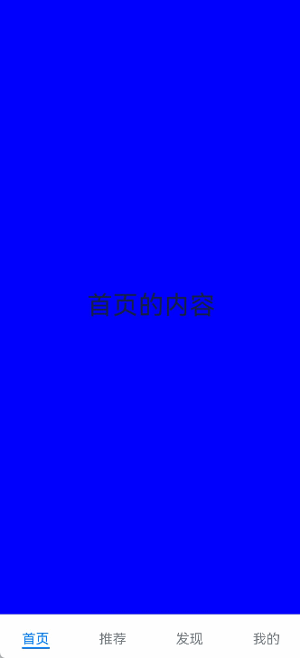
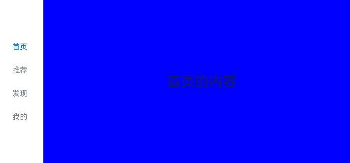
2.1 底部导航
BarPosition.End设置底部导航
@Entry
@Component
struct NavigationExample {
private arr: number[] = [1, 2, 3];
build() {
Column() {
Tabs({ barPosition: BarPosition.End }) {
TabContent() {
Text('首页的内容').fontSize(30)
}
.tabBar('首页')
TabContent() {
Text('推荐的内容').fontSize(30)
}
.tabBar('推荐')
TabContent() {
Text('发现的内容').fontSize(30)
}
.tabBar('发现')
TabContent() {
Text('我的内容').fontSize(30)
}
.tabBar("我的")
}
}
.height('100%')
.width('100%')
.backgroundColor('#F1F3F5')
}
}
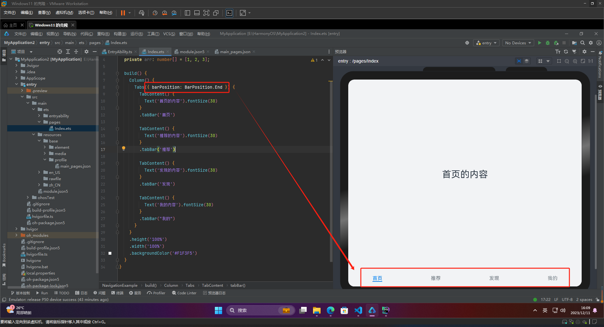
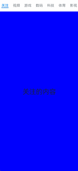
2.2 顶部导航
BarPosition.Start设置顶部导航
@Entry
@Component
struct NavigationExample {
private arr: number[] = [1, 2, 3];
build() {
Column() {
Tabs({ barPosition: BarPosition.Start }) {
TabContent() {
Text('关注的内容').fontSize(30)
}
.tabBar('关注')
...
}
.height('100%')
.width('100%')
.backgroundColor('#F1F3F5')
}
}
2.3 侧边导航
实现侧边导航栏需要设置Tabs的属性vertical为true
-
vertical为false时,tabbar宽度会默认撑满屏幕的宽度,需要设置barWidth为合适值。
-
vertical为true时,tabbar的高度会默认实际内容高度,需要设置barHeight为合适值。
@Entry
@Component
struct NavigationExample {
private arr: number[] = [1, 2, 3];
build() {
Column() {
Tabs({ barPosition: BarPosition.Start }) {
TabContent() {
Text('首页的内容').fontSize(30)
}
.tabBar('首页')
...
}.vertical(true)
.barWidth(100)
.barHeight(200)
}
.height('100%')
.width('100%')
.backgroundColor('#F1F3F5')
}
}
3.自定义导航栏
自定义导航栏是指在应用开发中,开发者使用自己定制的视图代替系统自带的导航栏,以实现更加自由、灵活和符合应用风格的导航栏。自定义导航栏可以包括各种 UI 元素,例如按钮、文本、图片、标签等,以满足不同应用的需求。自定义导航栏可以帮助应用创建独特的风格和品牌形象,提高用户体验和应用的可用性。
 @Builder TabBuilder(title: string, targetIndex: number, selectedImg: Resource, normalImg: Resource) {
   Column() {
     Image(this.currentIndex === targetIndex ? selectedImg : normalImg)
       .size({ width: 25, height: 25 })
     Text(title)
       .fontColor(this.currentIndex === targetIndex ? '#1698CE' : '#6B6B6B')
   }
   .width('100%')
   .height(50)
   .justifyContent(FlexAlign.Center)
 }
 TabContent() {
   Column(){
     Text('我的内容')
   }
   .width('100%')
   .height('100%')
   .backgroundColor('#007DFF')
 }
 .tabBar(this.TabBuilder('我的', 0, $r('app.media.mine_selected'), $r('app.media.mine_normal')))

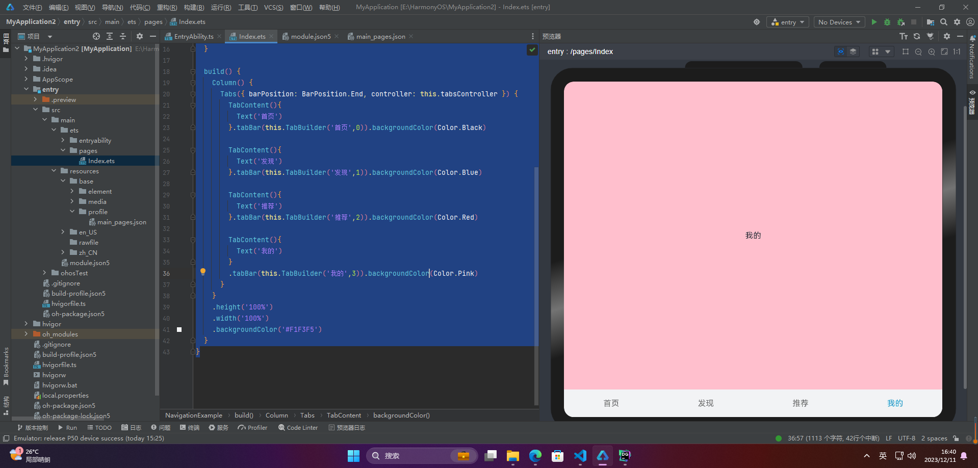
4.切换至指定页签
要想切换特定的标签页,需要使用TabsController。TabsController是Tabs组件的控制器,它用于控制Tabs组件进行标签页的切换。使用TabsController的changeIndex方法,可以实现跳转到指定索引值对应的标签页内容。
@Entry
@Component
struct NavigationExample {
private tabsController : TabsController = new TabsController()
@State currentIndex:number = 0;
@Builder TabBuilder(title: string, targetIndex: number) {
Column() {
Text(title)
.fontColor(this.currentIndex === targetIndex ? '#1698CE' : '#6B6B6B')
}
.onClick(() => {
this.currentIndex = targetIndex;
this.tabsController.changeIndex(this.currentIndex);
})
}
build() {
Column() {
Tabs({ barPosition: BarPosition.End, controller: this.tabsController }) {
TabContent(){
Text('首页')
}.tabBar(this.TabBuilder('首页',0)).backgroundColor(Color.Black)
TabContent(){
Text('发现')
}.tabBar(this.TabBuilder('发现',1)).backgroundColor(Color.Blue)
TabContent(){
Text('推荐')
}.tabBar(this.TabBuilder('推荐',2)).backgroundColor(Color.Red)
TabContent(){
Text('我的')
}
.tabBar(this.TabBuilder('我的',3)).backgroundColor(Color.Pink)
}
}
.height('100%')
.width('100%')
.backgroundColor('#F1F3F5')
}
}


 753
753

 被折叠的 条评论
为什么被折叠?
被折叠的 条评论
为什么被折叠?
 到【灌水乐园】发言


