


目录
页面组件
4.1组件的定义及属性
组件是页面视图层(wxml)的基本组成单元,组件组合可以构建功能强大的页面结构。
<标签名 属性名=“属性值”>内容</标签名>
组件通过属性来进一步细化。
id
组件的唯一表示
class
组件的样式类
style
组件的内联样式
hidden
组件是否显示
data-*
自定义属性
bind*/catch*
组件的事件
4.2 容器视图组件
4.2.1 view
view组件的特有属性


示例代码:
<!--pages/new4/new4.wxml-->
<text>pages/new4/new4.wxml</text>
<view style="text-align: center;">默认flex布局</view>
<view style="display: flex;">
<view style="border: 1px #f00 solid;flex-grow: 1;">1</view>
<view style="border: 1px #f00 solid;flex-grow: 1;">2</view>
<view style="border: 1px #f00 solid;flex-grow: 1;">3</view>
</view>
<view style="text-align: center;">上下混合布局</view>
<view style="display: flex;flex-direction: column;">
<view style="border: 1px #f00 solid;">1</view>
<view style="display: flex;">
<view style="border: 1px #f00 solid;flex-grow: 1;">2</view>
<view style="border: 1px #f00 solid;flex-grow: 1;">3</view>
</view>
</view>
<view style="text-align: center;">左右混合布局</view>
<view style="display: flex;">
<view style="border: 1px #f00 solid;flex-grow: 1;">1</view>
<view style="display: flex;flex-direction: column;flex-grow: 1;">
<view style="border: 1px #f00 solid;flex-grow: 1;">2</view>
<view style="border: 1px #f00 solid;flex-grow: 2;">3</view>
</view>
</view>
运行结果:

4.2.2 scroll-view
滚动视图的功能

示例代码:
//scroll-view.wxml
<view class ="container"style ="padding:0rpx"
<!--垂直滚动,这里必须设置高度-->
<scroll -view scroll-top="{{scrollTop}}" scroll-y="truei
style ="height: {{scrollHeight }} px;" class ="list" bind-
scrolltolower ="bindDownLoad"
bindscrolltoupper = "topload" bindscroll="scroll">
<view class ="item"wx:for="{{listl}}">
<image class e*img“erc-"{{item.pic_url}}"></image>
<view class ="text">
<text class="title">{{item.name}}</text>
<text class ="description">{{item.short _de-scription}}</text>
</view></view>
</scroll-view>
<view class ="body -view">
<loading hidden ="{{hidden}}"bindchange ="loadingChange">
加载中..
</loading></view>
</view>
//scroll-view.js
var url ="http://www.imooc.com/course/ajaxlist";
var page =0;
var page_size =5;
var sort ="last";
var is_easy =0;
var lange_id =0;
var pos_id =0;
var unlearn =0;
//请求数据
var loadMore = function(that){
that.setData({hidden: false});
wx.request({
url:url,
data:{
page:page,
page size: page_size,
sort:sort,
is easy:is _easy,
lange _id:lange _id,
pos _id:pos _id,
unlearn:unlearn
},
success:function(res){
//console.info(that.data.list);
var list = that.data.list;
for(var i =0; i < res.data.list.length;i++)l
list.push(res.data.list[i]);
that.setData({
1ist:list
});
page ++;
that.setData({
hidden: true
});
}
});
}
Page({
data:{
hidden:true,
1ist:[],
scrollTop:0,
scrollHeight:0
},
onLoad: function(){
//这里要注意,微信的SCro11-view必须设置高度才能监听滚动事件,所以需要在页面的onLoad事件中为scrol1-view的高度赋值
var that = this;
wx.getSystemInfo({
success: function(res){
that.setData({
scrollHeight:res.windowHeight
});
}
});
loadMore(that);
},
//页面滑动到底部
bindDownLoad:function(){
var that = this;
loadMore(that);
console.log("1ower");
},
scrol1: function(event){
//该方法绑定了页面滚动时的事件,这里记录了当前的position.y的值,为了在请求
据后把页面定位到这里
this.setData({
scrollTop:event.detail.scrollTop
});
},
topLoad; function(event){
//该方法绑定了页面滑动到顶部的事件,然后做页面上拉刷新
page =0;
this.setData({
1ist:[],
scrollTop:0
});
loadMore(this);
console.log("lower");
}
})
//scroll-view.wxss
.userinfo{
display:flex;
flex -direction:column;
align -items:center;
}
.userinfo-avatar{
width:128rpx;
height:128rpx;
margin:20rpx;
border-radius:50%;
}
.userinfo -nickname {
color:#aaa;
}
.usermotto {
margin -top:200px;
}
/* */
scroll-view{
width:100%;
}
.item{
width:90%;
height:300rpx;
margin:20rpxauto;
background:brown;
overflow:hidden;
}
.item.img{
width:430rpx;
margin-right:20rpx;
float:left;
}
.title{
font -size:30rpx;
display:block;
margin:30rpxauto;
}
.description{
font -size:26rpx;
line -height:15rpx;
}
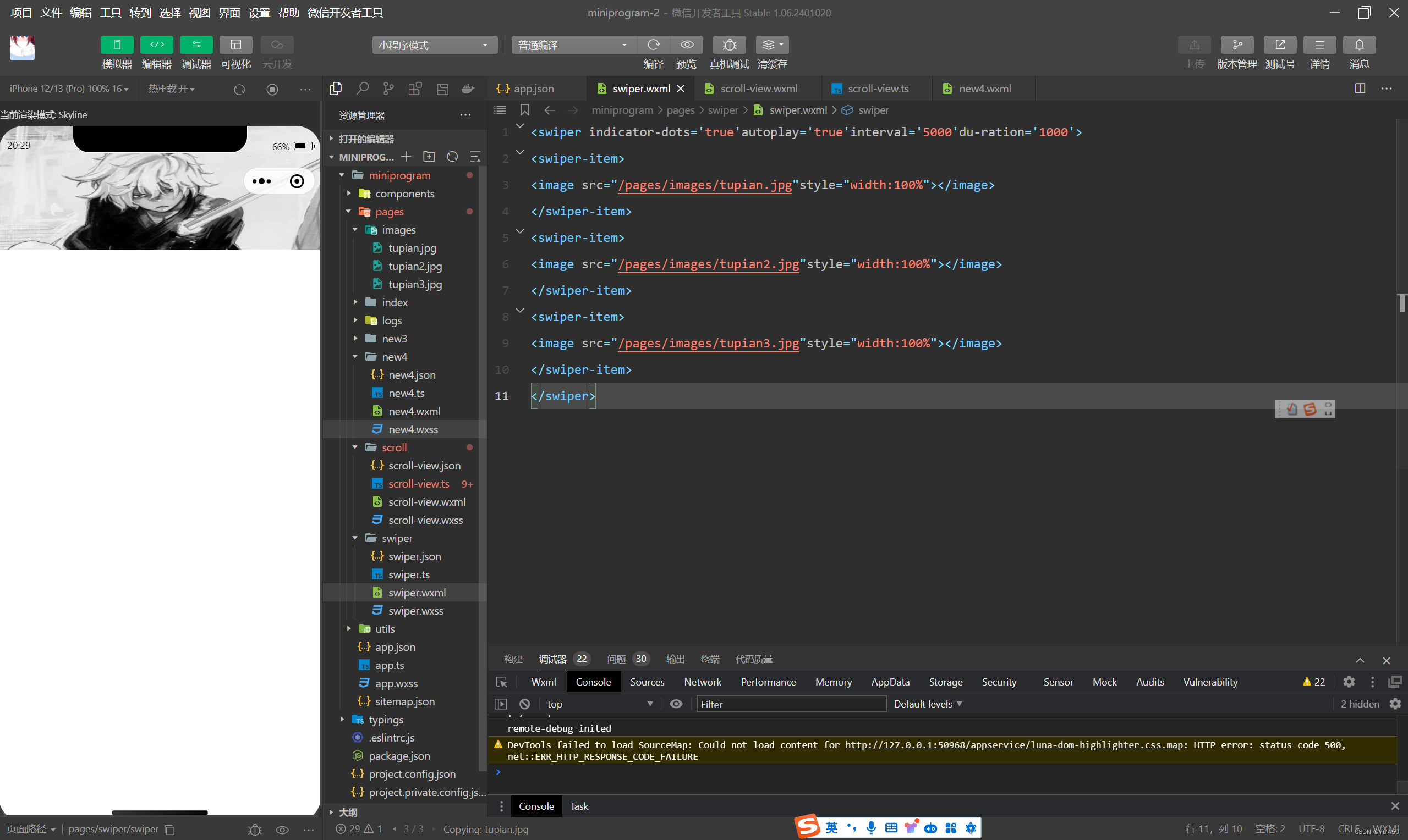
4.2.3 swiper

代码示例:
<swiper indicator-dots='true'autoplay='true'interval='5000'du-ration='1000'>
<swiper-item>
<image src="/pages/images/tupian.jpg"style="width:100%"></image>
</swiper-item>
<swiper-item>
<image src="/pages/images/tupian2.jpg"style="width:100%"></image>
</swiper-item>
<swiper-item>
<image src="/pages/images/tupian3.jpg"style="width:100%"></image>
</swiper-item>
</swiper>
运行结果:
4.3基础内容组件
4.3.1 icon
icon及图标组件
icon组件属性

代码示例:
.wxml
<!--pages/icon/icon.wxml-->
<view>
<view>icon类型:
<block wx:for="{{iconType}}">
<icon type="success"size="{{item}}"/>{{item}}
</block>
</view>
<view>icon大小:
<block wx:for="{{iconSize}}">
<icon type="success"size="{{item}}"/>{{item}}
</block>
</view>
<view>icon颜色:
<block wx:for="{{iconColor}}">
<icon type="success"size="30"color="{{item}}"/>{{item}}
</block>
</view>
</view>
.js
Page({
  data:{
    iconType:["success","success_no_circle","info","warn","wait-ing","cancel","dawnload","search","clear"],
    iconSize:[10,20,30,40],
    iconColor:['#f00','#0f0','#00f']
  }
})
运行结果:

4.3.2 text
text组件属性

示例代码:
.wxml
<block wx:for="{{x}}" wx:for-item="x">
<view class="aa">
<block wx:for="{{25-x}}" wx:for-item="x">
<text decode="{{true}}"space="{{true}}"> </text>
</block>
<block wx:for="{{y}}" wx:for-item="y">
<block wx:if="{{y<=2*x-1}}">
<text>*</text>
</block>
</block>
</view>
</block>
<block wx:for="{{x}}" wx:for-item="x">
<view class="aa">
<block wx:for="{{18.5+x}}" wx:for-item="x">
<text decode="{{true}}"space="{{true}}"> </text>
</block>
<block wx:for="{{y}}" wx:for-item="y">
<block wx:if="{{y<=11-2*x}}">
<text>*</text>
</block>
</block>
</view>
</block>.js
Page({
  data:{
    x:[1,2,3,4,5],
    y:[1,2,3,4,5,6,7,8,9]
  }
})
运行结果:

4.3.3 progress
进度条
progress组件属性

示例代码:
<view>显示百分比</view>
<progress percent='80' show-info='80'></progress>
<view>改变宽度</view>
<progress percent="50" stroke-width="2"></progress>
<view>自动显示进度条</view>
<progress percent="80" active></progress>
运行结果:

4.4表单组件
4.4.1 button
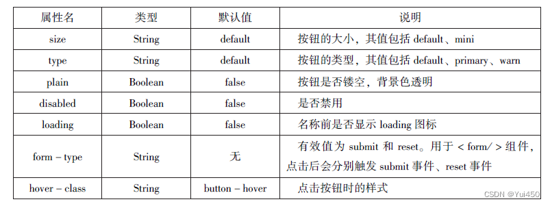
代码示例:
<!--pages/biaodan/biaodan.wxml-->
<button type="default">type:default</button>
<button type="primary">type:peimary</button>
<button type="warn">type:warn</button>
<button type="default"bindtap='buttonSize'size="{{size}}">改变size</button>
<button type="default"bindtap='buttonPlain'plain="{{plain}}">改变plain</button>
<button type="default"bindtap='buttonLoading'loading="{{loading}}">改变loading显示</button>
//biaodan.js
Page({
data:{
size:'default',
plain:'false',
loading:'false'
},
//改变按钮大小
buttonSize:function(){
if(this.data.size=="default")
this.setData({size:'mini'})
else
this.setData({size:'default'})
},
//是否显示镂空
buttonPlain:function(){
this.setData({plain:!this.data.plain})
},
//是否显示loading图案
buttonLoading:function(){
this.setData({loading:!this.data.plain})
}
})运行结果:

4.4.2 radio
单选框

代码示例:
<view>选择你喜爱的城市:</view>
<radio-group bindchange="citychange">
<radio value="西安">西安</radio>
<radio value="北京">北京</radio>
<radio value="上海">上海</radio>
<radio value="广州">广州</radio>
<radio value="深圳">深圳</radio>
</radio-group>
<view>你的选择:{{city}}</view>
<view>选择你喜爱的计算机语言:</view>
<radio-group class="radio-group"bindchange="radiochange">
<label class="radio" wx:for="{{radios}}">
<radio value="{{item.velue}}"checked="{{item.checked}}"/>{{item.name}}
</label>
</radio-group>
<view>你的选择:{{lang}}</view>
Page({
data:{
radios:[
{name:'java',value:'JAVA'},
{name:'python',value:'Python',checked:'true'},
{name:'php',value:'PHP'},
{name:'swif',value:'Swif'}
],
city:'',
lang:''
},
citychange:function(e){
this.setData({city:e.detail.value});
},
radiochange:function(event){
this.setData({lang:event.detail.value});
console.log(event.detail.value)
}
})运行结果:

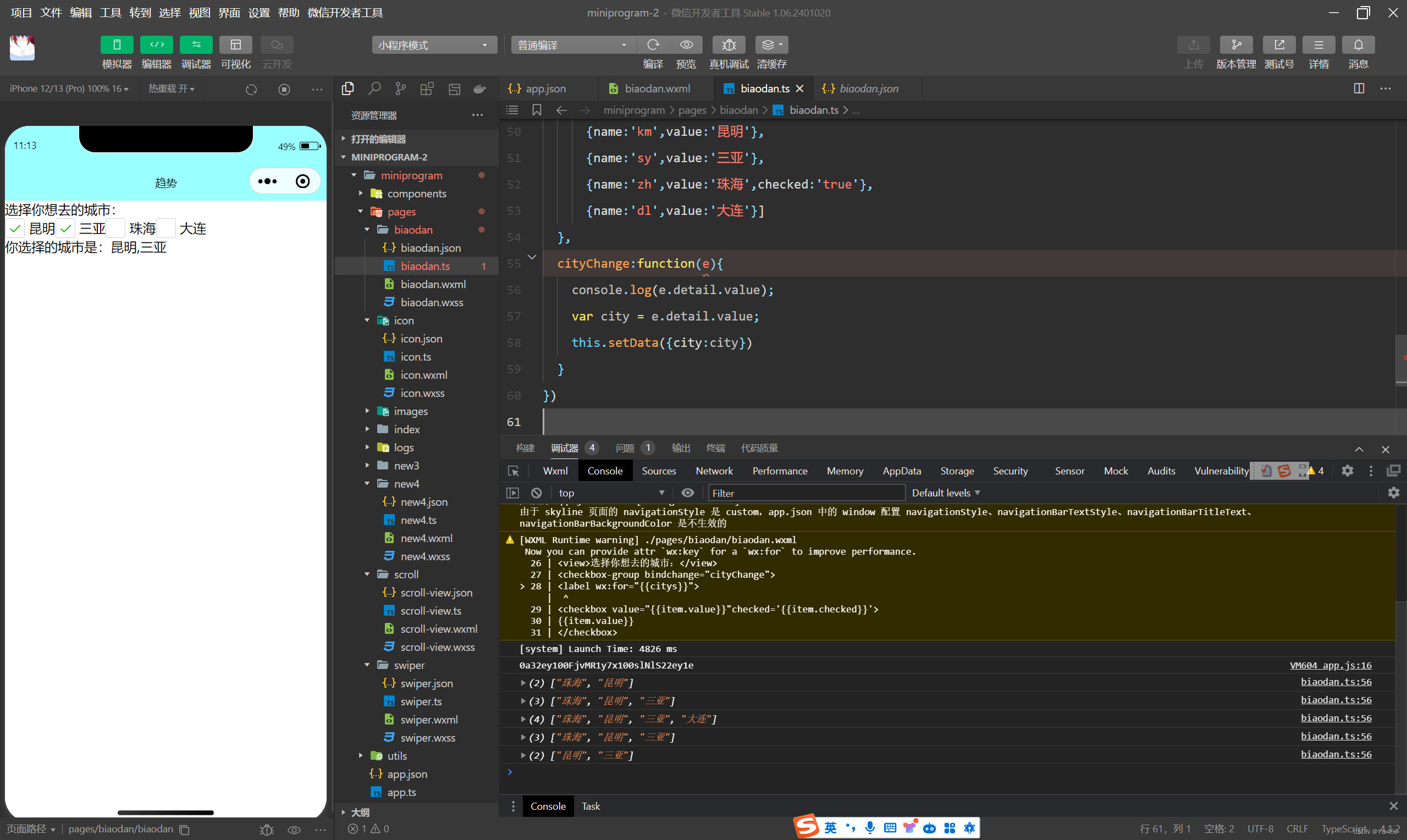
4.4.3 checkbox
复选框
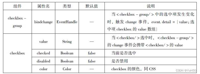
代码示例
.wxml
<!--复选框-->
<view>选择你想去的城市:</view>
<checkbox-group bindchange="cityChange">
<label wx:for="{{citys}}">
<checkbox value="{{item.value}}"checked='{{item.checked}}'>
{{item.value}}
</checkbox>
</label>
</checkbox-group>
<view>你选择的城市是:{{city}}</view>
.js
/*复选*/
Page({
  city:'',
  data:{
    citys:[
      {name:'km',value:'昆明'},
      {name:'sy',value:'三亚'},
      {name:'zh',value:'珠海',checked:'true'},
      {name:'dl',value:'大连'}]
  },
  cityChange:function(e){
    console.log(e.detail.value);
    var city = e.detail.value;
    this.setData({city:city})
  }
})
运行结果:
4.4.4 switch
switch组件的作用类似开关选择器

代码:
//.wxml
<view>
<switch bindchange="sw1">{{var1}}</switch>
</view>
<view>
<switch checked bindchange="sw2">{{var2}}</switch>
</view>
<view>
<switch type="checkbox" bindchange="sw3">{{var3}}</switch>
</view>
//.js
Page({
data:{
var1:'关',
var2:'开',
var3:'未选'
},
sw1:function(e){
this.setData({var1:e.detail.value?'开':'关'})
},
sw2:function(e){
this.setData({var2:e.detail.value?'开':'关'})
},
sw3:function(e){
this.setData({var3:e.detail.value?'已选':'未选'})
}
})运行结果:

4.4.5 slider
滑动选择器,可以通过滑动来设置相应的值。

示例代码:
//.wxml
<!--slider-->
<view>默认min=0 max=100 step=1</view>
<slider></slider>
<view>显示当前值</view>
<slider show-value></slider>
<view>设置min=20 max=200 step=10</view>
<slider min="0" max="200" step="10" show-value></slider>
<view>背景条红色,已选定颜色绿色</view>
<slider color="#f00" selected-color="#0f0"></slider>
<view>滑动改变icon的大小</view>
<slider show-value bindchange="sliderchange"></slider>
<icon type="success"size='{{size}}'></icon>
//.js
/*slider*/
Page({
data:{
size:'20'
},
sliderchange:function(e){
this.setData({size:e.detail.value})
}
})运行结果:

4.4.6 picker
滚动选择器
运行代码:
//.wxml
<!--sicker-->
<view>--range为数组--</view>
<picker range="{{array}}"value="{{index1}}"bindchange='arrayChange'>
当前选择:{{array[index1]}}
</picker>
<view>--range为数组对象--</view>
<picker bindchange="objArrayChange"value="{{index2}}"range-key="name"range="{{objArray}}">
当前选择:{{objArray[index2].name}}
</picker>
//.js
Page({
data:{
array:['Java','Python','C','C#'],
objArray:[
{id:0,name:'Java'},
{id:1,name:'Python'},
{id:2,name:'C'},
{id:3,name:'C#'}
],
index1:0,
index2:0
},
arrayChange:function(e){
console.log('picker值变为',e.detail.value)
var index=0;
this.setData({
index1:e.detail.value
})
},
objArrayChange:function(e){
console.log('picker值变为',e.detail.value)
this.setData({
index2:e.detail.value
})
}
})运行截图:

4.4.7 picker-view
嵌入页面的滚动选择器

代码示例:
//.wxml
<!--picker-view-->
<view>当前日期:{{year}}年{{month}}月{{day}}日</view>
<picker-view indicator-style="height:50px;"style="width:100%;height:300px;"value="{{value}}"bindchange="bindchange"><picker-view-column>
<view wx:for="{{years}}"style="line-height:50px">{{item}}年</view>
</picker-view-column>
<picker-view-column>
<view wx:for="{{months}}"style="line-height:50px;">{{item}}月</view>
</picker-view-column>
<picker-view-column>
<view wx:for="{{days}}"style="line-height:50px">{{item}}日</view>
</picker-view-column>
</picker-view>
//.js
/*picker-view*/
const date=new Date()
const years=[]
const months=[]
const days=[]
//定义年份
for(let i=1900;i<=2050;i++){
years.push(i)
}
//定义月份
for(let i=1;i<=12;i++){
months.push(i)
}
//定义日期
for(let i=1;i<=31;i++){
days.push(i)
}
Page({
data:{
years:years,
months:months,
days:days,
year:date.getFullYear(),
month:date.getMonth()+1,
day:date.getDate(),
value:[118,0,0],//定位到2018年1月1日
},
bindChange:function(e){
const val=e.detail.value
console.log(val);
this.setData({
year:this.data.years[val[0]],
month:this.data.months[val[1]],
day:this.data.days[val[2]]
})
}
})运行截图:

4.4.8 input
输入框组件,用户可输入相应的信息。

代码:
<!--input-->
<input placeholder="这是一个可以自动聚焦的input"auto-focus/>
<input placeholder="这个只有在点击的时候才聚焦"focus="{{f0-cus}}"/>
<button bindtap="bindButtonTop">使得输入框获取焦点</button>
<input maxlength="10"placeholder="最大输长度为10"/>
<view class="section_title">你输入的是:{{inputValue}}
<input bindinput="bindKeyInput"placeholder="输入同步到view中"/>
</view>
<input bindinput="bindReplaceInput"placeholder="连续的两个1会变成2"/>
<input password type="number"/>
<input password type="text"/>
<input type="digit"placeholder="带小数点垫底数字键盘"/>
<input type="idcard"placeholder="身份证输入键盘"/>
<input placeholder-style="color:red"placeholder="占位符字体是红色的"/>
/*input*/
Page({
data:{
focus:false,
inputValue:''
},
bindButtonTop:function(){
this.setData({
focus:true
})
},
bindKeyInput:function(e){
this.setData({
inputValue:e.detail.value
})
},
bindReplaceInput:function(e){
var value=e.detail.value
var pos=e.detail.cursor
if(pos!=-1){
//光标在中间
var left=e.detail.value.slice(0,pos)
//计算光标的位置
pos=left.replace(/ll/g,'2').length
}
//直接返回对象,可以对输入进行过滤处理,同时可以控制光标的位置
return{
value:value.replace(/ll/g,'2'),
cursor:pos
}
//或者直接返回字符串,光标在最后面
//return value.replace(//ll/g,'2'),
}
})运行截图:

4.4.9 textarea
textarea组件为多行输入框组件,可以实现多行内容的输入。


代码:
<!--textarea-->
<!--textarea.wxml-->
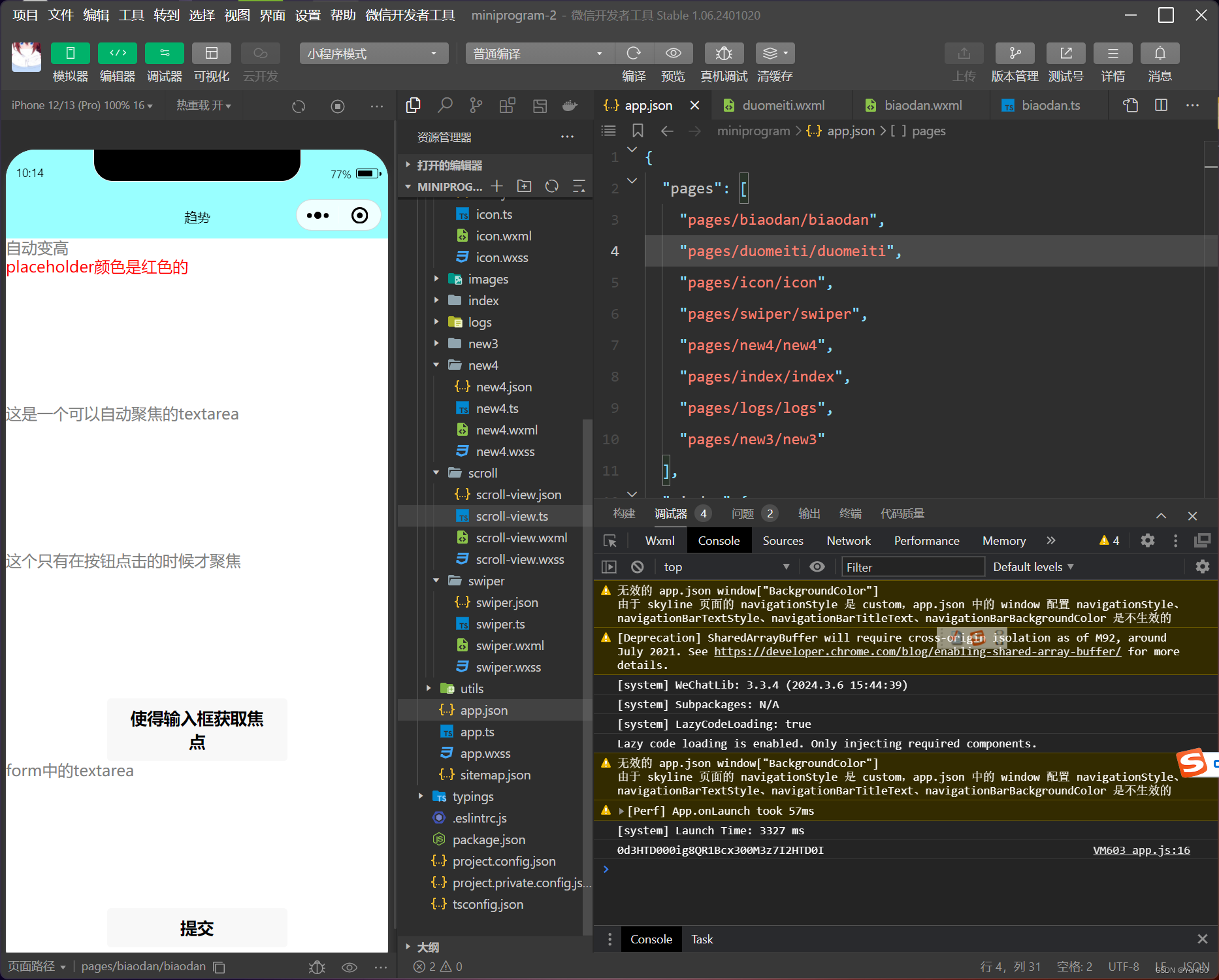
<textarea bindblur="bindTextAreaBlur"auto-height placeholder="自动变高"/>
<textarea placeholder="placeholder颜色是红色的"placeholder-style="color:red;"/>
<textarea placeholder="这是一个可以自动聚焦的textarea"auto-focus/>
<textarea placeholder="这个只有在按钮点击的时候才聚焦"focus="{{fo-cus}}"/>
<button bindtap="bindButtonTop">使得输入框获取焦点</button>
<form bindsubmit="bindFormSubmit">
<textarea placeholder="form中的textarea"name="textarea"/>
<button form-type="submit">提交</button>
</form>/*textarea*/
Page({
data:{
height:10,
focus:false
},
bindButtonTop:function(){
this.setData({
focus:true
})
},
bindTextAreaBlur:function(e){
console.log(e.detail.value)
},
bindFormSubmit:function(e){
console.log(e.detail.value.textarea)
}
})运行截图:
4.4.10 label
<!--label-->
<!--单击中国不能选择/取消复选框-->
<view><checkbox></checkbox>中国</view>
<!--单击“中国”可以选择/取消复选框-->
<view><label><checkbox></checkbox>中国</label></view>
<!--使用for找到对应的ID-->
<checkbox-group bindchange="cityChange">
<label wx:for="{{citys}}">
<checkbox value="{{item.value}}"checked='{{item.checked}}'>{{item.value}}</checkbox>
</label>
</checkbox-group>
<view>您的选择是:{{city}}</view>
/*label*/
Page({
city:'',
data:{
citys:[
{name:'km',value:'昆明'},
{name:'sy',value:'三亚'},
{name:'zh',value:'珠海',checked:'true'},
{name:'dl',value:'大连'}]
},
cityChange:function(e){
console.log(e.detail.value);
var city=e.detail.value;
this.setData({city:city})
}
})运行结果;

4.4.11 from
<!--from-->
<from bindsubmit="fromSubmit"bindreset="fromReset">
<view>姓名:
<input type="text"name="xm"/>
</view>
<view>性别:
<radio-group name="xb">
<label>
<radio value="男"checked/>男</label>
<label>
<radio value="女"checked/>女</label>
</radio-group>
</view>
<view>爱好:
<checkbox-group name="habby">
<label wx:for="{{hobbies}}">
<checkbox value="{{item.value}}"
checked='{{item.checked}}'>{{item.value}}</checkbox>
</label>
</checkbox-group>
</view>
<button formType='submit'>提交</button>
<button form-type="reset">重置</button>
</from>
Page({
hobby:'',
data:{
hobbies:[
{name:'jsj',value:'计算机',checked:'true'},
{name:'music',value:'听音乐'},
{name:'game',value:'玩游戏'},
{name:'swim',value:'游泳',checked:'true'}]
},
formSubmit:function(e){
console.log('from发生了submit事件,携带数据为:',e.detail.value)
},
fromReset:function(){
console.log('from发生了reset事件')
}
})运行截图:

4.5 多媒体组件
4.5.1 image

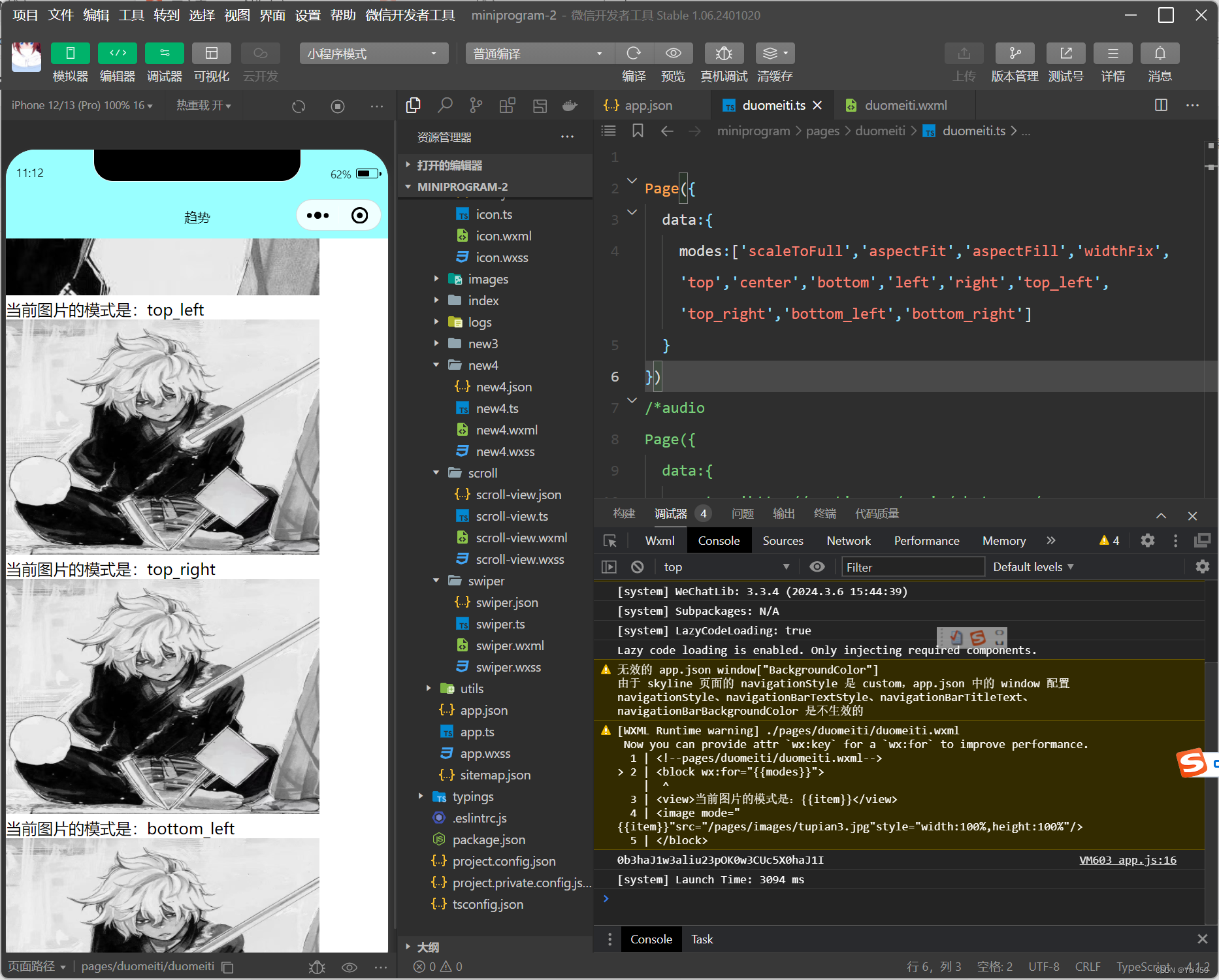
代码:
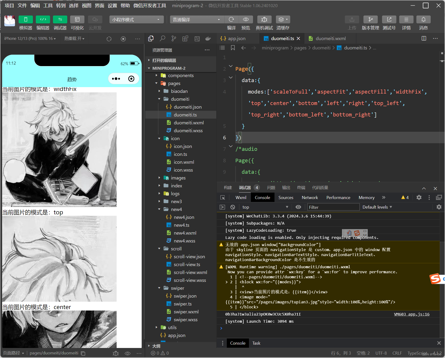
<block wx:for="{{modes}}">
<view>当前图片的模式是:{{item}}</view>
<image mode="{{item}}"src="/pages/images/tupian3.jpg"style="width:100%,height:100%"/>
</block>
Page({
data:{
modes:['scaleToFull','aspectFit','aspectFill','widthFix','top','center','bottom','left','right','top_left','top_right','bottom_left','bottom_right']
}
})运行截图;


4.5.2 audio
audio组件用来实现音乐播放,暂停等。

<audio src="{{src}}"action="{{action}}"poster="{{poster}}"name="{{name}}"author="{{author}}"loop controls></audio>
<button type="primary"bindtop='play'>播放</button>
<button type="primary"bindtop='pause'>暂停</button>
<button type="primary"bindtop='playRate'>设置速率</button>
<button type="primary"bindtop='currentTime'>设置当前时间(秒)</button>
Page({
data:{
poster:'http://y.gtimg.cn/music/photo_new/T002R300x300M000003rsKF44GyaSk.jpg?max_age=2592000',
name:'此时此刻',
author:'许巍',
src:'http://ws.stream.qqmusic.qq.com/M500001VfvsJ21xFqb.mp3?guid=ffffffff82def4af4b12b3cd9337d5e7&uin=346897220&vkey=6292F51E1E384E06DCBDC9AB7C49FD713D632D313AC4858BACB8DDD29067D3C601481D36E62053BF8DFEAF74C0A5CCFADD6471160CAF3E6A&fromtag=46',
},
play:function(){
this.setData({
action:{
method:'play'
}
})
},
pause:function(){
this.setData({
action:{
method:'pause'
}
})
},
playRate:function(){
this.setData({
action:{
method:'setPlaybackRate',
data:10//速率
}
})
console.log('当前速率:'+this.data.action.data)
},
currentTime:function(e){
this.setData({
action:{
method:'setCurrentTime',
data:120
}
})
},
})运行结果:

4.5.3 video
代码:
<video src="{{src}}"controls></video>
<view class="btn-area">
<button bindtap="bindButtonTap">获取视频</button>
</view>
Page({
data:{
src:'',
},
bindButtonTap:function(){
var that=this
wx.chooseVideo({
sourceType:['album','camera'],
maxDuration:60,
camera:['front','back'],
success:function(res){
that.setData({
src:res.tempFilePath
})
}
})
}
})运行结果:

4.5.4 camera
代码:
<camera device-position="back"flash="off"binderror="error"style="width:100%;height:350px"></camera>
<button type="primary"bindtap="takePhoto">拍照</button>
<view>预览</view>
<image mode="widthFix"src="{{src}}"></image>
Page({
takePhoto(){
const ctx=wx.createCameraContext()
ctx.takePhoto({
quality:'high',
success:(res)=>{
this.setData({
src:res.tempImagePath
})
}
})
},
error(e){
console.log(e.detail)
}
})运行结果:

4.6 其他组件
4.6.1 map
map组件属性

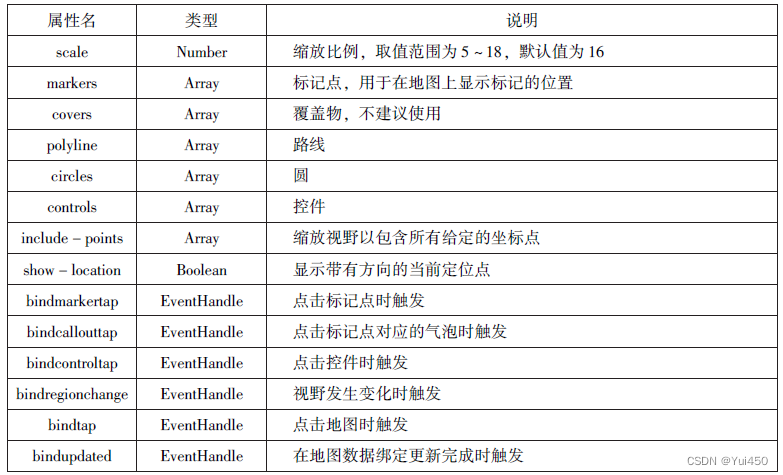
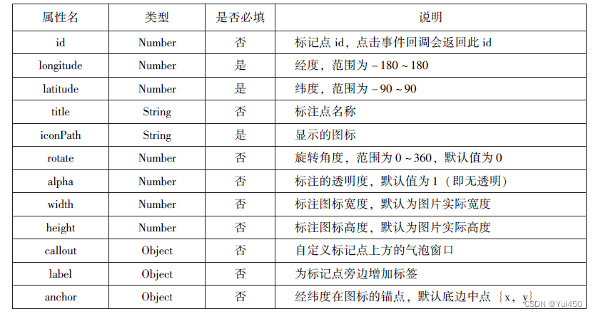
map组件的markers属性用于在地图上显示标记的位置其相关属性
map组件polyline属性的相关属性

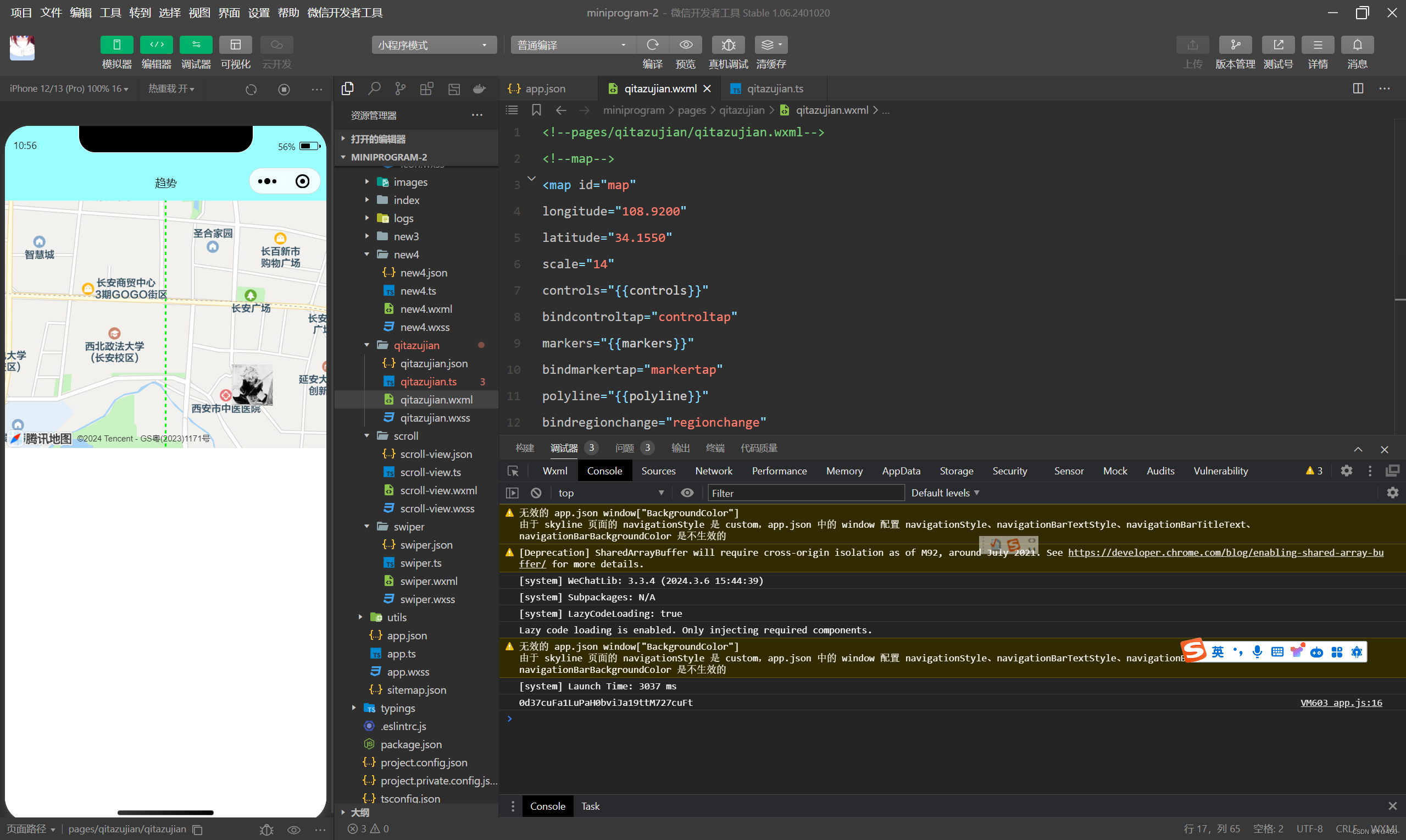
代码:
<map id="map"
longitude="108.9200"
latitude="34.1550"
scale="14"
controls="{{controls}}"
bindcontroltap="controltap"
markers="{{markers}}"
bindmarkertap="markertap"
polyline="{{polyline}}"
bindregionchange="regionchange"
show-location
style="width: 100%;height: 300px;">
Page({
data:{
markers:[{
iconPath:"/pages/images/tupian3.jpg",
id:0,
longitude:"108.9290",
latitude:"34.1480",
width:50,
height:50
}],
polyline:[{//路线
points:[{
longitude:"108.9200",
latitude:"34.1400"
},
{
longitude:"108.9200",
latitude:"34.1500"
},
{
longitude:"108.9200",
latitude:"34.1700"
}
],
color:"#00ff00",
width:2,
dottedLine:true
}],
controls:[{
id:1,
iconPath:'/pages/images/tupian3.jpg',
position:{
left:0,
top:300,
width:30,
height:30
},
clickable:true
}]
},
regionchange(e){
console.log(e.type)
},
markertop(e){
console.log(e.markerId)
},
controltap(e){
console.log(e.controlId)
}
})运行结果:
4.6.2 canvas
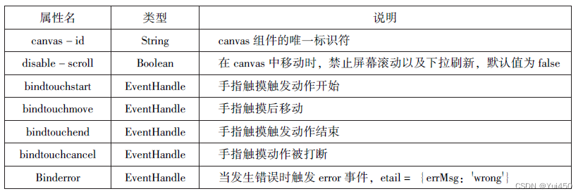
.wxml
<canvas canvas-id="myCanvas" style="border: 1px solid red;"/>Page({
onLoad:function(options){
var ctx=wx.createCanvasContext('myCanvas')
ctx.setFillStyle('green')
ctx.fillRect(10,10,200,100)
ctx.draw()
}
})运行结果:

本章小结:
本章介绍了小程序中的常用组件,包括容器组件(view、seroll-view、swiper)、基础内容组件(icon、text、progress、rich-text)、表单组件(form、input、button、radio、check-box,label、picker、picker-view、slider、switch、textarea)、多媒体组件(audio,imagevideo、camera)、其他组件(map、canvas等)。熟练掌握这些组件的属性和方法是开发小程序的必备技能。


 被折叠的 条评论
为什么被折叠?
被折叠的 条评论
为什么被折叠?
 到【灌水乐园】发言


