


在这个特别的日子里,人们会表达爱意,分享甜蜜的时刻。
无论是通过礼物、约会、写情书还是其他方式,重要的是真诚地表达你的感情,享受与对方在一起的时光。爱情是多样的,每个人的体验都是独一无二的,享受探索和体验爱情的过程吧!
<!DOCTYPE html>
<html lang="en">
<head>
<meta charset="UTF-8">
<meta http-equiv="X-UA-Compatible" content="IE=edge">
<meta name="viewport" content="width=device-width, initial-scale=1.0">
<title>susu</title>
<style>
@charset "utf-8";
*{
margin:0;
padding:0;
}
body{
/*background: url(../img/preview.png) ;*/
max-width: 100%;
min-width: 100%;
height: 100%;
background-size: cover;
background-repeat: no-repeat;
background-attachment: fixed;
background-size:100% 100%;
position: absolute;
margin-left: auto;
margin-right: auto;
}
li{
list-style: none;
}
.box{
width:200px;
height:200px;
background-size: cover;
background-repeat: no-repeat;
background-attachment: fixed;
background-size:100% 100%;
position: absolute;
margin-left: 42%;
margin-top: 22%;
-webkit-transform-style:preserve-3d;
-webkit-transform:rotateX(13deg);
-webkit-animation:move 5s linear infinite;
}
.minbox{
width:100px;
height:100px;
position: absolute;
left:50px;
top:30px;
-webkit-transform-style:preserve-3d;
}
.minbox li{
width:100px;
height:100px;
position: absolute;
left:0;
top:0;
}
.minbox li:nth-child(1){
background: url(../img/01.png) no-repeat 0 0;
-webkit-transform:translateZ(50px);
}
.minbox li:nth-child(2){
background: url(../img/02.png) no-repeat 0 0;
-webkit-transform:rotateX(180deg) translateZ(50px);
}
.minbox li:nth-child(3){
background: url(../img/03.png) no-repeat 0 0;
-webkit-transform:rotateX(-90deg) translateZ(50px);
}
.minbox li:nth-child(4){
background: url(../img/04.png) no-repeat 0 0;
-webkit-transform:rotateX(90deg) translateZ(50px);
}
.minbox li:nth-child(5){
background: url(../img/05.png) no-repeat 0 0;
-webkit-transform:rotateY(-90deg) translateZ(50px);
}
.minbox li:nth-child(6){
background: url(../img/06.png) no-repeat 0 0;
-webkit-transform:rotateY(90deg) translateZ(50px);
}
.maxbox li:nth-child(1){
background: url(../img/1.png) no-repeat 0 0;
-webkit-transform:translateZ(50px);
}
.maxbox li:nth-child(2){
background: url(../img/2.png) no-repeat 0 0;
-webkit-transform:translateZ(50px);
}
.maxbox li:nth-child(3){
background: url(../img/3.png) no-repeat 0 0;
-webkit-transform:rotateX(-90deg) translateZ(50px);
}
.maxbox li:nth-child(4){
background: url(../img/4.png) no-repeat 0 0;
-webkit-transform:rotateX(90deg) translateZ(50px);
}
.maxbox li:nth-child(5){
background: url(../img/5.png) no-repeat 0 0;
-webkit-transform:rotateY(-90deg) translateZ(50px);
}
.maxbox li:nth-child(6){
background: url(../img/6.png) no-repeat 0 0;
-webkit-transform:rotateY(90deg) translateZ(50px);
}
.maxbox{
width: 800px;
height: 400px;
position: absolute;
left: 0;
top: -20px;
-webkit-transform-style: preserve-3d;
}
.maxbox li{
width: 200px;
height: 200px;
background: #fff;
border:1px solid #ccc;
position: absolute;
left: 0;
top: 0;
opacity: 0.2;
-webkit-transition:all 1s ease;
}
.maxbox li:nth-child(1){
-webkit-transform:translateZ(100px);
}
.maxbox li:nth-child(2){
-webkit-transform:rotateX(180deg) translateZ(100px);
}
.maxbox li:nth-child(3){
-webkit-transform:rotateX(-90deg) translateZ(100px);
}
.maxbox li:nth-child(4){
-webkit-transform:rotateX(90deg) translateZ(100px);
}
.maxbox li:nth-child(5){
-webkit-transform:rotateY(-90deg) translateZ(100px);
}
.maxbox li:nth-child(6){
-webkit-transform:rotateY(90deg) translateZ(100px);
}
.box:hover ol li:nth-child(1){
-webkit-transform:translateZ(300px);
width: 400px;
height: 400px;
opacity: 0.8;
left: -100px;
top: -100px;
}
.box:hover ol li:nth-child(2){
-webkit-transform:rotateX(180deg) translateZ(300px);
width: 400px;
height: 400px;
opacity: 0.8;
left: -100px;
top: -100px;
}
.box:hover ol li:nth-child(3){
-webkit-transform:rotateX(-90deg) translateZ(300px);
width: 400px;
height: 400px;
opacity: 0.8;
left: -100px;
top: -100px;
}
.box:hover ol li:nth-child(4){
-webkit-transform:rotateX(90deg) translateZ(300px);
width: 400px;
height: 400px;
opacity: 0.8;
left: -100px;
top: -100px;
}
.box:hover ol li:nth-child(5){
-webkit-transform:rotateY(-90deg) translateZ(300px);
width: 400px;
height: 400px;
opacity: 0.8;
left: -100px;
top: -100px;
}
.box:hover ol li:nth-child(6){
-webkit-transform:rotateY(90deg) translateZ(300px);
width: 400px;
height: 400px;
opacity: 0.8;
left: -100px;
top: -100px;
}
@keyframes move{
0%{
-webkit-transform: rotateX(13deg) rotateY(0deg);
}
100%{
-webkit-transform:rotateX(13deg) rotateY(360deg);
}
}
</style>
</head>
<body>
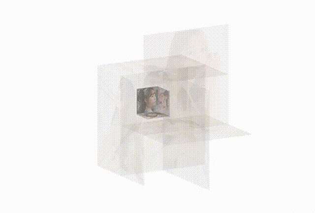
<div class="box">
<ul class="minbox">
<li><img src="img\01.png"></li>
<li><img src="img\02.png"></li>
<li><img src="img\03.png"></li>
<li><img src="img\04.png"></li>
<li><img src="img\05.png"></li>
<li><img src="img\06.png"></li>
</ul>
<ol class="maxbox">
<li><img src="img\1.png"></li>
<li><img src="img\2.png"></li>
<li><img src="img\3.png"></li>
<li><img src="img\4.png"></li>
<li><img src="img\5.png"></li>
<li><img src="img\6.png"></li>
</ol>
</div>
</body>
</html>
</body>
</html>


 1240
1240


 被折叠的 条评论
为什么被折叠?
被折叠的 条评论
为什么被折叠?
 到【灌水乐园】发言


