


系列文章目录
第一章 WPF自定义控件和样式教程-自己的控件库(一)-时间选择器TimePick
目录
前言
相信很多WPF从业者和我一样,都遇到过一个问题:我想要一个能同时选择年月日和时分秒的控件。
很可惜,WPF自带的时间控件要不然只支持年月日,要不然只支持时分秒。好吧,拿我就两个结合起来用,用着用着问题又来了:自带的控件怎么看怎么不顺眼,样式还不好调整。随着界面制作越来越追求美观和差异化,在项目中直接使用自带的控件就像野马装了个金杯面包车的车门一样别扭。
那么,我们为什么不自己制作一个又能编辑年月日,又能编辑时分秒的控件呢?
一、构思
首先,我们参考一下WIN10的日历。
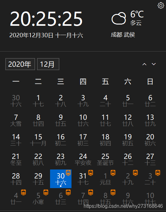
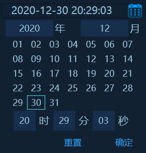
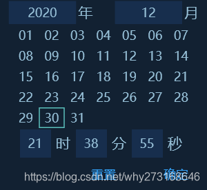
这个日历主要展示了时间中的年月日,我们可以参考这个来设计我们自己的控件。至于时分秒,我们就用最常见的 "XX 时 XX 分 XX秒" 来设计把。下面是我自己设计的一个简单的时间选择器。
二、UI设计
要想达到上图所示的效果,我们得先用系统自带的控件布好局。下面是控件的Xaml代码。
<UserControl x:Class="Why_Wpf_UserControls.TimePick"
             xmlns="http://schemas.microsoft.com/winfx/2006/xaml/presentation"
             xmlns:x="http://schemas.microsoft.com/winfx/2006/xaml"
             xmlns:mc="http://schemas.openxmlformats.org/markup-compatibility/2006"
             xmlns:d="http://schemas.microsoft.com/expression/blend/2008"
             xmlns:local="clr-namespace:Why_Wpf_UserControls"
             mc:Ignorable="d"
              MinWidth="200" MaxWidth="400" MinHeight="22" MaxHeight="30">
<UserControl.Resources>
        <ResourceDictionary Source="Resource/Themes/Dictionary.xaml" />
 </UserControl.Resources>
<Grid Background="#FF122132">
        <Grid.Resources>
            <Style TargetType="RadioButton" BasedOn="{StaticResource DayRadioButton}"/>
            <Style TargetType="{x:Type TextBox}" >
                <Setter Property="Background" Value="#FF172E4D" />
                <Setter Property="BorderBrush" Value="#FFEAEAEA" />
                <Setter Property="BorderThickness" Value="0" />
                <Setter Property="Foreground" Value="#96bfd6" />
            </Style>
            <Style TargetType="{x:Type Label}">
                <Setter Property="Foreground" Value="#96bfd6" />
                <Setter Property="FontSize" Value="14" />
            </Style>
            <Style TargetType="Button">
                <Style.Triggers>
                    <Trigger Property="Button.IsEnabled" Value="False">
                        <Setter Property="Opacity" Value="0.5" />
                    </Trigger>
                    <Trigger Property="Button.IsMouseOver" Value="True">
                        <Setter Property="Opacity" Value="0.7" />
                    </Trigger>
                </Style.Triggers>
            </Style>
        </Grid.Resources>
        <Border Background="Transparent"  >
            <WrapPanel Orientation="Vertical" HorizontalAlignment="Center" VerticalAlignment="Center" >
                <StackPanel Orientation="Horizontal" HorizontalAlignment="Left" VerticalAlignment="Center" >
                    <ToggleButton  x:Name="btn_ChoseTime" Content="{Binding RelativeSource={RelativeSource AncestorType={x:Type local:TimePick}}, Path=TimeValue, Converter={StaticResource DateToString}}" Width="200" Height="24" BorderThickness="0" Style="{StaticResource TimeToggle}" />
                </StackPanel>
                <Popup IsOpen="{Binding ElementName=btn_ChoseTime, Path=IsChecked}" Placement="Bottom" x:Name="Popup" Focusable="True" AllowsTransparency="True" PopupAnimation="Slide" StaysOpen="False">
                    <Grid Background="#FF122132" >
                        <Grid.RowDefinitions>
                            <RowDefinition Height="24" />
                            <RowDefinition Height="1*" />
                            <RowDefinition Height="30" />
                            <RowDefinition Height="30" />
                        </Grid.RowDefinitions>
                        <Grid Grid.Row="0">
                            <Grid.ColumnDefinitions>
                                <ColumnDefinition Width="1*" />
                                <ColumnDefinition Width="1*" />
                            </Grid.ColumnDefinitions>
                            <StackPanel Orientation="Horizontal" VerticalAlignment="Center" HorizontalAlignment="Center" Grid.Column="0">
                                <ComboBox x:Name="cmb_Year" Height="22" Width="65"  SelectionChanged="cmb_SelectionChanged" Style="{StaticResource TimeComboBox}"/>
                                <Label Content="年" Padding="2" HorizontalContentAlignment="Center" VerticalContentAlignment="Center"/>
                            </StackPanel>
                            <StackPanel Orientation="Horizontal" VerticalAlignment="Center" HorizontalAlignment="Center" Grid.Column="1" Margin="5,0,0,0">
                                <ComboBox x:Name="cmb_Mon" Height="22" Width="65"  SelectionChanged="cmb_SelectionChanged" Style="{StaticResource TimeComboBox}"/>
                                <Label Content="月" Padding="2" HorizontalContentAlignment="Center" VerticalContentAlignment="Center"/>
                            </StackPanel>
                        </Grid>
                        <WrapPanel x:Name="StartWrap" Width="175" Height="100" Grid.Row="1" Margin="12.5,0,12.5,0" />
                        <StackPanel Orientation="Horizontal" VerticalAlignment="Center" HorizontalAlignment="Center" Grid.Row="2">
                            <TextBox x:Name="text_Hour" Width="30" HorizontalContentAlignment="Center" PreviewTextInput="TextBox_PreviewTextInput"  VerticalContentAlignment="Center" LostFocus="Text_LostFocus" />
                            <Label Content="时" />
                            <TextBox x:Name="text_Min" Width="30" HorizontalContentAlignment="Center" PreviewTextInput="TextBox_PreviewTextInput"  VerticalContentAlignment="Center"  LostFocus="Text_LostFocus"/>
                            <Label Content="分" />
                            <TextBox x:Name="text_Second" Width="30" HorizontalContentAlignment="Center" PreviewTextInput="TextBox_PreviewTextInput"  VerticalContentAlignment="Center"  LostFocus="Text_LostFocus"/>
                            <Label Content="秒" />
                        </StackPanel>
                        <StackPanel Orientation="Horizontal" HorizontalAlignment="Right" VerticalAlignment="Center" Grid.Row="3">
                            <Button x:Name="btn_Clear" Content="重置" Foreground="#FF319FF4" Background="Transparent" BorderThickness="0" Click="btn_Clear_Click"  Width="40"/>
                            <Button x:Name="btn_Sure" Content="确定" Foreground="#FF319FF4" Background="Transparent" BorderThickness="0" Margin="30,0,10,0" Click="btn_Sure_Click"  Width="40"/>
                        </StackPanel>
                    </Grid>
                </Popup>
            </WrapPanel>
        </Border>
</Grid>
1.时间展示和开始选择按钮
大家看到这个布局可能有点疑惑,因为里面有一个ToggleButton的样式,作为我们这个控件展示时间和开始选择的按钮。
样式如下:
    <Style TargetType="{x:Type ToggleButton}" x:Key="TimeToggle">
        <Setter Property="MinWidth" Value="200" />
        <Setter Property="Height" Value="30" />
        <Setter Property="Background" Value="#FF122132" />
        <Setter Property="Foreground" Value="#96bfd6" />
        <Setter Property="BorderBrush" Value="#FFEAEAEA" />
        <Setter Property="BorderThickness" Value="0" />
        <Setter Property="FontSize"  Value="14" />
        <Setter Property="Template">
            <Setter.Value>
                <ControlTemplate TargetType="{x:Type ToggleButton}">
                    <Grid>
                        <Grid.ColumnDefinitions>
                            <ColumnDefinition Width="1*" />
                            <ColumnDefinition Width="30" />
                        </Grid.ColumnDefinitions>
                        <ContentPresenter HorizontalAlignment="Center"         VerticalAlignment="Center" Grid.Column="0"/>
                        <Border Background="Transparent" Width="auto" Height="auto" Grid.Column="1">
                            <Border x:Name="Back" Width="19" Height="20" HorizontalAlignment="Center" VerticalAlignment="Center">
                                <Border.Background>
                                    <ImageBrush ImageSource="/Why_Wpf_UserControls;component/Resource/Images/时间.png"/>
                                </Border.Background>
                            </Border>
                        </Border>
                    </Grid>
                </ControlTemplate>
            </Setter.Value>
        </Setter>
        <Style.Triggers>
            <MultiTrigger>
                <MultiTrigger.Conditions>
                    <Condition Property="IsMouseOver" Value="true" />
                </MultiTrigger.Conditions>
            </MultiTrigger>
            <MultiTrigger>
                <MultiTrigger.Conditions>
                    <Condition Property="IsMouseOver" Value="false" />
                </MultiTrigger.Conditions>
            </MultiTrigger>
            <Trigger Property="ToggleButton.IsMouseOver" Value="True">
                <Setter Property="Opacity" Value="0.7" />
            </Trigger>
            <Trigger Property="ToggleButton.IsEnabled" Value="False">
                <Setter Property="ToggleButton.Template">
                    <Setter.Value>
                        <ControlTemplate TargetType="{x:Type ToggleButton}">
                            <Border CornerRadius="3" BorderThickness="0" Background="{TemplateBinding Background}" BorderBrush="{TemplateBinding BorderBrush}">
                                <ContentPresenter HorizontalAlignment="Center" VerticalAlignment="Center" />
                            </Border>
                        </ControlTemplate>
                    </Setter.Value>
                </Setter>
            </Trigger>
        </Style.Triggers>
    </Style>
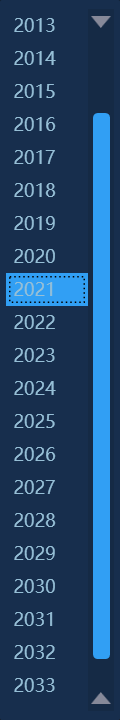
这里简单的讲解一下。首先,我们的修改ComboBox的样式。
我们把ComboBox分成两个部分,一个部分用来显示分本,另一个部分用来显示标识时间选择的按钮。这里我使用的图片大家可以自己到网上搜索,放入项目后就可以使用啦。为了图片显示的比较清楚,所以显示图片的Border的长宽设置成了和图片大小一直。
修改到这一步其实这个下拉框的样式已经和示意图上显示的差不多了,但是程序一运行以来,大家就会发现,不管是鼠标移入下拉框还是其他的事件,我们这个样式还是采用的系统自带的效果,这样会显得我们的控件看起来格格不入,很粗糙。解决这个问题最容易也是最简单的一个办法,就是修改这些事件的触发效果,让这些事件触发时,整个控件的透明度变化一下就可以啦。
<Trigger Property="ComboBox.IsMouseOver" Value="True">
      <Setter Property="Opacity" Value="0.7" />
</Trigger>
这里的IsEnabled的样式效果为不显示图片,仅显示时间。
2.下拉Popup
Popup主要用来显示编辑时间的区域,在我们不点击空间时不会展开,所以它的IsOpen属性绑定了我们上面的ToggleButton的IsCheck属性,这也是我们显示时间的控件采用ToggleButton而不是其他控件的原因。
<Popup IsOpen="{Binding ElementName=btn_ChoseTime, Path=IsChecked}" Placement="Bottom" x:Name="Popup" Focusable="True" AllowsTransparency="True" PopupAnimation="Slide" StaysOpen="False">Popup的区域我们从上到下分为四大块,第一块用来放置设置年月的两个ComboBox;第二块用来放置设置日的RadioButton们;第三块用来放置设置时分秒的三个TextBox;第四块用来放置重置和确定按钮。
第一部分-年月选择
下面是第一块区域的Xaml。
                        <Grid Grid.Row="0">
                            <Grid.ColumnDefinitions>
                                <ColumnDefinition Width="1*" />
                                <ColumnDefinition Width="1*" />
                            </Grid.ColumnDefinitions>
                            <StackPanel Orientation="Horizontal" VerticalAlignment="Center" HorizontalAlignment="Center" Grid.Column="0">
                                <ComboBox x:Name="cmb_Year" Height="22" Width="65"  SelectionChanged="cmb_SelectionChanged" Style="{StaticResource TimeComboBox}"/>
                                <Label Content="年" Padding="2" HorizontalContentAlignment="Center" VerticalContentAlignment="Center"/>
                            </StackPanel>
                            <StackPanel Orientation="Horizontal" VerticalAlignment="Center" HorizontalAlignment="Center" Grid.Column="1" Margin="5,0,0,0">
                                <ComboBox x:Name="cmb_Mon" Height="22" Width="65"  SelectionChanged="cmb_SelectionChanged" Style="{StaticResource TimeComboBox}"/>
                                <Label Content="月" Padding="2" HorizontalContentAlignment="Center" VerticalContentAlignment="Center"/>
                            </StackPanel>
                        </Grid>
这部分没有什么值得特别注意的地方,唯一的需要注意的是有一个下拉框的样式。
    <Style TargetType="ComboBox" x:Key="TimeComboBox">
        <Setter Property="VerticalContentAlignment" Value="Center" />
        <Setter Property="BorderThickness" Value="0" />
        <Setter Property="BorderBrush" Value="Transparent" />
        <Setter Property="Foreground" Value="#96bfd6" />
        <Setter Property="Background" Value="#FF172E4D" />
        <Setter Property="BorderBrush" Value="#FF172E4D" />
        <Setter Property="ItemContainerStyle">
            <Setter.Value>
                <Style TargetType="ComboBoxItem">
                    <Setter Property="MinHeight" Value="22"></Setter>
                    <Setter Property="Template">
                        <Setter.Value>
                            <ControlTemplate TargetType="ComboBoxItem">
                                <Border Name="Back" Background="{TemplateBinding Background}"  BorderThickness="0,0,0,0" BorderBrush="{TemplateBinding BorderBrush}">
                                    <ContentPresenter ContentSource="{Binding Source}"  VerticalAlignment="Center" HorizontalAlignment="Left" Margin="5,0,0,0"></ContentPresenter>
                                </Border>
                                <ControlTemplate.Triggers>
                                    <Trigger Property="IsMouseOver" Value="True">
                                        <Setter TargetName="Back" Property="Background" Value="#FF319FF4"></Setter>
                                    </Trigger>
                                    <Trigger Property="IsHighlighted" Value="True">
                                        <Setter TargetName="Back" Property="Background" Value="#FF319FF4"></Setter>
                                    </Trigger>
                                </ControlTemplate.Triggers>
                            </ControlTemplate>
                        </Setter.Value>
                    </Setter>
                </Style>
            </Setter.Value>
        </Setter>
        <Setter Property="Template">
            <Setter.Value>
                <ControlTemplate TargetType="ComboBox">
                    <Grid Background="{TemplateBinding Background}">
                        <Grid.ColumnDefinitions>
                            <ColumnDefinition Width="0.7*" />
                        </Grid.ColumnDefinitions>
                        <ToggleButton  Grid.Column="0" Foreground="{TemplateBinding Foreground}" Background="{TemplateBinding Background}"  Content="{TemplateBinding Text}" VerticalContentAlignment="Center"
IsChecked="{Binding Path=IsDropDownOpen, Mode=TwoWay, RelativeSource={RelativeSource TemplatedParent}}" ClickMode="Press" BorderThickness="0"></ToggleButton>
                        <Popup IsOpen="{TemplateBinding IsDropDownOpen}" Placement="Bottom" x:Name="Popup" Focusable="False" AllowsTransparency="True" PopupAnimation="Slide">
                            <Border CornerRadius="1" MaxHeight="{TemplateBinding MaxDropDownHeight}" MinWidth="80" x:Name="DropDown" SnapsToDevicePixels="True" Background="{TemplateBinding Background}">
                                <Border.Effect>
                                    <DropShadowEffect Color="Black" BlurRadius="2" ShadowDepth="0" Opacity="0.5" />
                                </Border.Effect>
                                <ScrollViewer Margin="4,6,4,6" Style="{DynamicResource ScrollViewerStyle}" MaxHeight="{TemplateBinding MaxDropDownHeight}" SnapsToDevicePixels="True" HorizontalScrollBarVisibility="Auto" VerticalScrollBarVisibility="Auto" CanContentScroll="True">
                                    <StackPanel IsItemsHost="True" KeyboardNavigation.DirectionalNavigation="Contained" Background="{TemplateBinding Background}" />
                                </ScrollViewer>
                            </Border>
                        </Popup>
                    </Grid>
                </ControlTemplate>
            </Setter.Value>
        </Setter>
    </Style>
众所周知,下拉框有一个显示区域和下拉区域组成,而WPF自带的下拉区域不改样式的话很难调整,所以我们也在这里重写了ComboBox中的Popup。然后,我们又遇到一个问题,在下拉框很长的时候我们需要一个滚动条来显示,老规矩了,WPF自带的滚动条也不容易调整样式,所以我们又重写了滚动条的样式。
<Style TargetType="ScrollViewer" x:Key="ScrollViewerStyle">
<Setter Property="Template">
<Setter.Value>
<ControlTemplate TargetType="{x:Type ScrollViewer}">
<Grid x:Name="Grid" Background="{TemplateBinding Background}">
<Grid.ColumnDefinitions>
<ColumnDefinition Width="*" />
<ColumnDefinition Width="Auto" />
</Grid.ColumnDefinitions>
<Grid.RowDefinitions>
<RowDefinition Height="*" />
<RowDefinition Height="Auto" />
</Grid.RowDefinitions>
<!--右下角四方形-->
<Rectangle x:Name="Corner" Grid.Row="1" Grid.Column="1" Fill="{DynamicResource {x:Static SystemColors.ControlBrushKey}}" />
<!--内容区域-->
<ScrollContentPresenter x:Name="PART_ScrollContentPresenter" Grid.Row="0" Grid.Column="0" Content="{TemplateBinding Content}" CanContentScroll="{TemplateBinding CanContentScroll}" ContentTemplate="{TemplateBinding ContentTemplate}" Margin="{TemplateBinding Padding}" />
<!--竖直滚动条-->
<ScrollBar x:Name="PART_VerticalScrollBar" Grid.Row="0" Grid.Column="1" AutomationProperties.AutomationId="VerticalScrollBar" Cursor="Arrow" Maximum="{TemplateBinding ScrollableHeight}" Minimum="0" Visibility="{TemplateBinding ComputedVerticalScrollBarVisibility}" Value="{Binding VerticalOffset, Mode=OneWay, RelativeSource={RelativeSource TemplatedParent}}" ViewportSize="{TemplateBinding ViewportHeight}" Style="{DynamicResource ScrollBarStyle}" Background="#152a45"/>
<!--水平滚动条-->
<ScrollBar x:Name="PART_HorizontalScrollBar" Grid.Row="1" Grid.Column="0" AutomationProperties.AutomationId="HorizontalScrollBar" Cursor="Arrow" Maximum="{TemplateBinding ScrollableWidth}" Minimum="0" Visibility="{TemplateBinding ComputedHorizontalScrollBarVisibility}" Value="{Binding HorizontalOffset, Mode=OneWay, RelativeSource={RelativeSource TemplatedParent}}" ViewportSize="{TemplateBinding ViewportWidth}" Style="{DynamicResource ScrollBarStyle}" Background="#152a45" Orientation="Horizontal" />
</Grid>
<ControlTemplate.Triggers>
<Trigger Property="HorizontalScrollBarVisibility" Value="Disabled">
</Trigger>
</ControlTemplate.Triggers>
</ControlTemplate>
</Setter.Value>
</Setter>
</Style>
<Style x:Key="VerticalScrollBarPageButton" TargetType="{x:Type RepeatButton}">
<Setter Property="OverridesDefaultStyle" Value="true" />
<Setter Property="Background" Value="Transparent" />
<Setter Property="Focusable" Value="false" />
<Setter Property="IsTabStop" Value="false" />
<Setter Property="Template">
<Setter.Value>
<ControlTemplate TargetType="{x:Type RepeatButton}">
<Rectangle Fill="{TemplateBinding Background}" Height="{TemplateBinding Height}" Width="{TemplateBinding Width}" />
</ControlTemplate>
</Setter.Value>
</Setter>
</Style>
<Style x:Key="HorizontalScrollBarPageButton" TargetType="{x:Type RepeatButton}">
<Setter Property="OverridesDefaultStyle" Value="true" />
<Setter Property="Background" Value="Transparent" />
<Setter Property="Focusable" Value="false" />
<Setter Property="IsTabStop" Value="false" />
<Setter Property="Template">
<Setter.Value>
<ControlTemplate TargetType="{x:Type RepeatButton}">
<Rectangle Fill="{TemplateBinding Background}" Height="{TemplateBinding Height}" Width="{TemplateBinding Width}" />
</ControlTemplate>
</Setter.Value>
</Setter>
</Style>
<!--Theum-->
<Style x:Key="ScrollBarThumb" TargetType="{x:Type Thumb}">
<Setter Property="OverridesDefaultStyle" Value="true" />
<Setter Property="IsTabStop" Value="false" />
<Setter Property="Template">
<Setter.Value>
<ControlTemplate TargetType="{x:Type Thumb}">
<Border x:Name="border" CornerRadius="3" Background="#FF319FF4" BorderThickness="0">
</Border>
<ControlTemplate.Triggers>
<Trigger Property="IsMouseOver" Value="True">
<Setter Property="Background" TargetName="border" Value="#888888" />
</Trigger>
<Trigger Property="IsDragging" Value="True">
<Setter Property="Background" TargetName="border" Value="#888888" />
</Trigger>
</ControlTemplate.Triggers>
</ControlTemplate>
</Setter.Value>
</Setter>
</Style>
<!--滚动条样式-->
<Style x:Key="ScrollBarStyle" TargetType="{x:Type ScrollBar}">
<Setter Property="Stylus.IsPressAndHoldEnabled" Value="false" />
<Setter Property="Stylus.IsFlicksEnabled" Value="false" />
<Setter Property="Foreground" Value="{DynamicResource {x:Static SystemColors.ControlTextBrushKey}}" />
<Setter Property="Width" Value="{DynamicResource {x:Static SystemParameters.VerticalScrollBarWidthKey}}" />
<Setter Property="MinWidth" Value="{DynamicResource {x:Static SystemParameters.VerticalScrollBarWidthKey}}" />
<Setter Property="Template">
<Setter.Value>
<ControlTemplate TargetType="{x:Type ScrollBar}">
<Grid x:Name="Bg" Background="{TemplateBinding Background}" SnapsToDevicePixels="true">
<Grid.RowDefinitions>
<RowDefinition MaxHeight="{DynamicResource {x:Static SystemParameters.VerticalScrollBarButtonHeightKey}}" />
<RowDefinition Height="0.00001*" />
<RowDefinition MaxHeight="{DynamicResource {x:Static SystemParameters.VerticalScrollBarButtonHeightKey}}" />
</Grid.RowDefinitions>
<!--上箭头-->
<RepeatButton Style="{DynamicResource ArrowDownPathButton}" Command="{x:Static ScrollBar.LineUpCommand}" IsEnabled="{TemplateBinding IsMouseOver}" />
<!--滑动条 ? 是不是Slider中的滑动条??? -是 -->
<Track x:Name="PART_Track" IsDirectionReversed="true" IsEnabled="{TemplateBinding IsMouseOver}" Grid.Row="1">
<!--滑动条上部区域-->
<Track.DecreaseRepeatButton>
<RepeatButton Command="{x:Static ScrollBar.PageUpCommand}" Style="{StaticResource VerticalScrollBarPageButton}" />
</Track.DecreaseRepeatButton>
<!--滑动条部分-->
<Track.IncreaseRepeatButton>
<RepeatButton Command="{x:Static ScrollBar.PageDownCommand}" Style="{StaticResource VerticalScrollBarPageButton}" />
</Track.IncreaseRepeatButton>
<!--滑动条下部区域-->
<Track.Thumb>
<Thumb Style="{StaticResource ScrollBarThumb}" Margin="3,0,3,0" />
</Track.Thumb>
</Track>
<!--下箭头-->
<RepeatButton Command="{x:Static ScrollBar.LineDownCommand}" IsEnabled="{TemplateBinding IsMouseOver}" Grid.Row="2" Style="{DynamicResource ArrowUpPathButton}" />
</Grid>
<ControlTemplate.Triggers>
<Trigger Property="IsEnabled" Value="false">
</Trigger>
</ControlTemplate.Triggers>
</ControlTemplate>
</Setter.Value>
</Setter>
<Style.Triggers>
<!--水平摆放时-->
<Trigger Property="Orientation" Value="Horizontal">
<Setter Property="Width" Value="Auto" />
<Setter Property="MinWidth" Value="0" />
<Setter Property="Height" Value="{DynamicResource {x:Static SystemParameters.HorizontalScrollBarHeightKey}}" />
<Setter Property="MinHeight" Value="{DynamicResource {x:Static SystemParameters.HorizontalScrollBarHeightKey}}" />
<Setter Property="Template">
<Setter.Value>
<ControlTemplate TargetType="{x:Type ScrollBar}">
<Grid x:Name="Bg" Background="{TemplateBinding Background}" SnapsToDevicePixels="true">
<Grid.ColumnDefinitions>
<ColumnDefinition MaxWidth="{DynamicResource {x:Static SystemParameters.HorizontalScrollBarButtonWidthKey}}" />
<ColumnDefinition Width="0.00001*" />
<ColumnDefinition MaxWidth="{DynamicResource {x:Static SystemParameters.HorizontalScrollBarButtonWidthKey}}" />
</Grid.ColumnDefinitions>
<RepeatButton Command="{x:Static ScrollBar.LineLeftCommand}" IsEnabled="{TemplateBinding IsMouseOver}" Style="{DynamicResource ArrowLeftPathButton}" />
<Track x:Name="PART_Track" Grid.Column="1" IsEnabled="{TemplateBinding IsMouseOver}">
<Track.DecreaseRepeatButton>
<RepeatButton Command="{x:Static ScrollBar.PageLeftCommand}" Style="{StaticResource HorizontalScrollBarPageButton}" />
</Track.DecreaseRepeatButton>
<Track.IncreaseRepeatButton>
<RepeatButton Command="{x:Static ScrollBar.PageRightCommand}" Style="{StaticResource HorizontalScrollBarPageButton}" />
</Track.IncreaseRepeatButton>
<Track.Thumb>
<Thumb Style="{StaticResource ScrollBarThumb}" Margin="0,3,0,3" />
</Track.Thumb>
</Track>
<RepeatButton Grid.Column="2" Command="{x:Static ScrollBar.LineRightCommand}" IsEnabled="{TemplateBinding IsMouseOver}" Style="{DynamicResource ArrowRightPathButton}" />
</Grid>
<ControlTemplate.Triggers>
<Trigger Property="IsEnabled" Value="false">
</Trigger>
</ControlTemplate.Triggers>
</ControlTemplate>
</Setter.Value>
</Setter>
</Trigger>
</Style.Triggers>
</Style>
<!--下箭头-->
<Style x:Key="ArrowDownPathButton" TargetType="RepeatButton">
<Setter Property="Template">
<Setter.Value>
<ControlTemplate TargetType="RepeatButton">
<Grid Background="Transparent">
<Path x:Name="PathFill" Fill="#868999" Width="13" Height="8" StrokeThickness="0" Data="M5.0000001,0 L10,10 L-2.0915641E-08,10 z" RenderTransformOrigin="0.500000001045782,0.5" Stretch="Fill">
<Path.RenderTransform>
<TransformGroup>
<ScaleTransform />
<SkewTransform />
<RotateTransform Angle="180" />
<TranslateTransform />
</TransformGroup>
</Path.RenderTransform>
</Path>
</Grid>
<ControlTemplate.Triggers>
<Trigger Property="IsMouseOver" Value="True">
<Setter Property="Fill" TargetName="PathFill" Value="#1C97EA"></Setter>
</Trigger>
<Trigger Property="IsPressed" Value="True">
<Setter Property="Fill" TargetName="PathFill" Value="#FF4D84AE"></Setter>
</Trigger>
</ControlTemplate.Triggers>
</ControlTemplate>
</Setter.Value>
</Setter>
</Style>
<!--上箭头-->
<Style x:Key="ArrowUpPathButton" TargetType="RepeatButton">
<Setter Property="Template">
<Setter.Value>
<ControlTemplate TargetType="RepeatButton">
<Grid Background="Transparent">
<Path x:Name="PathFill" Fill="#868999" Width="13" Height="8" VerticalAlignment="Center" HorizontalAlignment="Center" StrokeThickness="0" Data="M5.0000001,0 L10,10 L-2.0915641E-08,10 z" RenderTransformOrigin="0.500000001045782,0.5" Stretch="Fill">
<Path.RenderTransform>
<TransformGroup>
<ScaleTransform />
<SkewTransform />
<RotateTransform Angle="0" />
<TranslateTransform />
</TransformGroup>
</Path.RenderTransform>
</Path>
</Grid>
<ControlTemplate.Triggers>
<Trigger Property="IsMouseOver" Value="True">
<Setter Property="Fill" TargetName="PathFill" Value="#1C97EA"></Setter>
</Trigger>
<Trigger Property="IsPressed" Value="True">
<Setter Property="Fill" TargetName="PathFill" Value="#FF4D84AE"></Setter>
</Trigger>
</ControlTemplate.Triggers>
</ControlTemplate>
</Setter.Value>
</Setter>
</Style>
<!--左箭头-->
<Style x:Key="ArrowLeftPathButton" TargetType="RepeatButton">
<Setter Property="Template">
<Setter.Value>
<ControlTemplate TargetType="RepeatButton">
<Grid Background="Transparent">
<Path x:Name="PathFill" Fill="#868999" Width="13" Height="8" StrokeThickness="0" Data="M5.0000001,0 L10,10 L-2.0915641E-08,10 z" RenderTransformOrigin="0.500000001045782,0.5" Stretch="Fill">
<Path.RenderTransform>
<TransformGroup>
<ScaleTransform />
<SkewTransform />
<RotateTransform Angle="-90" />
<TranslateTransform />
</TransformGroup>
</Path.RenderTransform>
</Path>
</Grid>
<ControlTemplate.Triggers>
<Trigger Property="IsMouseOver" Value="True">
<Setter Property="Fill" TargetName="PathFill" Value="#1C97EA"></Setter>
</Trigger>
<Trigger Property="IsPressed" Value="True">
<Setter Property="Fill" TargetName="PathFill" Value="#FF4D84AE"></Setter>
</Trigger>
</ControlTemplate.Triggers>
</ControlTemplate>
</Setter.Value>
</Setter>
</Style>
<!--右箭头-->
<Style x:Key="ArrowRightPathButton" TargetType="RepeatButton">
<Setter Property="Template">
<Setter.Value>
<ControlTemplate TargetType="RepeatButton">
<Grid Background="Transparent">
<Path x:Name="PathFill" Fill="#868999" Width="13" Height="8" VerticalAlignment="Center" HorizontalAlignment="Center" StrokeThickness="0" Data="M5.0000001,0 L10,10 L-2.0915641E-08,10 z" RenderTransformOrigin="0.500000001045782,0.5" Stretch="Fill">
<Path.RenderTransform>
<TransformGroup>
<ScaleTransform />
<SkewTransform />
<RotateTransform Angle="90" />
<TranslateTransform />
</TransformGroup>
</Path.RenderTransform>
</Path>
</Grid>
<ControlTemplate.Triggers>
<Trigger Property="IsMouseOver" Value="True">
<Setter Property="Fill" TargetName="PathFill" Value="#1C97EA"></Setter>
</Trigger>
<Trigger Property="IsPressed" Value="True">
<Setter Property="Fill" TargetName="PathFill" Value="#FF4D84AE"></Setter>
</Trigger>
</ControlTemplate.Triggers>
</ControlTemplate>
</Setter.Value>
</Setter>
</Style>滑动条的样式非常复杂,这里我找了大佬写的滑动条样式,自己做了一些修改以适合我们的控件。此时,我们的下拉框已经成型了,下面给大家看下效果。
第二部分-Day的选择
参考WIN10日历的风格,我们打算把日期的选择做成一群按钮中选中一个的选择方式。这里的逻辑主要都在后台,在控件的Xaml中,我们用一个WrapPanel来放置我们的日期按钮。
<WrapPanel x:Name="StartWrap" Width="175" Height="100" Grid.Row="1" Margin="12.5,0,12.5,0" />
当然,日期按钮为了适合我们的控件样式,我们也需要进行样式的修改。为了方便开发,我在这里设置了WrapPanel和日期按钮控件具体的长和宽。
    <Style TargetType="RadioButton" x:Key="DayRadioButton">
        <Setter Property="Width" Value="25" />
        <Setter Property="Height" Value="20" />
        <Setter Property="BorderThickness" Value="0" />
        <Setter Property="Background" Value="Transparent" />
        <Setter Property="Foreground" Value="#96bfd6" />
        <Setter Property="BorderBrush" Value="#FF1CB6E4" />
        <Setter Property="Template">
            <Setter.Value>
                <ControlTemplate TargetType="{x:Type RadioButton}">
                    <Border  BorderThickness="0" Background="{TemplateBinding Background}"  BorderBrush="{TemplateBinding BorderBrush}">
                        <ContentPresenter HorizontalAlignment="Center" VerticalAlignment="Center" />
                    </Border>
                </ControlTemplate>
            </Setter.Value>
        </Setter>
        <Style.Triggers>
            <Trigger Property="RadioButton.IsChecked" Value="True">
                <Setter Property="RadioButton.Template">
                    <Setter.Value>
                        <ControlTemplate TargetType="{x:Type RadioButton}">
                            <Grid>
                                <Border  BorderThickness="1" Background="{TemplateBinding Background}"  BorderBrush="{TemplateBinding BorderBrush}">
                                    <Border.Triggers>
                                        <EventTrigger RoutedEvent="FrameworkElement.Loaded">
                                            <BeginStoryboard Name="BorderBlink" >
                                                <Storyboard>
                                                    <DoubleAnimation Storyboard.TargetProperty="(UIElement.Opacity)" From="0.3" To="1" RepeatBehavior="Forever" AutoReverse="True" Duration="0:0:0:0.3"/>
                                                    <ColorAnimation From="#FF1CB6E4" To="GreenYellow" Storyboard.TargetProperty="(Border.BorderBrush).(SolidColorBrush.Color)" AutoReverse="False" RepeatBehavior="Forever" Duration="0:0:1"/>
                                                </Storyboard>
                                            </BeginStoryboard>
                                        </EventTrigger>
                                    </Border.Triggers>
                                </Border>
                                <ContentPresenter HorizontalAlignment="Center" VerticalAlignment="Center" />
                            </Grid>
                        </ControlTemplate>
                    </Setter.Value>
                </Setter>
            </Trigger>
            <Trigger Property="RadioButton.IsMouseOver" Value="True">
                <Setter Property="Opacity" Value="0.5" />
            </Trigger>
            <Trigger Property="RadioButton.IsEnabled" Value="False">
                <Setter Property="Opacity" Value="0.5" />
            </Trigger>
        </Style.Triggers>
    </Style>
在这个日期按钮的样式中,为了使我们的控件有趣一点,给按钮的选中效果添加了两个动画,一个是按钮的边框闪烁,另外一个是按钮的边框颜色变化。由于第一次写博客也没制作过动图,这里的展示就看不出来动画效果了。
第三部分-时分秒
这一部分非常简单,结合我们之前在Grid里写的样式,很容易就能实现示意图上的效果。
                        <StackPanel Orientation="Horizontal" VerticalAlignment="Center" HorizontalAlignment="Center" Grid.Row="2">
                            <TextBox x:Name="text_Hour" Width="30" HorizontalContentAlignment="Center" PreviewTextInput="TextBox_PreviewTextInput"  VerticalContentAlignment="Center" LostFocus="Text_LostFocus" />
                            <Label Content="时" />
                            <TextBox x:Name="text_Min" Width="30" HorizontalContentAlignment="Center" PreviewTextInput="TextBox_PreviewTextInput"  VerticalContentAlignment="Center"  LostFocus="Text_LostFocus"/>
                            <Label Content="分" />
                            <TextBox x:Name="text_Second" Width="30" HorizontalContentAlignment="Center" PreviewTextInput="TextBox_PreviewTextInput"  VerticalContentAlignment="Center"  LostFocus="Text_LostFocus"/>
                            <Label Content="秒" />
                        </StackPanel>
需要注意的是,TextBox中的PreviewTextInput用来限制我们的输入,毕竟分钟不能接收1000这样的数据。
第四部分-重置与确定
这一部分也非常简单,直接放置两个按钮,微调一下就可以啦。
                    <StackPanel Orientation="Horizontal" HorizontalAlignment="Right" VerticalAlignment="Center" Grid.Row="3">
                            <Button x:Name="btn_Clear" Content="重置" Foreground="#FF319FF4" Background="Transparent" BorderThickness="0" Click="btn_Clear_Click"  Width="40"/>
                            <Button x:Name="btn_Sure" Content="确定" Foreground="#FF319FF4" Background="Transparent" BorderThickness="0" Margin="30,0,10,0" Click="btn_Sure_Click"  Width="40"/>
                        </StackPanel>
到这里,我们前端的工作就做完了,接下来该完善控件的后台逻辑了。
三、后台逻辑
为了让我们的控件使用起来更方便,需要设置一个依赖属性。
        #region 依赖属性
        /// <summary>
        /// 时间
        /// </summary>
        public DateTime TimeValue
        {
            get { return (DateTime)GetValue(TimeValueProperty); }
            set { SetValue(TimeValueProperty, value); }
        }

        public static readonly DependencyProperty TimeValueProperty =
            DependencyProperty.Register("TimeValue", typeof(DateTime), typeof(TimePick), new PropertyMetadata(DateTime.Now, (sender, e) =>
            {
                var dp = sender as TimePick;
                if (dp == null) return;
                dp.GetTime();
            }));
        #endregion
这个依赖属性用于我们展示时间的ToggleButton的绑定,由于这是一个DateTime,所以绑定的时候需要一个转换器才能正确运行。
    public class DateToString : IValueConverter
    {
        public object Convert(object value, Type targetType, object parameter, CultureInfo culture)
        {
            string timeStr = DateTime.Now.ToString("yyyy-MM-dd HH:mm:ss");
            if (value != null)
            {
                try
                {
                    DateTime dateTime = (DateTime)value;

                    timeStr = dateTime.ToString("yyyy-MM-dd HH:mm:ss");
                }
                catch
                {
                    timeStr = DateTime.Now.ToString("yyyy-MM-dd HH:mm:ss");
                }
            }
            return timeStr;
        }

        public object ConvertBack(object value, Type targetType, object parameter, CultureInfo culture)
        {
            DateTime dateTime = DateTime.Now;
            if (value != null)
            {
                try
                {
                    string timeStr = (string)value;

                    dateTime = System.Convert.ToDateTime(timeStr);
                }
                catch
                {
                    dateTime = DateTime.Now;
                }
            }
            return dateTime;
        }
    }
由于我们显示的时间绑定了依赖属性TimeValue,所以我们各种操作只需要修改这个TimeValue,界面上的时间就会自动修改了。并且在使用这个TimePick控件时,只要设置了TimePick的TimeValue属性,界面上的值也会跟着刷新。
ToggleButton上面显示的时间刷新了,接下来该完善Popup中的逻辑。首先,我们的第二块显示日期区域中有多少按钮是由选中的月份决定的,所以我们先完善月份的ComboBox的逻辑。
        private void cmb_SelectionChanged(object sender, SelectionChangedEventArgs e)
        {
            if (cmb_Year.SelectedValue != null && cmb_Mon.SelectedValue != null)
            {
                days.Clear();
                StartWrap.Children.Clear();
                int SelectedMon = (int)cmb_Mon.SelectedValue;
                switch (SelectedMon)
                {
                    case 1:
                    case 3:
                    case 5:
                    case 7:
                    case 8:
                    case 10:
                    case 12:
                        for (int i = 1; i < 32; i++)
                        {
                            RadioButton daybutton = new RadioButton();
                            daybutton.Content = i.ToString().PadLeft(2, '0');
                            daybutton.Click += Start_Daybutton_Click;
                            StartWrap.Children.Add(daybutton);
                            days.Add(daybutton);
                        }
                        break;
                    case 2:
                        if (cmb_Year.SelectedValue != null)
                        {
                            int temp = int.Parse(cmb_Year.SelectedValue.ToString());
                            if (temp % 4 == 0)
                            {
                                if (temp % 100 == 0)
                                {
                                    if (temp % 400 == 0)
                                    {
                                        for (int i = 1; i < 30; i++)
                                        {
                                            RadioButton daybutton = new RadioButton();
                                            daybutton.Content = i.ToString().PadLeft(2, '0');
                                            daybutton.Click += Start_Daybutton_Click;
                                            StartWrap.Children.Add(daybutton);
                                            days.Add(daybutton);
                                        }
                                    }
                                    else
                                    {
                                        for (int i = 1; i < 29; i++)
                                        {
                                            RadioButton daybutton = new RadioButton();
                                            daybutton.Content = i.ToString().PadLeft(2, '0');
                                            daybutton.Click += Start_Daybutton_Click;
                                            StartWrap.Children.Add(daybutton);
                                            days.Add(daybutton);
                                        }
                                    }
                                }
                                else
                                {
                                    for (int i = 1; i < 30; i++)
                                    {
                                        RadioButton daybutton = new RadioButton();
                                        daybutton.Content = i.ToString().PadLeft(2, '0');
                                        daybutton.Click += Start_Daybutton_Click;
                                        StartWrap.Children.Add(daybutton);
                                        days.Add(daybutton);
                                    }
                                }
                            }
                            else
                            {
                                for (int i = 1; i < 29; i++)
                                {
                                    RadioButton daybutton = new RadioButton();
                                    daybutton.Content = i.ToString().PadLeft(2, '0');
                                    daybutton.Click += Start_Daybutton_Click;
                                    StartWrap.Children.Add(daybutton);
                                    days.Add(daybutton);
                                }
                            }
                        }
                        break;
                    default:
                        for (int i = 1; i < 31; i++)
                        {
                            RadioButton daybutton = new RadioButton();
                            daybutton.Content = i.ToString().PadLeft(2, '0');
                            daybutton.Click += Start_Daybutton_Click;
                            StartWrap.Children.Add(daybutton);
                            days.Add(daybutton);
                        }
                        break;
                }
                TimeValue = new DateTime(int.Parse(cmb_Year.SelectedValue.ToString()), int.Parse(cmb_Mon.SelectedValue.ToString()), TimeValue.Day, TimeValue.Hour, TimeValue.Minute, TimeValue.Second);
            }
        }
这里写的比较简单,每个月份的天数都不同,闰年的2月和非闰年的2月天数也不同。在选中月份后,根据相应的月份创建对应天数的RadioButton放入WrapPanel中,由于我们的Xaml中已经设置了Radio的默认样式为之前开发的“DayButton”,所以这里不用再设置样式。在月份下拉框选中改变时,记得更新TimeValue属性。年份的下拉框的选中改变事件也可以复用该逻辑,因为内部已经做了区分。
此时我们的日期按钮也全部添加进界面中了,现在该为它们添加选中事件的逻辑了。
        private void Start_Daybutton_Click(object sender, RoutedEventArgs e)
        {
            RadioButton temp = sender as RadioButton;
            if (temp != null)
            {
                TimeValue = new DateTime(TimeValue.Year, TimeValue.Month, int.Parse(temp.Content.ToString()), TimeValue.Hour, TimeValue.Minute, TimeValue.Second);
            }
        }
这里的逻辑很简单,只需要更新一下TimeValue的值就行了。
年月日的逻辑已经编写完了,接下来该编写时分秒的逻辑了,之前我们在Xaml中已经指定了相应的事件,这里完善它们就可以了。
        private void TextBox_PreviewTextInput(object sender, TextCompositionEventArgs e)
        {
            Regex re = new Regex("[^0-9]+");
            e.Handled = re.IsMatch(e.Text);
        }
PreviewTextInput作为TextBox的输入响应事件,和TextInput的区别在于它触发在TextBox的值被设置之前,所以我们可以在这里用正则表达式来限定一下输入。
        private void Text_LostFocus(object sender, RoutedEventArgs e)
        {
            TextBox temp = sender as TextBox;
            if (temp != null)
            {
                if (string.IsNullOrEmpty(temp.Text))
                {
                    return;
                }
                switch (temp.Name)
                {
                    case "text_StartHour":
                        if (int.Parse(temp.Text) < 0)
                        {
                            temp.Text = "0";
                        }
                        else if (int.Parse(temp.Text) > 23)
                        {
                            temp.Text = "23";
                        }
                        break;
                    case "text_StartMin":
                        if (int.Parse(temp.Text) < 0)
                        {
                            temp.Text = "0";
                        }
                        else if (int.Parse(temp.Text) > 59)
                        {
                            temp.Text = "59";
                        }
                        break;
                    case "text_StartSecond":
                        if (int.Parse(temp.Text) < 0)
                        {
                            temp.Text = "0";
                        }
                        else if (int.Parse(temp.Text) > 59)
                        {
                            temp.Text = "59";
                        }
                        break;
                    default:
                        break;
                }
                TimeValue = new DateTime(TimeValue.Year, TimeValue.Month, TimeValue.Day, int.Parse(text_Hour.Text), int.Parse(text_Min.Text), int.Parse(text_Second.Text));
                temp.Text = temp.Text.PadLeft(2, '0');
            }
        }
LostFocus事件中的逻辑主要用来限制输入的数值范围,当然也可以在正则表达式中一起验证,就不需要再写该事件的逻辑了。笔者的正则表达式用的不好,就采用了这种土方法。
UI上元素的相应都做完了,我们还需要做一件事,就是TimeValue被外部修改的时候,我们控件里的Popupz中的年月日时分秒的值也要相应更新。这里我们完善TimeValue值改变时会触发的GetTime效果
        private void GetTime()
        {
            if (TimeValue != null)
            {
                //开始时间
                cmb_Year.SelectedValue = TimeValue.Year;
                cmb_Mon.SelectedValue = TimeValue.Month;
                cmb_SelectionChanged(null, null);
                RadioButton temp = days.FirstOrDefault(t => t.Content.ToString() == TimeValue.Day.ToString());
                if (temp != null)
                {
                    temp.IsChecked = true;
                }
                text_Hour.Text = TimeValue.Hour.ToString().PadLeft(2,'0');
                text_Min.Text = TimeValue.Minute.ToString().PadLeft(2, '0');
                text_Second.Text = TimeValue.Second.ToString().PadLeft(2, '0');
            }
        }
当然,重置和确定的逻辑也要完善。
        private void btn_Clear_Click(object sender, RoutedEventArgs e)
        {
            TimeValue = DateTime.Now;
        }

        private void btn_Sure_Click(object sender, RoutedEventArgs e)
        {
            btn_ChoseTime.IsChecked = false;
        }
最后,我们要在控件初始化的时候给年月的下拉框设置数据。这一步建议放置控件的构造函数中。
        private void InitCmb()
        {
            List<int> YearList = new List<int>();
            for (int i = DateTime.Now.Year - 10; i < DateTime.Now.Year + 15; i++)
            {
                YearList.Add(i);
            }
            cmb_Year.ItemsSource = YearList;
            List<int> MonList = new List<int>();
            for (int i = 1; i < 13; i++)
            {
                MonList.Add(i);

            }
            cmb_Mon.ItemsSource = MonList;
        }
大功告成,我们的事件选择器TimePick就做好了!下面放出整体的后台逻辑代码。
using System;
using System.Collections.Generic;
using System.Linq;
using System.Text.RegularExpressions;
using System.Windows;
using System.Windows.Controls;
using System.Windows.Input;

namespace Why_Wpf_UserControls
{
    /// <summary>
    /// TimePick.xaml 的交互逻辑
    /// </summary>
    public partial class TimePick : UserControl
    {
        #region 依赖属性
        /// <summary>
        /// 时间
        /// </summary>
        public DateTime TimeValue
        {
            get { return (DateTime)GetValue(TimeValueProperty); }
            set { SetValue(TimeValueProperty, value); }
        }

        public static readonly DependencyProperty TimeValueProperty =
            DependencyProperty.Register("TimeValue", typeof(DateTime), typeof(TimePick), new PropertyMetadata(DateTime.Now, (sender, e) =>
            {
                var dp = sender as TimePick;
                if (dp == null) return;
                dp.GetTime();
            }));

        #endregion

        List<RadioButton> days = new List<RadioButton>();

        private void GetTime()
        {
            if (TimeValue != null)
            {
                //开始时间
                cmb_Year.SelectedValue = TimeValue.Year;
                cmb_Mon.SelectedValue = TimeValue.Month;
                cmb_SelectionChanged(null, null);
                RadioButton temp = days.FirstOrDefault(t => t.Content.ToString() == TimeValue.Day.ToString());
                if (temp != null)
                {
                    temp.IsChecked = true;
                }
                text_Hour.Text = TimeValue.Hour.ToString().PadLeft(2,'0');
                text_Min.Text = TimeValue.Minute.ToString().PadLeft(2, '0');
                text_Second.Text = TimeValue.Second.ToString().PadLeft(2, '0');
            }
        }


        public TimePick()
        {
            InitializeComponent();
            Init();
        }

        private void Init()
        {
            InitCmb();
            TimeValue = DateTime.Now;
        }

        private void InitCmb()
        {
            List<int> YearList = new List<int>();
            for (int i = DateTime.Now.Year - 10; i < DateTime.Now.Year + 15; i++)
            {
                YearList.Add(i);
            }
            cmb_Year.ItemsSource = YearList;
            List<int> MonList = new List<int>();
            for (int i = 1; i < 13; i++)
            {
                MonList.Add(i);

            }
            cmb_Mon.ItemsSource = MonList;
        }

        private void btn_Clear_Click(object sender, RoutedEventArgs e)
        {
            TimeValue = DateTime.Now;
        }

        private void btn_Sure_Click(object sender, RoutedEventArgs e)
        {
            btn_ChoseTime.IsChecked = false;
        }

        private void cmb_SelectionChanged(object sender, SelectionChangedEventArgs e)
        {
            if (cmb_Year.SelectedValue != null && cmb_Mon.SelectedValue != null)
            {
                days.Clear();
                StartWrap.Children.Clear();
                int SelectedMon = (int)cmb_Mon.SelectedValue;
                switch (SelectedMon)
                {
                    case 1:
                    case 3:
                    case 5:
                    case 7:
                    case 8:
                    case 10:
                    case 12:
                        for (int i = 1; i < 32; i++)
                        {
                            RadioButton daybutton = new RadioButton();
                            daybutton.Content = i.ToString().PadLeft(2, '0');
                            daybutton.Click += Start_Daybutton_Click;
                            StartWrap.Children.Add(daybutton);
                            days.Add(daybutton);
                        }
                        break;
                    case 2:
                        if (cmb_Year.SelectedValue != null)
                        {
                            int temp = int.Parse(cmb_Year.SelectedValue.ToString());
                            if (temp % 4 == 0)
                            {
                                if (temp % 100 == 0)
                                {
                                    if (temp % 400 == 0)
                                    {
                                        for (int i = 1; i < 30; i++)
                                        {
                                            RadioButton daybutton = new RadioButton();
                                            daybutton.Content = i.ToString().PadLeft(2, '0');
                                            daybutton.Click += Start_Daybutton_Click;
                                            StartWrap.Children.Add(daybutton);
                                            days.Add(daybutton);
                                        }
                                    }
                                    else
                                    {
                                        for (int i = 1; i < 29; i++)
                                        {
                                            RadioButton daybutton = new RadioButton();
                                            daybutton.Content = i.ToString().PadLeft(2, '0');
                                            daybutton.Click += Start_Daybutton_Click;
                                            StartWrap.Children.Add(daybutton);
                                            days.Add(daybutton);
                                        }
                                    }
                                }
                                else
                                {
                                    for (int i = 1; i < 30; i++)
                                    {
                                        RadioButton daybutton = new RadioButton();
                                        daybutton.Content = i.ToString().PadLeft(2, '0');
                                        daybutton.Click += Start_Daybutton_Click;
                                        StartWrap.Children.Add(daybutton);
                                        days.Add(daybutton);
                                    }
                                }
                            }
                            else
                            {
                                for (int i = 1; i < 29; i++)
                                {
                                    RadioButton daybutton = new RadioButton();
                                    daybutton.Content = i.ToString().PadLeft(2, '0');
                                    daybutton.Click += Start_Daybutton_Click;
                                    StartWrap.Children.Add(daybutton);
                                    days.Add(daybutton);
                                }
                            }
                        }
                        break;
                    default:
                        for (int i = 1; i < 31; i++)
                        {
                            RadioButton daybutton = new RadioButton();
                            daybutton.Content = i.ToString().PadLeft(2, '0');
                            daybutton.Click += Start_Daybutton_Click;
                            StartWrap.Children.Add(daybutton);
                            days.Add(daybutton);
                        }
                        break;
                }
                TimeValue = new DateTime(int.Parse(cmb_Year.SelectedValue.ToString()), int.Parse(cmb_Mon.SelectedValue.ToString()), TimeValue.Day, TimeValue.Hour, TimeValue.Minute, TimeValue.Second);
            }
        }

        private void Start_Daybutton_Click(object sender, RoutedEventArgs e)
        {
            RadioButton temp = sender as RadioButton;
            if (temp != null)
            {
                TimeValue = new DateTime(TimeValue.Year, TimeValue.Month, int.Parse(temp.Content.ToString()), TimeValue.Hour, TimeValue.Minute, TimeValue.Second);
            }
        }

        private void TextBox_PreviewTextInput(object sender, TextCompositionEventArgs e)
        {
            Regex re = new Regex("[^0-9]+");
            e.Handled = re.IsMatch(e.Text);
        }

        private void Text_LostFocus(object sender, RoutedEventArgs e)
        {
            TextBox temp = sender as TextBox;
            if (temp != null)
            {
                if (string.IsNullOrEmpty(temp.Text))
                {
                    return;
                }
                switch (temp.Name)
                {
                    case "text_StartHour":
                        if (int.Parse(temp.Text) < 0)
                        {
                            temp.Text = "0";
                        }
                        else if (int.Parse(temp.Text) > 23)
                        {
                            temp.Text = "23";
                        }
                        break;
                    case "text_StartMin":
                        if (int.Parse(temp.Text) < 0)
                        {
                            temp.Text = "0";
                        }
                        else if (int.Parse(temp.Text) > 59)
                        {
                            temp.Text = "59";
                        }
                        break;
                    case "text_StartSecond":
                        if (int.Parse(temp.Text) < 0)
                        {
                            temp.Text = "0";
                        }
                        else if (int.Parse(temp.Text) > 59)
                        {
                            temp.Text = "59";
                        }
                        break;
                    default:
                        break;
                }
                TimeValue = new DateTime(TimeValue.Year, TimeValue.Month, TimeValue.Day, int.Parse(text_Hour.Text), int.Parse(text_Min.Text), int.Parse(text_Second.Text));
                temp.Text = temp.Text.PadLeft(2, '0');
            }
        }
    }
}
总结
其实我并不想写这么多后台逻辑的,想全部用数据绑定来完成,可惜DateTime的Year,Month,Day等属性全是只读,没法做双向绑定,我非要用绑定的话得再写一个Model来和DateTime交互,觉得太麻烦就没这样做,各位大佬如果有好的方法欢迎指导。


 4106
4106


 被折叠的 条评论
为什么被折叠?
被折叠的 条评论
为什么被折叠?
 到【灌水乐园】发言


