


blog.newstyle.json
{
  "sections": {
    "main": {
      "type": "main-blog",
      "disabled": true,
      "settings": {
        "layout": "collage",
        "show_image": true,
        "image_height": "medium",
        "show_date": true,
        "show_author": false,
        "padding_top": 0,
        "padding_bottom": 0
      }
    },
    "blog_posts2_YaKMJR": {
      "type": "blog-posts2",
      "settings": {
        "title": "Blog posts",
        "blog": "sexual-health",
        "post_limit": 3,
        "blog_show_tags": false,
        "blog_show_date": true,
        "blog_show_comments": false,
        "blog_show_author": false,
        "view_all": true,
        "divider": false
      }
    },
    "blog_posts2_rDqgRt": {
      "type": "blog-posts2",
      "settings": {
        "title": "Blog1",
        "blog": "sex-trick",
        "post_limit": 12,
        "blog_show_tags": false,
        "blog_show_date": true,
        "blog_show_comments": false,
        "blog_show_author": false,
        "view_all": true,
        "divider": false
      }
    },
    "blog_posts2_yxMLGt": {
      "type": "blog-posts2",
      "settings": {
        "title": "Blog posts",
        "blog": "sex-toy",
        "post_limit": 3,
        "blog_show_tags": false,
        "blog_show_date": true,
        "blog_show_comments": false,
        "blog_show_author": false,
        "view_all": true,
        "divider": false
      }
    },
    "blog_posts2_wptr63": {
      "type": "blog-posts2",
      "settings": {
        "title": "Blog posts",
        "blog": "sex-psychology",
        "post_limit": 3,
        "blog_show_tags": false,
        "blog_show_date": true,
        "blog_show_comments": false,
        "blog_show_author": false,
        "view_all": true,
        "divider": false
      }
    },
    "newsletter": {
      "type": "newsletter",
      "blocks": {
        "heading": {
          "type": "heading",
          "settings": {
            "heading": "SUBSCRIBE TO OUR EMAILS",
            "heading_size": "h1"
          }
        },
        "paragraph": {
          "type": "paragraph",
          "settings": {
            "text": "<p>Be the first to know about new collections and exclusive offers.<\/p>"
          }
        },
        "email-form": {
          "type": "email_form",
          "settings": {
          }
        }
      },
      "block_order": [
        "heading",
        "paragraph",
        "email-form"
      ],
      "settings": {
        "color_scheme": "background-1",
        "full_width": true,
        "padding_top": 0,
        "padding_bottom": 0
      }
    }
  },
  "order": [
    "main",
    "blog_posts2_YaKMJR",
    "blog_posts2_rDqgRt",
    "blog_posts2_yxMLGt",
    "blog_posts2_wptr63",
    "newsletter"
  ]
}
blog-posts2.liquid
{%- assign blog = blogs[section.settings.blog] -%}

{%- style -%}
.blog-articles__article:hover .motion-reduce{
  transition: opacity 0.2s;
  opacity: .8;
}
.page-width{width:100%}
.blog-articles{
margin-bottom:46px;
display: flex;
flex-wrap: wrap; /* 防止元素换行 */
justify-content: flex-start; /* 在元素之间添加空间 */
}
.blog-articles__article:hover .full-unstyled-link{
    color: #CD3278;
}
.blog-articles__article {
/* flex: calc(17% - 20px); */
width:25%;
margin-bottom: 1.4em;
box-sizing: border-box;
padding: 0 10px;
}
.underline-links-hover:hover a {
text-decoration: none;}
.full-unstyled-link{
  /* text-transform: uppercase;    */
font-size: 1.4rem;
    font-weight: 500;

    margin: 10px 0 10px;}
.full-unstyled-link:hover{color: #CD3278;}

.article-card__excerpt {
font-size: 1.4rem;}
.blog-articles--collage>*:nth-child(3n+1) .card, .blog-articles--collage>*:nth-child(3n+2):last-child .card {
text-align: left;
}
@media only screen and (max-width: 767px){
.blog-articles__article {
flex: calc(50%);
}
}


.image-wrap{overflow:hidden}


.sdfgdsfg67567{display:none!important}

@media screen and (min-width: 750px){
.blog-articles--collage>*:nth-child(3n+1), .blog-articles--collage>*:nth-child(3n+2):last-child {
grid-column: span 1;
text-align: center;
}
}
.ratio{display:block}
.card__media, .card .media{position:relative!important}
.media > *:not(.zoom):not(.deferred-media__poster-button), .media model-viewer{position:relative!important}
.reader1234{font-size: 1rem;    text-transform: uppercase;    cursor: pointer;background:#f2f2f2;
width:30%;text-align:center;
padding: 4px 8px;}
@media only screen and (max-width: 767px) {
.reader1234{ width:50%;}
.full-unstyled-link{font-size:1.3rem}
}
.reader1234:hover {
background-color: #161616;
color: #fff;
}
.circle-divider{    padding: 4px 0 10px;
display: block;}
.rte-width {    line-height: 1.5;
margin: 0 auto 0.5rem;}

.neiwflex{display: flex;justify-content: space-between;font-size: 24px; border-bottom:1px solid #ececec;    margin-bottom: 38px;}
.pblogurl1{display: block;
text-decoration: none;font-size: 18px;
color: #CD3278;}
.is-divider {
    background-color: rgba(0, 0, 0, .1);
    display: block;
    height: 3px;
    margin: 1em 0;
    max-width: 30px;
    width: 100%;display: block!important;
    margin-left: auto;
    margin-right: auto;

    margin-bottom: .5em;
    margin-top: .5em;
}
.readmorebtn{    text-align: center;
    display: block;
    text-decoration: none;
    color: #333;
    font-size: 1.2rem;}
.main22222222222{padding: 0!important;}
.icon-caret231{    transform: rotate(270deg);
    height: 0.5rem;}
{%- endstyle -%}

    <div class="page-width clx">

<header class="section-header section-header111 neiwflex">
<span class="blogtitle1">
{{ blog.title }}
</span>
<a href="{{ blog.url }}" class="pblogurl1">More

<svg aria-hidden="true" focusable="false" role="presentation" class="icon icon-caret icon-caret231" viewBox="0 0 10 6">
  <path fill-rule="evenodd" clip-rule="evenodd" d="M9.354.646a.5.5 0 00-.708 0L5 4.293 1.354.646a.5.5 0 00-.708.708l4 4a.5.5 0 00.708 0l4-4a.5.5 0 000-.708z" fill="currentColor">
</path></svg>

</a>
</header>

<div class="grid grid--uniform uniform123">


  <div class="main-blog12345678 main-blog page-width section-{{ section.id }}-padding main22222222222 aa3454">

    <div class="blog-articles {% if section.settings.layout == 'collage' %}blog-articles--collage{% endif %}">


   {%- for article in blog.articles limit: 12 -%}
        <div class="blog-articles__article article">

<div class="card-wrapper underline-links-hover aaaaa111111  article-card12345678">
    <div class="card article-card card--standard article-card__image--medium card--media"
      style="--ratio-percent: {{ 1 | divided_by: ratio | times: 100 }}%;"
    >
      <div class="card__inner {% if settings.card_style == 'standard' %} color-{{ settings.card_color_scheme }} gradient{% endif %}{% if article.image and show_image or settings.card_style == 'standard' %} ratio{% endif %}" style="--ratio-percent: {{ 1 | divided_by: ratio | times: 100 }}%;">

          <div class="article-card__image-wrapper card__media">
            <a href="{{ article.url }}" class="article-card__image media media--hover-effect" >

              <img src="{{ article.image.src | image_url: width: 533 }}"
                sizes="(min-width: {{ settings.page_width }}px) {{ settings.page_width | minus: 100 | divided_by: 2 }}px, (min-width: 750px) calc((100vw - 130px) / 2), calc((100vw - 50px) / 2)"
                alt="{{ article.image.src.alt | escape }}"
                class="motion-reduce"
                {% unless lazy_load == false %}loading="lazy"{% endunless %}
                width="{{ article.image.width }}"
                height="{{ article.image.height }}"
              >

            </a>
          </div>

      </div>

      <a href="{{ article.url }}" class="full-unstyled-link">
        {{ article.title | truncate: 150 | escape }}
      </a>

  <!-- <div class="is-divider"></div> -->


<!-- <a href="" class="readmorebtn">Read Morer</a> -->

    </div>
  </div>

        </div>

 {%- endfor -%}

    </div>

  </div>
</div>
</div>

{% schema %}
{
  "name": "t:sections.blog-posts.name",
  "class": "index-section",
  "settings": [
    {
      "type": "text",
      "id": "title",
      "label": "t:sections.blog-posts.settings.title.label",
      "default": "Blog posts"
    },
    {
      "id": "blog",
      "type": "blog",
      "label": "t:sections.blog-posts.settings.blog.label"
    },
    {
      "type": "range",
      "id": "post_limit",
      "label": "t:sections.blog-posts.settings.post_limit.label",
      "default": 3,
      "min": 3,
      "max": 12,
      "step": 3
    },
    {
      "type": "checkbox",
      "id": "blog_show_tags",
      "label": "t:sections.blog-posts.settings.blog_show_tags.label"
    },
    {
      "type": "checkbox",
      "id": "blog_show_date",
      "label": "t:sections.blog-posts.settings.blog_show_date.label",
      "default": true
    },
    {
      "type": "checkbox",
      "id": "blog_show_comments",
      "label": "t:sections.blog-posts.settings.blog_show_comments.label"
    },
    {
      "type": "checkbox",
      "id": "blog_show_author",
      "label": "t:sections.blog-posts.settings.blog_show_author.label"
    },
    {
      "type": "checkbox",
      "id": "view_all",
      "label": "t:sections.blog-posts.settings.view_all.label",
      "default": true
    },
    {
      "type": "checkbox",
      "id": "divider",
      "label": "t:sections.blog-posts.settings.divider.label",
      "default": false
    }
  ],
  "presets": [
    {
      "name": "t:sections.blog-posts.presets.blog_posts.name",
      "settings": {
        "blog": "News",
        "post_limit": 3
      }
    }
  ]
}
{% endschema %}
blog.show2.liquid
<style>
.blog-articles__article:hover .article-card__image img{
transition: opacity 0.2s;
opacity: .8;
}
.dfsgdfgre1232:hover span{color:#333}
.clx:before,.clx:after{content:"";display:block;}.clx:after{clear:both;}.clx{*zoom:1;}
.page-width{width:100%}
.blog-articles{
display: flex;
/* display:block; */
width: 73%;
padding-right: 1%;
flex-wrap: wrap;
border-right: 1px solid #eee;
justify-content: flex-start;
}
.rightsection123{width:25%;margin-left:1%;font-size:1.4rem;margin-bottom:3%}
.blog-articles__article {
/* flex: calc(17% - 20px); */
width:33.3333%;
/* float:left; */
margin-bottom: 1.4em;
box-sizing: border-box;
padding: 0 10px;
}
.underline-links-hover:hover a {
text-decoration: none;}
.full-unstyled-link{
/* text-transform: uppercase; */
font-size: 1.4rem;
font-weight: 600;
min-height:86px;
height:3lh;
margin: 10px 0 0px;
display: -webkit-box;
-webkit-line-clamp: 3;
-webkit-box-orient: vertical;
overflow: hidden;
text-overflow: ellipsis;
}
@media only screen and (min-width: 768px) and (max-width: 1024px) {
.full-unstyled-link{height:76px;}
}
.article-card__excerpt {
font-size: 1.4rem;}
.blog-articles--collage>*:nth-child(3n+1) .card, .blog-articles--collage>*:nth-child(3n+2):last-child .card {
text-align: left;
}
@media only screen and (max-width: 767px){
.blog-articles__article {
flex: calc(100%);
width:100%;
float:none;
}
}
.image-wrap{overflow:hidden}
.sdfgdsfg67567{display:none!important}
@media screen and (min-width: 750px){
.blog-articles--collage>*:nth-child(3n+1), .blog-articles--collage>*:nth-child(3n+2):last-child {
grid-column: span 1;
text-align: center;
}
}
.ratio{display:block}
.card__media, .card .media{position:relative!important}
.media > *:not(.zoom):not(.deferred-media__poster-button), .media model-viewer{position:relative!important}
.reader1234{font-size: 1rem; text-transform: uppercase; cursor: pointer;background:#f2f2f2;
width:30%;text-align:center;
padding: 4px 8px;}
@media only screen and (min-width: 768px) and (max-width: 1024px) {
.blog-articles {width:100%;}
.rightsection123{width:100%;margin-left: 0%;}
}
@media only screen and (max-width: 767px) {
.reader1234{ width:50%;}
.blog-articles{width:100%;padding-right:0; border-right: none;}
.full-unstyled-link{font-size: 1.4rem;height:auto!important;min-height:0}
.rightsection123{width:100%; margin-left:0; font-size: 1.4rem;}
}
.reader1234:hover {
background-color: #161616;
color: #fff;
}
.circle-divider{ padding: 4px 0 10px;
display: block;}
.rte-width { line-height: 1.5;
margin: 0 auto 0.5rem;}
.neiwflex{display: flex;justify-content: space-between;font-size: 24px; border-bottom:1px solid #ececec; margin-bottom: 38px;}
.pblogurl1{display: block;
text-decoration: none;font-size: 18px;
color: #333;}
.is-divider {
background-color: rgba(0, 0, 0, .1);
display: block;
height: 3px;
margin: 1em 0;
max-width: 30px;
width: 100%;display: block!important;
margin-left: auto;
margin-right: auto;
margin-bottom: .5em;
margin-top: .5em;
}
.is-divider2 {
background-color: rgba(0, 0, 0, .1);
display: block;
height: 3px;
margin: 1em 0;
max-width: 30px;
width: 100%;display: block!important;
margin-bottom: .5em;
margin-top: .5em;
}
.readmorebtn{ text-align: center;
display: block;
text-decoration: none;
color: #333;
font-size: 1.1rem;}
.pagination-wrapper {
margin-top:0rem!important;
margin-bottom:4rem;
font-size:1.1rem;
}
.pagination__item{ font-size:1.1rem;}
.allboc{display: flex;
width: 100%;align-items: start;
flex-wrap: wrap;
justify-content: space-between;}
.widget-title{font-weight:600}
.toptitle11{margin-bottom: 14px;}
.blog-articles__article:hover .full-unstyled-link{
color: #CD3278;
}
.articlecontent222 {
display: block;
font-size: 1.4rem;
display: -webkit-box;
-webkit-line-clamp: 3;
-webkit-box-orient: vertical;
overflow: hidden;
text-overflow: ellipsis;
margin: 2px 0 10px;
}
.dfsgdfgre1232{ text-decoration: none;
color: #CD3278;
padding-bottom: 7px;
margin-bottom: 12px;
border-bottom: 1px solid #eee;
display: flex;}
.dfsgdfgre1232:last-child{border-bottom:none}
.dfsgdfgre1232 span{display: block;width:64%;}
.dfsgdfgre1232 img{display: block; margin-right: 11px;}
.uiosdg33 {
margin-right: 3%;
width: 31%;
}
.uiosdg33 img{display:block;max-width:100%;}
</style>
{%- paginate blog.articles by 12 -%}
<div class="grid grid--uniform uniform123">
<div class="main-blog page-width allboc">
<div class="blog-articles {% if section.settings.layout == 'collage' %}blog-articles--collage{% endif %}">
{%- for article in blog.articles -%}
<div class="blog-articles__article article">
<div class="card-wrapper underline-links-hover aaaaa111111 article-card12345678">
<div class="card article-card card--standard article-card__image--medium card--media"
style=""
>
<a href="{{ article.url }}" class="article-card__image media media--hover-effect" {% if section.settings.media_height == 'adapt' %} style="padding-bottom: {{ 1 | divided_by: article.image.aspect_ratio | times: 100 }}%;"{% endif %}>
<img src="{{ article.image.src | image_url: width: 533 }}">
</a>
<a href="{{ article.url }}" class="full-unstyled-link" alt="{{ article.title | truncate: 150 | escape }}">
{{ article.title | truncate: 150 | escape }}
</a>
<a class="articlecontent222"> {{ article.content | strip_html | truncatewords: 35 }}</a>
<!-- <a href="{{ article.url }}" class="readmorebtn">Read Morer</a> -->
</div>
</div>
</div>
{%- endfor -%}
</div>
<div class="rightsection123 clx">
<div class="toptitle11">
<span class="widget-title ">About AAAAA</span>
<div class="is-divider2 small"></div>
</div>
<section>
<p>AAAAAAAAAAAAAAAAAAAAAAAAAAAAAAAAAAAAAAAAAAAA</p>
</section>
<br/>
<section>
<span class="widget-title ">NEWEST POSTS</span>
<div class="is-divider2 small" ></div>
{% assign array1 = blogs.sexual-health.articles %}
{% assign array2 = blogs.sex-trick.articles %}
{% assign array3 = blogs.sex-toy.articles %}
{% assign array4 = blogs.sex-psychology.articles %}
{% assign merged_1 = array1 | concat: array2 %}
{% assign merged_2 = merged_1 | concat: array3 %}
{% assign merged_3 = merged_2 | concat: array4 %}
{% assign article_sorted_by_time = merged_3 | sort: 'created_at'| reverse %}
<div id="articleList">
{% for article in article_sorted_by_time limit: 3 %}
<div>
<a href="{{ article.url }}" class="dfsgdfgre1232">
<div class="uiosdg33">
<img src="{{ article.image.src | image_url: width: 90 }}">
</div>
<span>{{ article.title | truncate: 46 | escape }}</span>
</a>
</div>
{% endfor %}
</div>
</section>
<br/>
<section>
<span class="widget-title ">Categories</span>
<div class="is-divider2 small"></div>
<a href="/blogs/sexual-health" class="dfsgdfgre1232">
<span>Sexual Health</span>
</a>
<a href="/blogs/sex-trick" class="dfsgdfgre1232">
<span>Sex Trick</span>
</a>
<a href="/blogs/sex-toy" class="dfsgdfgre1232">
<span>Sex Toy</span>
</a>
<a href="/blogs/sex-psychology" class="dfsgdfgre1232">
<span>Sex Psychology</span>
</a>
</section>
<br/>
<section>
<span class="widget-title ">Subscription</span>
<div class="is-divider2 small"></div>
{% form 'customer', class: 'subcribox1' %}
<input type="hidden" name="contact[tags]" value="newsletter">
<div class="newsletter-form__field-wrapper">
<div class="newsletter-form__button_wzer_fieldBox">
<div class="newsletter-form__button_wzer_field">
<input style=""
id="NewsletterForm--{{ section.id }}"
type="email"
name="contact[email]"
class="field4input"
value="{{ form.email }}"
aria-required="true"
autocorrect="off"
autocapitalize="off"
autocomplete="email"
{% if form.errors %}
autofocus
aria-invalid="true"
aria-describedby="Newsletter-error--{{ section.id }}"
{% elsif form.posted_successfully? %}
aria-describedby="Newsletter-success--{{ section.id }}"
{% endif %}
placeholder="Email Address"
required
>
<!-- <label class="field__label" style="line-height:1.8" for="NewsletterForm--{{ section.id }}">
Enter your email
</label> -->
</div>
<div class="newsletter-form__button_wzer_bottom">
<button type="submit" class="dsfsdf54" name="commit" id="Subscribe" aria-label="{{ 'newsletter.button_label' | t }}">
<span>Subscribe</span>
</button>
</div>
</div>
{%- if form.errors -%}
<small class="newsletter-form__message form__message" id="Newsletter-error--{{ section.id }}">{% render 'icon-error' %}{{ 'newsletter.error' | t }}</small>
{%- endif -%}
</div>
{%- if form.posted_successfully? -%}
<h3 class="newsletter-form__message newsletter-form__message--success form__message" id="Newsletter-success--{{ section.id }}" tabindex="-1" autofocus>{% render 'icon-success' %}{{ 'newsletter.success' | t }}</h3>
{%- endif -%}
{% endform %}
</section>
<style>
.subcribox1{width:80%}
@media only screen and (max-width: 767px) {.subcribox1{width:100%}}
.field4input{ background-clip: padding-box;
background-image: none;
border: 1px solid #dadbdd;
border-radius: 7px;
color: #606266;
font-family: -apple-system, "system-ui", Segoe UI, Roboto, Oxygen-Sans, Ubuntu, Cantarell, Helvetica Neue, sans-serif;
line-height: 1;
margin-bottom: 0;
width: 100%;
padding: 11px 15px;
transition: border-color .15s ease-in-out, box-shadow .15s ease-in-out;}
.field4input:focus-visible {
outline: none;
outline-offset: none;
box-shadow: none;
}
.dsfsdf54{ background-color: rgba(214, 49, 133, 1); margin-top: 10px;
border-color: rgba(214, 49, 133, 1);
color: #ffffff;
min-width: 100%;
border: 1px solid transparent;
border-radius: 7px;
cursor: pointer;
display: inline-block;
font-size: 16px;
font-weight: 500;
line-height: 1.5;
padding: 8px 20px;
position: relative;
text-align: center;
transition: background-color .15s ease-in-out, border-color .15s ease-in-out, box-shadow .15s ease-in-out;
-webkit-user-select: none;
-moz-user-select: none;
user-select: none;
vertical-align: middle;
white-space: nowrap;}
.dsfsdf54:hover {
background-color: #ffffff;
border-color: rgba(214, 49, 133, 1);
color: #D63185;
min-width: 100%;
}
.newsletter-form__message:focus-visible {
outline: none;
outline-offset: none;
box-shadow: none;
}
</style>
</div>
</div>
</div>
{%- if paginate.pages > 1 -%}
{%- render 'pagination', paginate: paginate -%}
{%- endif -%}
{%- endpaginate -%}
<!-- <script>
// 检查localStorage中是否有数据
const storedData = localStorage.getItem('articleListData');
if (storedData) {
// 如果有数据,则直接解析并使用,不发起请求
const data = JSON.parse(storedData);
displayArticles(data);
} else {
// 如果没有数据,则发起请求
fetch('https://apis.aaa.com/sync/shopify/list?act=http&find=articles&limit=3')
.then(response => {
if (!response.ok) {
throw new Error('Network response was not ok');
}
return response.json();
})
.then(data => {
// 存储数据到localStorage
localStorage.setItem('articleListData', JSON.stringify(data));
displayArticles(data);
})
.catch(error => {
console.error('There has been a problem with your fetch operation:', error);
});
}
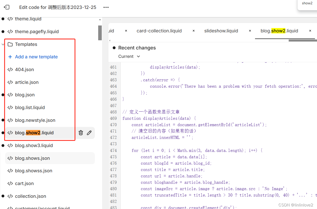
// 定义一个函数来显示文章
function displayArticles(data) {
const articleList = document.getElementById('articleList');
// 清空旧的内容(如果有的话)
articleList.innerHTML = '';
for (let i = 0; i < Math.min(3, data.data.length); i++) {
const article = data.data[i];
const blogId = article.blog_id;
const title = article.title;
const url = article.handle;
const bloghandle = article.blog_handle;
const imageSrc = article.image ? article.image.src : 'No Image';
const truncatedTitle = title.length > 30 ? title.substring(0, 40) + '...' : title;
const div = document.createElement('div');
div.innerHTML = `<a href="${bloghandle}/${url}" class="dfsgdfgre1232"><div class="uiosdg33"><img src="${imageSrc}" alt="${title}" /></div> <span>${truncatedTitle}</span> </a>`;
articleList.appendChild(div);
}
}
</script> -->
<!-- <script>
fetch('https://apis.aaaa.com/sync/shopify/list?act=http&find=articles&limit=3')
.then(response => {
if (!response.ok) { throw new Error('Network response was not ok'); }
return response.json();
})
.then(data => {
const articleList = document.getElementById('articleList');
console.log(data);
for (let i = 0; i < Math.min(3, data.data.length); i++) {
const article = data.data[i];
const blogId = article.blog_id;
const title = article.title;
const url = article.handle;
const bloghandle = article.blog_handle;
const imageSrc = article.image ? article.image.src : 'No Image';
const truncatedTitle = title.length > 30 ? title.substring(0, 40) + '...' : title;
const div = document.createElement('div')
div.innerHTML = `<a href="${bloghandle}/${url}" class="dfsgdfgre1232"><div class="uiosdg33"><img src="${imageSrc}" alt="${title}" /></div> <span>${truncatedTitle}</span> </a>`;
articleList.appendChild(div);
}
})
.catch(error => {
console.error('There has been a problem with your fetch operation:', error);
});
</script> -->
{{ 'contact-email.js' | asset_url | script_tag }}


 1149
1149


 被折叠的 条评论
为什么被折叠?
被折叠的 条评论
为什么被折叠?
 到【灌水乐园】发言


