


我写了一个函数,一键绘制Nature IPCC风格全球地图
引言
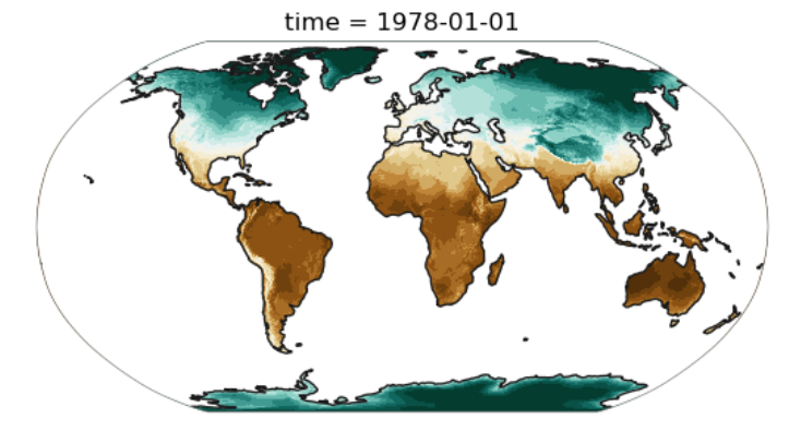
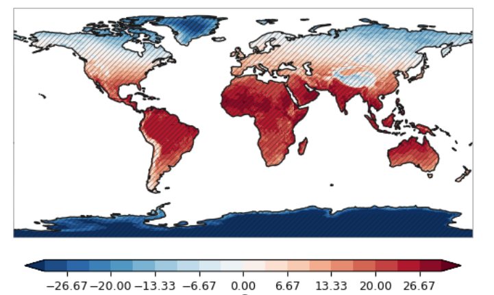
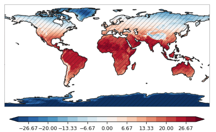
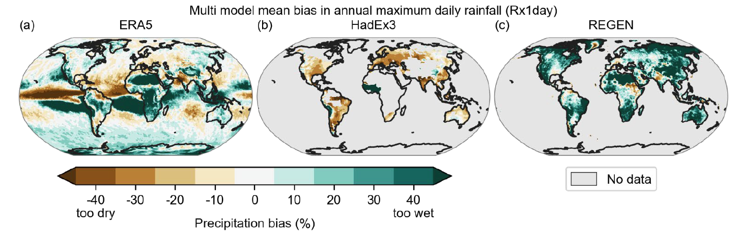
先来欣赏一些全球地图,非常美观啊。
最重要的是这是用Python批量绘制的,而不用ArcGIS点来点去:
裁剪—加载边界—重分类—修改投影—配色.....
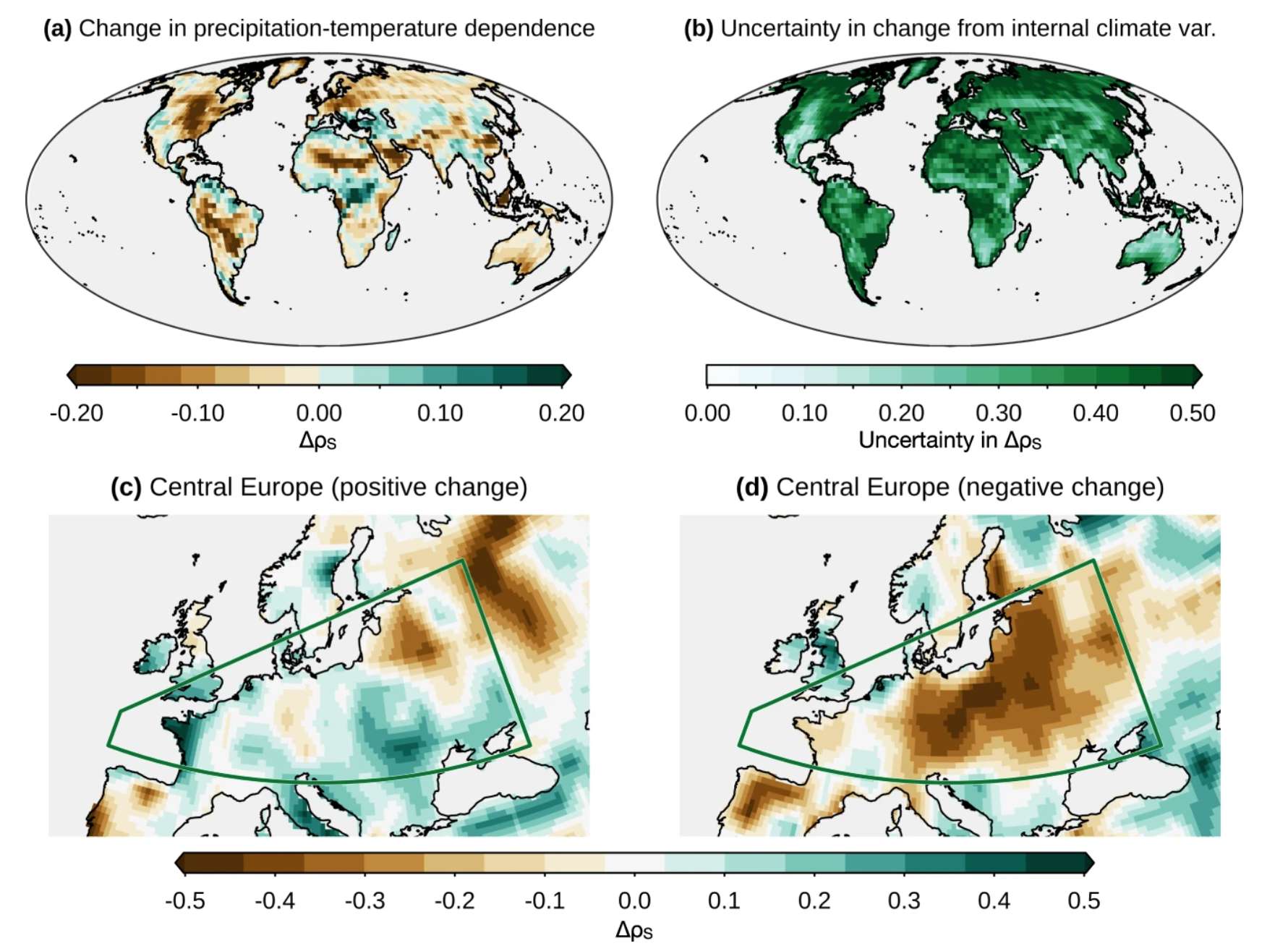
Bevacqua, E., Suarez-Gutierrez, L., Jézéquel, A. et al. Advancing research on compound weather and climate events via large ensemble model simulations. Nat Commun 14, 2145 (2023). https://doi.org/10.1038/s41467-023-37847-5
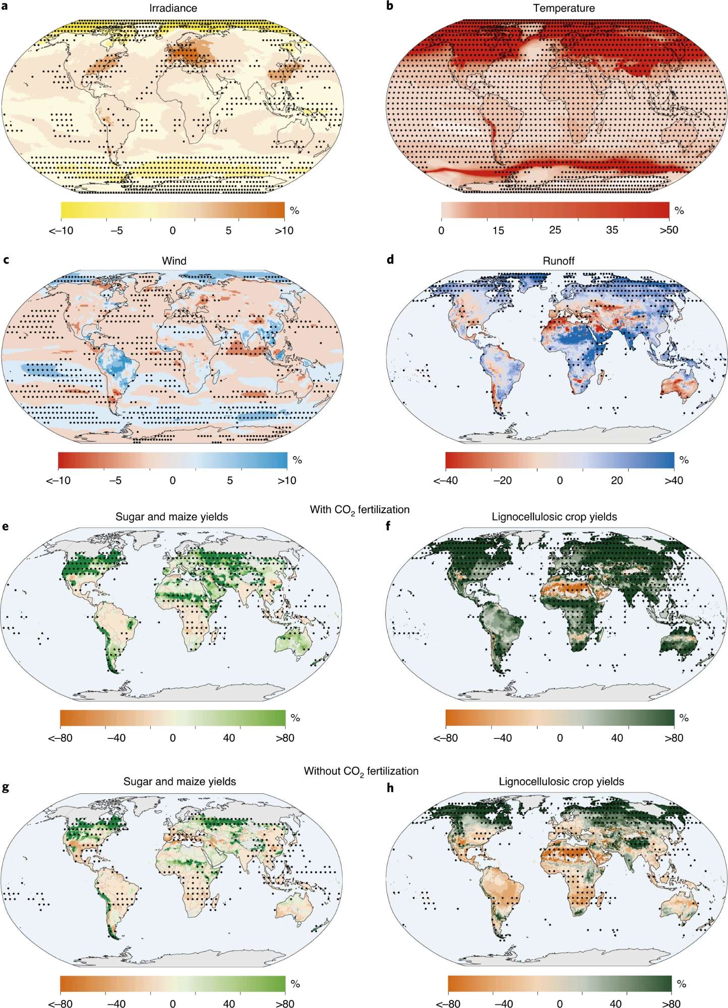
Pokhrel, Y., Felfelani, F., Satoh, Y. et al. Global terrestrial water storage and drought severity under climate change. Nat. Clim. Chang. 11, 226–233 (2021). https://doi.org/10.1038/s41558-020-00972-w
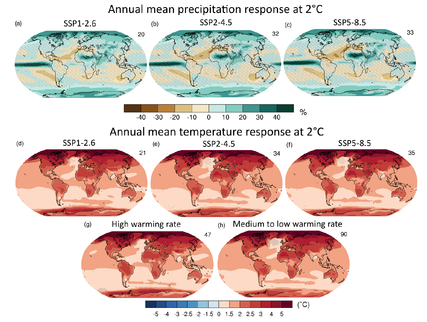
IPCC AR6
上面的图,都是用Python绘制的,有的还有显著性划线(或显著性打点),但是对于Cartopy来说,这些操作需要很多很多的代码,如果能写成函数,一键绘制就好了。
文末我会把我写的函数分享:
画一张简单的图(one_map_flat)
首先导入我写的绘图库:
这里我使用了utils库来管理自己定义的库函数
utils 是一个模块,模块是 Python 的一种代码组织方式,它提供了一种将代码分成不同文件并将其组织在一起的方法。
from utils import plot
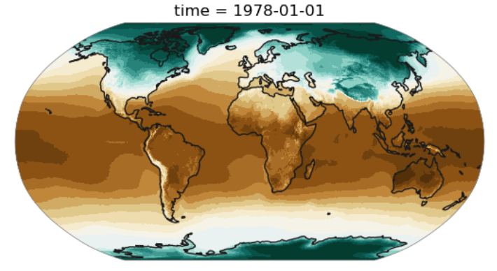
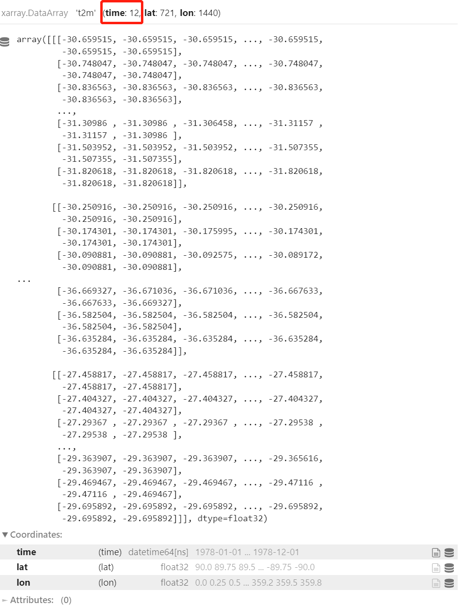
加载我的测试数据:
import xarray as xr
file_name='data/ERA5temp_1978_monthly.nc'
ds=xr.open_dataset(file_name)
lat = ds['latitude']
lon = ds['longitude']


ds = ds.rename_dims({'latitude':'lat','longitude':'lon'})
ds.coords['lat'] = ('lat', lat.to_numpy())
ds.coords['lon'] = ('lon', lon.to_numpy()) # 对维度lon指定新的坐标信息lon
ds = ds.reset_coords(names=['latitude','longitude'], drop=True)
ds['t2m'] = ds['t2m'] - 273.15
ds['t2m']
这里我把数据的Coordinates重命名了,数据的Coordinates:必须包含lon和lat属性,若没有需要重命名,这里我的基本绘图数据单位是xarray.DataArray类型,如果你是numpy.ndarray类型,需要转换为我的标准类型。
建一张画布,并指定一个投影:
import matplotlib.pyplot as plt
import cartopy.crs as ccrs
import numpy as np
fig = plt.figure()
proj = ccrs.Robinson() #ccrs.Robinson()
ax = fig.add_subplot(111, projection=proj)
绘图:
levels = np.linspace(-30, 30, num=19)
plot.one_map_flat(ds['t2m'][0], ax, levels=levels, cmap="BrBG_r", mask_ocean=False, add_coastlines=True, add_land=True, plotfunc="pcolormesh")
我设置了一些关键字,详情可以看我的one_map_flat函数,意思是简单绘制一张map
def one_map_flat(
    da,
    ax,
    levels=None,
    mask_ocean=False,
    ocean_kws=None,
    add_coastlines=True,
    coastline_kws=None,
    add_land=False,
    land_kws=None,
    plotfunc="pcolormesh",
    **kwargs,
):
    """plot 2D (=flat) DataArray on a cartopy GeoAxes

    Parameters
    ----------
    da : DataArray
        DataArray to plot.
    ax : cartopy.GeoAxes
        GeoAxes to plot da on.
    levels : int or list-like object, optional
        Split the colormap (cmap) into discrete color intervals.
    mask_ocean : bool, default: False
        If true adds the ocean feature.
    ocean_kws : dict, default: None
        Arguments passed to ``ax.add_feature(OCEAN)``.
    add_coastlines : bool, default: None
        If None or true plots coastlines. See coastline_kws.
    coastline_kws : dict, default: None
        Arguments passed to ``ax.coastlines()``.
    add_land : bool, default: False
        If true adds the land feature. See land_kws.
    land_kws : dict, default: None
        Arguments passed to ``ax.add_feature(LAND)``.
    plotfunc : {"pcolormesh", "contourf"}, default: "pcolormesh"
        Which plot function to use
    **kwargs : keyword arguments
        Further keyword arguments passed to the plotting function.

    Returns
    -------
    h : handle (artist)
    The same type of primitive artist that the wrapped matplotlib
    function returns
    """

    # ploting options
    opt = dict(
        transform=ccrs.PlateCarree(),
        add_colorbar=False,
        rasterized=True,
        extend="both",
        levels=levels,
    )
    # allow to override the defaults
    opt.update(kwargs)

    if land_kws is None:
        land_kws = dict(fc="0.8", ec="none")

    if add_land:
        ax.add_feature(cfeature.LAND, **land_kws)

    if "contour" in plotfunc:
        opt.pop("rasterized", None)
        da = mpu.cyclic_dataarray(da)
        plotfunc = getattr(da.plot, plotfunc)
    elif plotfunc == "pcolormesh":
        plotfunc = getattr(da.plot, plotfunc)
    else:
        raise ValueError(f"unkown plotfunc: {plotfunc}")

    h = plotfunc(ax=ax, **opt)

    if mask_ocean:
        ocean_kws = {} if ocean_kws is None else ocean_kws
        _mask_ocean(ax, **ocean_kws)

    if coastline_kws is None:
        coastline_kws = dict()

    if add_coastlines:
        coastlines(ax, **coastline_kws)

    # make the spines a bit finer
    s = ax.spines["geo"]
    s.set_lw(0.5)
    s.set_color("0.5")

    ax.set_global()

    return h
这里提供了一系列关键字,如设置mask_ocean来掩膜海洋:
plot.one_map_flat(ds['t2m'][0], ax, levels=levels, cmap="BrBG_r", mask_ocean=True, add_coastlines=True, add_land=True, plotfunc="pcolormesh")
如设置add_coastlines来决定是否添加海岸线:
plot.one_map_flat(ds['t2m'][0], ax, levels=levels, cmap="BrBG_r", mask_ocean=True, add_coastlines=False, add_land=True, plotfunc="pcolormesh")
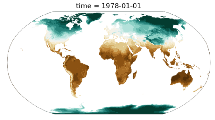
add_land来决定是否添加南极大陆阴影。plotfunc是绘图函数的选择,应当为pcolormesh或contourf的一种。
当然你也可以修改各种合适的投影,所有的投影请参考:
https://www.cnblogs.com/youxiaogang/p/14247184.html
绘制一张完整的地图(one_map)
接下来介绍one_map函数,绘制一张完整的地图:
fig = plt.figure()
proj = ccrs.PlateCarree()  #ccrs.Robinson()
#proj = ccrs.Robinson()
ax = fig.add_subplot(111, projection=proj)
levels = np.linspace(-30, 30, num=19)
plot.one_map(ds['t2m'], ax,  average='median', dim="time", cmap="RdBu_r", levels=levels,  mask_ocean=True,  add_coastlines=True,  add_land=True,  plotfunc="pcolormesh", colorbar=True, getmean=True)
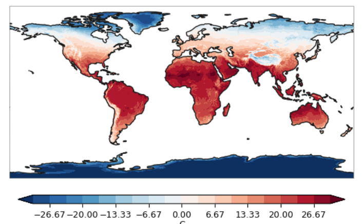
其中getmeam关键字用于设定是否按某个维度计算统计值(mean/median/...)
average关键字是用于reduce da with (along dim)关键字
实例代码按time维度计算了平均值
如果不需要计算,设置上述关键字为None,并给一张xarray.DataArray即可:
plot.one_map(ds['t2m'][0], ax, average=None, dim=None, cmap="RdBu_r", levels=levels, mask_ocean=True, add_coastlines=True, add_land=True, plotfunc="pcolormesh", colorbar=True, getmean=False)
添加显著性斜线或打点
这个功能是通过hatch_map()实现的:
在这之前必须计算一个p变量,改变量是0,1的xarray.DataArray,其中0不画斜线,1画斜线。
fig = plt.figure()
proj = ccrs.PlateCarree()  #ccrs.Robinson()
ax = fig.add_subplot(111, projection=proj)
plot.hatch_map(ax, p, 6 * "/", label="Lack of model agreement", invert=True, linewidth=0.25, color="0.1")

这个功能被封装进了one_map函数中,只需要添加hatch_data=p即可
plot.one_map(ds['t2m'], ax, hatch_data=p, average='mean', dim='time', cmap="RdBu_r", levels=levels, mask_ocean=True, add_coastlines=True, add_land=True, plotfunc="pcolormesh", colorbar=True, getmean=True)
但是内置的显著性斜线方法只能默认斜线距离,长度和打点方式。
如需定制,可以在图层后叠加hatch_map函数
增大斜线间距
plot.one_map(ds['t2m'], ax,  average='mean', dim='time', cmap="RdBu_r", levels=levels,  mask_ocean=True,  add_coastlines=True,  add_land=True,  plotfunc="pcolormesh", colorbar=True, getmean=True)
plot.hatch_map(ax, p, 3 * "/", label="Lack of model agreement", invert=True, linewidth=0.25, color="0.1")
增大线条粗细
plot.one_map(ds['t2m'], ax,  average='mean', dim='time', cmap="RdBu_r", levels=levels,  mask_ocean=True,  add_coastlines=True,  add_land=True,  plotfunc="pcolormesh", colorbar=True, getmean=True)
plot.hatch_map(ax, p, 3 * "/", label="Lack of model agreement", invert=True, linewidth=0.5, color="0.1")

改为显著性打点
plot.one_map(ds['t2m'], ax,  average='mean', dim='time', cmap="RdBu_r", levels=levels,  mask_ocean=True,  add_coastlines=True,  add_land=True,  plotfunc="pcolormesh", colorbar=True, getmean=True)
plot.hatch_map(ax, p, 3 * ".", label="Lack of model agreement", invert=True, linewidth=0.25, color="0.1")

DIY自己的函数
有了上述基础的函数,结合python绘图语法,就可以定制自己的函数了:
如果我们想复现这个IPCC的多栏图:
可以自己定制一个三栏绘图函数,就利用上述的基础功能:
def at_warming_level_one(
    at_warming_c,
    unit,
    title,
    levels,
    average,
    mask_ocean=False,
    colorbar=True,
    ocean_kws=None,
    skipna=None,
    hatch_data=None,
    add_legend=False,
    plotfunc="pcolormesh",
    colorbar_kwargs=None,
    legend_kwargs=None,
    getmean=True,
    **kwargs,
):
    """
    plot at three warming levels: flatten and plot a 3D DataArray on a cartopy GeoAxes,
    maybe add simple hatch

    Parameters
    ----------
    at_warming_c : list of DataArray
        List of three DataArray objects at warming levels to plot.
    unit : str
        Unit of the data. Added as label to the colorbar.
    title : str
        Suptitle of the figure. If average is not "mean" it is added to the title.
    levels : int or list-like object, optional
        Split the colormap (cmap) into discrete color intervals.
    average : str
        Function to reduce da with (along dim), e.g. "mean", "median".
    mask_ocean : bool, default: False
        If true adds the ocean feature.
    colorbar : bool, default: True
        If to add a colorbar to the figure.
    ocean_kws : dict, default: None
        Arguments passed to ``ax.add_feature(OCEAN)``.
    skipna : bool, optional
        If True, skip missing values (as marked by NaN). By default, only
        skips missing values for float dtypes
    hatch_simple : float, default: None
        If not None determines hatching on the fraction of models with the same sign.
        hatch_simple must be in 0..1.
    add_legend : bool, default: False
        If a legend should be added.
    plotfunc : {"pcolormesh", "contourf"}, default: "pcolormesh"
        Which plot function to use
    colorbar_kwargs : keyword arguments for the colorbar
        Additional keyword arguments passed on to mpu.colorbar
    legend_kwargs : keyword arguments for the legend
        Additional keyword arguments passed on to ax.legend.
    **kwargs : keyword arguments
        Further keyword arguments passed to the plotting function.

    Returns
    -------
    cbar : handle (artist)
        Colorbar handle.
    """

    if average != "mean":
        title += f" – {average}"

    f, axes = plt.subplots(1, 3, subplot_kw=dict(projection=ccrs.Robinson()))
    axes = axes.flatten()

    if colorbar_kwargs is None:
        colorbar_kwargs = dict()

    if legend_kwargs is None:
        legend_kwargs = dict()

    for i in range(3):

        h, legend_handle = one_map(
            da=at_warming_c[i],
            ax=axes[i],
            average=average,
            levels=levels,
            mask_ocean=mask_ocean,
            ocean_kws=ocean_kws,
            skipna=skipna,
            hatch_data=hatch_data,
            plotfunc=plotfunc,
            getmean=getmean,
            **kwargs,
        )

    for ax in axes:
        ax.set_global()

    if colorbar:
        factor = 0.66 if add_legend else 1
        ax2 = axes[1] if add_legend else axes[2]

        colorbar_opt = dict(
            mappable=h,
            ax1=axes[0],
            ax2=ax2,
            size=0.15,
            shrink=0.25 * factor,
            orientation="horizontal",
            pad=0.1,
        )
        colorbar_opt.update(colorbar_kwargs)
        cbar = mpu.colorbar(mappable=h, ax1=axes[0], ax2=ax2, size=0.15, shrink=0.25 * factor, orientation="horizontal", pad=0.1)

        cbar.set_label(unit, labelpad=1, size=9)
        cbar.ax.tick_params(labelsize=9)

    if add_legend and (not colorbar or hatch_data is None):
        raise ValueError("Can only add legend when colorbar and hatch_data is True")

    if add_legend:
        # add a text legend entry - the non-hatched regions show high agreement
        h0 = text_legend(ax, "Colour", "High model agreement", size=7)

        legend_opt = dict(
            handlelength=2.6,
            handleheight=1.3,
            loc="lower center",
            bbox_to_anchor=(0.5, -0.45),
            fontsize=8.5,
            borderaxespad=0,
            frameon=True,
            handler_map={mpl.text.Text: TextHandler()},
            ncol=1,
        )

        legend_opt.update(legend_kwargs)

        axes[2].legend(handles=[h0, legend_handle], **legend_opt)

    axes[0].set_title("At 1.5°C global warming", fontsize=9, pad=4)
    axes[1].set_title("At 2.0°C global warming", fontsize=9, pad=4)
    axes[2].set_title("At 4.0°C global warming", fontsize=9, pad=4)

    axes[0].set_title("(a)", fontsize=9, pad=4, loc="left")
    axes[1].set_title("(b)", fontsize=9, pad=4, loc="left")
    axes[2].set_title("(c)", fontsize=9, pad=4, loc="left")

    # axes[0].set_title("Tglob anomaly +1.5 °C", fontsize=9, pad=2)
    # axes[1].set_title("Tglob anomaly +2.0 °C", fontsize=9, pad=2)
    # axes[2].set_title("Tglob anomaly +4.0 °C", fontsize=9, pad=2)

    side = 0.01
    subplots_adjust_opt = dict(wspace=0.025, left=side, right=1 - side)
    if colorbar:
        subplots_adjust_opt.update({"bottom": 0.3, "top": 0.82})
    else:
        subplots_adjust_opt.update({"bottom": 0.08, "top": 0.77})

    f.suptitle(title, fontsize=9, y=0.975)
    plt.subplots_adjust(**subplots_adjust_opt)
    mpu.set_map_layout(axes, width=18)

    f.canvas.draw()

    if colorbar:
        return cbar
调用我们上述DIY的函数:
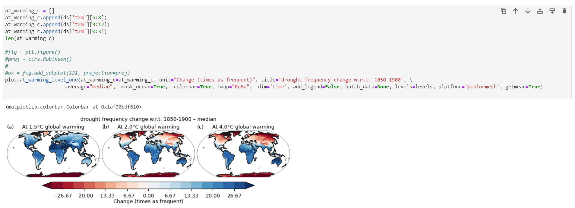
基本完成了IPCC风格的绘制
更多细节
-
这些函数还有更多自己可以修改的内容,进行进一步定制 -
没有写帮助文档,转而全都写在了函数定义下面,可以查询这些关键字的具体内容并自己进一步修改

-
完整的函数和示例代码数据后台回复【plotmap】 -
这个函数我会不断更新,来进行更多美观的绘制(如经纬度统计线,经纬刻度等等)可以后续关注 -
有任何使用上的BUG可以后台联系
本文由 mdnice 多平台发布


 被折叠的 条评论
为什么被折叠?
被折叠的 条评论
为什么被折叠?
 到【灌水乐园】发言


