


css多棱柱立体旋转
css代码:
    *{
	  margin:0;
	  padding:0
	}
	html,body{
	  height:100%;
	  overflow:hidden
	}
	#box{
	  width:450px;
	  height:450px;
	  border:1px solid;
	  position:absolute;
	  left:0;
	  top:0;
	  right:0;
	  bottom:0;
	  margin:auto;
	  perspective:300px;
	}
	#cube{
	  width:150px;
	  height:150px;
	  position:absolute;
	  left:0;
	  top:0;
	  right:0;
	  bottom:0;
	  margin:auto;
	  transition:2s transform;
	  transform-style:preserve-3d;
	}
	#cube > div{
	  width:150px;
	  height:150px;
	  border:1px solid blue;
	  box-sizing:border-box;
	  background:rgba(255,0,0,.3);
	  text-align:center;
	  font:60px/150px "微软雅黑";
	  position:absolute;
	  /* backface-visibility:hidden; */
	}
	#box:hover #cube{
	  transform:rotateY(360deg)
	}
HTML代码:
  <div id="box">
	<div id="cube">
	</div>
  </div>
JS代码:
	window.onload = function(){
		//棱数自己设置
		prism(6);
		function prism(n){
			var cube = document.getElementById('cube');
			var style = document.createElement('style');
			document.head.appendChild(style);
			var cssText = '';
			var div = '';
			for (var i = 0; i < n; i++) {
				div += '<div>'+(i+1)+'</div>';
				cssText += '#cube > div:nth-child(' + (i + 1) + '){transform:rotateY(' + (i * (360 / n)) + 'deg)}';
			}
			cube.innerHTML = div;
			var divNode = document.querySelector('#box > #cube > div');
			//棱长
			var cubeLength = divNode.offsetWidth;
			//外角度数
			var outDeg = 360 / n;
			//内角度数
			var inDeg = 180 - outDeg;
			cssText += '#cube{transform-origin:center center -' + ((cubeLength / 2) * Math.tan((inDeg / 2) * Math.PI / 180)) + 'px}';
			cssText += '#cube > div{transform-origin:center center -' + ((cubeLength / 2) * Math.tan((inDeg / 2) * Math.PI / 180)) + 'px}';
			style.innerHTML = cssText;
		}
	}
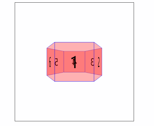
页面效果:


 405
405


 被折叠的 条评论
为什么被折叠?
被折叠的 条评论
为什么被折叠?
 到【灌水乐园】发言


