


 本文介绍了Flexbox伸缩布局盒模型,包括伸缩格式化上下文(FFC)、主轴与侧轴的概念,以及如何定义伸缩布局上下文。此外,还探讨了Flexbox的兼容性问题,提到了不同版本的语法差异,并指出了一些属性的兼容性细节。
一、伸缩布局盒模型(伸缩格式化上下文(FFC))

A flex container is the box generated by an element with a computed display of flex orinline-flex. In-flow children of a flex container are called flex items and are laid out using the flex layout model.
【译】如图,一个伸缩容器是通过将一个元素的display设置为flex或者inline-flex的方式生成的,伸缩容器的孩子节点叫做伸缩项目并且这些伸缩项目使用伸缩布局模型进行布局。伸缩容器可以通过display为flex或者inline-flex定义。
Unlike block and inline layout, whose layout calculations are biased to the block and inline flow directions, flex layout is biased to the flex directions. To make it easier to talk about flex layout, this section defines a set of flex flow–relative terms. The flex-flow value and thewriting mode determine how these terms map to physical directions (top/right/bottom/left), axes (vertical/horizontal), and sizes (width/height).
【译】并不像块元素或者行内元素的布局方式,这些布局方式是通过块或者行文本流方向布局的,伸缩布局是基于伸缩方向布局。为了让他更好的谈论相关伸缩布局,这章节介绍了相关的一些关于伸缩布局的术语,这个伸缩特性值和书写模式决定了怎样将这些定义映射到伸缩容器的方向,轴,大小等特性上。
(1)主轴:通过这个伸缩盒子特性,可以很好的管理伸缩项目在伸缩盒子中的布局方向。这个方向可以是从左到右,从上到下,从下到上,从右到左。这个主轴的方向可以通过flex-direction属性来定义值分别为row,row-reverse,column,column-reverse。
(2)主轴起点和终点:伸缩项目从主轴起点开始布局到终点结束。属性justify-content就是根据主轴的起点和终点赋予start,center,end等值来布局的。
(3)主轴长度:伸缩项目在主轴方向上的宽度或者高度就是项目的主轴长度。
(4)侧轴:与主轴垂直的轴是侧轴,所以说,侧轴的方向是由主轴决定的。
(5)侧轴的起点和终点:伸缩项目充满伸缩行,并且伸缩行从侧轴起点开始布局容器到侧轴终点结束。
(6)侧轴长度:伸缩项目在侧轴方向上的宽度或者高度就是项目的侧轴长度。
二、兼容性
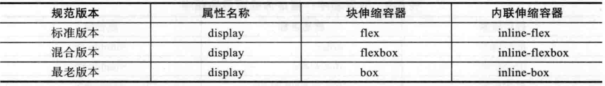
根据Flexbox的发展状态,到现在为止出现了多个版本,分别是:最老版本、混合版本、标准版本。这些版本的语法都有区别。
根据该网站介绍:http://caniuse.com/#search=flex
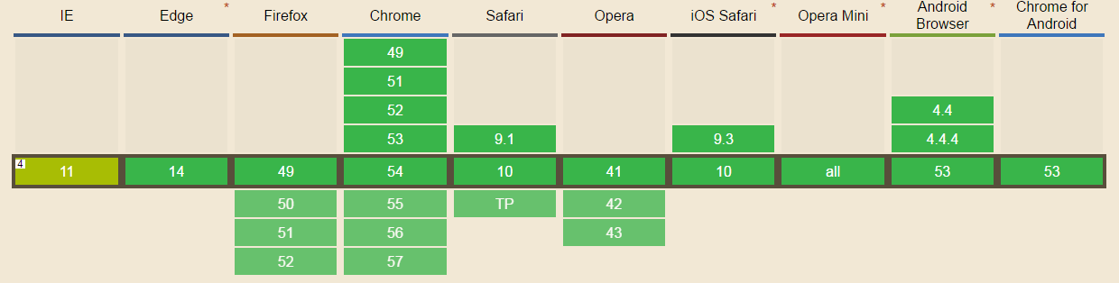
通过该网站介绍总结如下表:

接下来将分别介绍伸缩和模型上的一些属性,通过这些属性来操作FFC上的一些特性,进行相应的布局。在接下来的这一节中,也会介绍到各个属性的兼容性问题(只介绍最老版本和标准版本,由于混合模式仅仅是IE10支持,在使用时请参考文档)。
三、伸缩布局盒的基本属性
一、定义伸缩布局上下文:
Flex:Display为这个值意味着导致这个元素成为一个块级伸缩容器框。
Inline-flex:Display为这个值,意味着导致这个元素成为一个行级伸缩容器框。
A flex container establishes a new flex formatting context for its contents. This is the same as establishing a block formatting context, except that flex layout is used instead of block layout. For example, floats do not intrude into the flex container, and the flex container’s margins do not collapse with the margins of its contents. Flex containers form a containing block for their contents exactly like block containers do. [CSS21] The overflow property applies to flex containers.
【译】一个伸缩容器为它的内容建立一个新的伸缩格式化格式化上下文(FFC)。FFC有点类似于BFC。只不过不同之处在于用伸缩布局替代了块布局。例如:该很所容器外部的元素(比如浮动元素)不会对该容器产生影响,在伸缩容器内部浮动子元素的margin不会和伸缩容器的margin合并。伸缩容器为它们的内容形成一个包含块,这个特别像是一个块容器,但是绝对定位的除外。
Flex containers are not block containers, and so some properties that were designed with the assumption of block layout don’t apply in the context of flex layout. In particular:
【译】毕竟伸缩容器并不是块级容器,一些本来假设是应用于块级布局(应用在BFC中)的一些元素不能应用在伸缩格式化上下文中,特别是:
the column-* properties in the Multi-column Layout module [CSS3COL] have no effect on a flex container.
float and clear do not create floating or clearance of flex item, and do not take it out-of-flow.
vertical-align has no effect on a flex item.
the ::first-line and ::first-letter pseudo-elements do not apply to flex containers, andflex containers do not contribute a first formatted line or first letter to their ancestors.
【译】
(1)在多栏布局模型中的column-*特性在伸缩容器中没有效果。
(2)Float和clear在伸缩项目下也没有效果。
(3)声明vertical-align在伸缩项目下没有效果。
(4)::first-line和::first-letter不能应用在伸缩项目下。
.box {
		display: box;
		display: -webkit-box;/*旧版本 ios6-,safari 3.1-6*/
		display: -moz-box;/*旧版本:FF19-*/
		display: -ms-flexbox;/*混合版本:IE10*/
		display: -webkit-flexbox;/*新版本:chrome等*/
		display: flexbox;/*w3c标准*/
	}
其他属性在接下来的Flexbox系列文章中一一介绍。


 982
982

 被折叠的 条评论
为什么被折叠?
被折叠的 条评论
为什么被折叠?
 到【灌水乐园】发言


