


 本文详细介绍了Flexbox布局中的伸缩行概念,包括单行和多行的区别,并探讨了在侧轴上的对齐方式,如`align-content`属性对多行伸缩行的影响,以及`align-items`和`align-self`如何控制所有及单个伸缩项目在侧轴上的对齐。内容涵盖了不同对齐方式的解释和示例,帮助开发者深入理解Flexbox的布局机制。
伸缩行
Flex items in a flex container are laid out and aligned within flex lines, hypothetical containers used for grouping and alignment by the layout algorithm. A flex container can be either single-line or multi-line, depending on the flex-wrap property:
在伸缩容器中的伸缩项目在伸缩行中对齐和布局,伸缩行是用来分组的假设容器同时通过布局算法对齐。一个伸缩容器可以包含单行或者多行,取决于flex-wrap属性。
A single-line flex container (i.e. one with flex-wrap: nowrap) lays out all of its children in a single line, even if that would cause its contents to overflow.
一个单行的伸缩容器使得他的所有孩子即伸缩项目在一行显示,即使会引起溢出。
A multi-line flex container (i.e. one with flex-wrap: wrap or flex-wrap: wrap-reverse) breaks its flex items across multiple lines, similar to how text is broken onto a new line when it gets too wide to fit on the existing line. When additional lines are created, they are stacked in the flex container along the cross axis according to the flex-wrap property. Every line contains at least one flex item, unless the flex container itself is completely empty.
一个包含多行的伸缩容器,使得伸缩项目在多行上显示,当文本变的太宽以至于不能包含所有的伸缩项目的时候,文本会断行。当增加的行被创建,这些行会根据flex-wrap属性沿着侧轴堆放在伸缩容器中,除非伸缩容器本身是空的。
Once content is broken into lines, each line is laid out independently; flexible lengths and thejustify-content and align-self properties only consider the items on a single line at a time.
一旦伸缩项目被换行,每一行就会独立的布局。伸缩行灵活的长度和每一个伸缩项目的对齐方式属性仅仅只能在单一的行考虑。
In a multi-line flex container (even one with only a single line), the cross size of each line is the minimum size necessary to contain the flex items on the line (after alignment due toalign-self), and the lines are aligned within the flex container with the align-contentproperty. In a single-line flex container, the cross size of the line is the cross size of the flex container, and align-content has no effect. The main size of a line is always the same as themain size of the flex container’s content box.
**对于伸缩容器中包含多个行的时候(flex-wrap为wrap的时候)。每一行的侧轴的长度是尽可能包含该行伸缩项目的最小值(在伸缩项目侧轴对齐之后align-items,align-self)。伸缩行通过伸缩容器设置的align-content属性对齐。每一行的主轴大小一直和伸缩容器的内容盒的大小一致。
**对于伸缩容器只能包含一个行的时候(flex-wrap为nowrap的时候),行的侧轴长度是伸缩容器的侧轴长度,并且align-content没有效果。该行的主轴大小一直和伸缩容器的内容盒的大小一致。
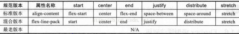
伸缩行在侧轴对齐:
The
 最低0.47元/天 解锁文章


 4912
4912

 被折叠的 条评论
为什么被折叠?
被折叠的 条评论
为什么被折叠?
 到【灌水乐园】发言


