在ECharts的图表混搭中,一个图表包含唯一图例、工具箱、数据区域缩放 模块、值域漫游模块和一个直角坐标系,直角坐标系可包含一条或多条类目轴线、一条或多条值轴线,类目轴线和值轴线最多上下左右共4条。 ECharts中支持任意图表的混搭,其中常见的图表混搭有折线图与柱状图的混搭、折线图与饼状图的混搭等。
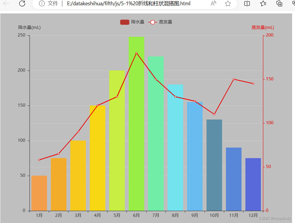
利用某地区一年的降水量和蒸发量数据绘制双y轴的折线图与柱状图混搭图表,如图所示。
<!DOCTYPE html>
<html lang="en">
<head>
<meta charset="UTF-8">
<meta name="viewport" content="width=device-width, initial-scale=1.0">
<!-- 引入 ECharts 文件 -->
<script src="echarts.js"></script>
<title>5-1 双y轴的折线图与柱状图混搭图</title>
</head>
<body>
<div id="main" style="width: 800px; height: 600px"></div>
<script type="text/javascript">
//基于准备好的dom,初始化ECharts图表
var myChart = echarts.init(document.getElementById("main"));
//水印
var waterMarkText = '自己想加入的内容'; //设置水印的字符
var canvas = document.createElement('canvas');
var ctx = canvas.getContext('2d');
canvas.width = canvas.height = 100;
ctx.textAlign = 'center';
ctx.textBaseline = 'middle';
ctx.globalAlpha = 0.09;
ctx.font = '20px Microsoft Yahei'; //设置水印文字的字体
ctx.translate(50, 50); //设置水印文字的偏转值
ctx.rotate(-Math.PI / 4); //设置水印旋转的角度
ctx.fillText(waterMarkText, 0, 0); //设置填充水印
var option = { //指定图表的配置项和数据
//: { type: 'pattern', image: canvas, repeat: 'repeat' },
//二选一
//ECharts 本身的 backgroundColor 属性不支持直接设置两种类型的颜色或图案。
backgroundColor: 'rgba(128, 128, 128, 0.5)', //rgba设置透明度0.1
tooltip: { trigger: 'axis' },
legend: { data: ['降水量', '蒸发量'], left: 'center', top: 12 },
xAxis: [
{
type: 'category',
data: ['1月', '2月', '3月', '4月', '5月', '6月',
'7月', '8月', '9月', '10月', '11月', '12月']
}
],
yAxis: [
{ //设置两个Y轴之1:降水量
type: 'value', name: '降水量(mL)',
min: 0, max: 250, interval: 50,
axisLabel: { formatter: '{value} ' }
},
{ //设置两个Y轴之2:蒸发量
type: 'value', name: '蒸发量(mL)', min: 0, max: 200,
position: 'right', //设置y轴安置的位置
offset: 0, //设置向右偏移的距离
axisLine: { lineStyle: { color: 'red' } },
axisLabel: { formatter: '{value} ' }
}
],
series: [
{
name: '降水量', type: 'bar',
itemStyle: { //设置柱状图颜色
normal: {
color: function (params) {
var colorList = [ //build a color map as your need
'#fe9f4f', '#fead33', '#feca2b', '#fed728', '#c5ee4a',
'#87ee4a', '#46eda9', '#47e4ed', '#4bbbee', '#4f8fa8',
'#4586d8', '#4f68d8', '#F4E001', '#F0805A', '#26C0C0'];
return colorList[params.dataIndex]
},
}
},
data: [50, 75, 100, 150, 200, 248, 220, 180, 155, 130, 90, 75]
},
{
name: '蒸发量', type: 'line',
yAxisIndex: 1, //指定使用第2个y轴
itemStyle: { normal: { color: 'red' } }, //设置折线颜色
data: [58, 65, 90, 120, 130, 180, 150, 130, 125, 110, 150, 145]
}
]
};
myChart.setOption(option); //为echarts对象加载数据
</script>
</body>
</html>
<!DOCTYPE html>
<html lang="en">
<head>
<meta charset="UTF-8">
<meta name="viewport" content="width=device-width, initial-scale=1.0">
<!-- 引入 ECharts 文件 -->
<script src="echarts.js"></script>
<title>5-1 双y轴的折线图与柱状图混搭图</title>
</head>
<body>
<div id="main" style="width: 800px; height: 600px"></div>
<script type="text/javascript">
//基于准备好的dom,初始化ECharts图表
var myChart = echarts.init(document.getElementById("main"));
//水印
var waterMarkText = '自己的'; //设置水印的字符
var canvas = document.createElement('canvas');
var ctx = canvas.getContext('2d');
canvas.width = canvas.height = 100;
ctx.textAlign = 'center';
ctx.textBaseline = 'middle';
ctx.globalAlpha = 0.09;
ctx.font = '20px Microsoft Yahei'; //设置水印文字的字体
ctx.translate(50, 50); //设置水印文字的偏转值
ctx.rotate(-Math.PI / 4); //设置水印旋转的角度
ctx.fillText(waterMarkText, 0, 0); //设置填充水印
var option = { //指定图表的配置项和数据
//: { type: 'pattern', image: canvas, repeat: 'repeat' },
//二选一
//ECharts 本身的 backgroundColor 属性不支持直接设置两种类型的颜色或图案。
backgroundColor: 'rgba(128, 128, 128, 0.5)', //rgba设置透明度0.1
tooltip: { trigger: 'axis' },
legend: { data: ['降水量', '蒸发量'], left: 'center', top: 12 },
xAxis: [
{
type: 'category',
data: ['1月', '2月', '3月', '4月', '5月', '6月',
'7月', '8月', '9月', '10月', '11月', '12月']
}
],
yAxis: [
{ //设置两个Y轴之1:降水量
type: 'value', name: '降水量(mL)',
min: 0, max: 250, interval: 50,
axisLabel: { formatter: '{value} ' }
},
{ //设置两个Y轴之2:蒸发量
type: 'value', name: '蒸发量(mL)', min: 0, max: 200,
position: 'right', //设置y轴安置的位置
offset: 0, //设置向右偏移的距离
axisLine: { lineStyle: { color: 'red' } },
axisLabel: { formatter: '{value} ' }
}
],
series: [
{
name: '降水量', type: 'bar',
itemStyle: { //设置柱状图颜色
normal: {
color: function (params) {
var colorList = [ //build a color map as your need
'#fe9f4f', '#fead33', '#feca2b', '#fed728', '#c5ee4a',
'#87ee4a', '#46eda9', '#47e4ed', '#4bbbee', '#4f8fa8',
'#4586d8', '#4f68d8', '#F4E001', '#F0805A', '#26C0C0'];
return colorList[params.dataIndex]
},
}
},
data: [50, 75, 100, 150, 200, 248, 220, 180, 155, 130, 90, 75]
},
{
name: '蒸发量', type: 'line',
yAxisIndex: 1, //指定使用第2个y轴
itemStyle: { normal: { color: 'red' } }, //设置折线颜色
data: [58, 65, 90, 120, 130, 180, 150, 130, 125, 110, 150, 145]
}
]
};
myChart.setOption(option); //为echarts对象加载数据
</script>
</body>
</html>