


<!DOCTYPE html>
<html lang="en">
<head>
<meta charset="UTF-8">
<meta http-equiv="X-UA-Compatible" content="IE=edge">
<meta name="viewport" content="width=device-width, initial-scale=1.0">
<title>Document</title>
<style>
*{margin: 0;padding: 0;}
ul li{list-style: none;}
/* 大屏 */
@media screen and (min-width:1200px){
.one{
width: 80%;
margin: 0 auto;
height: 40px;
background-color: aliceblue;
}
.one>li{
width: 20%;
line-height: 40px;
text-align: center;
float: left;
overflow: hidden;
}
.two{
/* display: none; */
position: relative;
transform: translateY(-250px);
z-index: -5;
}
.one>li:hover .two{
transform: translateY(0);
transition:0.5s;
}
}
@media screen and (min-width:768px) and (max-width:1200px) {
.one{
width: 300px;
height: 400px;
background-color: aqua;
}
.one>li{
width: 100%;
height: 50px;
line-height: 50px;
text-align: center;
position: relative;
}
.two{
width: 100px;
height: 300px;
background-color: bisque;
position: absolute;
left: 300px;
top: 0;
transform: translate(-100px,-13px);
z-index: -1;
}
.one>li:hover .two{
transform: translate(0,0);
transition: 0.5s;
}
}
@media screen and (max-width:768px){
.one{
width: 100%;
}
.one li{
width: 100%;
height: 40px;
background-color: blue;
text-align: center;
line-height: 40px;
}
.two{
width: 100%;
height: 200px;
z-index: -1;
transform: translateY(-250px);
}
.one>li:hover .two{
transform: translateY(0);
transition: 0.3s;
z-index: 5;
}
}
</style>
</head>
<body>
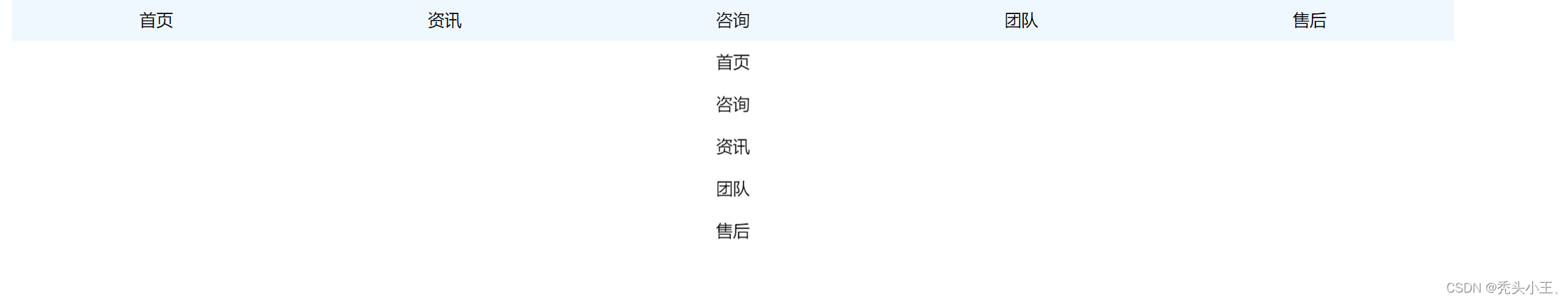
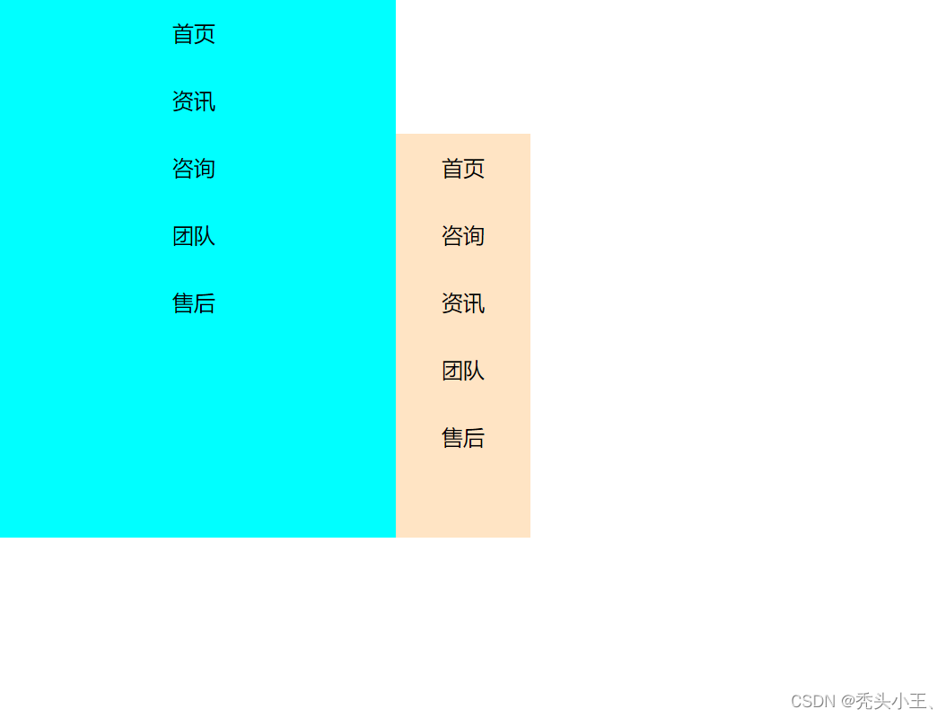
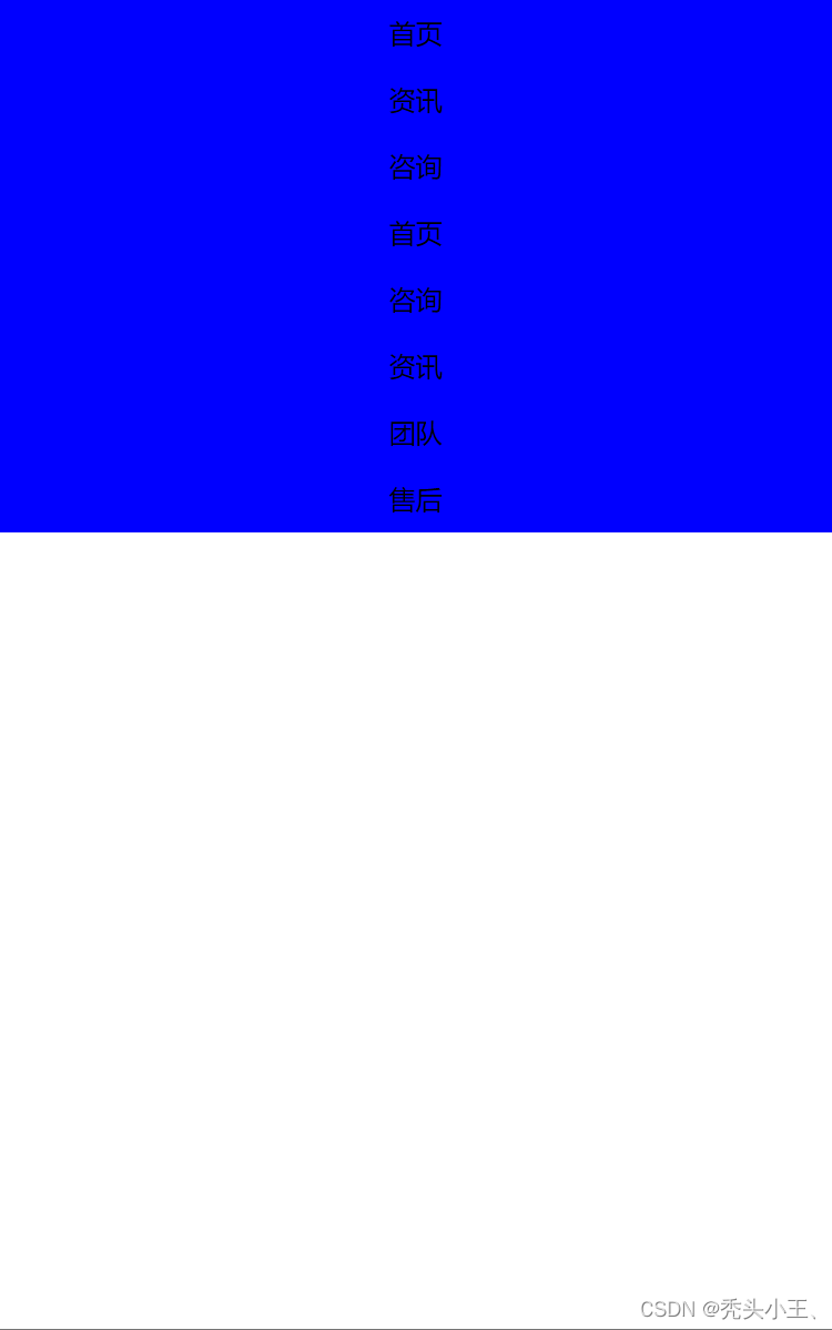
<ul class="one">
<li>首页</li>
<li>资讯</li>
<li>咨询
<ul class="two">
<li>首页</li>
<li>咨询</li>
<li>资讯</li>
<li>团队</li>
<li>售后</li>
</ul>
</li>
<li>团队</li>
<li>售后</li>
</ul>
</body>
</html>
效果图:


 95
95


 被折叠的 条评论
为什么被折叠?
被折叠的 条评论
为什么被折叠?
 到【灌水乐园】发言


