


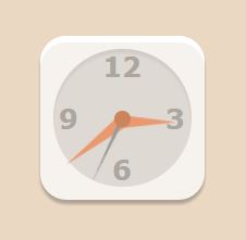
今天用css3和Html5实现了一个钟表,钟表的样式是在网上找的,细节部分实现的不是很好,但是基本可以看了。
主要是利用了css3的border-radius和box-shadow,animate等属性实现了。
代码如下:
<!doctype html>
<html>
<head>
<meta charset="utf-8">
<title>csss实现钟表</title>
<style>
    body{background-color:#ebd8c3;}
    .clock{
        height:151px;
        width:151px;
        margin:100px auto;
        position:relative;
        background-color:#f6f3ef;
        -webkit-border-radius:24px;
        -moz-border-radius:24px;
        border-radius:24px;
        -webkit-box-shadow: 0px 4px 3px 0px rgba(0,0,0,15),0px 6px 0px -0px #fff inset;
        -moz-box-shadow:0px 4px 3px 0px rgba(0,0,0,15),0px 6px 0px 0px #fff inset;
        box-shadow: 0px 4px 3px 0px rgba(0,0,0,0.25),0px 6px 0px 0px #fff inset;
    }
    .cricle{
        height:127px;
        width:127px;
        border-radius:50%;
        background-color:#DFD9D3;
        position:absolute;
        top:12px;
        left:12px;
        box-shadow:0 4px 3px 0px rgba(0,0,0,0.06) inset;
    }
    .cricle:after{
        content:"";
        height:15px;
        width:15px;
        border-radius:50%;
        background-color:#cc845c;
        position:absolute;
        top:56.5px;
        left:56px;
        z-index:2;
    }
    #hours{
        height:0px;
        width:0px;
        border-style: solid;
        border-width:6px 6px 6px 50px;
        border-color:transparent transparent transparent #E9996D;
        transform-origin:0% 50%;
        position:absolute;
        top:72.5px;
        left:75.5px;
        -webkit-animation:HoursChange 43200s linear  infinite;
        animation: HoursChange 43200s linear  infinite;
    }
    #minutes{
        height:0px;
        width:0px;
        border-style: solid;
        border-width:6px 6px 6px 65px;
        border-color:transparent transparent transparent #E9996D;
        transform-origin:0% 50%;
        position:absolute;
        top:72.5px;
        left:75.5px;
        -webkit-animation:MinutesChange 3600s linear  infinite;
        animation:MinutesChange 3600s linear  infinite;
        z-index:1;
    }
    #seconds{
        height:0px;
        width:0px;
        border-style: solid;
        border-width:2px 2px 2px 65px;
        border-color:transparent transparent transparent #999;
        transform-origin:0% 50%;
        position:absolute;
        top:74.5px;
        left:75.5px;
        -webkit-animation:SecondsChange 60s linear  infinite;
        animation:SecondsChange 60s linear  infinite;
        z-index:1;
    }
    .num{
        font-family:proximanova,Verdana, Geneva, sans-serif;
        font-size:25px;
        position:relative;
        width:127px;
        height:127px;
        top:12px;
        left:12px;

    }
    .num b{
        height:22px;
        width:19px;
        line-height:22px;
        text-align:center;
        color:#aba6a0;
        position:absolute;
    }
    .num b:first-child{
        width:38px;
        top:5px;
        left:44.5px;
    }
    .num b:nth-child(2){
        top:52.5px;
        right:5px;
    }
    .num b:nth-child(3){
        bottom:5px;
        left:54px;
    }
    .num b:nth-child(4){
        top:52.5px;
        left:5px;
    }
@keyframes  HoursChange{
     0%   {transform: rotate( 0deg );}
     50%  {transform: rotate( 180deg );}
     100% {transform: rotate( 360deg );}
}
@-webkit-keyframes HoursChange{
     0%   { -webkit-transform: rotate( 0deg );}
     50%  { -webkit-transform: rotate( 180deg );}
     100% {-webkit-transform: rotate( 360deg );}
}
@keyframes  MinutesChange{
     0%   {transform: rotate( 135deg );}
     50%  {transform: rotate( 315deg );}
     100% {transform: rotate( 495deg );}
}
@-webkit-keyframes MinutesChange{
    0%{transform: rotate( 135deg );}
     50%  {transform: rotate( 315deg );}
     100% {transform: rotate( 495deg );}
}
@keyframes  SecondsChange{
     0%   {transform: rotate( 45deg );}
     50%  {transform: rotate( 225deg );}
     100% {transform: rotate( 405deg );}
}
@-webkit-keyframes SecondsChange{
     0%   {transform: rotate( 45deg );}
     50%  {transform: rotate( 225deg );}
     100% {transform: rotate( 405deg );}
}

</style>
</head>

<body>
<div class="clock">
    <div class="cricle"></div>
    <div class="num">
        <b>12</b>
        <b>3</b>
        <b>6</b>
        <b>9</b>
    </div>
     <div id="hours"></div>
     <div id="minutes"></div>
    <div id="seconds"></div>
</div>
</body>
</html>


 1468
1468


 被折叠的 条评论
为什么被折叠?
被折叠的 条评论
为什么被折叠?
 到【灌水乐园】发言


