


写在前面:新手总要跨过自定义View这个坎,虽然本人也是菜鸡一枚。看书学了几个Demo,记录总结一下,便日后查阅复习。(^__^) 嘻嘻……
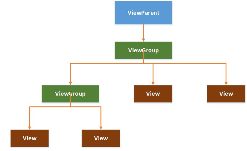
一、android控件架构:
- androidView树结构:
- UI界面架构:
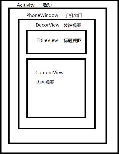
PhoneWindow将DecorView设置为整个窗口的根View,作为窗口界面的顶层视图。
oncreate()方法调用setContentView后,ActivityManagerService会回调onResume方法,此时系统才会将DecorView加入PhoneWindow中,从而完成界面绘制。
二、自定义View
自定义View的精髓其实就在于三个方法:
①onMeasure
②onLayout
③onDraw
下面就以几个简单的例子逐一解释:
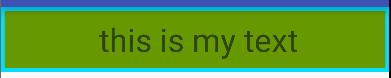
1.在原生的控件上添加效果
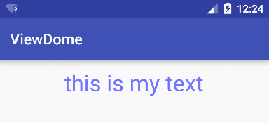
这个例子是直接继承了TextView,然后给原本的文本加了两个外边框,先看下效果吧:
PS:如果是直接修改系统控件可以不需要重写onMeasure方法,直接设置他的宽高,下面贴出代码:
public class SuperTxt extends TextView{

    private Paint mPaint1,mPaint2;//定义两个画笔,一个是外边框,一个是内边框

    public SuperTxt(Context context, AttributeSet attrs, int defStyleAttr) {
        super(context, attrs, defStyleAttr);
    }

    public SuperTxt(Context context, AttributeSet attrs) {
        super(context, attrs);
    }

    public SuperTxt(Context context) {
        super(context);
    }


    @Override
    protected void onDraw(Canvas canvas) {

        mPaint1 = new Paint();
        mPaint1.setColor(getResources().getColor(android.R.color.holo_blue_bright));
        mPaint1.setStyle(Paint.Style.FILL);
        mPaint2 = new Paint();
        mPaint2.setColor(getResources().getColor(android.R.color.holo_green_dark));
        mPaint2.setStyle(Paint.Style.FILL);


        canvas.drawRect(0, 0, getMeasuredWidth(), getMeasuredHeight(), mPaint1);
        canvas.drawRect(10, 10, getMeasuredWidth() - 10, getMeasuredHeight() - 10, mPaint2);

        //保存画布
        canvas.save();
        canvas.translate(10, 0);//在X轴方向平移10个PX,Y轴不变
        //在回调父类方法前,实现自定义逻辑,在绘制文本内容前完成
        super.onDraw(canvas);//父类方法就是绘制文本
        //在回调父类方法后,实现自定义逻辑,在绘制文本内容后完成
        canvas.restore();
    }
    }
下面是XML里的配置:
<com.test.wxj.viewdome.view.SuperTxt
        android:id="@+id/txt"
        android:layout_width="match_parent"
        android:layout_height="60dp"
        android:text="this is my text"
        android:textSize="30sp"
        android:gravity="center"/>
MainActivity直接findViewById就行了,代码我就不贴了。运行起来就能得到图片里的效果。简单解释下吧,逻辑其实和很简单,继承TextView然后直接重写onDraw方法,给出坐标画两个有颜色的矩形,其他属性照常,就是这样子。
2.闪动文字效果文本
还是先贴出效果:
public class ShinyTxt extends TextView {

    private int mViewWidth;
    private int mTranslate;
    private Paint mPaint;
    //给出渐变渲染器
    private LinearGradient mLinearGradient;
    //给出变化模式
    private Matrix mGradientMarix;

    public ShinyTxt(Context context, AttributeSet attrs, int defStyleAttr) {
        super(context, attrs, defStyleAttr);
    }

    public ShinyTxt(Context context, AttributeSet attrs) {
        super(context, attrs);
    }

    public ShinyTxt(Context context) {
        super(context);
    }

    //定制一个具有闪耀字体效果的TEXTVIEW

    //重写onSizeChanged方法并设置一个LinearGradient渐变渲染器

    @Override
    protected void onSizeChanged(int w, int h, int oldw, int oldh) {
        super.onSizeChanged(w, h, oldw, oldh);
        if (mViewWidth == 0) {
            mViewWidth = getMeasuredWidth();
            if (mViewWidth > 0) {
                mPaint = getPaint();//用这个方法动态的得到画笔,每次画出不同的颜色从而达到闪烁效果
                //渐变渲染器,位置参数,颜色变化集合,变化模式
                mLinearGradient = new LinearGradient(
                        0,
                        0,
                        mViewWidth,
                        0,
                        new int[]{Color.BLUE, 0xffffffff, Color.BLUE},
                        null,
                        Shader.TileMode.CLAMP);
                mPaint.setShader(mLinearGradient);
                mGradientMarix = new Matrix();
            }
        }
    }

    //重写ondraw

    @Override
    protected void onDraw(Canvas canvas) {
        super.onDraw(canvas);
        if (mGradientMarix != null) {
            //设置每次变化位移为宽度的1/5
            mTranslate += mViewWidth / 5;
            if (mTranslate > 2 * mViewWidth) {//闪完一次,往回闪
                mTranslate = -mViewWidth;
            }
            mGradientMarix.setTranslate(mTranslate, 0);//X轴不断平移,Y轴不变
            mLinearGradient.setLocalMatrix(mGradientMarix);
            postInvalidateDelayed(100);//设置变化延时间隔0.1S
        }
    }
}
分析一下:其实思想和上一个控件没有多大出路,继承TextView然后重写onDraw和onSizeChanged方法,在这里需要注意的是onSizeChanged里给出了一个颜色渐变渲染器,从代码里不难看出这个属性最后是通过set方法传给了画笔工具的,也就是它不断改变画笔属性不停onDraw从而达到了图中滚动字幕的效果。
3.自定义标题栏
效果图:
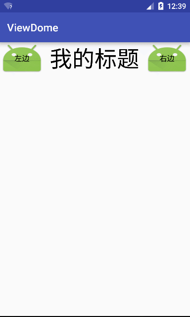
这里我写的比较简陋,别吐槽~~
图中显示了三个部分,左边Button,中间文本,右边Button。因此我们分别给出他们的属性,这里需要在values文件夹下创建attrs.xml
<?xml version="1.0" encoding="utf-8"?>
<resources>

    <declare-styleable name="MyTopBar">

        <attr name="midtitle" format="string"/>
        <attr name="midtitleTextSize" format="dimension"/>
        <attr name="midtitleTextColor" format="color"/>

        <attr name="leftText" format="string"/>
        <attr name="leftBackgroud" format="reference|color"/>
        <attr name="leftTextColor" format="color"/>

        <attr name="rightText" format="string"/>
        <attr name="rightBackgroud" format="reference|color"/>
        <attr name="rightTextColor" format="color"/>

    </declare-styleable>

</resources>
声明三个部分的属性
public class MyTopBar extends RelativeLayout {

    private int leftTextColor;
    private Drawable leftBackGround;
    private String leftText;

    private int rightTextColor;
    private String rightText;
    private Drawable rightBackGround;

    private int midtitleTextColor;
    private String midtitleText;
    private float midtitleTextSize;


    private TextView titleView;
    private Button leftButton;
    private Button rightButton;

    private RelativeLayout.LayoutParams leftParams;
    private RelativeLayout.LayoutParams rightParams;
    private RelativeLayout.LayoutParams titleParams;

    private topbarClickListener mListener;

    public MyTopBar(Context context, AttributeSet attrs, int defStyleAttr) {
        super(context, attrs, defStyleAttr);
    }

    public MyTopBar(Context context, AttributeSet attrs) {
        super(context, attrs);
        initAttr(context, attrs);
        initViews(context);

    }


    public MyTopBar(Context context) {
        super(context);
    }


    private void initAttr(Context context, AttributeSet attrs) {
        //给一个TypedArray取出自定义属性
        TypedArray ta = context.obtainStyledAttributes(attrs, R.styleable.MyTopBar);
        //取出需要设置的属性值,并设置属性
        midtitleText = ta.getString(R.styleable.MyTopBar_midtitle);
        midtitleTextSize = ta.getDimension(R.styleable.MyTopBar_midtitleTextSize, 16);
        midtitleTextColor = ta.getColor(R.styleable.MyTopBar_midtitleTextColor, 0);

        leftText = ta.getString(R.styleable.MyTopBar_leftText);
        leftTextColor = ta.getColor(R.styleable.MyTopBar_leftTextColor, 0);
        leftBackGround = ta.getDrawable(R.styleable.MyTopBar_leftBackgroud);

        rightText = ta.getString(R.styleable.MyTopBar_rightText);
        rightTextColor = ta.getColor(R.styleable.MyTopBar_rightTextColor, 0);
        rightBackGround = ta.getDrawable(R.styleable.MyTopBar_rightBackgroud);

        //不要忘记回收资源
        ta.recycle();
    }

    private void initViews(Context context) {
        titleView = new TextView(context);
        leftButton = new Button(context);
        rightButton = new Button(context);

        // 为创建的组件赋值
        titleView.setText(midtitleText);
        titleView.setTextSize(midtitleTextSize);
        titleView.setTextColor(midtitleTextColor);
        titleView.setGravity(Gravity.CENTER);

        leftButton.setText(leftText);
        leftButton.setTextColor(leftTextColor);
        leftButton.setBackground(leftBackGround);

        rightButton.setText(rightText);
        rightButton.setTextColor(rightTextColor);
        rightButton.setBackground(rightBackGround);

        // 为组件布局
        // 在左边
        leftParams = new LayoutParams(LayoutParams.WRAP_CONTENT, LayoutParams.MATCH_PARENT);
        leftParams.addRule(RelativeLayout.ALIGN_PARENT_LEFT, RelativeLayout.TRUE);
        //添加左边的控件
        addView(leftButton, leftParams);

        // 在右边
        rightParams = new LayoutParams(LayoutParams.WRAP_CONTENT, LayoutParams.MATCH_PARENT);
        rightParams.addRule(RelativeLayout.ALIGN_PARENT_RIGHT, RelativeLayout.TRUE);
        //添加右边的控件
        addView(rightButton, rightParams);

        //中间
        titleParams = new LayoutParams(LayoutParams.WRAP_CONTENT, LayoutParams.MATCH_PARENT);
        titleParams.addRule(RelativeLayout.CENTER_IN_PARENT, RelativeLayout.TRUE);
        //添加中间的title
        addView(titleView, titleParams);

        //实现方法操作
        leftButton.setOnClickListener(new OnClickListener() {
            @Override
            public void onClick(View view) {
                mListener.leftClick();
            }
        });
        rightButton.setOnClickListener(new OnClickListener() {
            @Override
            public void onClick(View view) {
                mListener.rightClick();
            }
        });
    }

    //给出一个接口,暴露出左右button的点击事件
    public interface topbarClickListener {
        void leftClick();

        void rightClick();
    }

    //给出设置接口的方法
    public void setOnTopBarClickListener(topbarClickListener mListener) {
        this.mListener = mListener;
    }


    //给出公有方法,让其容器活动来设置按钮的可见性
    public void setButtonVisable(int id, boolean flag) {
        if (flag) {
            if (id == 0) {
                leftButton.setVisibility(View.VISIBLE);
            } else {
                rightButton.setVisibility(View.VISIBLE);
            }
        } else {
            if (id == 0) {
                leftButton.setVisibility(View.GONE);
            } else {
                rightButton.setVisibility(View.GONE);
            }
        }

    }
}
public class MainActivity extends AppCompatActivity {
private MyTopBar myTopBar;
myTopBar= (MyTopBar) findViewById(R.id.topbar);
myTopBar.setButtonVisable(0,true);
myTopBar.setButtonVisable(1,true);
myTopBar.setOnTopBarClickListener(new MyTopBar.topbarClickListener() {
@Override
public void leftClick() {
Toast.makeText(MainActivity.this,"leftclick",Toast.LENGTH_SHORT).show();
}
@Override
public void rightClick() {
Toast.makeText(MainActivity.this,"rightclick",Toast.LENGTH_SHORT).show();
}
});
}
}
@Override
protected void onCreate(Bundle savedInstanceState) {
super.onCreate(savedInstanceState);
setContentView(R.layout.activity_main);像这种TopBar其实我建议大家单独写成一个XML资源文件,然后每次需要用的时候直接include就行;
<?xml version="1.0" encoding="utf-8"?>
<com.test.wxj.viewdome.view.MyTopBar xmlns:android="http://schemas.android.com/apk/res/android"
    xmlns:custom="http://schemas.android.com/apk/res-auto"
    android:id="@+id/topbar"
    android:layout_width="match_parent"
    android:layout_height="60dp"
    custom:leftText="左边"
    custom:leftTextColor="#000000"
    custom:leftBackgroud="@mipmap/ic_launcher"
    custom:rightText="右边"
    custom:rightTextColor="#000000"
    custom:rightBackgroud="@mipmap/ic_launcher"
    custom:midtitle="我的标题"
    custom:midtitleTextColor="#000000"
    custom:midtitleTextSize="14sp">

</com.test.wxj.viewdome.view.MyTopBar>
核心思想:通过attrs设置控件属性,然后在构造方法里获取属性并设置值完成初始化工作,控件的点击事件通过暴露接口和重写方法,让调用者自己来实现具体的操作,而不是固定在控件生成的时候。
4.重写View实现自己的控件
效果图:
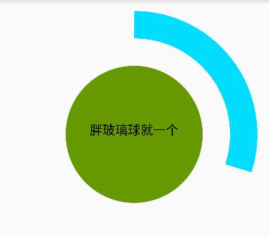
一样的如图分为三个部分,中间圆形,中间文本,外圈弧形。
public class YuanHu extends View {

    private int mMeasureHeigth;// 控件高度
    private int mMeasureWidth;// 控件宽度
    // 圆形
    private Paint mCirclePaint;
    private float mCircleXY;//圆心坐标
    private float mRadius;//圆形半径
    // 圆弧
    private Paint mArcPaint;
    private RectF mArcRectF;//圆弧的外切矩形
    private float mSweepAngle;//圆弧的角度
    private float mSweepValue = 50;
    // 文字
    private Paint mTextPaint;
    private String mShowText;//文本内容
    private float mShowTextSize;//文本大小

    public YuanHu(Context context, AttributeSet attrs, int defStyleAttr) {
        super(context, attrs, defStyleAttr);
    }

    public YuanHu(Context context, AttributeSet attrs) {
        super(context, attrs);
    }

    public YuanHu(Context context) {
        super(context);
    }

    @Override
    protected void onMeasure(int widthMeasureSpec, int heightMeasureSpec) {

        mMeasureWidth = MeasureSpec.getSize(widthMeasureSpec);
        mMeasureHeigth = MeasureSpec.getSize(heightMeasureSpec);
        setMeasuredDimension(mMeasureWidth, mMeasureHeigth);

        initView();

    }

    /**
     * 画笔的准备
     */
    private void initView() {

        float length = Math.min(mMeasureWidth, mMeasureHeigth);//长度取宽和高的较小者,竖屏或横屏
        mCircleXY = length / 2;//圆心
        mRadius = (float) (length * 0.5 / 2);//半径
        mCirclePaint = new Paint();
        mCirclePaint.setAntiAlias(true);// 去锯齿
        mCirclePaint.setColor(getResources().getColor(android.R.color.holo_green_dark));

        //弧形
        mArcRectF = new RectF((float) (length * 0.1), (float) (length * 0.1), (float) (length * 0.9), (float) (length * 0.9));
        mSweepAngle = (mSweepValue / 100f) * 360f;
        mArcPaint = new Paint();
        mArcPaint.setColor(getResources().getColor(android.R.color.holo_blue_bright));
        mArcPaint.setStrokeWidth((float) (length * 0.1));//圆弧宽度
        mArcPaint.setStyle(Paint.Style.STROKE);//圆弧

        //文本
        mShowText = setShowText();
        mShowTextSize = setShowTextSize();
        mTextPaint = new Paint();
        mTextPaint.setTextSize(mShowTextSize);
        mTextPaint.setTextAlign(Paint.Align.CENTER);
    }

    private float setShowTextSize() {
        this.invalidate();
        return 50;
    }

    private String setShowText() {
        this.invalidate();
        return "胖玻璃球就一个";
    }

    public void forceInvalidate() {
        this.invalidate();
    }

    public void setSweepValue(float sweepValue) {
        if (sweepValue != 0) {
            mSweepValue = sweepValue;
        } else {
            mSweepValue = 25;
        }
        this.invalidate();
    }
    /**
     * 分析下圆弧结构:中间文本,中心圆,外圈圆弧
     * 自定义VIEW,就得onMeasure,在ondraw,重写原生控件可省去onmeasure
     */
    @Override
    protected void onDraw(Canvas canvas) {
        super.onDraw(canvas);
        canvas.drawCircle(mCircleXY, mCircleXY, mRadius, mCirclePaint);
        canvas.drawArc(mArcRectF, 270, mSweepAngle, false, mArcPaint);
        canvas.drawText(mShowText, 0, mShowText.length(), mCircleXY, mCircleXY + mShowText.length() / 4, mTextPaint);
    }
}
核心就是onDraw方法,计算圆心啊半径啊弧度啊BALABALA~~的这些我看的时候也头昏,多看几遍理解起来也不难~
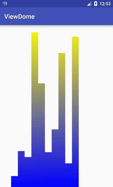
5.自定义音频条形图
类似音乐播放器的一个插件,我没有数据,所以高度是用随机数给的。
public class MusicBar extends View {

    private int mRectCount;
    private Paint mPaint;
    private int mRectWidth;
    private int mWidth;
    private int mRectHeight;
    private int mHeight;

    private int offset=5;//设置每个小方块的间隔
    private double mRandom;
    private LinearGradient mLinearGradient;

    public MusicBar(Context context, AttributeSet attrs, int defStyleAttr) {
        super(context, attrs, defStyleAttr);
    }
    public MusicBar(Context context, AttributeSet attrs) {
        super(context, attrs);
    }
    public MusicBar(Context context) {
        super(context);

    }

    @Override
    protected void onMeasure(int widthMeasureSpec, int heightMeasureSpec) {

        mWidth = MeasureSpec.getSize(widthMeasureSpec);
        mHeight = MeasureSpec.getSize(heightMeasureSpec);
        setMeasuredDimension(mWidth, mHeight);
    }

    private void initView() {
        mPaint = new Paint();
        mPaint.setColor(Color.GREEN);
        mPaint.setStyle(Paint.Style.FILL);
        mRectCount = 10;
    }

    @Override
    protected void onSizeChanged(int w, int h, int oldw, int oldh) {
        initView();
        super.onSizeChanged(w, h, oldw, oldh);
        mWidth=getWidth();//得到父控件宽度
        mRectHeight=getHeight();//矩形高先设置为父控件高度
        mRectWidth= (int)(mWidth * 0.6 / mRectCount);//设置矩形宽度
        mLinearGradient=new LinearGradient(0,
                0,
                mRectWidth,
                mRectHeight,
                Color.YELLOW,
                Color.BLUE,
                Shader.TileMode.CLAMP);
        mPaint.setShader(mLinearGradient);
    }

    @Override
    protected void onDraw(Canvas canvas) {
        super.onDraw(canvas);

        for (int i=0;i<mRectCount;i++){
            mRandom=Math.random();
            float currentHeight= (float) (mRectHeight*mRandom);//动态获取矩形的高度
            canvas.drawRect((float)(mWidth*0.2/2+mRectWidth*i+offset),
                    currentHeight,
                    (float)(mWidth*0.2/2+mRectWidth*(i+1)+offset),
                    mRectHeight,mPaint);
        }
        postInvalidateDelayed(500);
    }
}
拆分一下图形:其实就是不断绘制高度不等、间隔相同的数个矩形。
灵活的运用onDraw和onMeasure方法。
三、自定义ViewGroup
效果图:
代码实现:
public class MyScroll extends ViewGroup {

    private int mScreenHeight;
    private int mLastY;
    private int mStart;
    private int mEnd;
    private Scroller mScroller = null;
    private Context mContext;

    public MyScroll(Context context, AttributeSet attrs, int defStyleAttr) {
        super(context, attrs, defStyleAttr);
    }

    public MyScroll(Context context, AttributeSet attrs) {
        super(context, attrs);
        mContext = context;
        init();
    }

    public MyScroll(Context context) {
        super(context);
    }
    //创建Scroller对象,配合使用,使我们的自定义ViewGroup具有滑动的一些功能
    private void init() {
        mScroller = new Scroller(mContext);
    }

    @Override
    /**
     * 测量子控件,采用遍历方式,获取每个子控件的宽和高
     */
    protected void onMeasure(int widthMeasureSpec, int heightMeasureSpec) {
        super.onMeasure(widthMeasureSpec, heightMeasureSpec);
        int count = getChildCount();
        for (int i = 0; i < count; i++) {
            View childView = getChildAt(i);
            measureChild(childView, widthMeasureSpec, heightMeasureSpec);
        }
    }

    /**
     * 测量屏幕高度
     *
     * @return
     */
    private int getScreenHeight() {
        WindowManager manager = (WindowManager) getContext().getSystemService(Context.WINDOW_SERVICE);
        DisplayMetrics dm = new DisplayMetrics();
        manager.getDefaultDisplay().getMetrics(dm);
        return dm.heightPixels;
    }

    @Override
    /**
     * 遍历子控件可见的就layout
     */
    protected void onLayout(boolean changed, int l, int t, int r, int b) {
        int childCount = getChildCount();
        //设置ViewGroup的高度
        mScreenHeight = getScreenHeight();
        MarginLayoutParams mlp = (MarginLayoutParams) getLayoutParams();
        mlp.height = mScreenHeight * childCount;//设置每一个子控件占满屏,父容器高度就是屏幕高度*子控件个数
        setLayoutParams(mlp);
        //遍历layout,每个子空间加入父容器
        for (int i = 0; i < childCount; i++) {
            View child = getChildAt(i);
            if (child.getVisibility() != View.GONE) {
                child.layout(l, i * mScreenHeight, r, (i + 1) * mScreenHeight);//每个占满屏
            }
        }
    }

    @Override
    /**
     * 事件监听,根据不同的动作给不同的操作
     */
    public boolean onTouchEvent(MotionEvent event) {
        int y = (int) event.getY();//得到触点的Y坐标
        switch (event.getAction()) {//根据触摸动作类型给出不同的操作
            case MotionEvent.ACTION_DOWN:
                mLastY = y;
                mStart = getScrollY();//得到触摸起点
                break;
            case MotionEvent.ACTION_MOVE:
                if (!mScroller.isFinished()) {
                    mScroller.abortAnimation();//不是静止状态就让他停止
                }
                int dy = mLastY - y;
                //View移动到上边沿
                if (getScrollY() < 0) {
                    dy = 0;
                }
                //View移动到下边沿
                if (getScrollY() > getHeight() - mScreenHeight) {
                    dy = 0;
                }
                scrollBy(0, dy);
                mLastY = y;
                break;
            case MotionEvent.ACTION_UP:
                // 记录触摸终点
                mEnd = getScrollY();
                int dScrollY = mEnd - mStart;
                Log.e("监测Y轴滑动距离", "---dscrollY=" + dScrollY);
                if (dScrollY > 0) {// 上滑

                    if (dScrollY < mScreenHeight / 3) {// 回弹效果
                        mScroller.startScroll(0, getScrollY(), 0, -dScrollY);
                    } else {// 滑到下一个view
                        mScroller.startScroll(0, getScrollY(), 0, mScreenHeight - dScrollY);
                    }
                } else {// 下滑
                    if (-dScrollY < mScreenHeight / 3) {// 回弹
                        mScroller.startScroll(0, getScrollY(), 0, -dScrollY);
                    } else {
                        mScroller.startScroll(0, getScrollY(), 0, -mScreenHeight - dScrollY);
                    }
                }
                break;
        }
        //不要忘了
        postInvalidate();
        return true;
    }

    @Override
    public void computeScroll() {
        super.computeScroll();
        if (mScroller.computeScrollOffset()) {
            scrollTo(0, mScroller.getCurrY());
            postInvalidate();
        }
    }
}
<?xml version="1.0" encoding="utf-8"?>
<com.test.wxj.viewdome.view.MyScroll xmlns:android="http://schemas.android.com/apk/res/android"
android:id="@+id/outscroller"
android:layout_width="match_parent"
android:layout_height="match_parent">
<ImageView
android:layout_width="wrap_content"
android:layout_height="wrap_content"
android:src="@drawable/back1" />
<ImageView
android:layout_width="wrap_content"
android:layout_height="wrap_content"
android:src="@drawable/back2" />
</com.test.wxj.viewdome.view.MyScroll>代码比较长,长话短说,分析一下核心思想:首先ViewGroup作为一个view的容器,他需要得到每一个子View的宽高属性,并且为每一个子View设置摆放位置,这两个功能通过onMeasure和onLayout方法来实现,代码中都通过遍历的方式给每一个子View设置属性。然后注意创建了一个Scroller对象并在构造方法里初始化,这样就使得我们的自定义有了滑动视图的一些效果,然后后面一大堆算法(本人也没怎么看懂,- -),就是写了一种黏性效果~~~最后把自定义写出xml文件,在activity里初始化就可以看见效果了。
结语:好了,这次就算是对android自定义View部分作了一个比较系统的总结吧,参考《android群英传》,写下这篇博客,也算是读书记录吧,希望对各位看官有所帮助,欢迎指正错误~


 扫一扫
扫一扫
 1618
1618

 被折叠的 条评论
为什么被折叠?
被折叠的 条评论
为什么被折叠?
 到【灌水乐园】发言


