


#css实现四条边有弧度的圆角矩形
直接上图。
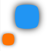
那兄弟让我用css给它整出来。我*****

然后我就用border-radius:25%;做出来发现不对啊,四条边没弧度啊,这可不行。
最后我就发现了这种写法border-radius: 16px 16px 16px 16px/45px 45px 45px 45px; 得到了两条弧度边。
于是最后代码如下:
.box{
            margin: 30px 50px;
            position: relative;
            width: 96px;
            height: 80px;
            background-color: rgb(33, 149, 243);
            border-radius: 16px 16px 16px 16px/56px 56px 56px 56px;
            box-shadow: 0 0 15px 6px rgb(107, 107, 107);
            z-index:0;
        }
        .box::after{
            content: "";
            position:absolute;
            top: -8px;
            left: 8px;
            width: 80px;
            height: 96px;
            background-color: rgb(33, 149, 243);
            border-radius: 56px 56px 56px 56px/16px 16px 16px 16px;
            z-index:-1;
        }

        .box1{
            position: relative;
            width: 48px;
            height: 40px;
            background-color: rgb(255, 115, 1);
            border-radius: 8px 8px 8px 8px/20px 20px 20px 20px;
            box-shadow: 0 0 15px 2px rgb(107, 107, 107);
            z-index:0;
        }

        .box1::after{
            content: "";
            position:absolute;
            top: -4px;
            left: 4px;
            width: 40px;
            height: 48px;
            background-color: rgb(255, 115, 1);
            border-radius: 20px 20px 20px 20px/8px 8px 8px 8px;
            z-index:-1;
        }
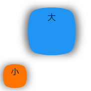
最后的z-index属性,可写可不写,只是为了字能够显示出来。
html只需插入两个盒子即可:
<div class="box">大</div>
<div class="box1">小</div>
成品图片如下:


 4155
4155


 被折叠的 条评论
为什么被折叠?
被折叠的 条评论
为什么被折叠?
 到【灌水乐园】发言


