


当 display:flex 碰上 white-space nowrap 的时候,会打乱 flex 布局。解决方法:给 flex 布局级设置最小宽度为 0。
示例
当 display:flex 碰上 white-space nowrap,flex布局被打乱了,示例中表现为内部元素超出父元素范围(可能存在其他情况)。
解决方法:
给flex布局级(例:设置“flex:1;”的子盒子)设置最小宽度为0
HTML
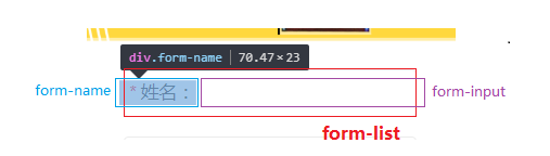
<div class="form-list">
    <div class="form-name">
        <span class="form-star">*</span>姓名:
    </div>
    <input type="text" data-type="name" data-form="1" class="form-input" />
</div>
CSS
.form-list  {
    display: flex;
    flex-flow: row nowrap;
    justify-content: center;
    align-items: center;
    box-sizing: border-box;
    width: 6.53333rem;
    height: 1.06667rem;
}
.form-name {
    color: #474747;
    font-size: 0.4rem;
    white-space: nowrap;
    min-width: 0;     /* 重要!!! */
}
.form-input {
    border: none;
    flex: 1;
    padding-left: 0.26667rem;
    outline: none;
    color: #000000;
    font-size: 0.4rem;
    min-width: 0;     /* 重要!!! */
    background-color: transparent;
}


 169
169


 被折叠的 条评论
为什么被折叠?
被折叠的 条评论
为什么被折叠?
 到【灌水乐园】发言


