


 网页设计网页的一些布局方式
目录
一.浮动(float)布局
1.浮动的特点
浮动只有左浮动和右浮动两个属性可以设置
floa:left
float:right
浮动会脱离标准流,可能会导致布局的困难
浮动会让元素变成行内块元素,可以让元素设宽高
2.清除浮动
清除浮动有几种方法
1.overflow:hidden
2.直接在父元素设置一个div盒子然后用clear:both清除浮动
3.给父元素设高度
4.伪类选择器清除浮动
二、弹性盒子(flex)布局
1.flex的基本属性
flex-direction:可以设置盒子内元素的排列顺序
row:从左到右
row-reverse:从右到左
column:从上到下
column-reverse:从下到上
flex-wrap:可以设计盒子内元素的换行
wrap:换行
no-wrap:不换行
wrap-reverse:换行,第一行在下方
justify-content:可以设置元素的对齐方式
flex-start(默认值):左对齐
flex-end:右对齐
center: 居中
space-between:两端对齐,项目之间的间隔都相等。
space-around:每个项目两侧的间隔相等。
三.举例说明
1.浮动布局演示
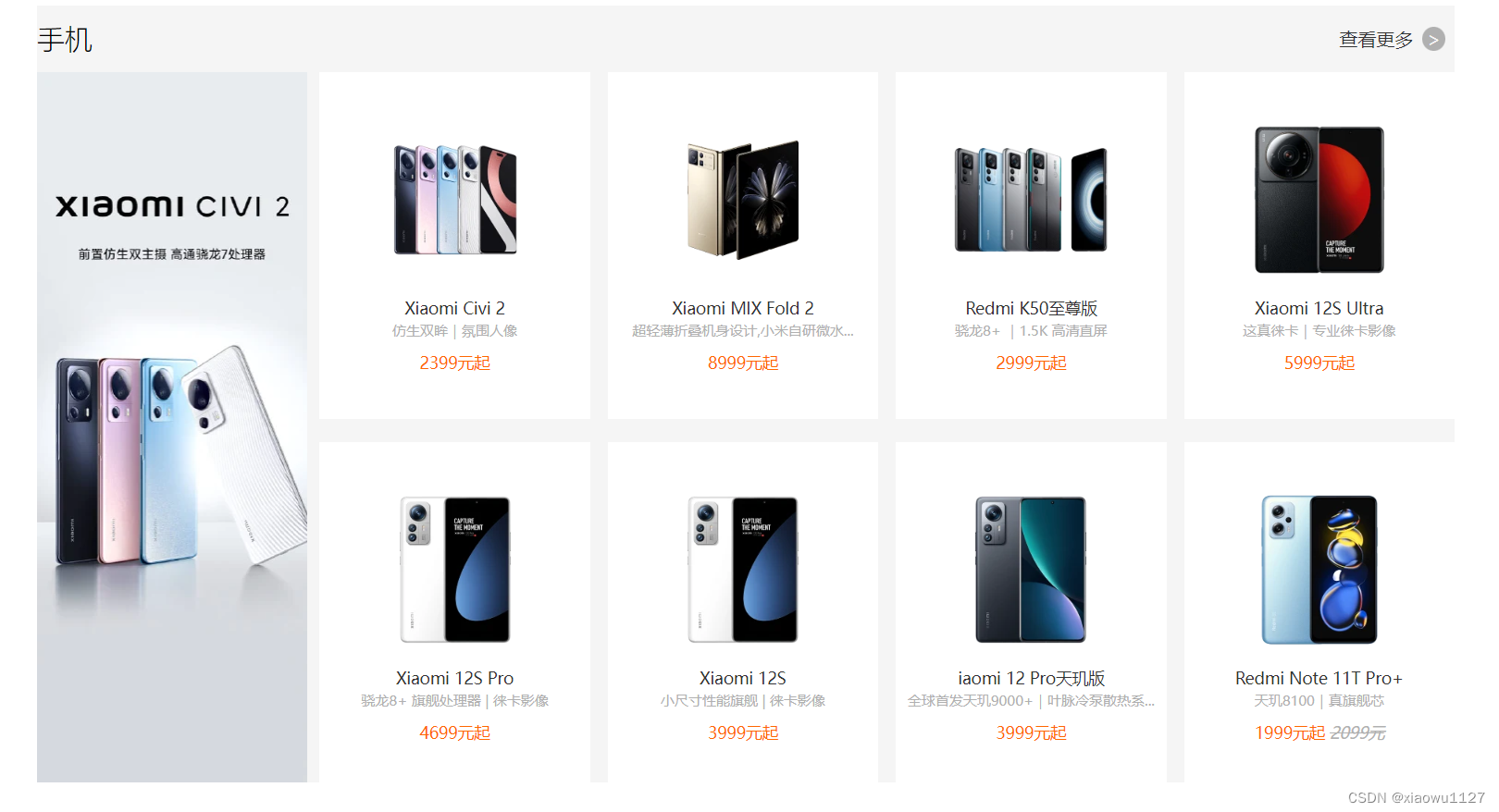
效果图:
代码:
<!DOCTYPE html>
<html lang="en">

<head>
    <meta charset="UTF-8">
    <meta http-equiv="X-UA-Compatible" content="IE=edge">
    <meta name="viewport" content="width=device-width, initial-scale=1.0">
    <title>Document</title>
    <style>
        * {
            padding: 0;
            margin: 0;
            box-sizing: border-box;
        }

        .phone {
            width: 1226px;
            margin: 10px auto;
            background-color: #f5f5f5;

        }

        .phone .title {
            width: 100%;
            height: 58px;
        }

        .phone .title h2 {
            float: left;
            font-weight: lighter;
            line-height: 58px;
        }

        .phone .title a {
            float: right;
            line-height: 58px;
            text-decoration: none;
            width: 100px;
            color: #333;
        }

        .phone .title a:hover {
            color: #ff6700;
        }

        .phone .title a span {
            background-color: #b0b0b0;
            border-radius: 100%;
            margin-left: 8px;
            padding: 0 4px;
            color: #f5f5f5;
        }

        .commodity {
            overflow: hidden;
        }

        .commodity>img {
            float: left;
            width: 234px;
            height: 614px;
        }

        .commodity .mobile {
            width: 992px;
            height: 614px;
            float: right;
        }

        .commodity .m
最低0.47元/天 解锁文章


 8万+
8万+


 被折叠的 条评论
为什么被折叠?
被折叠的 条评论
为什么被折叠?
 到【灌水乐园】发言


