


传统布局
传统布局即是早期在平板电脑、智能手机等移动设备并不流行的时候使用的布局方式。
一、表格布局
例如:采用表格方式实现如下简单模型的布局
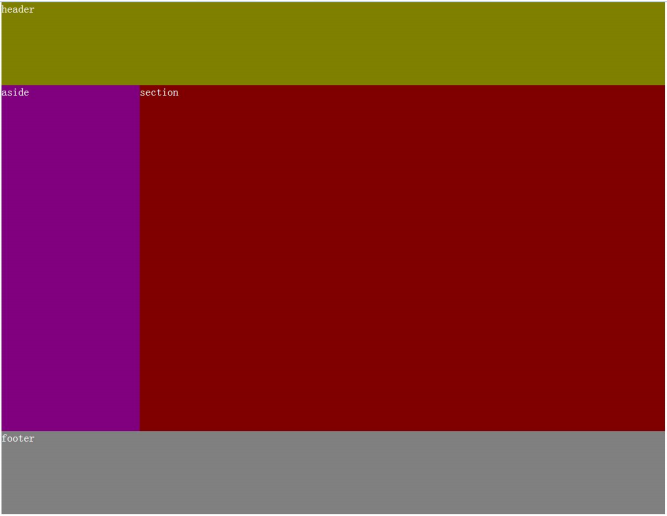
(1)固定布局
即用具体的像素值来确定模型的宽和高等值。
HTML代码如下所示
<table border="0">
    <tr>
        <td colspan="2" class="header">header</td>
    </tr>
    <tr>
        <td class="aside">aside</td>
        <td class="section">section</td>
    </tr>
    <tr>
        <td colspan="2" class="footer">footer</td>
    </tr>
</table>
css代码
@charset "utf-8";

body {
    margin: 0;
}

table {
    margin: 0 auto;
    width: 960px;
    border-spacing: 0;
}

.header {
    height: 120px;
    background-color: olive;
}

.aside {
    width: 200px;
    height: 500px;
    background-color: purple;
}

.section {
    width: 760px;
    height: 500px;
    background-color: maroon;
}

.footer {
    height: 120px;
    background-color: gray;
}
(2)流体布局
即采用百分比设置宽度等值,表格的固定布局采用流体布局的方式比较简单,只需要将table的width值设置为100%.
流体布局css代码
@charset "utf-8";

body {
    margin: 0;
}

table {
    margin: 0 auto;
    width: 960px;
    border-spacing: 0;
}

.header {
    height: 120px;
    background-color: olive;
}

.aside {
    width: 200px;
    height: 500px;
    background-color: purple;
}

.section {
    width: 760px;
    height: 500px;
    background-color: maroon;
}

.footer {
    height: 120px;
    background-color: gray;
}
二、浮动布局
浮动布局主要采用float和clear方式两个属性来构建
(1)固定布局
HTML代码片段
<body>
    <header>header</header>
    <aside>aside</aside>
    <section>section</section>
    <footer>footer</footer>
</body>
CSS代码
@charset "utf-8";

body {
    width: 960px;
    margin: 0 auto;
}

header {
    height: 120px;
    background-color: olive;
}

aside {
    width: 200px;
    height: 500px;
    background-color: purple;
    float: left;  //左浮动
}

section {
    width: 760px;
    height: 500px;
    background-color: maroon;
    float: right;  //右浮动
}

footer {
    height: 120px;
    background-color: gray;
    clear: both;
}
注意:aside和section这两部分必须要添加浮动并且两者总长度不能超过body的总长度,否则无法将两者并排显示
(2)流体布局
流体布局只要更改 body 元素的限定长度为 auto 或 100%。然后左右两列分别设置 20% 和 80%即可。
流体布局css代码
@charset "utf-8";

body {
    width: auto;   //此处改为auto或者100%
    margin: 0 auto;
}

header {
    height: 120px;
    background-color: olive;
}

aside {
    width: 20%; //此处改为百分比
    height: 500px;
    background-color: purple;
    float: left;
}

section {
    width: 80%;  //此处改为百分比
    height: 500px;
    background-color: maroon;
    float: right;
}

footer {
    height: 120px;
    background-color: gray;
    clear: both;
}
三、定位布局
在使用布局前先了解一下css2关于position属性的用法。
属性 说明 static 默认值,没有定位 absolute 绝对定位,使用top,right,bottom,left来进行位移 relative 相对定位,使用top,right,bottom,left来进行位移 fixed 以窗口参考定位,使用top,right,bottom,left来进行位移
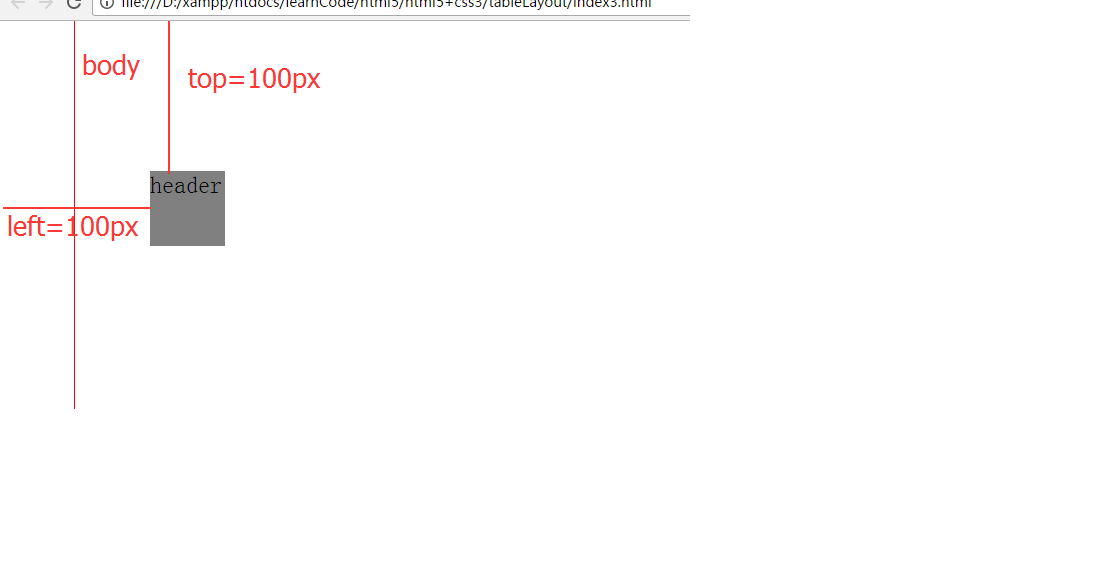
//absolute 绝对定位:,脱离文档流,以窗口文档左上角 0,0 为起点
CSS代码
@charset "utf-8";

body {
    margin: 10px auto;
    width: 800px;
    height: 500px;
    border: 1px solid red;
}

header {
    position: absolute;
    top: 100px;
    left: 100px;
    width: 50px;
    height: 50px;
    background-color: grey;
}
效果图如图所示
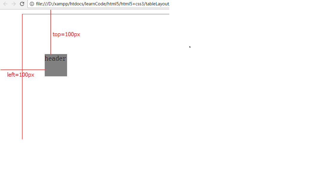
所谓脱离文档流的意思,就是本身这个元素在文档流是占位的。如果脱离了,就不占有文档的位置,好像浮在了空中一般,有了层次感。
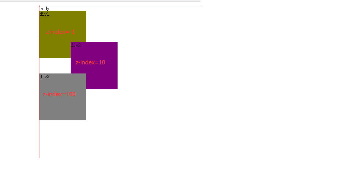
由于绝对定位脱离了文档流,出现层次概念。那么每个元素到底在那一层,会不会冲突覆盖。这时通过 z-index 属性来判定它们的层次关系。
| 属性 | 说明 |
|---|---|
| auto | 默认层次 |
| 数字 | 设置层次,数字越大,层次越高 |
示例如下:
html代码
<body>
body
<header>
    <div class="div1">div1</div>
    <div class="div2">div2</div>
    <div class="div3">div3</div>
</header>
</body>
css代码
header {
    position: relative;
}

div {
    width: 150px;
    height: 150px;
    position: absolute;
}

.div1 {
    background-color: olive;
    left: 0px;
    z-index: -1;   //设置在-1层。
}

.div2 {
    background-color: purple;
    top: 100px;
    left: 100px;
    z-index: 10;   //设置在第10层
}

.div3 {
    background-color: gray;
    top: 200px;
    left: 0;
    z-index: 100;   //设置在100层
}
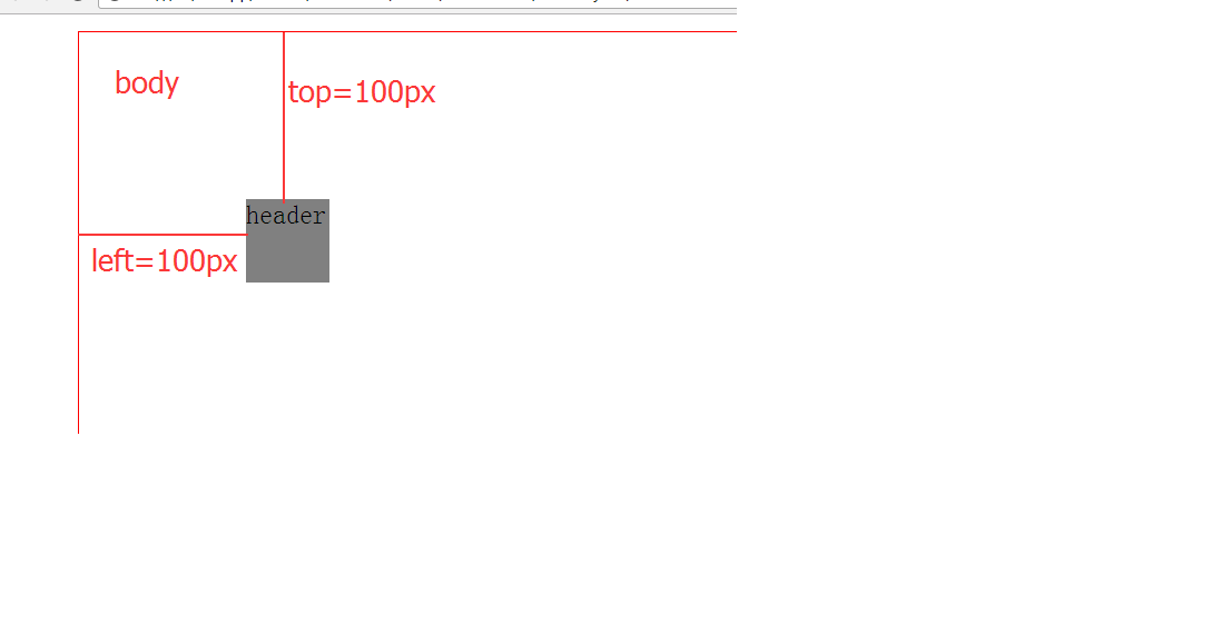
//relative 相对定位,不脱离文档流,占位偏移
CSS代码
@charset "utf-8";

body {
    margin: 10px auto;
    width: 800px;
    height: 500px;
    border: 1px solid red;
}

header {
    position: relative; //相对定位
    top: 100px;
    left: 100px;
    width: 50px;
    height: 50px;
    background-color: grey;
}
效果图如下
//fixed 以窗口参考定位,脱离文档流,会随滚动条滚动而滚动
css代码
@charset "utf-8";

body {
    margin: 10px auto;
    width: 800px;
    height: 500px;
    border: 1px solid red;
}

header {
    position: fixed;  // 以窗口参考定位
    top: 100px;
    left: 100px;
    width: 50px;
    height: 50px;
    background-color: grey;
}
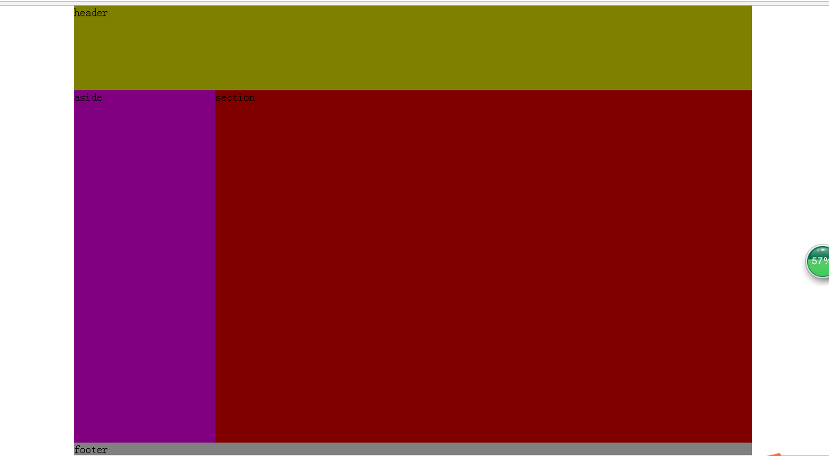
这三种分别都在各自的情况下使用,均比较常用。但还有一种情况,就是:1.既要脱离文档流(这样元素之间不会相互冲突);2.以父元素,比如 body 或其他父元素为参考点(这样可以实现区域性绝对定位);3.还必须是绝对定位。
HTML代码
<body>
    <header>
        header
    </header>

    <aside>
        aside
    </aside>
    <section>
        section
    </section>
    <footer>
        footer
    </footer>
</body>
CSS代码
@charset "utf-8";

body {
    width: 960px;
    margin: 0 auto;
    //第一步,将需要设置参考点的父元素设置为相对,且不设置坐标
    position: relative;
}

header {
    width: 960px;
    height: 120px;
    background-color: olive;
    //第二步,如果父元素设置了参考点,子元素的绝对定位将以它为基准
    position: absolute;
    top: 0;
    left: 0;
}

aside {
    width: 200px;
    height: 500px;
    background-color: purple;
    position: absolute;
    top: 120px;
    left: 0;
}

section {
    width: 760px;
    height: 500px;
    background-color: maroon;
    position: absolute;
    top: 120px;
    right: 0;
}

footer {
    width: 960px;
    height: 120;
    background-color: gray;
    position: absolute;
    top: 620px;
    left: 0;
}
效果图
四、box-sizing
在盒模型中,元素盒子如果加入了内边距 padding 和边框 border 后,它的总长度会增加。那么如果这个元素用于非常精确的布局时,我们就需要进行计算增减。
为了解决这个精确计算的问题,CSS3 提供了一个属性 box-sizing,这个属性可以定义元素盒子的解析方式,从而可以选择避免掉布局元素盒子增加内边距和边框的长度增减问题。
| 属性 | 说明 |
|---|---|
| content-box | 默认值,border 和 padding 设置后用于元素的总长度。 |
| border-box | border 和 padding 设置后不用于元素的总长度。 |
| inherit | 规定应从父元素继承 box-sizing 属性的值。 |
示例:设置 border-box 让 border 和 padding 不在额外增加元素大小
aside {
    width: 200px;
    height: 500px;
    background-color: purple;
    border: 5px solid green;
    padding: 10px;
    box-sizing: border-box;
    float: left;
}
box-sizing 是 CSS3 推出的,各个厂商在实现时设置了私有前缀。
| Opera | Firefox | Chrome | Safari | IE |
|---|---|---|---|---|
| 支持需带前缀 | 无 | 2 ~ 28 | 4 ~ 9 | 3.1 ~ 5 |
| 支持不带前缀 | 10.1+ | 29+ | 10+ | 6+ |
//完整形式
-webkit-box-sizing: border-box;
-moz-box-sizing: border-box;
-ms-box-sizing: border-box;
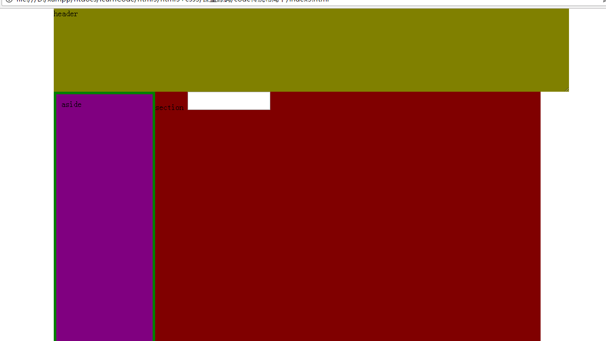
box-sizing: border-box;五:resize
CSS3 提供了一个 resize 属性,来更改元素尺寸大小。
| 属性 | 说明 |
|---|---|
| none | 默认值,不允许用户调整元素大小。 |
| both | 用户可以调节元素的宽度和高度。 |
| horizontal | 用户可以调节元素的宽度 |
| vertical | 用户可以调节元素的高度。 |
一般普通元素,默认值是不允许的。但如果是表单类的 textarea 元素,默认是允许的。而普通元素需要设置 overflow:auto,配合 resize 才会出现可拖拽的图形。
示例如下
HTML代码
<body>
    <header>
        header
    </header>

    <aside>
        aside
    </aside>

    <section>
        section
        <textarea></textarea>
    </section>

    <footer>
        footer
    </footer>
</body>
css代码
@charset "utf-8";

body {
    width: 960px;
    margin: 0 auto;
}

header {
    height: 120px;
    background-color: olive;
    overflow: auto;  //必须
    resize: both;  //设置为用户可以调节元素的宽度和高度。
}

aside {
    width: 200px;
    height: 500px;
    background-color: purple;
    border: 5px solid green;
    padding: 10px;
    box-sizing: border-box;
    float: left;
}

section {
    width: 760px;
    height: 500px;
    background-color: maroon;
    float: right;
}

footer {
    width: 960px;
    height: 120;
    background-color: gray;
    clear: both;
}

textarea {
    resize: none;
}
效果图如下
学习参考资料:李炎恢HTML5第一季视频教程


 856
856

 被折叠的 条评论
为什么被折叠?
被折叠的 条评论
为什么被折叠?
 到【灌水乐园】发言


