


基本概念
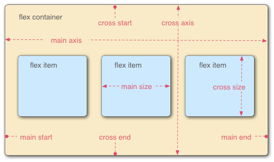
采用Flex布局的元素,被称为Flex container,其所有子元素被称为Flex item;容器默认存在两个轴,分别是主轴(main axis)和垂直的交叉轴(cross axis),主轴开始的位置叫做main start,结束的位置叫main end;交叉轴的开始位置叫做cross start,结束的位置叫做cross end;单个item占据的主轴空间叫做main size,占据的交叉轴控件叫做cross size。如下图所示:
属性列表
1. alignItems
定义item在cross axis上如何对齐。
enum('flex-start', 'flex-end', 'center', 'stretch')
// flex-start:交叉轴的起点对齐。
// flex-end:交叉轴的终点对齐。
// center:交叉轴的中点对齐。
// stretch(默认值):如果项目未设置高度或设为auto,将占满整个容器的高度。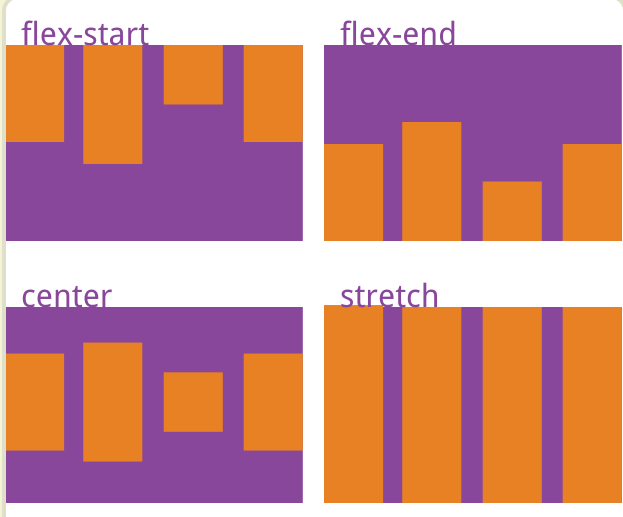
2. alignSelf
允许单个item有与其他item不一样的对齐方式,可覆盖alignItems属性。
enum('auto', 'flex-start', 'flex-end', 'center', 'stretch')
// auto(默认值):表示继承父元素的alignItems属性,如果没有父元素,则等同于stretch。
// flex-start:交叉轴的起点对齐。
// flex-end:交叉轴的终点对齐。
// center:交叉轴的中点对齐。
// stretch:如果项目未设置高度或设为auto,将占满整个容器的高度。
3. flex
设置item的放大比例,默认是0,即如果存在剩余空间,也不放大。当flex=1时,表示所有子项目将等分剩余空间。当其中一个item A的flex=2时,其他item都为1,则item A将占据的剩余空间将比其他item多1倍。
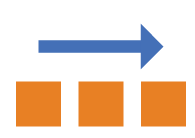
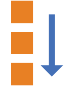
4. flexDirection
决定main axis的方向,即item的排列方向。
enum('row', 'column')
// row(默认值):主轴为水平方向,起点在左端。
// column:主轴为垂直方向,起点在上沿。
row:
column:
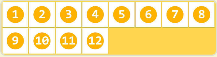
5. flexWrap
定义所有item是否都排在一条线上,即如果一条轴线排不下,是否要换行继续排列。
enum('wrap', 'nowrap')
// nowrap(默认值):不换行
// wrap:换行
nowrap:
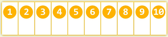
wrap:
6. justifyContent
定义item在main axis上的对齐方式,与alignItems类似,alignItems是定义在cross axis上的对齐方式。
enum('flex-start', 'flex-end', 'center', 'space-between', 'space-around')
// flex-start(默认值):左对齐
// flex-end:右对齐
// center: 居中
// space-between:两端对齐,项目之间的间隔都相等。
// space-around:每个项目两侧的间隔相等。所以,项目之间的间隔比项目与边框的间隔大一倍。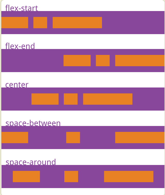
7. borderBottomWidth
设置底部边框的宽度。
8. borderLeftWidth
设置左侧边框的宽度。
9. borderRightWidth
设置右侧边框的宽度。
10. borderTopWidth
设置顶部边框的宽度。
11. borderWidth
设置边框的宽度。
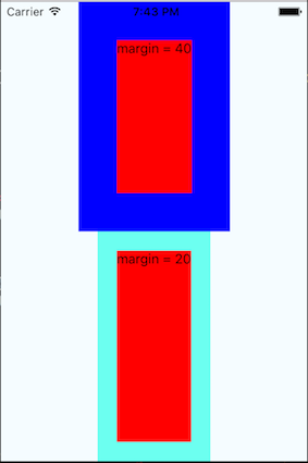
12. margin
设置item的外边距
 <View style={styles.container}>
       <View style={[styles.container, {backgroundColor: 'blue'}]}>
          <View style={{flex: 1,flexDirection: 'row',justifyContent:'center',backgroundColor:'red', margin: 40}}>
              <Text>{'margin = 40'}</Text>
          </View>
        </View>
       <View style={[styles.container, {backgroundColor: '#6cfff0'}]}>
          <View style={{flex: 1,flexDirection: 'row',justifyContent:'center',backgroundColor:'red', margin: 20}}>
              <Text>{'margin = 20'}</Text>
          </View>
        </View>
效果图:
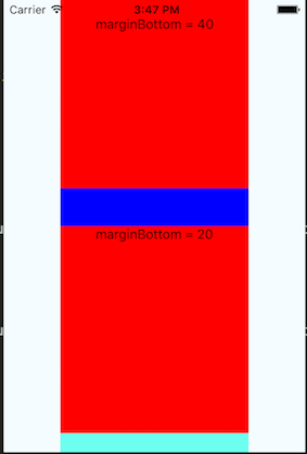
13. marginBottom
设置item的底部外边距
效果图:
14. marginHorizontal
设置item的水平外边距
15. marginLeft
设置item的左边外边距
16. marginRight
设置item的右边外边距
17. marginTop
设置item的顶部外边距
18. marginVertical
设置item的垂直外边距
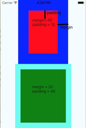
19. padding
设置item的内边距。
  return (
      <View style={styles.container}>
        <View style={[styles.container, {backgroundColor: 'blue'}]}>
          <View style={{flex: 1,flexDirection: 'row',justifyContent:'center',backgroundColor:'red',margin: 40, padding: 10}}>
              <Text>{'\n margin= 40 \n padding = 10'}</Text>
          </View>
        </View>
       <View style={[styles.container, {backgroundColor: '#6cfff0'}]}>
          <View style={{flex: 1,flexDirection: 'row',justifyContent:'center',backgroundColor:'green',margin: 20, padding: 40}}>
              <Text>{'\n margin = 20 \n padding = 40'}</Text>
          </View>
        </View>
      </View>
效果图:
20. paddingBottom
设置item的底部内边距。
21. paddingHorizontal
设置item的水平内边距。
22. paddingLeft
设置item的左边内边距。
23. paddingRight
设置item的右边内边距。
24. paddingTop
设置item的顶部内边距。
25. paddingVertical
设置item的垂直内边距。
26. position
设置item的定位类型。
enum('absolute', 'relative')
// absolute:生成绝对定位的item,个人感觉不要在 外面包着多层view的内层view使用absolute,展示可能和你预期的不一样。
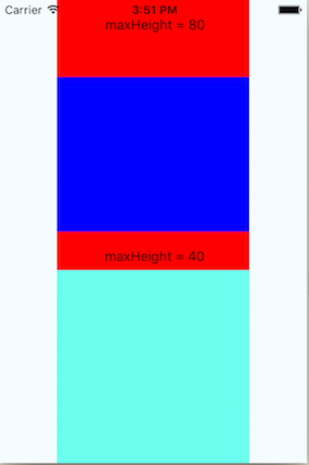
// relative(默认值):生成相对定位的item,相对于正常位置进行定位。27. maxHeight
设置item的最大高度。
      <View style={styles.container}>
        <View style={[styles.container, {backgroundColor: 'blue'}]}>
          <View style={{flex: 1,flexDirection: 'row',justifyContent:'center',backgroundColor:'red', width: 200, maxHeight: 80}}>
              <Text>{'\n maxHeight = 80'}</Text>
          </View>
        </View>
      <View style={[styles.container, {backgroundColor: '#6cfff0'}]}>
          <View style={{flex: 1,flexDirection: 'row',justifyContent:'center',backgroundColor:'red', width: 200, maxHeight: 40}}>
              <Text>{'\n maxHeight = 40'}</Text>
          </View>
        </View>
     </View>
效果图:
28. maxWidth
设置item的最大宽度。
29. minHeight
设置item的最小高度。
30. minWidth
设置item的最小宽度。
31. height
设置item的高度。
32. left
设置item的左边位置。
33. right
设置item的右边位置。
34. top
设置item的上边位置。
35. bottom
设置元素的底部边缘,该属性定义了元素下边边距边界与其包含元素下边界之间的偏移。
36. width
设置item的宽度。


 2486
2486

 被折叠的 条评论
为什么被折叠?
被折叠的 条评论
为什么被折叠?
 到【灌水乐园】发言


