


如果你想在同一图表中同时展示预测值、真实值以及它们的误差,可以使用以下方法来创建一个更全面的视图。这样可以更直观地比较预测结果与真实数据,并评估模型的性能。以下是如何使用 Matplotlib 在 Python 中实现这一点的具体步骤:
步骤 1: 准备数据
首先,我们继续使用之前生成的数据:
import numpy as np
import matplotlib.pyplot as plt

# 生成一些模拟数据
np.random.seed(0)
x = np.linspace(0, 10, 50)  # 时间或独立变量
true_values = np.sin(x) + np.random.normal(scale=0.1, size=x.shape)  # 真实值
predicted_values = np.sin(x) + np.random.normal(scale=0.2, size=x.shape)  # 预测值
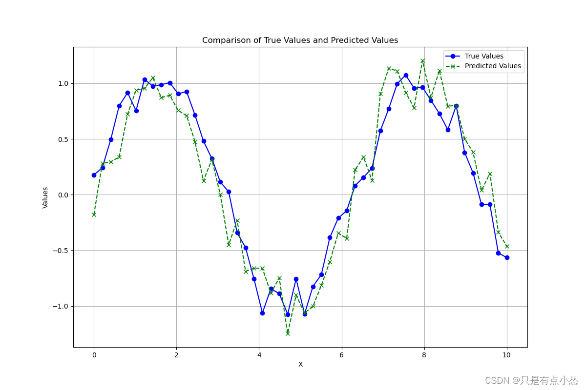
步骤 2: 绘制真实值和预测值
使用 Matplotlib 绘制真实值和预测值:
plt.figure(figsize=(12, 8))

# 绘制真实值
plt.plot(x, true_values, marker='o', linestyle='-', color='blue', label='True Values')

# 绘制预测值
plt.plot(x, predicted_values, marker='x', linestyle='--', color='green', label='Predicted Values')

# 添加图例
plt.legend()

# 添加标题和标签
plt.title('Comparison of True Values and Predicted Values')
plt.xlabel('X')
plt.ylabel('Values')

# 显示网格
plt.grid(True)

plt.show()
步骤 3: 绘制误差曲线
为了在同一图表中同时展示误差,可以添加第二个 y 轴来展示误差数据:
fig, ax1 = plt.subplots(figsize=(12, 8))

# 绘制真实值和预测值
ax1.plot(x, true_values, marker='o', linestyle='-', color='blue', label='True Values')
ax1.plot(x, predicted_values, marker='x', linestyle='--', color='green', label='Predicted Values')
ax1.set_xlabel('X')
ax1.set_ylabel('Values')
ax1.legend(loc='upper left')

# 创建共享x轴的第二个y轴
ax2 = ax1.twinx()

# 计算并绘制误差
errors = predicted_values - true_values
ax2.plot(x, errors, marker='o', linestyle='-', color='red', label='Prediction Error')
ax2.set_ylabel('Error (Predicted - True)')
ax2.legend(loc='upper right')

# 设置图表标题和显示网格
ax1.set_title('True vs Predicted Values and Errors')
ax1.grid(True)

plt.show()
在这个图表中:
- 左 y 轴 显示了真实值和预测值。
- 右 y 轴 显示了预测误差。
- 使用两种不同的线型和标记来区分真实值和预测值,同时用颜色区分误差。
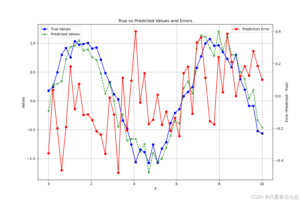
这种图表的布局使得比较直观,可以清楚地看到模型在不同点上的表现如何,以及误差的变化趋势。这对于评估模型精确度和诊断问题非常有帮助。


 398
398

 被折叠的 条评论
为什么被折叠?
被折叠的 条评论
为什么被折叠?
 到【灌水乐园】发言


