


 本文介绍了如何使用Echarts开发树型图,以展示公司人事架构为例,详细阐述了从引入Echarts库到配置数据源和参数的步骤。通过一个简单的demo程序展示了效果,并探讨了根据不同数据源定制开发tree图的方法,强调了递归在构建树状结构中的关键作用。最后,提供了完整的代码示例以供参考,有助于深入理解Echarts的树图绘制和递归概念。
引言:Echarts是百度开发的一款可视化的开源js框架,诸如此类的框架很多,今天我们就重点研究Echarts。使用Echarts非常简单,我们将需要展示的数据源以及可视化效果以参数的形式传入Echarts中即可。
一.Echarts使用
我们以官网的一个关于制作简单的树形图为例子,说明Echarts开发的整套流程。
1.开发流程
1).编写visual.hmtl文件,并引入echarts.js文件。
我们这里使用的是echarts 2.x版本,因为3.x版本中tree结构被移除了。详情见echarts配置及下载官方文档
2).定义一个容器
我们将可视化展示的图形放在一个定制好的容器中,这里所说的容器是div或者 可以容纳其他元素的便签。
3).配置数据源和参数
通过echarts提供的接口配置我们需要展示的数据源和效果
2.demo程序
1)效果展示如下:
2)核心代码如下:
<html>
<head>
<meta charset="UTF-8">
<title>社交网络</title>
<style>
</style>
<script src="echarts-2.x.js"></script>
</head>
<body>
<!-- 为ECharts准备一个具备大小(宽高)的Dom -->
<div style="padding:20px;width:100%;height:100%;">
<div id="main" style="width: 1104px;height:464px;">
</div>
</div>
<script type="text/javascript">
//定义echarts容器
var myChart = echarts.init(document.getElementById('main'), 'macarons');
option = {
title : {
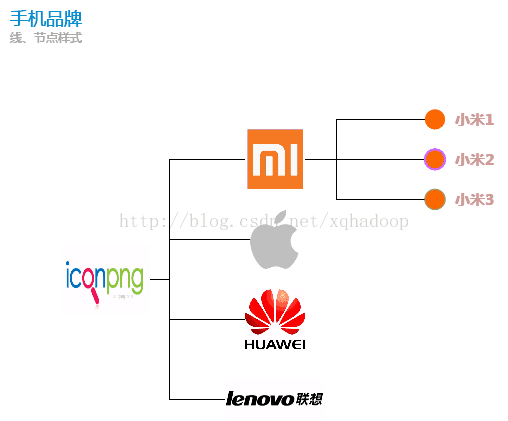
text: '手机品牌',
subtext: '线、节点样式'
},
series : [
{
name:'树图',
type:'tree',
orient: 'horizontal', // vertical horizontal
rootLocation: {x: 100, y: '60%'}, // 根节点位置 {x: 'center',y: 10}
nodePadding: 20,
symbol: 'circle',
symbolSize: 40,
itemStyle: {
normal: {
label: {
show: true,
position: 'inside',
textStyle: {
color: '#cc9999',
fontSize: 15,
fontWeight: 'bolder'
}
},
lineStyle: {
color: '#000',
width: 1,
type: 'broken' // 'curve'|'broken'|'solid'|'dotted'|'dashed'
}
},
emphasis: {
label: {
show: true
}
}
},
data: [
{
name: '手机',
value: 6,
symbolSize: [90, 70],
symbol: 'image://http://www.iconpng.com/png/ecommerce-business/iphone.png',
itemStyle: {
normal: {
label: {
show: false
}
}
},
children: [
{
name: '小米',
value: 4,
symbol: 'image://http://pic.58pic.com/58pic/12/36/51/66d58PICMUV.jpg',
 最低0.47元/天 解锁文章


 1万+
1万+

 被折叠的 条评论
为什么被折叠?
被折叠的 条评论
为什么被折叠?
 到【灌水乐园】发言


