kibana visualize添加自定义查询

在分析nginx日志的时候的,我想统计时间范围内那些访问地址最高并且过滤掉jpg之类的请求。

1.进入Visualize->点击添加,选择Pie chart饼状图


选择之前配置的logstash-*,如果没有可以选择的,请先导入一份数据到elasticsearch,可参考http://blog.csdn.net/xr568897472/article/details/71216971进入数据导入


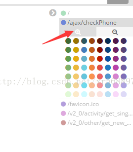
我解析出来的request.keyword就是对应的是nginx的请求日志路径,如下所示,展示了排名前五访问次数最多的


现在我想排除掉路径中含有ajax字符的路径,不想统计这些。实现方法如下

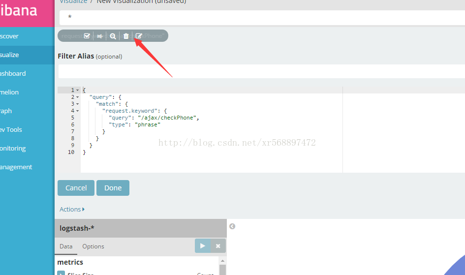
点击修改标识,覆盖填写的脚本,然后点击Done,然后就可以看到自己想要的结果。上一步骤如果你点了减号,统计的结果与写的脚本内容表达的是相反的意思

{
   "query": {
     "bool": {
       "must_not": [
         {"match": {
           "request": "ajax"
         }}
       ]
     }
   }
}


  • 3
    点赞
  • 2
    收藏
    觉得还不错? 一键收藏
  • 0
    评论
Practical data design tips from a data visualization expert of the modern age Data doesn?t decrease; it is ever-increasing and can be overwhelming to organize in a way that makes sense to its intended audience. Wouldn?t it be wonderful if we could actually visualize data in such a way that we could maximize its potential and tell a story in a clear, concise manner? Thanks to the creative genius of Nathan Yau, we can. With this full-color book, data visualization guru and author Nathan Yau uses step-by-step tutorials to show you how to visualize and tell stories with data. He explains how to gather, parse, and format data and then design high quality graphics that help you explore and present patterns, outliers, and relationships. Presents a unique approach to visualizing and telling stories with data, from a data visualization expert and the creator of flowingdata.com, Nathan Yau Offers step-by-step tutorials and practical design tips for creating statistical graphics, geographical maps, and information design to find meaning in the numbers Details tools that can be used to visualize data-native graphics for the Web, such as ActionScript, Flash libraries, PHP, and JavaScript and tools to design graphics for print, such as R and Illustrator Contains numerous examples and descriptions of patterns and outliers and explains how to show them Visualize This demonstrates how to explain data visually so that you can present your information in a way that is easy to understand and appealing. From the Author: Telling Stories with Data Author Nathan Yau A common mistake in data design is to approach a project with a visual layout before looking at your data. This leads to graphics that lack context and provide little value. Visualize This teaches you a data-first approach. Explore what your data has to say first, and you can design graphics that mean something. Visualization and data design all come easier with practice, and you can advance your skills with every new dataset and project. To begin though, you need a proper foundation and know what tools are available to you (but not let them bog you down). I wrote Visualize This with that in mind. You'll be exposed to a variety of software and code and jump right into real-world datasets so that you can learn visualization by doing, and most importantly be able to apply what you learn to your own data. Three Data Visualization Steps: 1) Ask a Question (Click Graphic to See Larger Version) When you get a dataset, it sometimes is a challenge figuring out where to start, especially when it's a large dataset. Approach your data with a simple curiosity or a question that you want answered, and go from there. 2) Explore Your Data (Click Graphic to See Larger Version) A simple curiosity often leads to more questions, which are a good guide for what stories to dig into. What variables are related to each other? Can you see changes over time? Are there any features in the data that stand out? Find out all you can about your data, because the more you know what's behind the numbers, the better story you can tell. 3) Visualize Your Data (Click Graphic to See Larger Version) Once you know the important parts of your data, you can design graphics the best way you see fit. Use shapes, colors, and sizes that make sense and help tell your story clearly to readers. While the base of your charts and graphs will share many of the same properties – bars, slices, dots, and lines – the final design elements will and should vary by your unique dataset.

“相关推荐”对你有帮助么?

  • 非常没帮助
  • 没帮助
  • 一般
  • 有帮助
  • 非常有帮助
提交
评论
添加红包

请填写红包祝福语或标题

红包个数最小为10个

红包金额最低5元

当前余额3.43前往充值 >
需支付:10.00
成就一亿技术人!
领取后你会自动成为博主和红包主的粉丝 规则
hope_wisdom
发出的红包
实付
使用余额支付
点击重新获取
扫码支付
钱包余额 0

抵扣说明:

1.余额是钱包充值的虚拟货币,按照1:1的比例进行支付金额的抵扣。
2.余额无法直接购买下载,可以购买VIP、付费专栏及课程。

余额充值