


网上有很多渐变边框,但是不是透明的
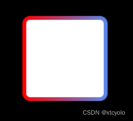
非透明效果:
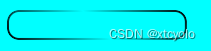
透明效果:
<!DOCTYPE html>
<html lang="en">
<head>
<meta charset="UTF-8">
<meta name="viewport" content="width=device-width, initial-scale=1.0">
<style>
  .box{
    width: 500px;
    height: 500px;
    background-color: aqua;
  }
.gradient-border {
  position: relative;
}

.gradient-border::before {
  content: "";
  border-radius: 12px;
  padding: 2px;
  inset: 0;
  position: absolute;
  background: linear-gradient(45deg, black, transparent, black);
  mask: linear-gradient(#fff 0 0) content-box, linear-gradient(#fff 0 0);
  mask-composite: exclude;
}

.some-other-styling {
  width: 200px;
  height: 50px;
}
</style>

</style>
<title>渐变圆角边框示例</title>
</head>
<body>
  <div class="box">
    <div class="gradient-border some-other-styling">
    </div>
  </div>

</body>
</html>


 3万+
3万+


 被折叠的 条评论
为什么被折叠?
被折叠的 条评论
为什么被折叠?
 到【灌水乐园】发言


