


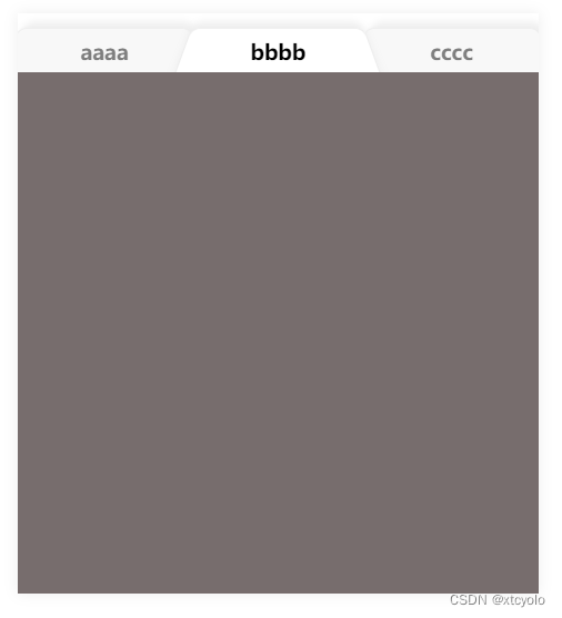
效果图
代码
<template>
  <div class="main">
    <div class="content">
      <div class="nav1" ref="nav1" @click="cutTab('nav1','a')">aaaa <span ref="a" class="a"></span></div>
      <div class="nav2" ref="nav2" @click="cutTab('nav2','b')">bbbb <span ref="b" class="b"></span></div>
      <div class="nav3" ref="nav3" @click="cutTab('nav3','c')">cccc <span ref="c" class="c"></span></div>
    </div>
    <div class="list">
    </div>
  </div>

</template>
<script>

export default {
  components: {},
  data() {
    return {
    }
  },
  computed: {},
  watch: {},
  methods: {
    cutTab(select, type) {
      // 三个nav是控制层级
      const arr = ['nav1', 'nav2', 'nav3',]
      const valueToRemove = select;
      // 得到一个新的数组,不包含选择的nav,设置未选择的样式
      const newArr = arr.filter(item => item !== valueToRemove);
      newArr.forEach(it => {
        this.$refs[it].style.backgroundColor = '#f8f8f8';
        this.$refs[it].style.color = '#7e7e7e';
        this.$refs[it].style.zIndex = '1';
      })
      // 设置选择的样式
      this.$refs[select].style.backgroundColor = '#ffffff';
      this.$refs[select].style.color = '#000';
      this.$refs[select].style.zIndex = '99';
      if (select == 'nav1') {
        this.$refs.nav2.style.zIndex = '2';
      }
      // 三个span是画梯形的+阴影的
      const arr1 = ['a', 'b', 'c',]
      const valueToRemove1 = type;
      const newArr1 = arr1.filter(item => item !== valueToRemove1);
      newArr1.forEach(it => {
        this.$refs[it].style.backgroundColor = '#f8f8f8';
      })
      this.$refs[type].style.backgroundColor = '#ffffff';
    }

  },
  created() {
  },
  mounted() {
  },
}
</script>
<style>
.main {
  box-shadow: 0px 0px 8px #ededed;
  width: 300px;
  margin: 80px;
}
.content {
  width: 300px;
  overflow: hidden;
  padding: 10px 0px 0px;
  display: flex;
  align-items: baseline;
}

.nav3,
.nav2,
.nav1 {
  position: relative;
  text-decoration: none;
  display: inline-block;
  width: 100px;
  font-size: 12px;
  color: #7e7e7e;
  line-height: 24px;
  text-align: center;
  height: 24px;
  font-weight: 600;
  z-index: -1;
}
.nav1 {
  z-index: 2;
}
.nav2 {
  z-index: 1;
}
.a {
  content: "";
  position: absolute;
  top: 0;
  left: 0;
  right: 0;
  bottom: 0;
  border: 1px solid #ededed;
  border-bottom: none;
  border-radius: 5px 5px 0 0;
  box-shadow: 3px -3px 5px #ededed;
  transform: perspective(10px) scale(1.1, 1.3) rotateX(5deg);
  z-index: -1;
  background: #fff;
}
.b {
  content: "";
  position: absolute;
  top: 0;
  left: 0;
  right: 0;
  bottom: 0;

  border: 1px solid #ededed;
  border-bottom: none;
  border-radius: 5px 5px 0 0;
  box-shadow: 0px -3px 5px #ededed;
  transform: perspective(10px) scale(1.1, 1.3) rotateX(5deg);
  z-index: -1;
  background: #f8f8f8;
}
.c {
  content: "";
  position: absolute;
  top: 0;
  left: 0;
  right: 0;
  bottom: 0;

  border: 1px solid #ededed;
  border-bottom: none;
  border-radius: 5px 5px 0 0;
  box-shadow: 3px -3px 5px #ededed;
  transform: perspective(10px) scale(1.1, 1.3) rotateX(5deg);
  z-index: -1;
  background: #f8f8f8;
}

.list {
  width: 300px;
  height: 300px;
  background-color: #776d6d;
}
</style>


 325
325


 被折叠的 条评论
为什么被折叠?
被折叠的 条评论
为什么被折叠?
 到【灌水乐园】发言


