


表单效果图:
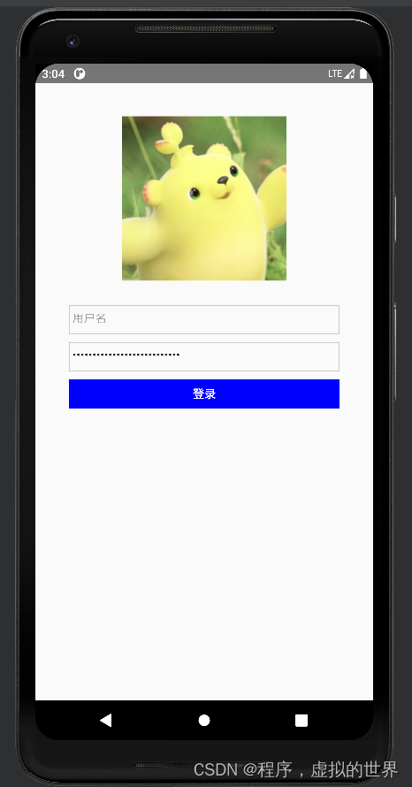
这个登录页面,只要使用ReactNative的TextInput, View, StyleSheet, Text几个组件。
用为React Native组件内不能使用Form表单,如果不使用第三方UI库的话,自己动手封装表单了。
TextInput组件,实现输入框;
View,容器组件,页面布局用,可以把它当成html元素对应的div标签
Text,内容组件,对标html的span标签,在ReactNative中,一般是使用Text组件将文本内容包裹起来,
StyleSheet,创建样式
样式代码如下:
const styles = StyleSheet.create({
  flex: {
    display: 'flex',
    justifyContent: 'space-between',
    marginTop: 20,
  },
  borderStyle: {
    borderColor: '#cacaca',
    borderWidth: 1,
  },
  inputStyle: {
    width: '80%',
    height: 35,
    marginLeft: 'auto',
    marginRight: 'auto',
    marginTop: 10,
  },
  button: {
    backgroundColor: 'blue',
    display: 'flex',
    justifyContent: 'center',
    alignItems: 'center',
  },
  buttonText: {
    color: '#ffffff',
    fontWeight: 'bold',
  },
});
表单部分使用的Flex弹性布局,在ReactNative中,默认主轴方向应该是垂直方向【目前测试中,主轴方向默认是垂直方向】。
完整代码:
import React, {useState} from 'react';
import {
  TextInput,
  View,
  StyleSheet,
  Text,
  TouchableHighlight,
  Button,
} from 'react-native';

const formDefaultData = {
  userName: null,
  password: null,
};
export default function Form() {
  const [formData, setFormData] = useState(formDefaultData);

  const onBtn = () => {
    console.log('formData', formData);
  };
  return (
    <View style={styles.flex}>
      <TextInput
        placeholder="用户名"
        onChange={value => {
          console.log('表单', value);
        }}
        style={[styles.inputStyle, styles.borderStyle]}
      />
      <TextInput
        secureTextEntry={true}
        placeholder="密码"
        style={[styles.inputStyle, styles.borderStyle]}
      />
      <View style={[styles.inputStyle, styles.borderStyle]}>
        <Button
          onPress={onBtn}
          title="登录"
          color="#841584"
          accessibilityLabel="Learn more about this purple button"
        />
      </View>
    </View>
  );
}

const styles = StyleSheet.create({
  flex: {
    display: 'flex',
    justifyContent: 'space-between',
    marginTop: 20,
  },
  borderStyle: {
    borderColor: '#cacaca',
    borderWidth: 1,
  },
  inputStyle: {
    width: '80%',
    height: 35,
    marginLeft: 'auto',
    marginRight: 'auto',
    marginTop: 10,
  },
  button: {
    backgroundColor: 'blue',
    display: 'flex',
    justifyContent: 'center',
    alignItems: 'center',
  },
  buttonText: {
    color: '#ffffff',
    fontWeight: 'bold',
  },
});
待完善。。。


 3350
3350


 被折叠的 条评论
为什么被折叠?
被折叠的 条评论
为什么被折叠?
 到【灌水乐园】发言


